Get started with Bulma
Learn how to build a responsive site with CSS framework Bulma using this handy step-by-step guide.
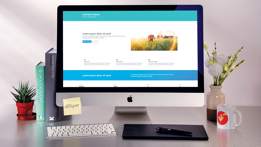
Want to get started using Bulma? You're in the right place. Bulma is a popular CSS framework with a simple flexbox grid system. It differs from other frameworks by taking a lighter approach and not including any JavaScript – leaving that decision entirely up to the developer (to explore other options, see our pick of the best CSS frameworks).
In this tutorial, we will demonstrate how to install Bulma, and build a website with its various classes. To prove how versatile the classes are in Bulma, the entire tutorial page has been built without writing a single line of CSS. Want other options? Try an excellent website builder. And to make sure your site runs at its best, choose the right web hosting service.

Generate CSS is the hottest web event in town. From 20-22 Sept you can pick up a ticket for half price using the code FLASHSALE5. Click the image to find out more.
Article continues below01. Get started
Create a new directory, and within it, create an index.html file. Open this file in a code editor and create a simple starter HTML document, with a DOCTYPE html and a responsive viewport tag.
<!DOCTYPE html>
	<html>
		<head>
			<meta name="viewport" content=
			"width=device-width, initial-scale=1">
			<title>Page Title</title>
		</head>
	<body>
	</body>
	</html>
02. Install Bulma
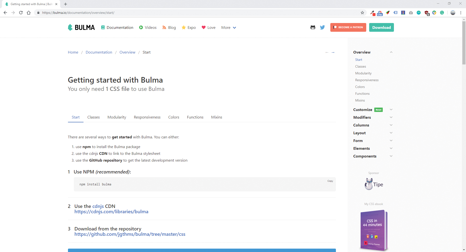
Using Bulma out the box is as fast as adding a single CSS file. Using the CDN add a link in the HTML. If it is necessary to change variables and have more control over the framework, npm install Bulma can be used (see the full documentation). For the full experience, font awesome 5 should also be included.
<link rel="stylesheet" href=”https://cdnjs.cloudflare.com/ajax/libs/bulma/0.7.5/css/bulma.min.css">
<script defer src="https://use.fontawesome.com/releases/v5.3.1/js/all.js"></script>
03. Build a page
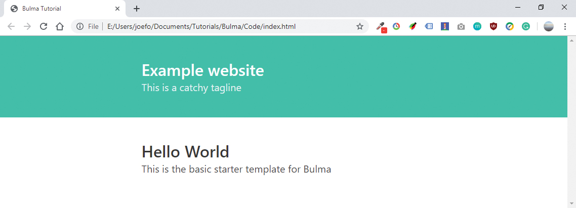
Inside the body tag, create a section element and a div with the class container. Within the container, create an h1 with the class title then a paragraph with the class subtitle. For now, input 'hello world' into the title and some text into the paragraph. We now have the basic starter template for Bulma.
<section class="section">
		<div class="container">
			<h1 class="title">
				Hello World
			</h1>
			<p class="subtitle">
				This is the basic starter
				template for Bulma
			</p>
		</div>
	</section>
04. Create a top hero bar
Make a new section above the previous one, and instead of the class section, give it the class hero. The hero class allows the creation of a full-width banner, with a variety of options controlling its height. Within this new section create a div with the class hero-body and then a container this will hold the content.
Sign up to Creative Bloq's daily newsletter, which brings you the latest news and inspiration from the worlds of art, design and technology.
<section class="hero">
<div class="hero-body ">
		<div class="container">...</div>
</div>
</div>
05. Add title and subtitles
Inside the container div, add an h1 and h2 tag with the classes title and subtitle. These are typography classes that will increase the size of their content. Bulma is smart to know when a title and subtitle are combined, and will bring them closer together.
06. Add a splash of colour
Add the class is-primary to the hero section. This will apply the primary colour to the background, and change the text to the lighter variant. Instead of primary, info, success, warning, danger, light and dark can also be chosen
<section class="hero is-primary ">07. Split the content into columns
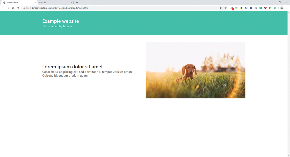
The first content area of the website is split into two columns. Make a new section with the class section and add a container. To set up the columns, a div is added with columns class. Each column is added within the parent container. Columns will space themselves equally in the available space with a small gap between unless specified.
If you've got a lot of content, make sure you back your assets up in reliable cloud storage.
<section class="section">
	<div class="container">
		<div class="columns is-vcentered">
			<div class="column">
				...
			</div>
			<div class="column">
				...
			</div>
			</div>
	</div>
</section>
08. Create responsive images
The second column will contain an image. Wrap the image in a figure element, and, if possible, give the figure a class of the aspect ratio of the image. In the example, 16by9 has been used (see the full list of available ratios).
<div class="column">
		<figure class="image is-16by9">
			<img src="img/dog.jpg">
		</figure>
</div>
09. Suggest action with buttons
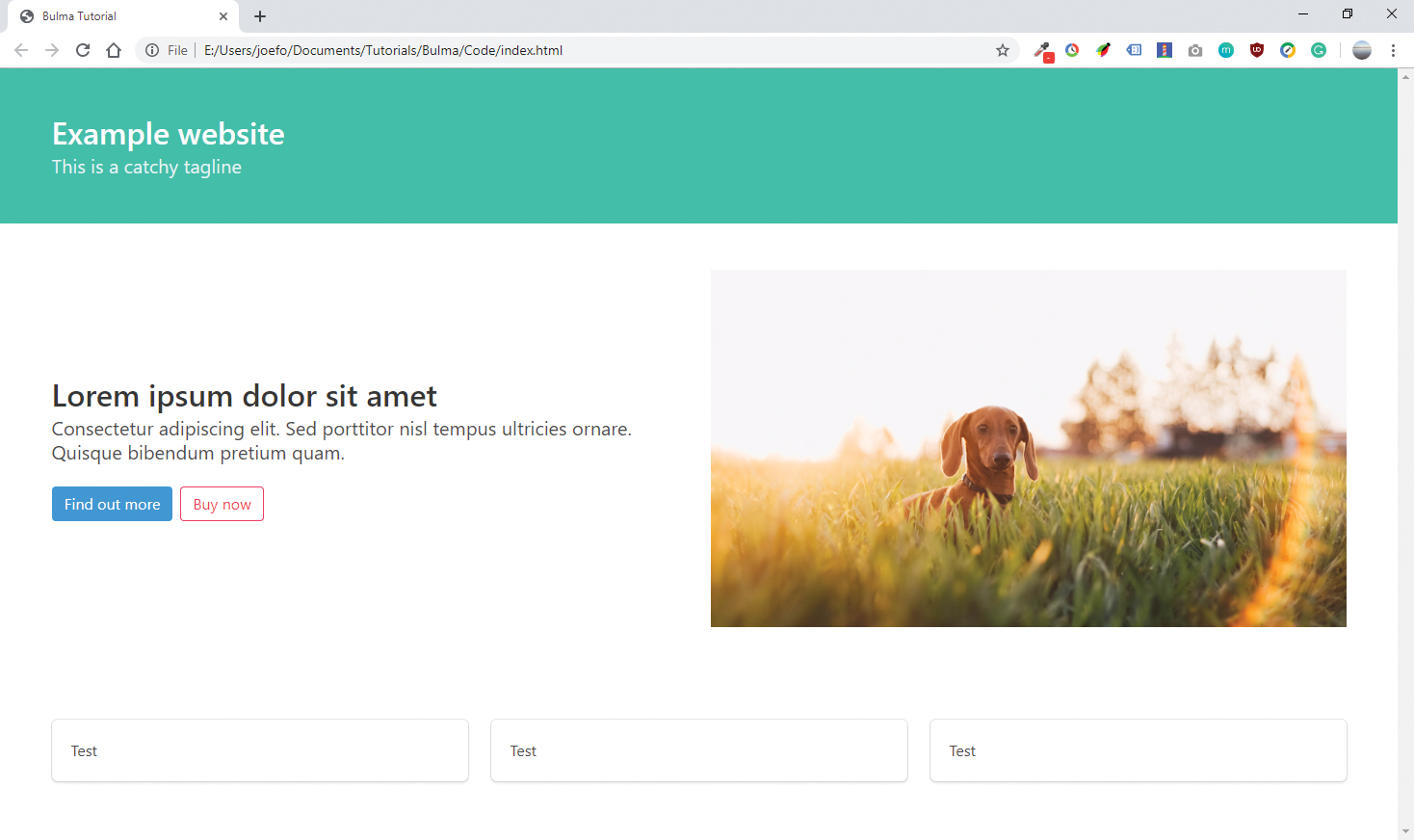
The button class creates colourful buttons and can be applied <a> elements or <button> elements in forms.Add two buttons to the first column and apply colour modifiers to them. If using more than one button, wrap them in a div with the class buttons, which corrects the gap and allows the application of classes as a group.
<div class="buttons">
	<a class="button is-info">
	Find out more</a>
	<a class="button is-danger is-outlined">
	Buy now</a>
</div>
10. Create boxed content
Add a new section at the bottom of the page with three columns. Within the columns, a box element is added. Box elements are simple containers with a border around them that separate them from the background of a page.
<div class="column">
		<div class="box">
			Test
		</div>
	</div>
11. Use iconic boxes
Bulma integrates with Font Awesome 5, but is compatible with all font libraries, and has classes to call most available icons. Inside each box, add a content container, followed by a span element with the class icon. Inside the span, use an <i> element to call the required classes for the desired icon. Icons are coloured the same way as text.
<div class="content">
	<span class="icon">
				<i class="fas fa-lg fa-home
				has-text-success"></i>
		</span>
			<div class="title is-size-6">...</div>
			<div class="subtitle is-size-6">...</div>
</div>
12. Be bold
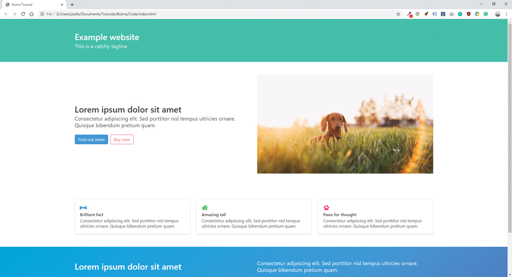
Create a new two-column hero section at the bottom of the page, giving an is-info class to the section. For an interesting effect, also apply the is-bold class to this section for a subtle gradient. This modifier works with all seven of the main colours.
13. Change the levels
Levels are a great way to ensure elements are vertically centered in a row. Within a new section at the bottom of the page, add a div with the level class and nest inside four level items. Any content added within a level item will be vertically aligned.
<div class="level">
		<div class="level-item has-text-centered">
				...
			</div>
		<div class="level-item has-text-centered">
	...
		</div>
</div>
14. Add and control forms
To add a form to the bottom of the page, make a new two-column hero section with is-primary. Split it into two columns, and in the right column, create a field class. The field class is used to group several form inputs together, ensuring they are spaced properly. Every input must also be wrapped in an individual .control class.
<div class="field">
	<div class="control has-icons-left
	has-icons-right">
		<input class="input" type="email"
		placeholder="Your Email">
			<span class="icon is-small
			is-left">
				<i class="fas fa-envelope"></i>
			</span>
	</div>
</div>
15. Give users feedback
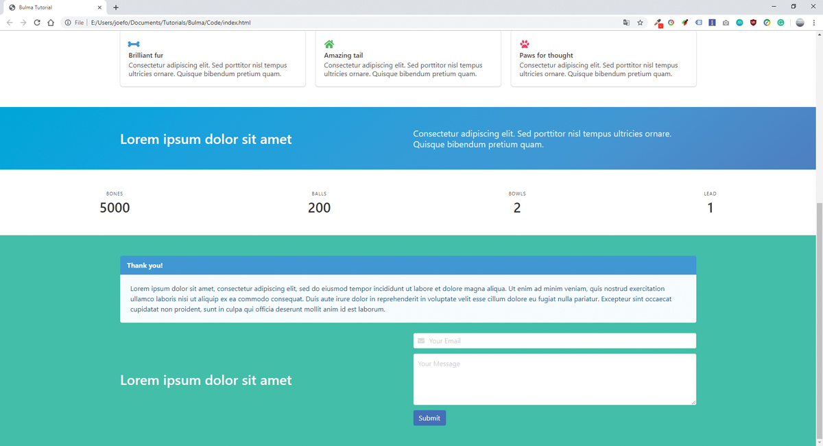
Once a form is submitted, it should return a message to users so that they will know what happens next. Although Bulma is not able to control when this message will be displayed, the front end can be built with the message class.
<article class="message is-info">
		<div class="message-header">
				<p>Thank you!</p>
		</div>
			<div class="message-body">
		... </div>
	</article>
16. Add a footer
The flexible footer class allows any element to be added at the bottom of a page, providing a place for copyright info and bottom navigation, as well as bringing a finish to the website.
<footer class="footer">
		<div class="content has-text-centered">
			<p>...</p>
		</div>
</footer>
17. Customise variables
Most projects, beyond prototypes, will have a requirement to work with a brand guideline and colours. Similarly, it is safe to assume a designer will need to change the fonts, colours or other aspects of Bulma. A major part of Bulma is that it is customisable and modular. Not only can modules be selectively imported, but up to 415 Sass variables can be changed within the framework.
The use of variables means setting a new colour as primary will change that colour across the entire Bulma framework for that project. Setting this up can be tricky at first, but guides have been provided using three different methods in the documentation.
This article was originally published in issue 289 of creative web design magazine Web Designer. Buy issue 289 or subscribe here.
Read more:
Joe has been building websites his whole life, and he now runs Corebyte Ltd, a small web development company in Southampton.
