Get more from ArtRage 6: Top tips to boost your workflow
Make the most of ArtRage with this step-by-step walkthrough.
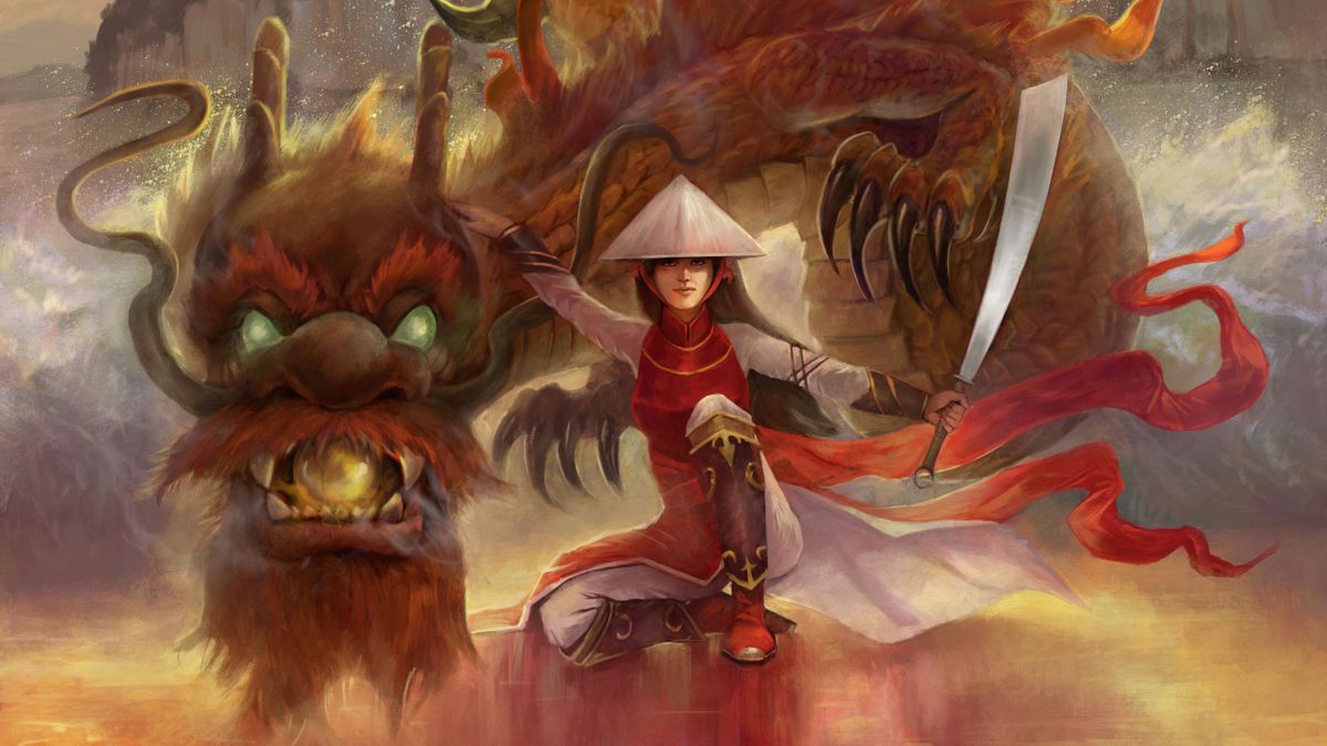
In this article I’ll be providing advice and insights on ArtRage, a program I use quite a bit. I started painting with ArtRage when it was first released back in 2004, and it remains a primary tool in my workflow. It’s great to see the advancements made in its custom brush engine, which is pretty much all I use in most of my work. I’ll be going over some important areas during the painting process and revealing tips on specific tools that I feel might be beneficial.
My goal is to not only showcase the power of ArtRage, but to prove that you don’t have to spend a fortune on certain tools to create professional art. If you’re familiar with ArtRage but have yet to try the latest version (6), some of the new features include now being able to adjust paint depth and lighting to custom brushes. Smoothing has been added to the pencil, there’s improved smoothing for the ink pen and you can create deeper impasto effects and adjustable gloss for the oil brush. (See our piece for how to get started in ArtRage for a beginner's guide.)
For more on different types of software, including the pros and cons of each, also see our best digital art software roundup.
01. References and sketch
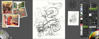
Once I have a rough idea of what I’d like to paint I’ll do a search for suitable references, either online or through my own photo collection. I usually look for a colour palette that appeals to me and real-life references to help me paint accurately. The sketch itself at this point isn’t that great – its purpose is to get the ball rolling. I like to build up the image on the canvas as I go, so I know that a lot of these details will start to develop as I paint.
02. Reference window
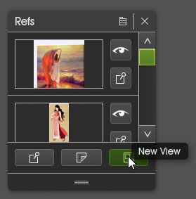
ArtRage has a unique feature when working with references. The program enables you to pin them up next to your work – just like you would when working with real paint. The identical version of my sketch to the right is a feature called New View. In the Refs window you can click New View to open a copy of your work. This comes in handy once you start to zoom in on your work to add those details, when you want to be able to see your painting in its entirety without having to zoom out.
03. Customise the toolbox
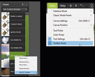
The Toolbox panel is a custom set of brushes that I tend to use the most. You can create your own by enabling the Toolbox window (click View > Toolbox panel). Whenever you want to add a preset to your Toolbox, right-click it and choose Add to Toolbox. Your toolbox resets with each painting, but you can save your toolbox so that it reloads with each new piece.
04. Set the canvas texture
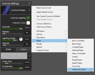
Next, choose your painting’s canvas. This will help develop the mood of the piece as it reacts to your choice of brushes. It’ll also be present throughout the painting process, giving you a consistent foundation to work from. I tend to stick with the watercolour paper canvas, because it creates a great visual effect.
05. Lay down the first layer of paint
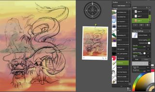
I usually place the sketch on its own layer with a transparent background. I set the sketch layer to Multiply and then paint on the layer underneath. This enables me to lay down the colour without worrying about messing up the initial sketch, and is a quick way to fill in the background, too. When filling in with paint I use the Pastel tool. It’s the perfect brush for tackling large areas and it doesn’t have any additional features that might cause ArtRage to suffer lag when working with a large brush size.
06. Hide the sketch and refine the background
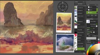
Once I’m happy with the direction my background colours are taking, I’ll hide the sketch and just focus on the background. I use the Color Sampler tool by holding down Alt and pulling colours from my reference images. At this point I’ve only used the Pastel brush and two custom brushes.
You’ll find that ArtRage has a unique way of blending and applying textures at the same time, while mimicking how colours are blended in real life on the canvas. This means you don’t have a sprawling set of tools to try and choose from, which can be a distraction for some artists.
07. Bring the sketches back

Once the bulk of the background is done, I’ll start to bring the main subject matter into focus. I’ve found that if you complete the background first and then apply your main subject matter on a separate layer, it makes things easier when you need to do some cleaning up in the piece or even decide to resize your foreground elements. It’ll save you some time in having to repaint them, too.
08. Focus on the details
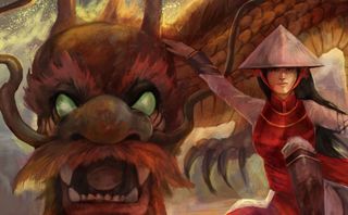
At this point I have a good sense of colour and composition, so it’s now time to focus on bringing those details out. This is where I try and find a nice balance between hard edges, blending and texture. I tend to use a custom airbrush tool and ink pen for the hard edge. The key is to choose an Opacity setting for your brush so that when you start to paint it acts like a wash building up when painting with acrylics.
For blending and textures I’ll use Sav Scatola’s custom brushes. They’re perfect for creating chalk-like textures with a nice smudge/blend effect. Press down hard to produce the blend effect, then lightly tap to add texture.
09. Depict realistic smoke
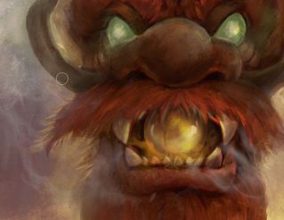
You can create a smoke effect by laying down paint on a new layer with the Watercolor brush, then using the Palette Knife with the Soft effect enabled to smear the paint around. Adjust the Pressure and Opacity for the desired effect. A perfect example of this in action is the smoke I paint around the ball in the dragon’s mouth.
10. Use soft light layers to make your colours pop
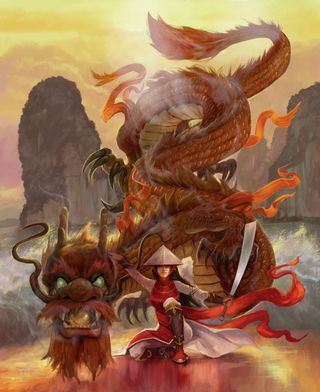
Once I’m happy with the level of detail in the scene, I like to create new layers with the Soft Light blend mode. This helps to enhance the colour tone. Right-click your new layer and go to Blend mode > Soft Light. I usually reduce the Opacity anywhere from 20 to 50 per cent and use either the Oil brush or a custom brush that can lay down a lot of paint. To me this is the best way to mimic oil glazing, only instead of using linseed oil you’re using a layer and blending mode. You’ll soon notice your reds and orange start to become more vibrant.
11. Make final adjustments
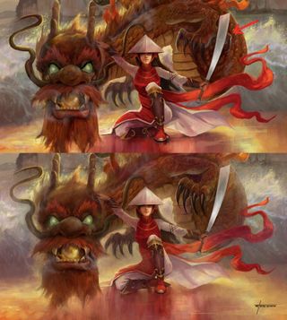
The beauty of painting digitally is you can go back and change things. In the workshop video you’ll see me making adjustments to the dragon’s claw and warrior’s foot, and shorten her arm that’s holding the blade. Once I’m satisfied with the overall detail I’ll create another layer with a low Opacity (say, 38 per cent) and select a textured Bristle brush.
I’ll then go around the edges of the subject matter and start pulling in colours from their surroundings. This will take off some of those hard edges and in some cases create a special effect. I want the dragon to look a little more magical; this technique enables me to put a soft glow around him.

This article originally appeared in issue 178 of ImagineFX, the world's leading magazine for digital artists. Subscribe here.

Join us in London for our unmissable event for 2D and 3D artists, featuring workshops from over 20 professional artists from film, video games, VFX and illustration. Book now: www.vertexconf.com
Read more:
- Krita tutorial: How to clean up your sketches
- 11 amazing concept tips for client work
- 6 quick tips to improve your brush pen drawing
Get the Creative Bloq Newsletter
Daily design news, reviews, how-tos and more, as picked by the editors.

Thank you for reading 5 articles this month* Join now for unlimited access
Enjoy your first month for just £1 / $1 / €1
*Read 5 free articles per month without a subscription

Join now for unlimited access
Try first month for just £1 / $1 / €1
Steve paints using traditional and digital media to capture life and the imagination. He’s worked as a concept artist, art director and game card illustrator.
