Use Framer X to build interactive prototypes
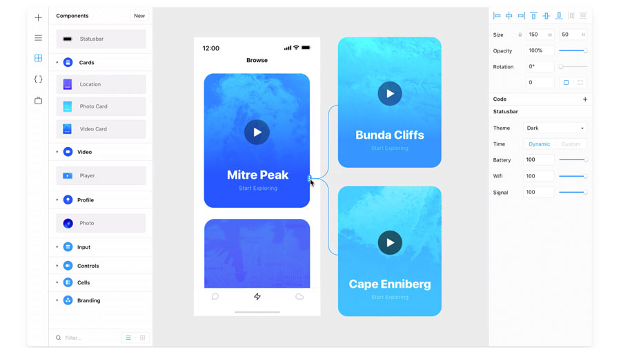
Quickly add interactions using Framer X’s intuitive drag and drop UI.

As designers, there is always the question of what prototyping tools you should use for your project. There is lots of software out there for tasks like wireframing (see our top wireframing tools and excellent website builders), prototyping and building complex interactions; however very few tools are capable of handling all of these. Framer is one tool that has all these functions and greatly speeds up the process of creating tiny animations and interactions.
The latest iteration, Framer X, now uses React and JavaScript instead of using CoffeeScript for developing micro-interactions and animation. This helps deliver faster load times and better performance. Plus, the use of React components means that users have more scope to add and extend including embedding media players, real-time data and graphs inside prototypes.
Testing is a core part of the the prototype building process and while Framer X is great at creating interactive prototypes it needs help to see how good its creations are. Check out our user testing post for some of the best tools to complement Framer and help build real-world prototypes, and make sure you're using the best web hosting service for you.
How to create an app with Framer X
To fully appreciate the power of Framer X we’re going to create a real-life project: a simple cooking recipe application with some content and media (assets that are backed up in reliable cloud storage). The first thing to build is the homepage. We shall keep things simple with the following elements:
- Standard search bar to find recipes
- Recent activity to show the latest recipes viewed
- Recipe cards showing things like the most popular recipes
- Creating a detailed view of the recipe with video and sharing options
To get started you need to create a new Frame (an artboard) by clicking the + icon on the left navbar. Select any artboard style from a list of standard iPhone/Android templates on the right bar. Now you are ready to go.
01. Build a search bar
Let’s begin by building the search bar. Instead of creating a rectangle and adding a search icon like we normally would, we can actually use quick reusable components in Framer X, these are called packages. There are thousands of packages that can be found in the left navigation bar under Store. Click on Store, search for Android Kit and Example Kit and then install them.
These packages contain elements like cards, buttons, keyboards, sliders, inputs and navigation menu items. Once you install these packages, you can use the elements from the Components menu on the left.
Find the elements you want by searching in the filter – in this case a search bar, which is found under Example Kit. Simply drag and drop it onto the frame. Now you can modify properties such as placeholder text, font size and colour using the right bar.
Get the Creative Bloq Newsletter
Daily design news, reviews, how-tos and more, as picked by the editors.
02. Create a content stack
For this recent activity block, first add the text ‘Recent Activity’, which is pretty straightforward. Now we can use a new feature of Framer X called Stacks. This can be done by clicking on the + icon and selecting Stack S from the menu. After selecting the stack, drag and drop an area of 600 x 300 on the working frame to create a stack. This stack will be shown as blue.
Now let’s go back to the Components section and under Android kit, search for the Card-5 element and drag it into the stack we just created. Duplicate these cards twice and make sure all the three cards are in the stack.
As long as they are in the stack, these three cards can be easily rearranged without you having to worry about the spacing. If you want to increase the spacing between the cards, you can increase the width of the entire stack. It’s as simple as that. You can also personalise these cards by changing the name of the title and background according to your liking.
Now that we have created a stack, let’s make it scrollable. Move it out of the frame / artboard. Click on the + icon from the left nav and click the Scroll option. Just as we created an area with the stack, create a scrollable area on the frame / artboard that’s the same size as the stack.
Now change the property of the scroll in the right bar by changing the direction arrows in order to make it a horizontal scroll. After our scroll container is created we need content for it, which is served by the stack we previously created. So simply connect the scroll container to the stack using the arrow prompt on the scroll container. It works by dragging the mouse pointer to the stack.
03. Create a vertical stack

For the recipe cards, you need to follow a method similar to step 2 but instead of creating a horizontal scroll of cards, you will create a similar vertical one that is essentially a list of the most popular recipes with thumbnails. For this exercise, each card for a recipe has four elements – an image thumbnail, rating, name of the recipe and time needed to prepare it.
Do not worry about the details of each card. They can be personalised based on your design taste. Follow the same method of using a card from the components, duplicating them and adding all of them to a stack with vertical scroll.
04. Create a new page
Now let’s create a new page to go into the details of a particular recipe. For example, let’s take the case of the second card here: French Pasta. To create this new page, create a new frame/artboard and introduce the elements that we need for showing more details about the French Pasta recipe. This new page can be broken down into a video, a title, the rating, the time needed to make it and a few action buttons, such as save to list and share to social media.
For adding video, go to the store and install the YouTube package, which enables you to effortlessly add videos to your prototype. Now go to your Components panel and drag-and-drop the YouTube element from under the YouTube component into the frame.
Adjust the width of the thumbnail so that it fits the width of the frame. In the right Properties pane, you can insert the URL of the video that you want to play in the prototype. If you’d like, there is also a way to autoplay videos through the checkbox in the Properties panel.
Below this video, you can add the title, rating and various icons. To add icons for our example, I made use of the component from the Icon Generator store. It’s an easy process: simply drag-and-drop the base icon onto the frame and then change the property called Icon on the right-side panel to ‘heart’ and ‘share’. This will change the base icons into the save and share icons respectively. Their colours can also be easily changed using the right panel.
To make things easy for visitors, you could add a section called Ingredients, which would list all the ingredients needed for our recipe – in this case, French Pasta.
05. Introduce interactions

Now let’s make our design more engaging by adding interactions for a button. Ideally, when you click on the share icon, you should be prompted with a screen to share the recipe across various social media channels. Let’s build that using a new frame.
Make sure that the width and height of this frame is the same width and height as the other two frames we created. The idea is for this new share screen to slide up and replace the present screen when the share icon is clicked.
To help make the screen distinct, let’s add some colour to it and fill it with social media icons such as Facebook, Instagram, WhatsApp and email. This share screen should also have an X icon added to it, which when clicked would bring it back to the original state.
Make sure that all the icons are arranged inside a stack. As soon as the X icon is included, the next step is to link this frame so that it pops up when you click the share icon.
In order to do this, select the frame that contains the share icon. In the right-side panel, there is a property called Link. Once you click on that, the application interface will provide you with an arrow that you can drag to the new share frame we created. This will create a link in the background.
Now, when you select the share icon, you will observe new properties in the right-side panel under Link, which are Target, Transition and Direction. Each of these properties enable you to change the elements, such as type of transitions and the direction in which the screen should pop up, etc.
You can test if the prototype is working or not by clicking on the play icon found at the top-right corner of the interface. Similarly, you need to link the share screen to the video screen so that when the user clicks on the X icon, it returns to the previous screen.
This can be achieved using a similar link property and adding the target as the video screen. If you want to have a go at adding a bit of variation, you can make the direction left instead of top and then use the play command to test if the interaction is working or not.
06. Add a save button
Now let’s add an overlay interaction to the save icon. Here, our goal is that whenever a visitor clicks the heart-shaped icon, there should be a pop-up window appear that asks if you want to save the recipe to a custom made list.
Let’s start by creating a new frame called saved lists. Just as you did with the previous one, make sure this frame has the same width but this time you need to reduce its height because it will appear as an overlay when clicked. For the styling of the saved lists frame, add a header, a text input to enter the name of the list and a button that’s a CTA for saving it.
To link, select the heart-shaped icon on the video frame and add a link to the saved lists frame. Now, instead of the transition property being a push, make it an overlay. Adjust it to 80% and then test it using the play button. Modify until you are satisfied with the overlay. Link the X icon on the saved lists icon back to the video page.
This is how to use Framer X to easily create actionable interactive prototypes. There are also advanced tools you can use, as well as adding React coding snippets to the elements of the frames. Also, the best part of Framer X is that anyone can master it by trying it out on a few prototypes.
This article was originally published in issue 325 of net, the world's best-selling magazine for web designers and developers. Buy issue 325 or subscribe to net.

Join us in April 2020 with our lineup of JavaScript superstars at GenerateJS – the conference helping you build better JavaScript. Book now at generateconf.com
Read more:

Thank you for reading 5 articles this month* Join now for unlimited access
Enjoy your first month for just £1 / $1 / €1
*Read 5 free articles per month without a subscription

Join now for unlimited access
Try first month for just £1 / $1 / €1
Vamsi is a senior UX designer at SunTrust Banks and is an expert in UX, mobile animation and JavaScript.
