Experiment with Procreate brushes to explore iPad's creative art app
Learn to experiment with Procreate brushes and find your style. Artist Rafael Sarmento explains offers his advice.
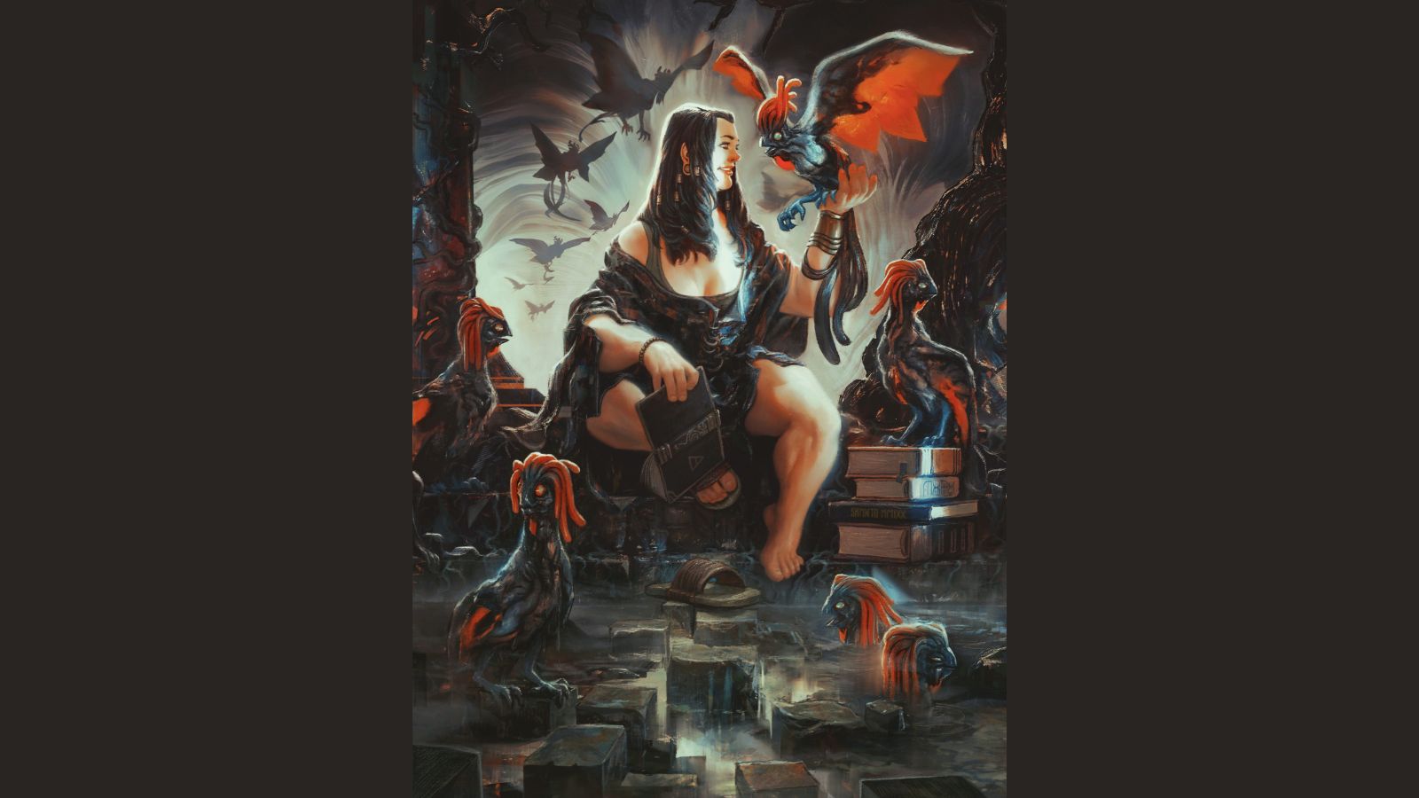
If you want to experiment with Procreate brushes then this tutorial can help. In my Procreate tutorial below I will trying out some new brush skills and sharing the results.
Since the release of its fifth version in 2019, Procreate has placed even more creative power in the hands of artists of all levels, from beginners to seasoned pros. (If you're yet to try this digital art app, read our Procreate 5.2 review for more details). Not only does Procreate come with a comprehensive range of tools and a rebuilt engine that now runs faster than ever, there’s also a revamped brush system: the Brush Studio.
This feature offers a collection of redesigned and new tools for modifying or creating your own brushes, which gives the artist even greater control over their mark making. (Read our guide to how to create your own Procreate brushes.)
If you're already familiar with my work, you'll know that I’m a huge fan of portrait art, which belongs squarely in my comfort zone and is my sandbox for experimenting with new ideas. But I'm actually a huge fan of storytelling-driven imagery, too. The art of conveying a narrative within a single illustration is something that will never cease to fascinate me.
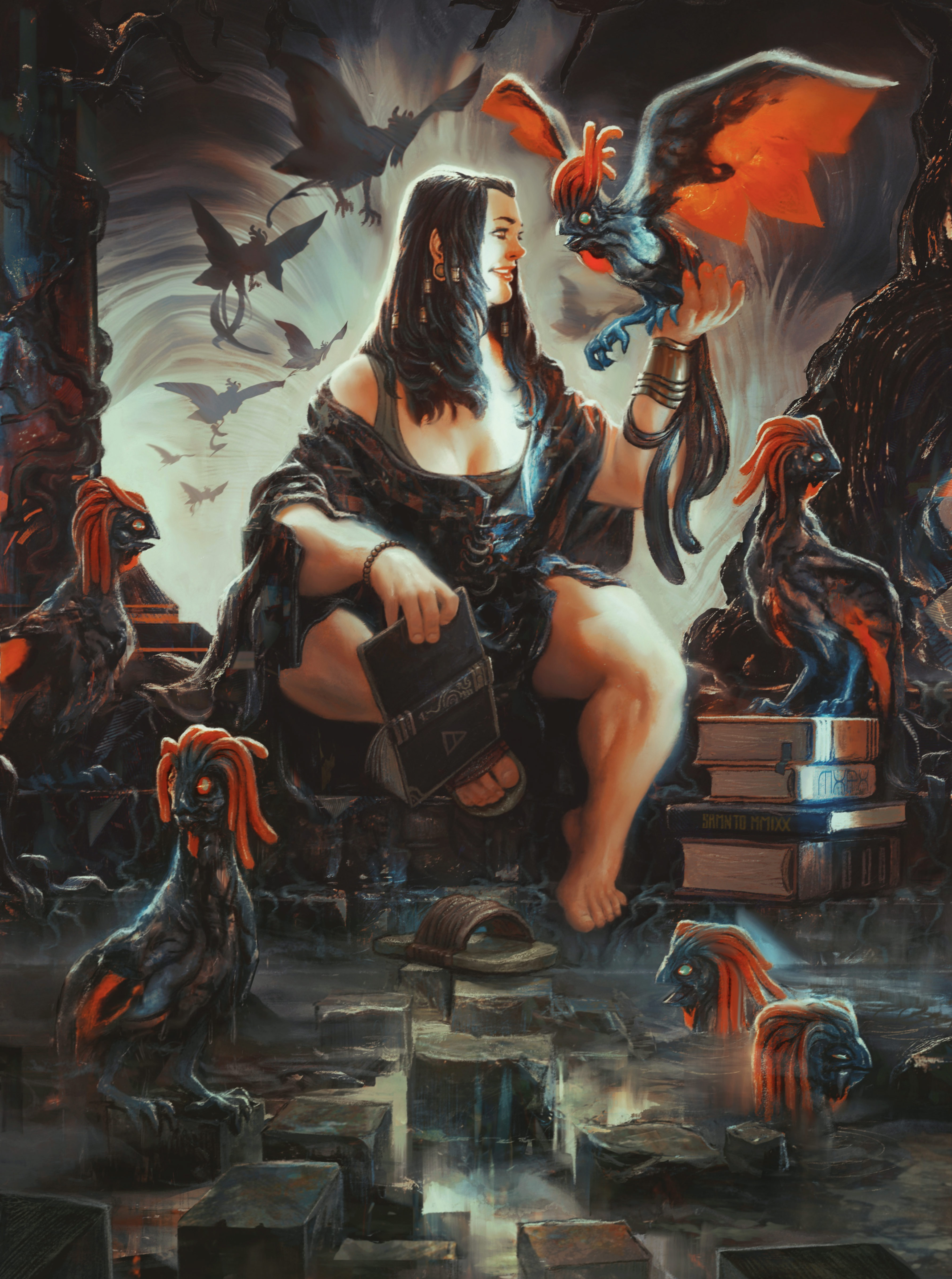
For this workshop I'm creating a fantasy image that will serve as a testing ground for the brush experiments that I'll be doing, which actually fits pretty well with the way I visualise and execute my ideas. You can follow the step-by-step below, and see the full finished piece at the bottom of the page.
Rafa is an internationally published illustrator, with clients including Universal Pictures, Wizards of the Coast and Riot Games. With work that inhabits the space between the baroque and the urban, fantasy and sci-fi, he creates storytelling-driven paintings for clients from all over the world.
Experiment with Procreate brushes: video tutorial
Experiment with Procreate brushes: my brushes
Here are the Procreate brushes we'll be using for this tutorial.
Custom Brushes: Maxu Sketchy Sarmento
Get the Creative Bloq Newsletter
Daily design news, reviews, how-tos and more, as picked by the editors.
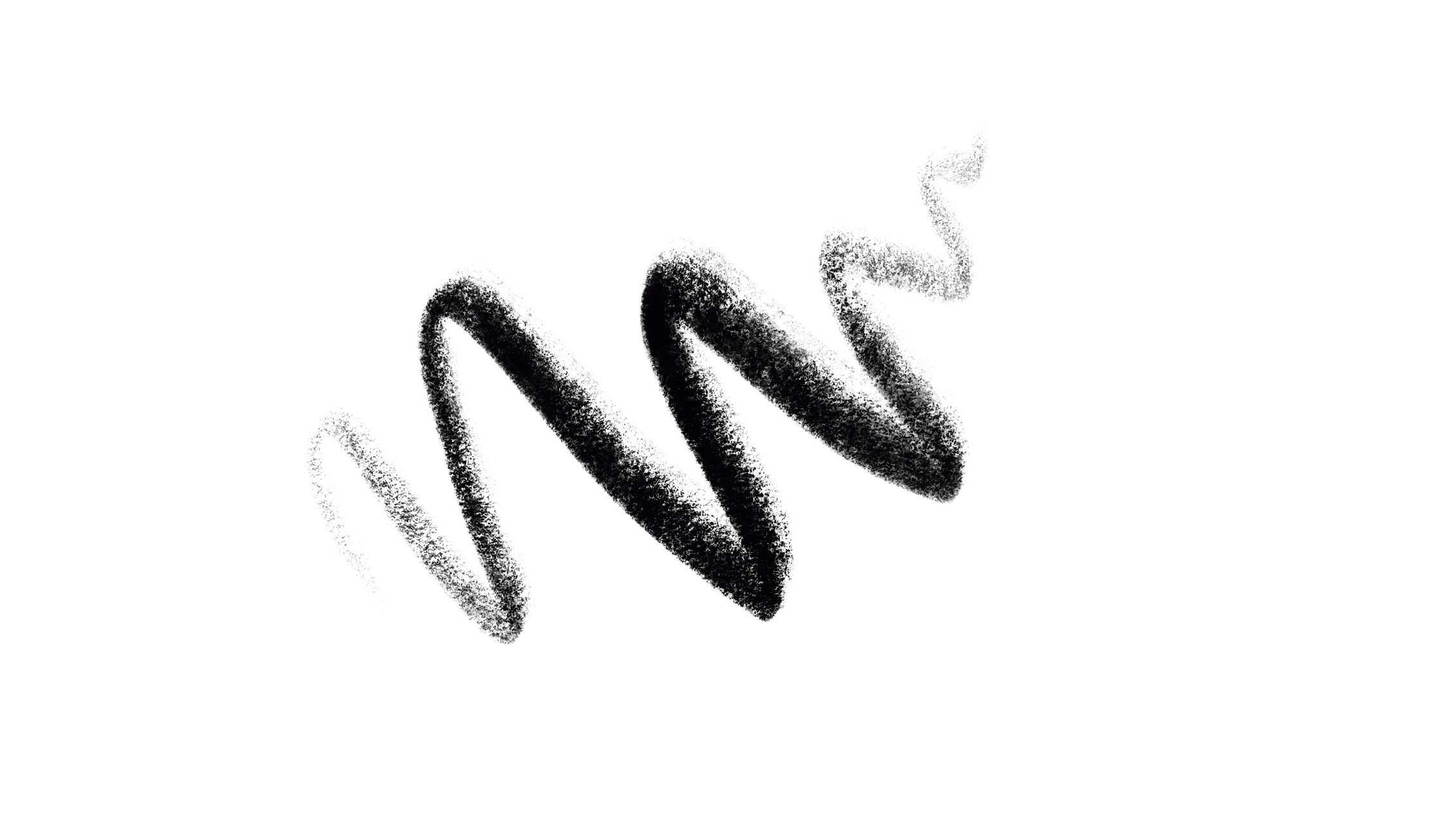
Created for me by Max Ulichney, it emulates the Staedtler 8B pencil.
Maxu Grain Cloud
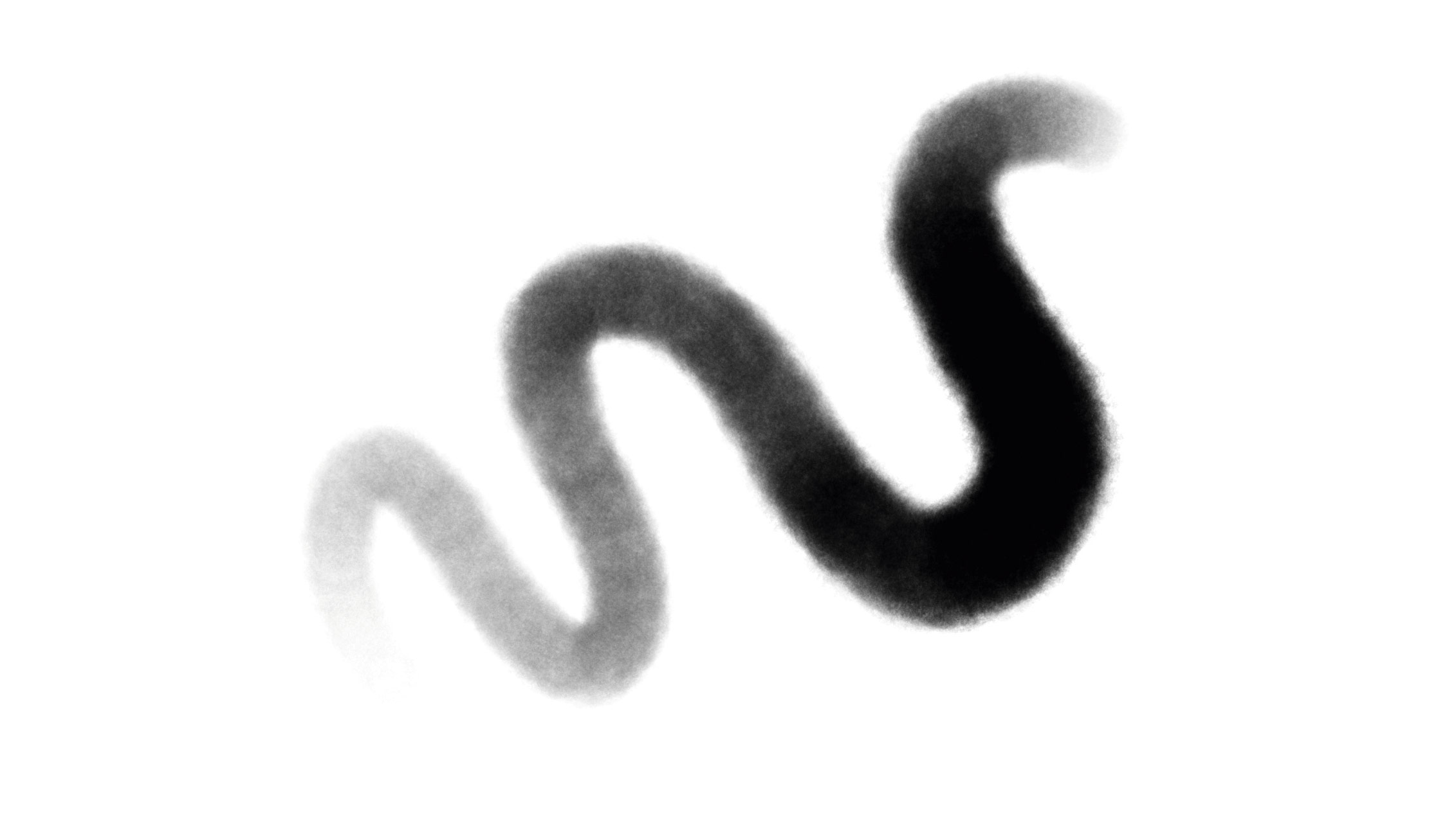
Replaces the soft airbrushed look with a tasty grainy texture.
Maxu Incredibly Smooth Inker
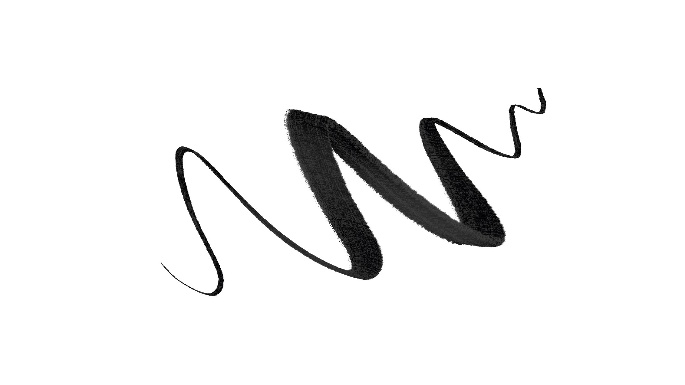
Has characteristics of pen and brush – ideal for gestural sketches.
Experiment with Procreate brushes: learn new skills
Below you can find my approach to painting a portrait using Procreate and its brush engine. We also have a guide to the best Procreate brushes you can download and import to carry on experimenting.
01. Launch the Brush Studio
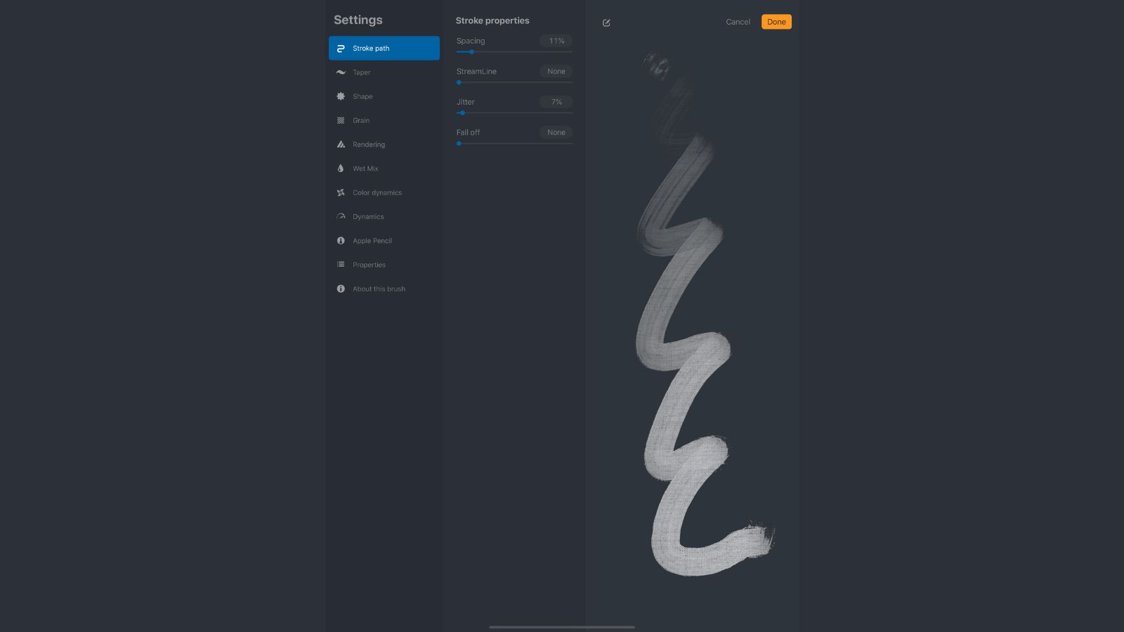
This is the interface of Brush Studio – you just need to click the brush you're using to open the configuration sliders, just like in the earlier versions of Procreate. Here, you'll also find a 'canvas' where you can test your selected brush, with real-time updates on the brush stroke’s structure. This is helpful if you're new to what each slider does, or just want to have a play around.
02. Letting ideas flow
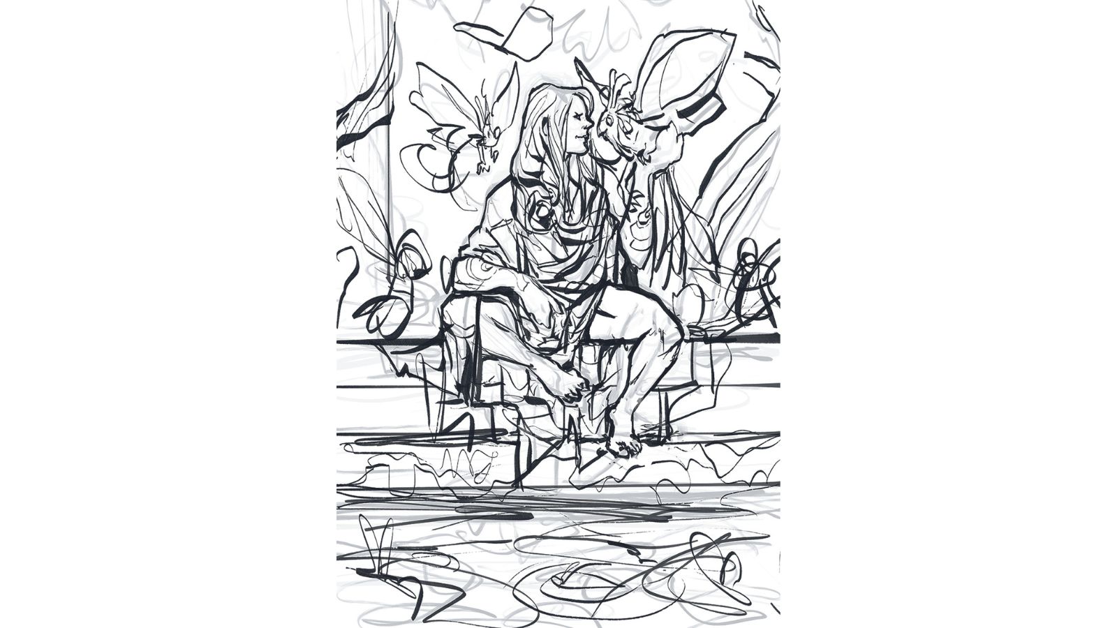
My creative process works as a balancing act between order and chaos, where I usually 'listen' to what the image asks me, and discover all the subsequent problems that I'll have to solve. When I say to people 'follow the idea', I mean follow your gut feeling, and allow the lines and shapes to dictate the next steps in an intuitive yet thoughtful way. So the sketching part is when I start letting the intuition flow.
03. Lay down the foundation
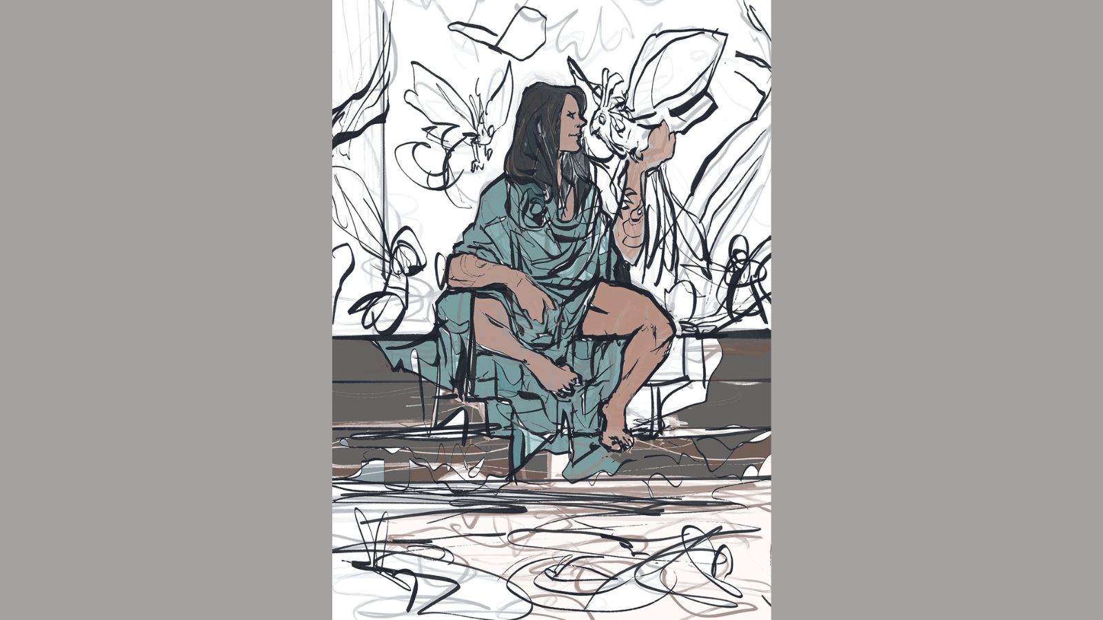
I like to use ink brushes for my layouts and sketches, since they afford me a little more spontaneity during the gestural portion of the sketching. This is when I scribble away, searching for the right shapes and poses I'm looking for. The brush I’m using here is the Max Incredibly Smooth Inker, which you'll find as a free download with this issue’s collection of resources.
04. Let’s do some colouring
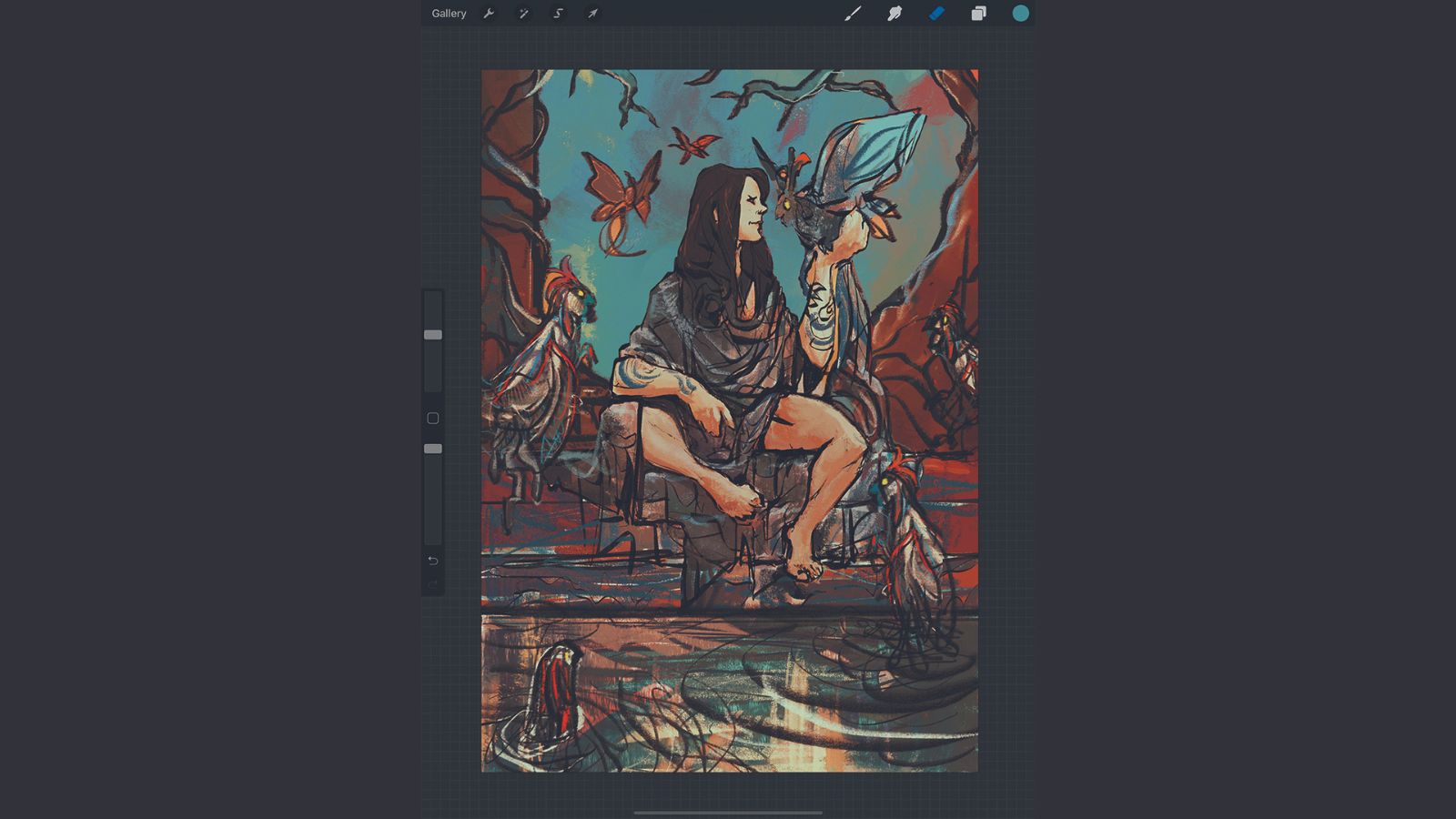
With the very loose first sketch laid down, it's time for putting some basic colours to work. Using the Recolor feature, I can instantly fill the areas I want to colour, always adjusting the threshold so that it doesn't leak (very much) over the gnarly lines. Sometimes colour leaks into other areas, which can lead to unexpected and fun results – and fun is what we’re looking for here, right?
05. Shaping the shapes
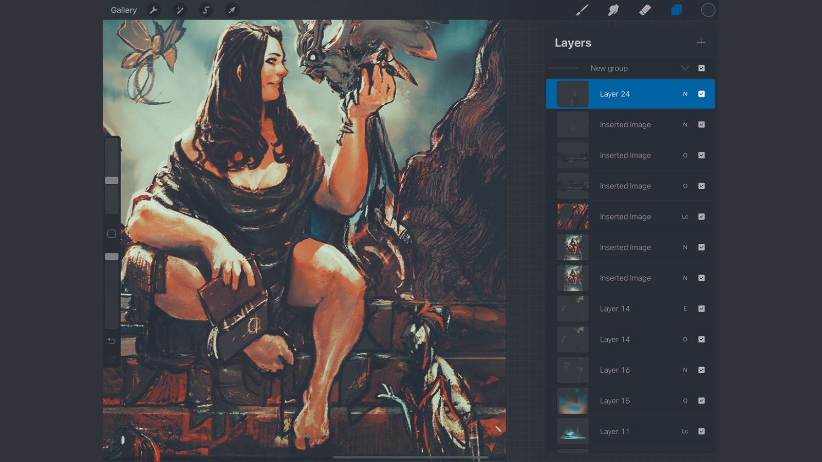
Now that I have a basic composition to start working with, I grab a special brush: the Sarmento Sketchy. This was created for me by the illustration wizard and brushmancer Max Ulichney, the creator of the world-acclaimed MaxPacks brushes for Procreate. It has the 'dent' I’m looking for to lay down the first coats of digital paint over the base colours from the previous step.
06. Checking the values
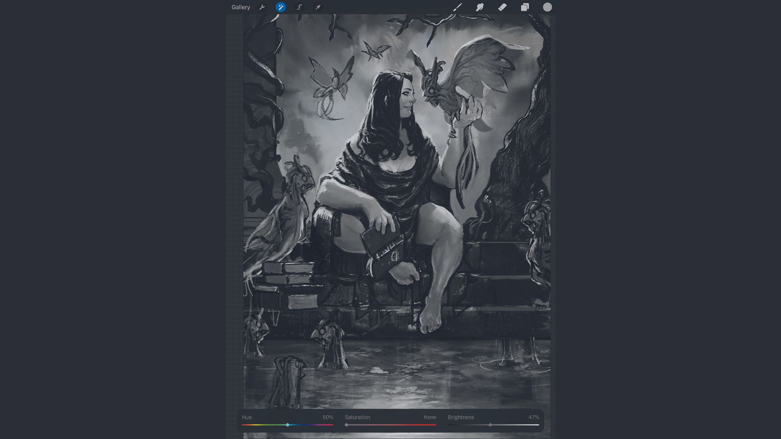
Here's where the fun begins. With all the elements (mostly) recognisable, it's time to start messing around with the composition again. We want the viewer to have a clear reading of the image, so I check and adjust the value range of the elements. This is key for ensuring clarity in the narrative of the composition.
07. Using shortcuts to adding textures
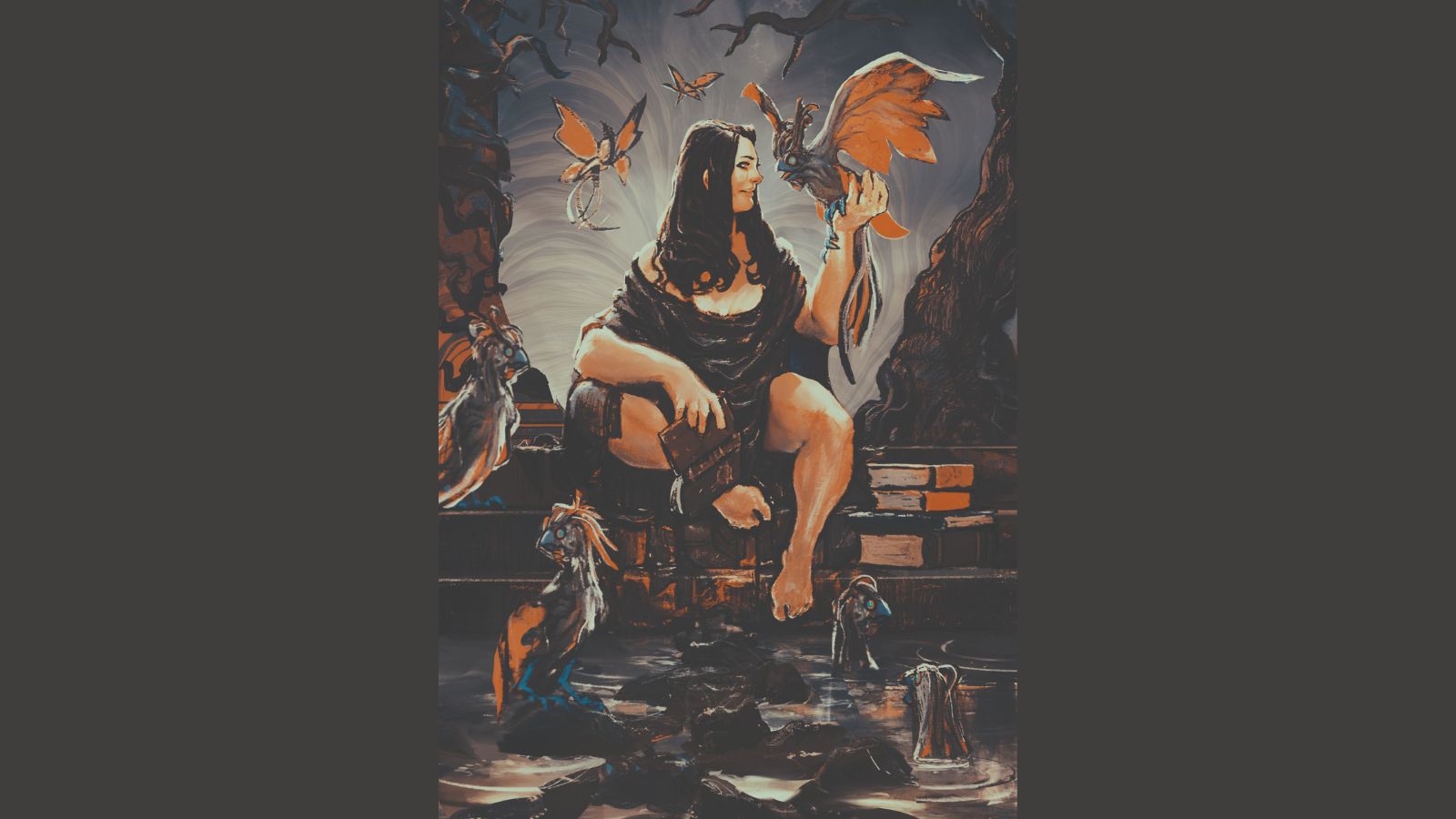
To achieve certain effects I like to use external photos and textures when I need to get things done faster. One of the best places for finding copyright-free images is Unsplash. It's also a great source of inspiration. Because I have an idea of what I want the background to be like, I'll use an image created by Paweł Czerwinski, which I'll modify accordingly to fit the composition.
08. Setting the mood using Snapseed
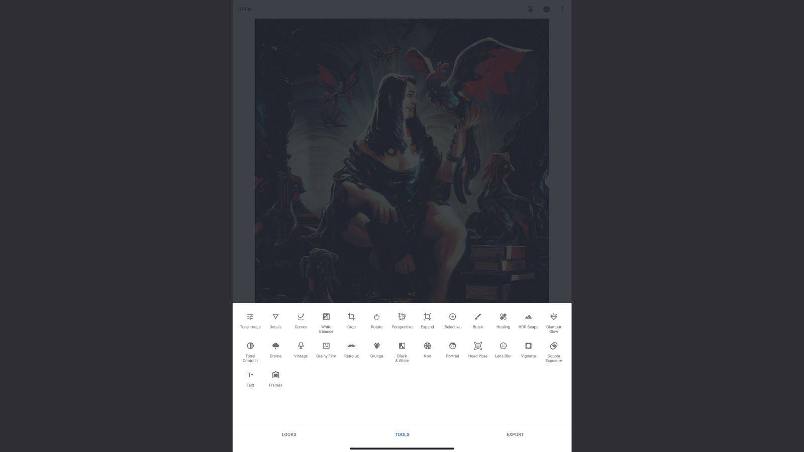
Although Procreate offers some amazing colour editing tools, sometimes I need to quickly produce certain looks that I can test with my colour palettes, to hopefully develop the right atmosphere and feel in my painting. Here, I'm using Snapseed, a speedy photo-editing app. It’s not a mainstay in my creative toolbox, but it’s there when I need to make quick adjustments.
09. Experimenting with layer modes
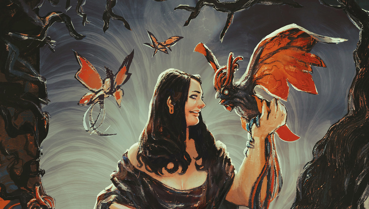
Because Snapseed enables you to save both your chosen 'looks' and the order of effects you used to achieve them, you can quickly change the overall mood. After trying some iterations of colours over the image I generated in Snapseed, using layers properties such as Soft Light, Exclusion and Darker Color, I start experimenting with Procreate’s built-in Salamanca and Styx brushes, adding textures and editing the artefacts to fit the context.
10. Rearranging elements in the composition
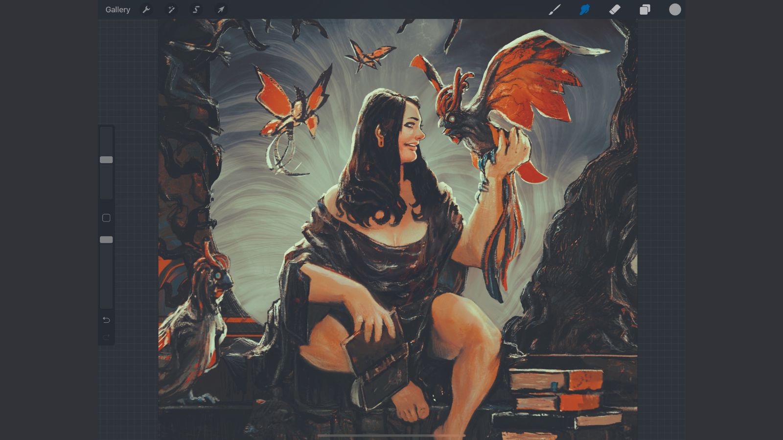
As I mentioned earlier, my painting process is largely guided by the problem-solving aspects that the image offers. I'm both the mark maker and editor, so here is when I begin to 'destroy' and reconstruct certain parts, rearranging the visual context and editing the content. I want to create a better sense of balance in the composition, and push the illustration in the direction that I'm envisioning. I love doing this!
11. Boosting a sense of story
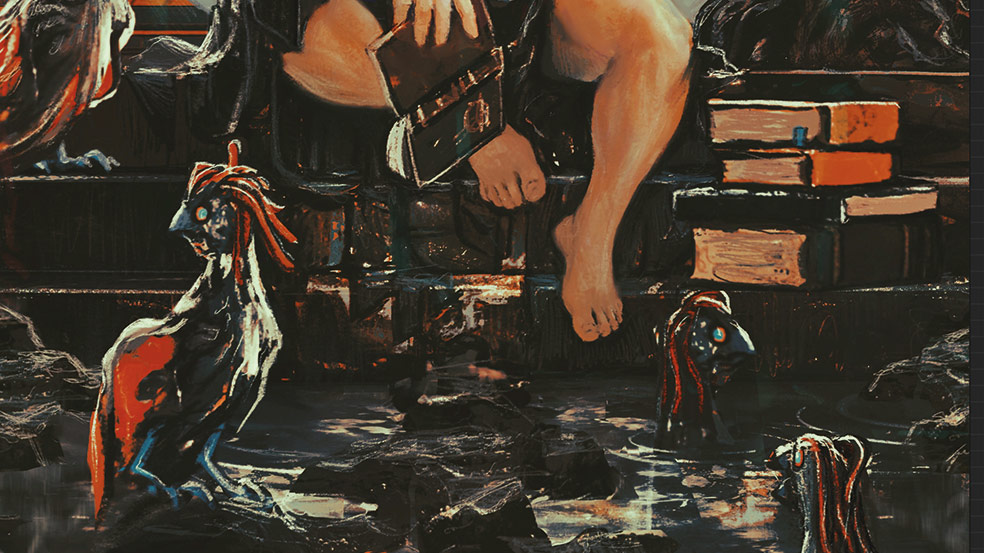
Now that everything is properly placed, I start rearranging objects to increase the hints of storytelling that I'm trying to convey. The Splatter brush that comes with Procreate is a great way of getting the water right, with the speckles and drips in the places exactly where I want them to be. Those creatures chilling on the water won’t get wet by themselves!
12. Bringing in a new light source
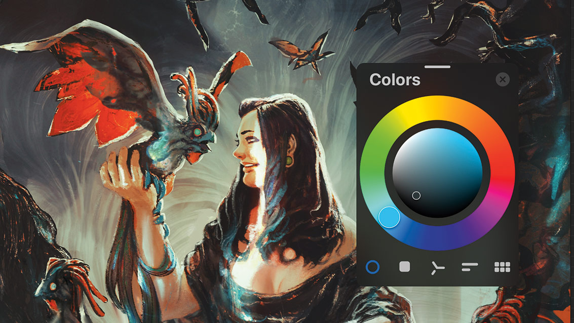
Here's a great example of how inspiration can hit you randomly. I thought the image was going in an interesting direction, but something was lacking. Then I suddenly came up with the idea of adding saturated light to the scene, which would be worth the effort of having to balance the composition again. I use my Sketchy Sarmento brush to give the light a bit more weight.
13. Refining the designs
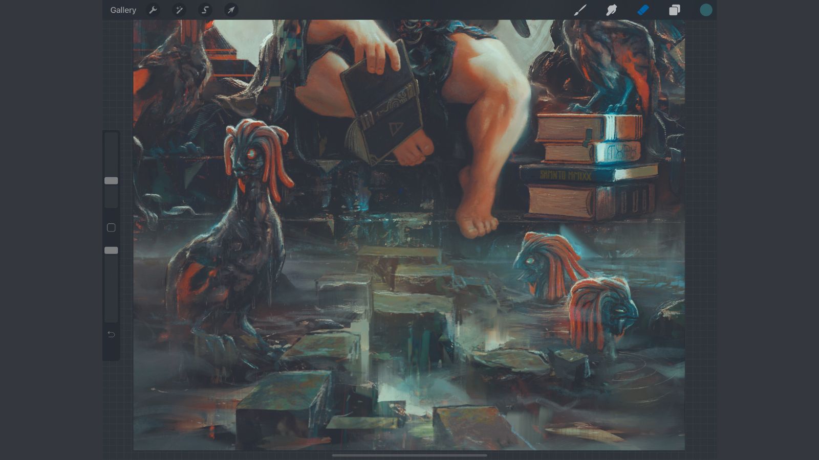
Now I start polishing and adding specific details. Because I didn't design the creatures before beginning the painting, I start consolidating some of the overall ideas that will complement their designs. I avoid overworking them because this will draw some attention away from the central figure. Instead, I do just enough to help the viewer’s eyes travel throughout the scene.
14. Wrapping things up
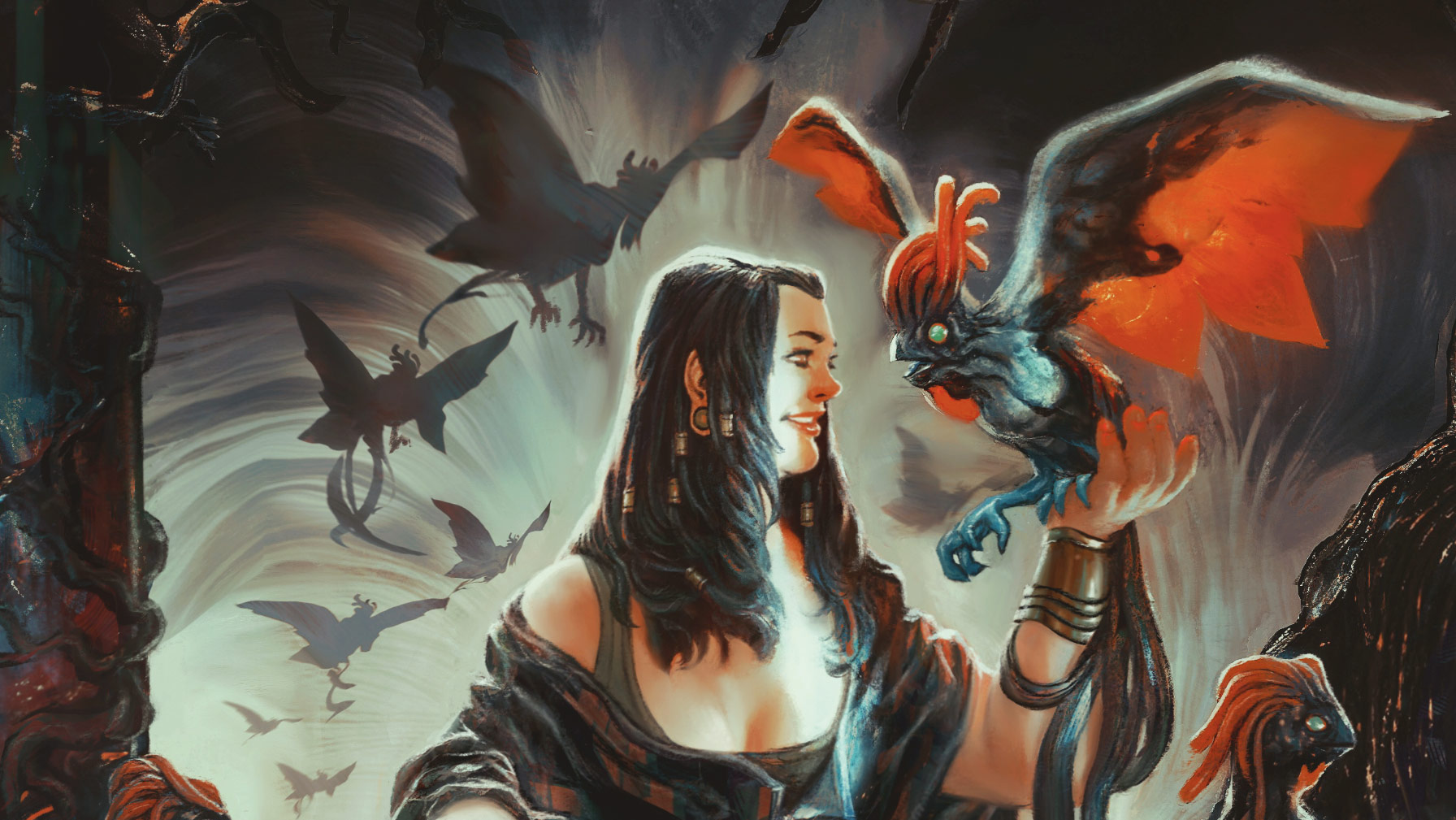
During this final stage I generally use some lightly textured brushes to add a little grain to certain areas, such as the Max Grain Cloud brush on an Overlay layer. Everything else from here is just fine-tuning, and minor colour and contrasts tweaks. All I want from this whole experience is that you take these tips and make them yours! Thanks for your company on this short journey – it was fun!
Get more Procreate tutorials in ImagineFX
This content originally appeared in ImagineFX magazine, the world's leading digital art and fantasy art magazine. ImagineFX is on sale in the UK, Europe, United States, Canada, Australia and more. Limited numbers of ImagineFX print editions are available for delivery from our online store (the shipping costs are included in all prices)
Alternatively, you can access us instantly through our digital options:
• Apple app (for iPad or iPhone)
• Pocket mags (multi-platform app, great for Android users)
• Zinio (multi-platform app for desktop or smartphone)

Thank you for reading 5 articles this month* Join now for unlimited access
Enjoy your first month for just £1 / $1 / €1
*Read 5 free articles per month without a subscription

Join now for unlimited access
Try first month for just £1 / $1 / €1
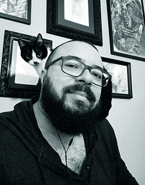
Rafa is an illustrator, character designer and cover artist for the entertainment industry. Also, he’s a pizza addict.
