Easy posing techniques for 3D models
Stop over-analysing your character animation work and try to get a pose done in as little time as possible.
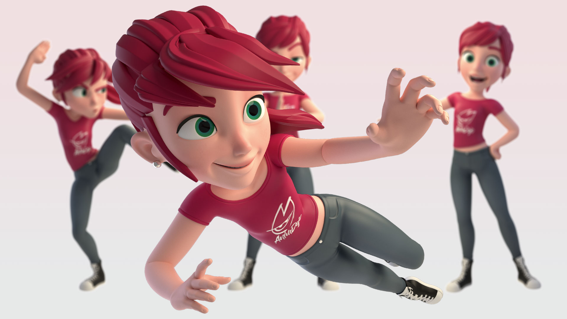
I've been an animation director for the past couple of years and have worked with many animators, helping them hone their skills to become faster and more efficient. Initially, I found that the animators were taking too long fiddling with their keys in the graph editor, trying to fix a fundamentally flawed animation. The best thing to do was to start again with a new foundation for them to follow.
So we thought it would be best to put these steps into an easy-to-follow list rather than a load of Maya tutorials. This has developed into the foundations of AnimDojo's approach to animating.
There are many things I can cover here, but I want to share with you something practical so you can get a sense of how our approach is different. This is an exercise that's recommended to be done at least half an hour before animating, just like a warm-up exercise. Doing so will help you to build muscle memory, enabling you to break free from viewing the computer or Maya as an obstacle. Instead, you'll embrace it as part of your time and work effortlessly. In time this will free you to focus on posing and animating without feeling "slow or stuck".
You'll have five minutes per pose, and you can use the rig provided with this workshop and follow along in one of our pre-recorded live sessions. However, before you do that you need to follow a few simple steps to know how to do it correctly…
Download the resources for this tutorial.
01. Configuring the viewport in Maya
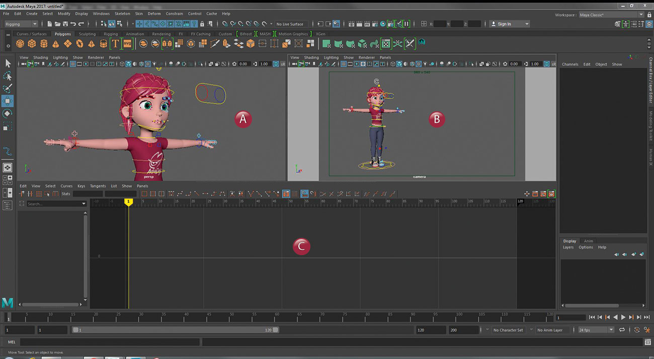
One of the things that helped me improve my speed and efficiency in Maya was when I used the three-port view instead of having dual monitors. On the left would be my perspective (A), on the right my camera view (B), and below is the graph editor (C). The reason for this is so I don't keep turning my head between two screens, constantly checking both for every step I make. I work 90 per cent of the time directly in the camera view, and only use perspective if I can't get the pose to work because of awkward positioning of body parts to the camera.
02. Let's middle mouse it!
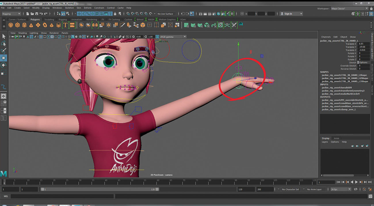
This is a term I use a lot with my animators. I've seen so many people control the rig by selecting the actual manipulators and moving them axis by axis. This is such a time waster! Grab the character's arm, then anywhere on the screen just use your middle mouse button and drag it wherever you need it to be. This is much faster, and over time you'll see the benefits of this approach. Note that this is only possible with translation, not rotation.
Get the Creative Bloq Newsletter
Daily design news, reviews, how-tos and more, as picked by the editors.
03. Less is definitely more
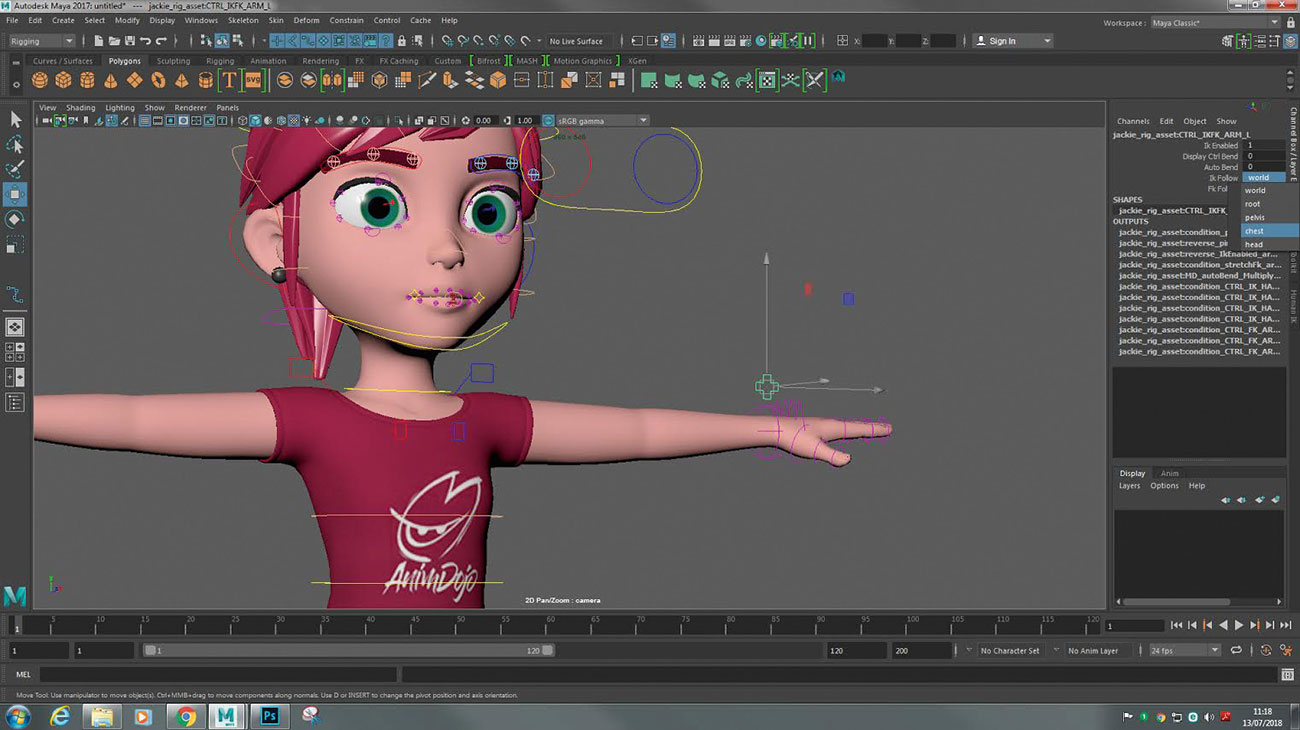
The idea that the more complex a rig is the better it'll perform, is a pet peeve of mine. Keep things simple. Set your arms to IK mode and set their space to either hips or chest. That way, when you move the hips the entire upper body moves along with it. You want to be able to move the character with as few controllers as possible.
04. Quickly assess your line of action
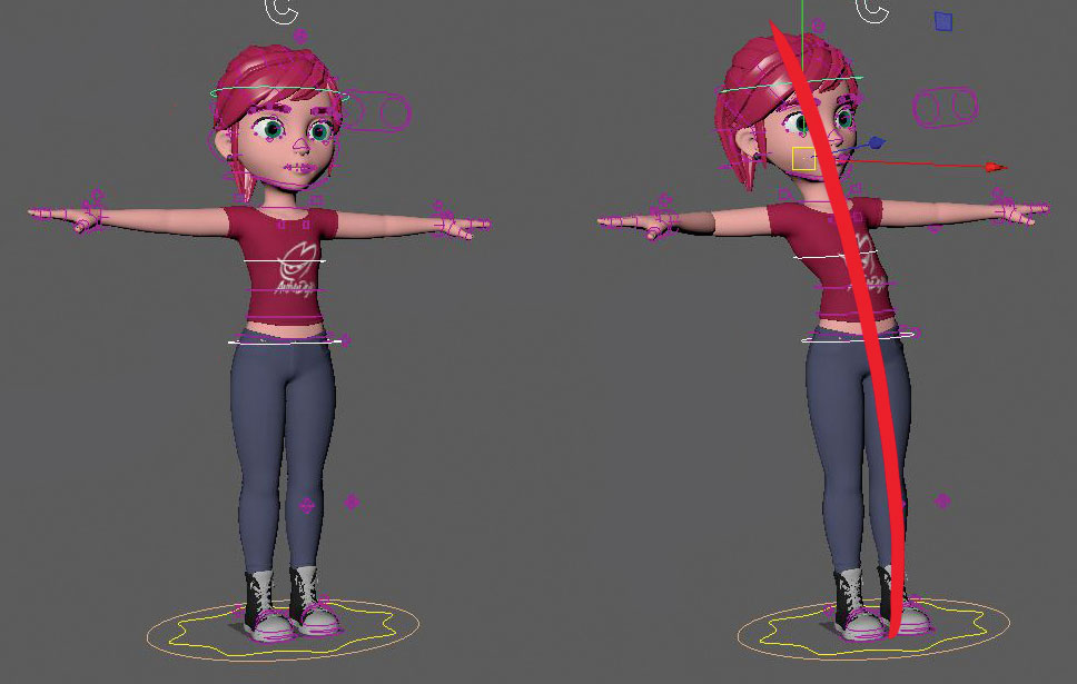
The amount of time wasted when posing a character sometimes boils down to one little thing animators forget about, and that's the line of action. Grab the hips, the chest and the head if need be, and together move them into position. This will give you a quick glance at what your line of action will look like, without spending a long time moving each body part – only to realise you haven't pushed the pose enough.
05. It's all in the hips
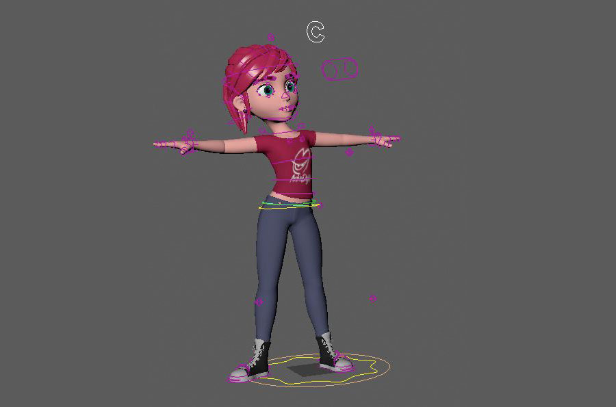
Once you've posed your line of action, you'll notice that your character looks a little wonky. But that's okay, because now it's time to fix the pose to work with our line of action. Don't bother with the chest or head, and completely ignore the arms at this stage. Your focus should be on the hips. If you've set up your rig to work from the hips up like we did in step two, then moving the hips moves the entire upper body. This is also a good time to pose the legs to work with the hips.
06. Go through the spine upwards
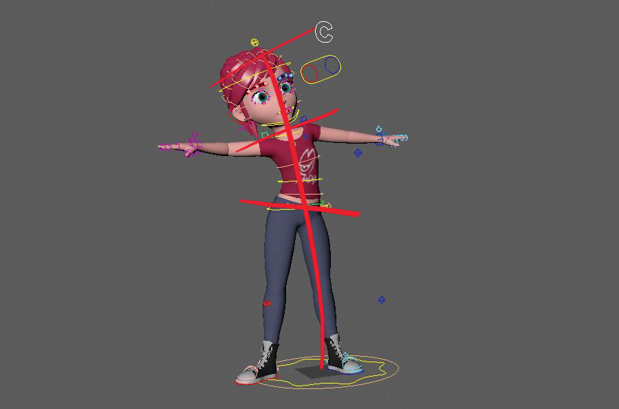
Now that our hips are in place, it's time to adjust the chest and head to fit perfectly into our line of action. Don't forget to tilt the shoulders in such a way that it's in balance with the hips. I always keep an eye out for twinning (when both sides of the body are mirrored) and this is a simple way to fix that.
07. Work the face early on
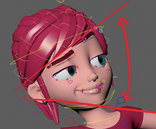
One thing that I regularly notice with animators is they tend to leave the face until the very end. This usually results in the face feeling detached from the body as it moves. A good way to get into the habit of always posing the face with the body is by following this workshop. Don't ignore things and say to yourself, "I'll get to that when I polish my animation." The face needs to be posed from the very first blocking stage.
08. The hands need attention, too
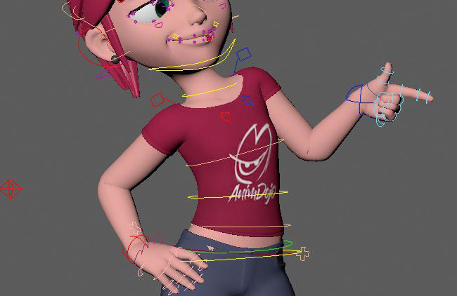
I often get asked how I pose my hands so quickly, and the answer is very simple. I select all the controllers at once, so when I rotate they all rotate together. It's taken me some time to get used to doing it, but once you work this way you won't want to go back to your old ways of posing.
09. Soften the edges of the character's limbs
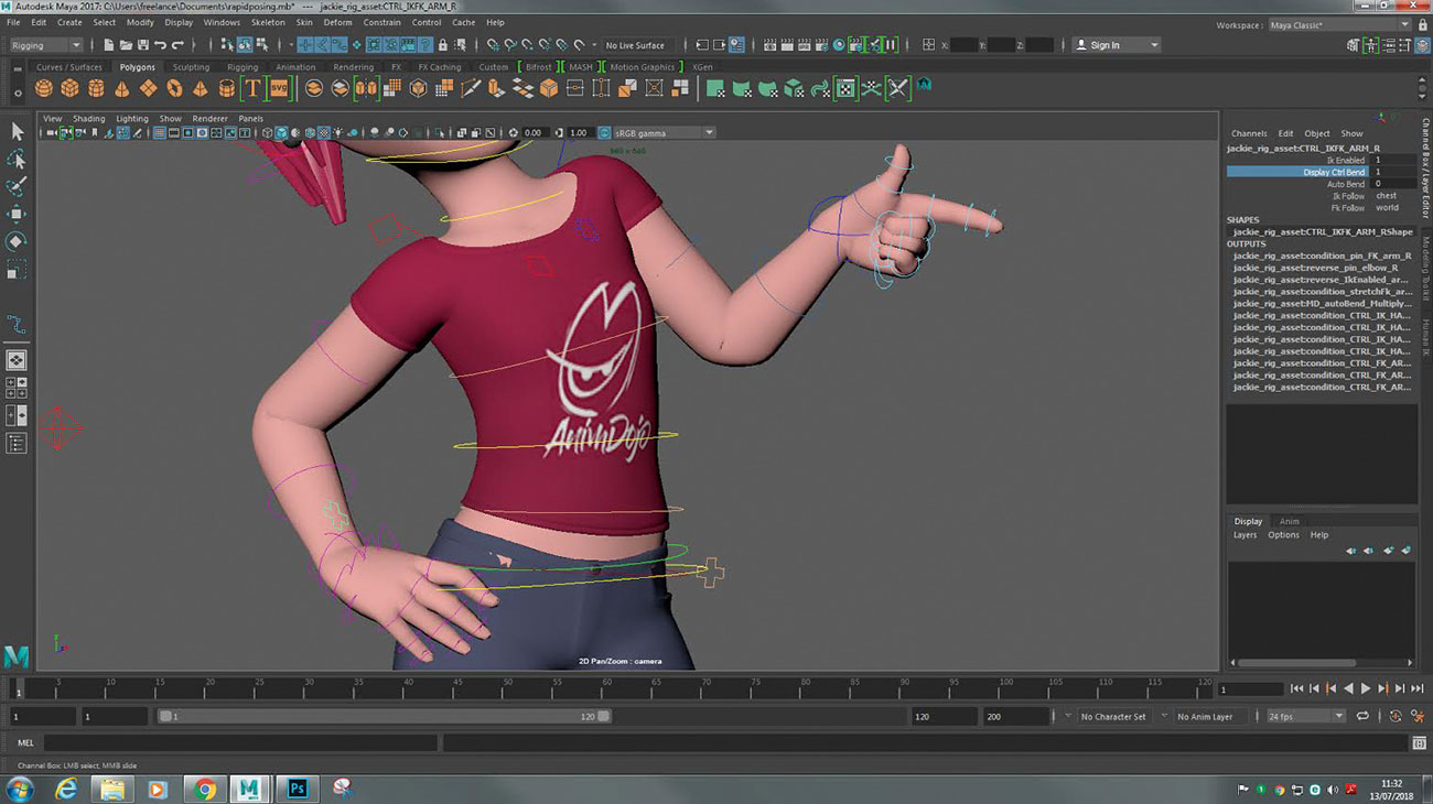
In general, for cartoon animation I always prefer to soften the edges of elbows and knees. It gives it a softer more appealing look. Don't go overboard though, otherwise you'll end up with a "rubber hose" style (unless that's the look you're going for). It's a balancing act and I always push my animators and students to work this into their initial blocking.
10. Do you have more time?
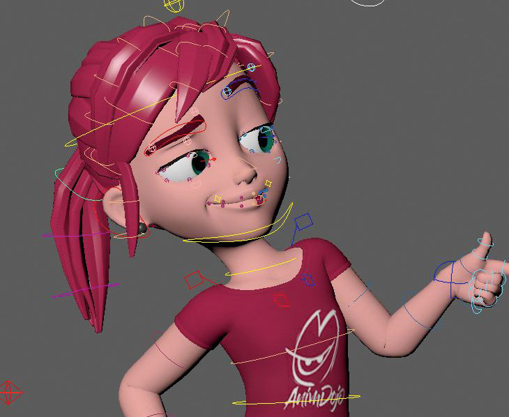
Now this step relates specifically to our AnimDojo workshop. If you find that you still have time to work on the pose before the five minutes are up, be careful not to over-analyse and end up ruining the pose you came up with. There's a creative freedom that you generate from the first "gesture" pose you made, and you don't want to lose that. I'd recommend focusing on pushing the details. Work more on the limbs, the face – even the character's hair could add to the pose.
11. Go one way or the other
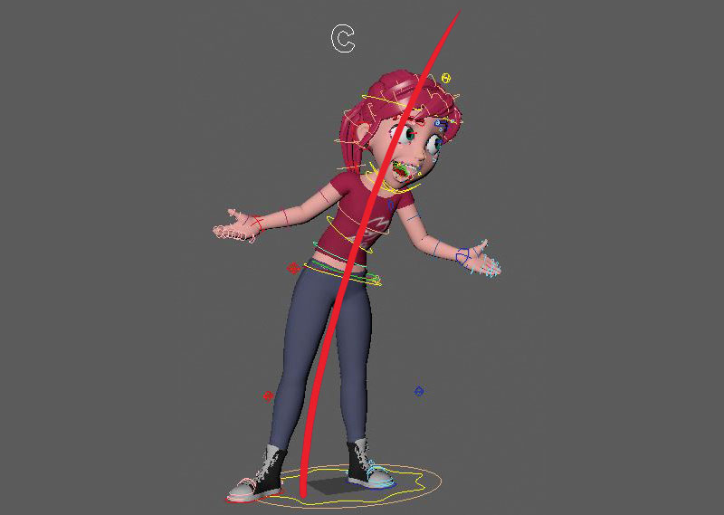
I always get asked about acting and how to decide what pose to put the character in. The tricky part is how to do this in just five minutes! The way I look at posing a character is by simply going one way or the other. For example, if I were to pose the character as "surprised" I can either draw my line of action going away, or towards the viewer. There are many other ways of course, but I like to keep things simple. If I'm posing a character moving as they talk, pose one would be one way and pose two would be in the opposite direction.
12. It's all about developing contrast
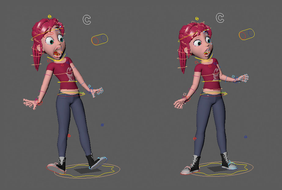
One of the problems I used to experience early in my career was getting my animation to look cartoon-like. I've realised over the years that the reason I wasn't getting those results was mainly down to me not putting enough contrast between my poses. Don't just go for 50 per cent of what the pose could be – push beyond and exaggerate it. Don't be afraid to "break" the rig – in other words, pushing it beyond its limits. As long as what's broken is hidden from the camera view, it doesn't matter.
13. Compiling an acting library
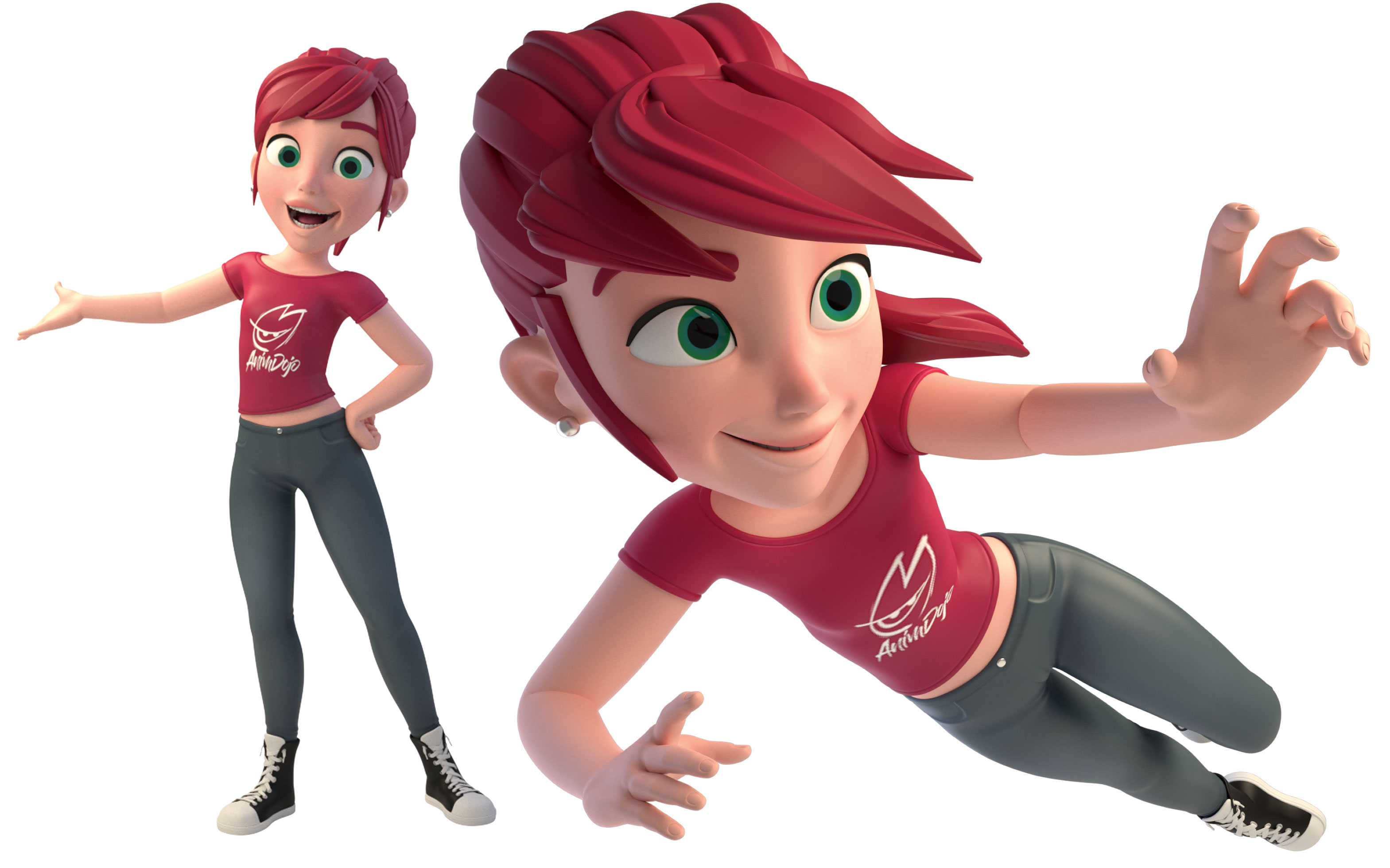
One of the best ways to learn how to pose is to build a library of acting choices in your head. I love going to the park just to observe and study people. I keep a mental note of what I see and try to add it to my work. I also try to act and feel things out, to know which muscles to pull or where the weight is in my poses. This takes time, but in the long run you'll be able to pull a pose out of your head whenever you need it!
This article was originally published in issue 165 of ImagineFX, the world's best-selling magazine for digital artists. Subscribe to ImagineFX here.
Related articles:

Thank you for reading 5 articles this month* Join now for unlimited access
Enjoy your first month for just £1 / $1 / €1
*Read 5 free articles per month without a subscription

Join now for unlimited access
Try first month for just £1 / $1 / €1
