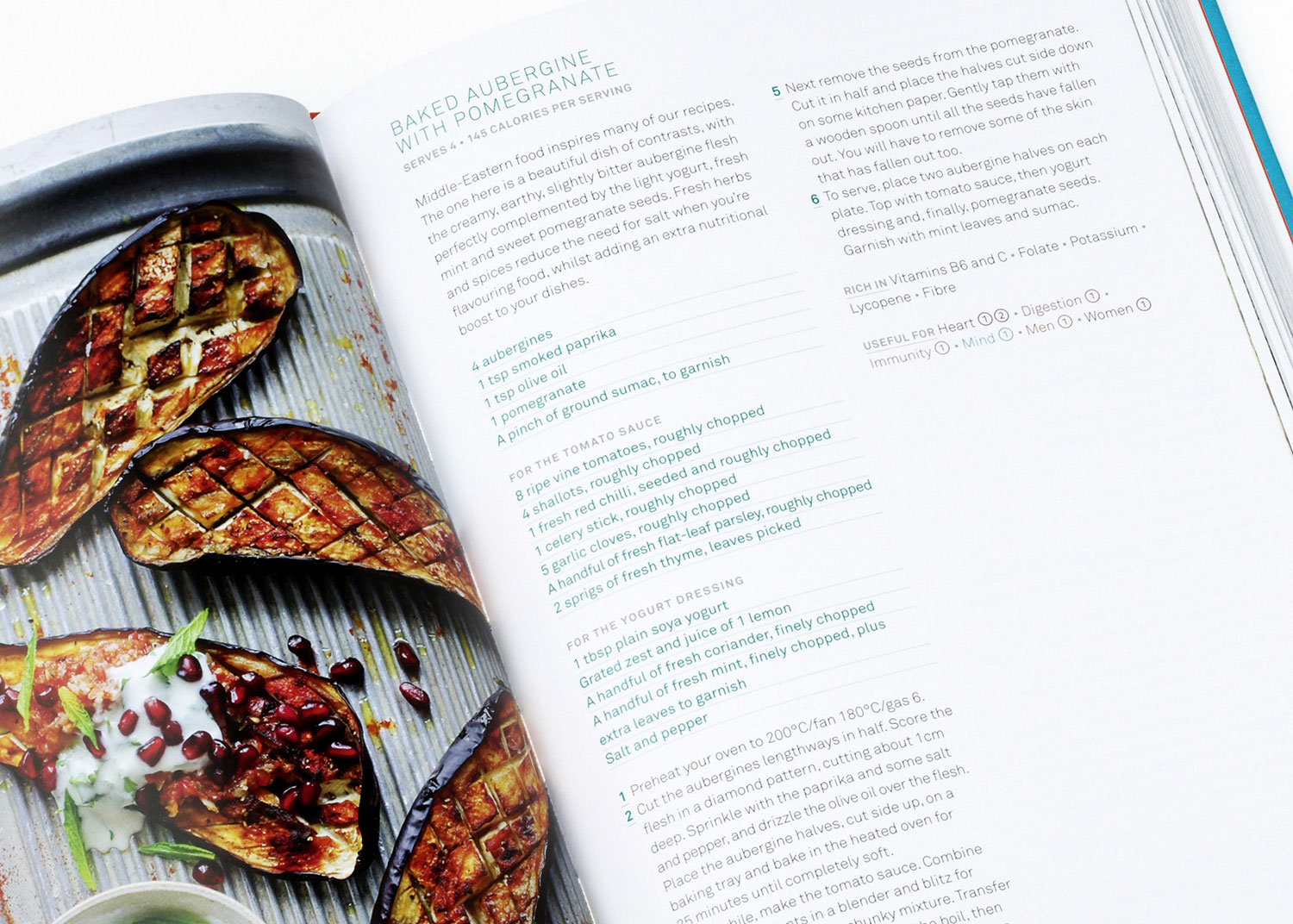
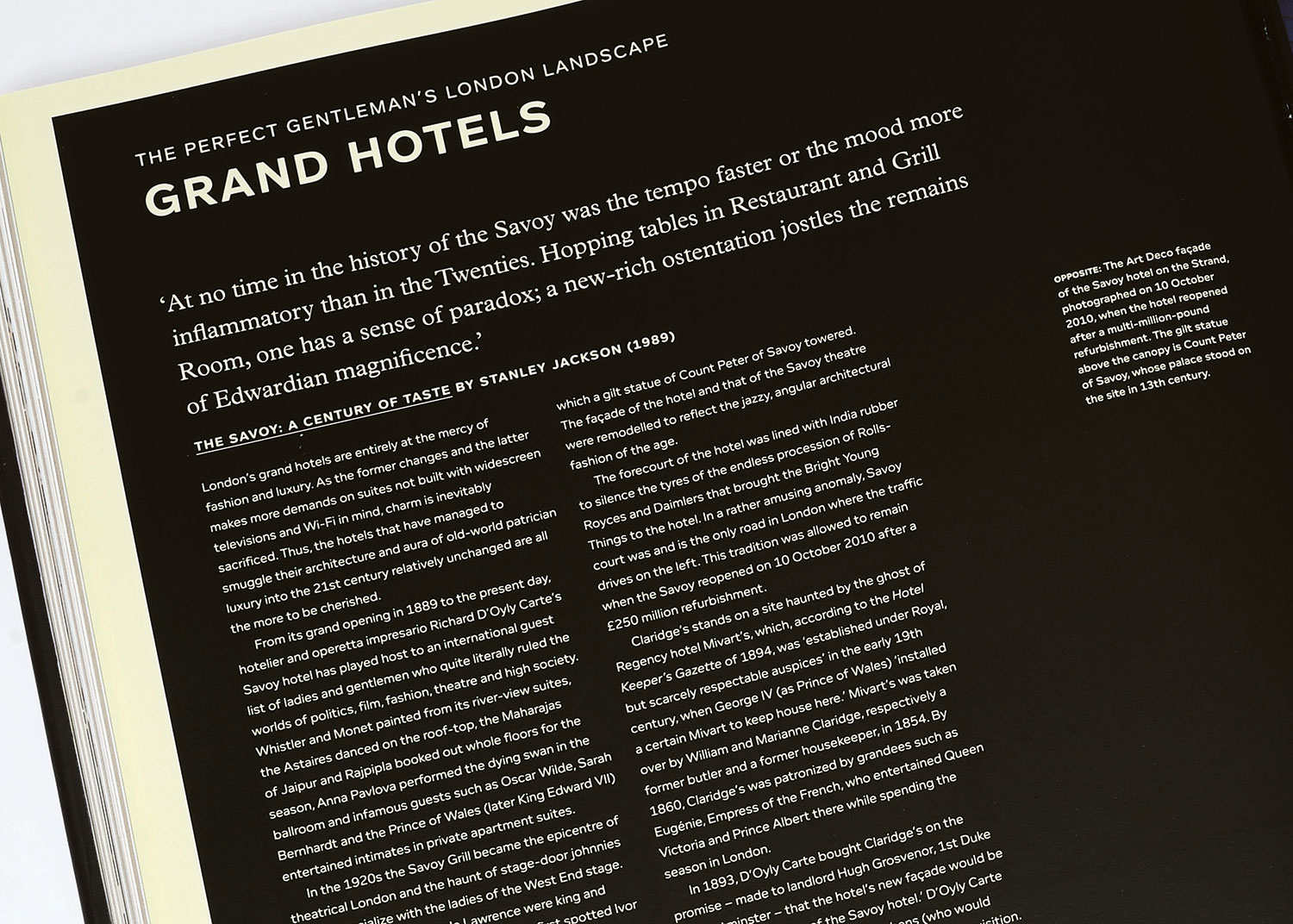
Discover the style and substance of typography
How's your typography knowledge? Have a refresher session on the rules regarding size, weight, style and hierarchy.
Decisions, decisions, decisions… if there is one key aspect to the process of working with type it is that the designer or typographer will need to make a whole host of decisions before getting to a final design and layout. From size to understanding the hierarchy of the content, the designer needs to make the right choice at every single junction in order to not only create a good-looking piece of work, but also one that the audience will understand and respond to.
In this feature, the decision making is broken down into four key elements – type size, weight, style and hierarchy – and although many other decisions will need to be made during the design process, these four, tackled correctly, can put you on a solid path to success with your design.
Size matters?
When working with your content, it's important to get a grip on the role each text element plays in the design. Different elements of the text will require different sizes applied to them, not only to aid reading, but also assist the reader's navigation through a document or book.
There are no hard and fast rules, such as headings must be 36 point or text must be 10 point on a 12 point line feed – that is for the designer to experiment with – but you need to take care with the balance between the text elements and the format they will appear in.
If you are setting large swathes of text across numerous pages, too small a size for the main reading text is going to make it difficult to read, too large and the text will be unwieldy in appearance and give your design an amateurish look. Most body text in books rarely appears above 10 point for the main reading matter, whereas introductions (standfirsts), headings and subheadings can be as large as you like.

Weighty issues
You usually get a rough idea of the visual approach to take when designing a book (for instance) from the brief, the subject matter and the target audience. Decisions such as choice and weight of typeface can make the difference between the success or failure of a project. For example, I wouldn't choose an ultra-futuristic font for a book about religion because it wouldn't be a sympathetic choice for the subject matter. It would alienate the reader, and would result in poor sales or none at all. Choosing an appropriate typeface, one that creates the right emotive connection between the material and the reader, will get a much more positive reader response.
Topic and audience are key factors which provide strong cues towards the choice of typeface and the weights to choose to create the right balance between the various type elements on the page. Once again there are no hard and fast rules to apply as long as you are confident and experienced. Even body text set in a bold weight can work – and look ‘edgy' – although it is likely that over many pages the density of text will make it difficult to scan and tiring to read. Commonly you would choose a light or regular weight for a body text, accompanied by italics and maybe a medium or bold weight for captions and subheadings. For titling weights, the designer needs to judge the balance between sizes and weights used elsewhere in the design for other sub-headings and the space available in the chosen layout or format in order to decide on the right weight.
Get the Creative Bloq Newsletter
Daily design news, reviews, how-tos and more, as picked by the editors.
If feeling bold, you can even rely on a single weight from one typeface and simply adjust the size to create different hierarchies – it sounds much easier than it is to achieve a good result!
Style for substance

Choice of typeface boils down to context: what you are designing for. With a wealth of typefaces to buy and free fonts to download (from websites such as Dafont), choice has never been wider or more readily available, and as a result the options can be overwhelming.
For novice typographers, I'd recommend experimenting with professional fonts in some of the classic serif and sans serif styles, for example Garamond, Sabon and Times for the former, Helvetica, Gill and Futura for the latter. Examine how the characters sit on the page when formatted as reading text and as headings. Compare the space different typefaces need for the same number of words due to the different character widths and kerning.
Hierarchy

An understanding of the copy structure (especially if it's complicated) should be one of the first things a designer addresses when styling text. The structure governs the hierarchy and is a guide to choosing the appropriate sizes, weights and formats that make a design appealing and legible.
You often come across situations where a book is divided into several sections and then further sub-divided into smaller chapters, each of which have pull-out features. It is the demand of the content that drives the decisions made by the designer. These decisions then allow the reader to understand not only what they are reading, but where they are in relation to the overall content of what they are reading.
This article originally appeared in Computer Arts issue 257; buy it here!

Thank you for reading 5 articles this month* Join now for unlimited access
Enjoy your first month for just £1 / $1 / €1
*Read 5 free articles per month without a subscription

Join now for unlimited access
Try first month for just £1 / $1 / €1
