How to design with CSS shapes: An introduction
Go beyond the rectangle and create cool effects with CSS shapes.
The basis of every website is to sub-divide the page down into smaller elements that have content. The big problem with this for designers is that the content is always a rectangle. Screens are rectangular in shape, and any subdivision of that is going to be a rectangle. In this tutorial we are going to examine how to go beyond rectangular shapes by using the CSS clip-path property and rotation to make the design more interesting. For other ways to make your designs more interesting, check out our examples of CSS animation. If all this sounds like too much work, try a top website builder instead. But whatever the needs of your site, you need to get the right web hosting for you.
The easiest shape to start with is a circle or oval. If you have a rectangle and you set all of the border radius to more than 50 per cent you will have an oval, and if you start with a square, because all the sides are the same length, you will get a circle. This is something you’ve probably done before, but it's a technique that is often underused in the design of pages.
A more complex solution is to create a triangle by using the CSS clip-path to reduce the visible part of a div. A triangle is quite a simple shape to create because it has only three points, but if you want to create more complex shapes then a visual clip-path editor will be required.
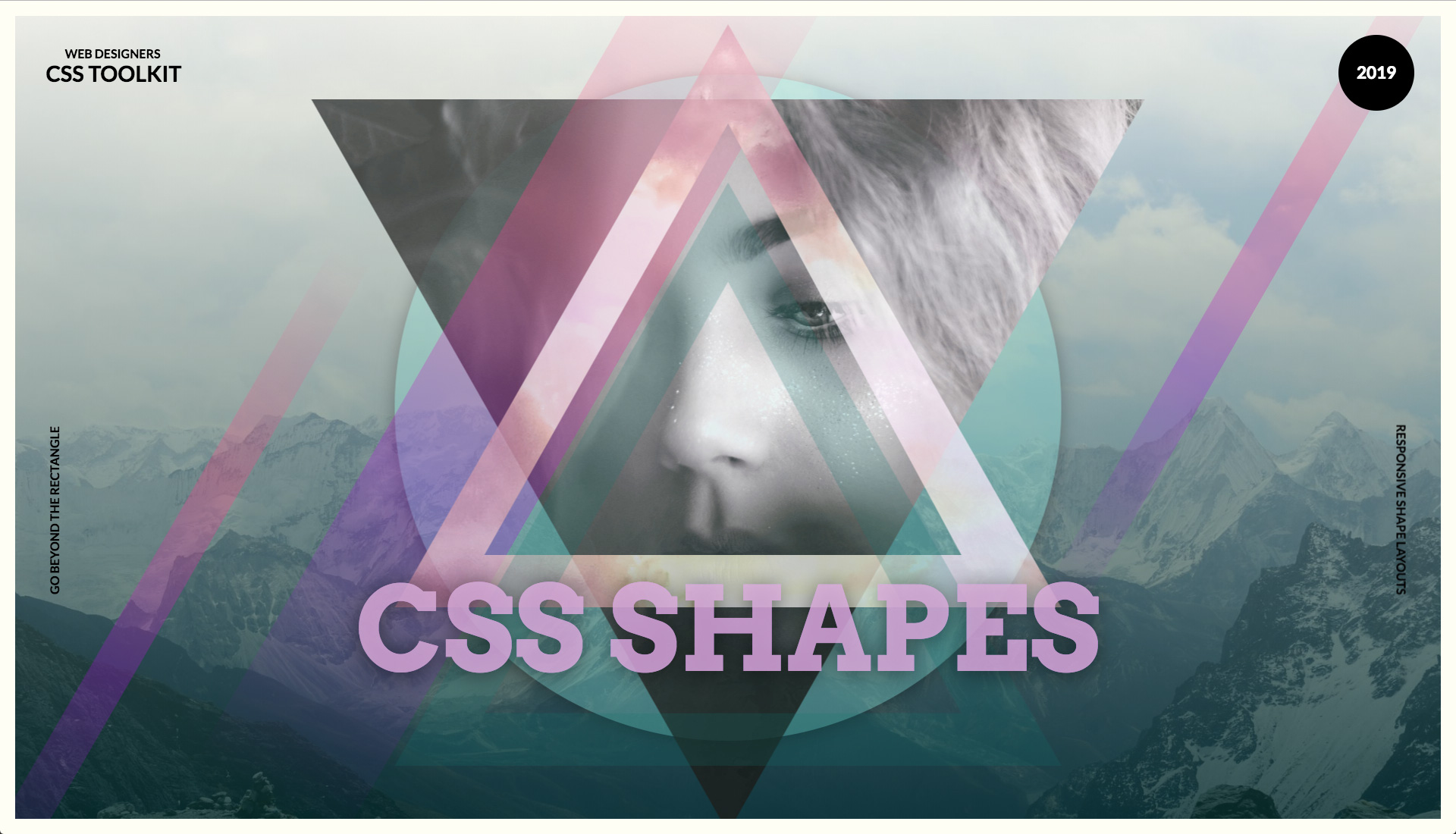
This tutorial will show you how to add all of these elements together, including gradients and rotating rectangles, to create a more unique design. Add CSS gradients, and a complex geometric design can be created through CSS.
01. Get started
Open the start folder in your IDE code editor and start editing the index.html page. To start off the tutorial, a simple link-up to Google Fonts typefaces will be required so that when some text is included later it can have the appropriate typefaces added to the page.
<link rel="stylesheet" href="css/shapes.css">
<link href="https://fonts.googleapis.com/
css?family=Arvo:700|Lato:700" rel="stylesheet">
02. Anchor the shapes together
In the body tag on the page add the following content. The shape contain div tag will be used to hold all of the different shapes that are produced, and this will be made to fill the browser viewport. The first shape to be created will be a simple circle, which will anchor the other images together.
<div id="shape_contain">
	<div id="circle"></div>
</div>
03. Make the page
Now move over to the CSS folder and open the shapes.css file. The body and HTML are just set to fill the browser with the right font family, set up for the majority of the text that will be added towards the end of the tutorial as the finishing touches.
Get the Creative Bloq Newsletter
Daily design news, reviews, how-tos and more, as picked by the editors.
body,
html {
	margin: 0;
	padding: 0;
	width: 100%;
	height: 100vh;
	overflow-x: hidden;
	font-family: 'Lato', sans-serif;
	text-transform: uppercase;
}
04. Contain the shapes
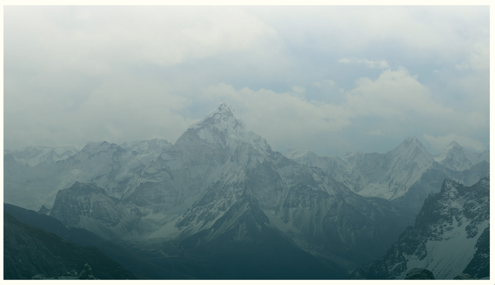
The next CSS rule is for the div with the ID of shape_contain. This is set to fill the browser with any overflow hidden. The translate3d is to ensure that the content is hardware-accelerated. A large border is added before two background images. One is a regular image while the one above is an aqua-coloured, semi-transparent gradient.
#shape_contain {
	box-sizing: border-box;
	width: 100%;
	height: 100vh;
	overflow: hidden;
	transform: translate3d(0, 0, 0);
	border: 20px solid rgb(255, 254, 244);
	background: linear-gradient(0deg, rgba (7,
	47, 46, 0.8) 0%, rgba(255, 252, 226, 0.5)
	100%), url(../images/mountain.jpg)
	no-repeat center center;
	background-size: cover;
}
05. Start with a circle
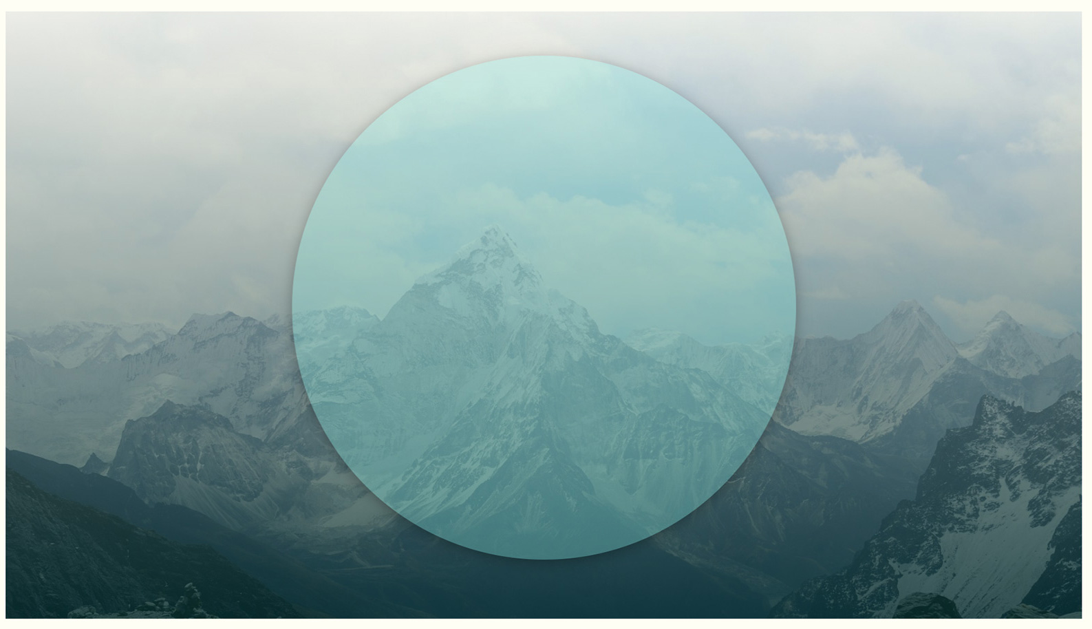
The first geometric shape that will be created is one of the most simple shapes. A circle can be made out of any square-shaped div by adding a border radius of 50%. The circle is semi-transparent, with a soft shadow added to the edge of it.
#circle {
	width: 80vh;
	height: 80vh;
	border-radius: 50%;
	background: rgba(136, 239, 231, 0.3);
	position: absolute;
	top: 7vh;
	left: 50%;
	transform: translate3d(-50%, 0, 0);
	box-shadow: 0px 5px 40px rgba(0, 0, 0, 0.3);
}
06. Try a triangle
The next shape will be slightly more complex because it is a triangle. It’s relatively straightforward to create by using the CSS clip-path that allows for a polygon shape to be created. Add this div into the shape_contain div.
<div id="tri1"></div>07. Apply the triangle
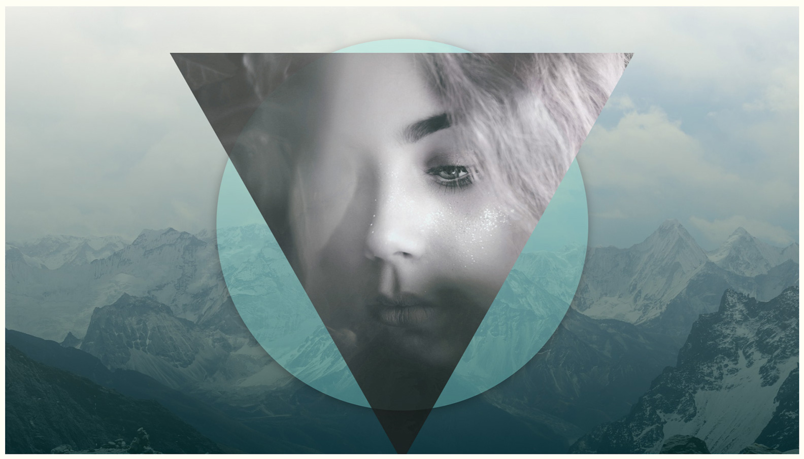
Here the clip-path is created for the CSS to make the triangle. The shape is simply three points. The background image is added, and a filter is added here so that hue can be shifted slightly, which makes the image take on a slight pink tint that is emphasised with the contrast.
#tri1 {
	clip-path: polygon(0 0, 100% 0, 50%
	100%);
	width: 100vh;
	height: 88vh;
	background: url(../images/girl3.jpg)
	no-repeat center center;
	background-size: cover;
	position: absolute;
	top: 10vh;
	left: 50%;
	transform: translate3d(-50%, 0, 0);
	filter: hue-rotate(310deg) contrast(140%);
	opacity: 0.8;
}
08. Go more complex
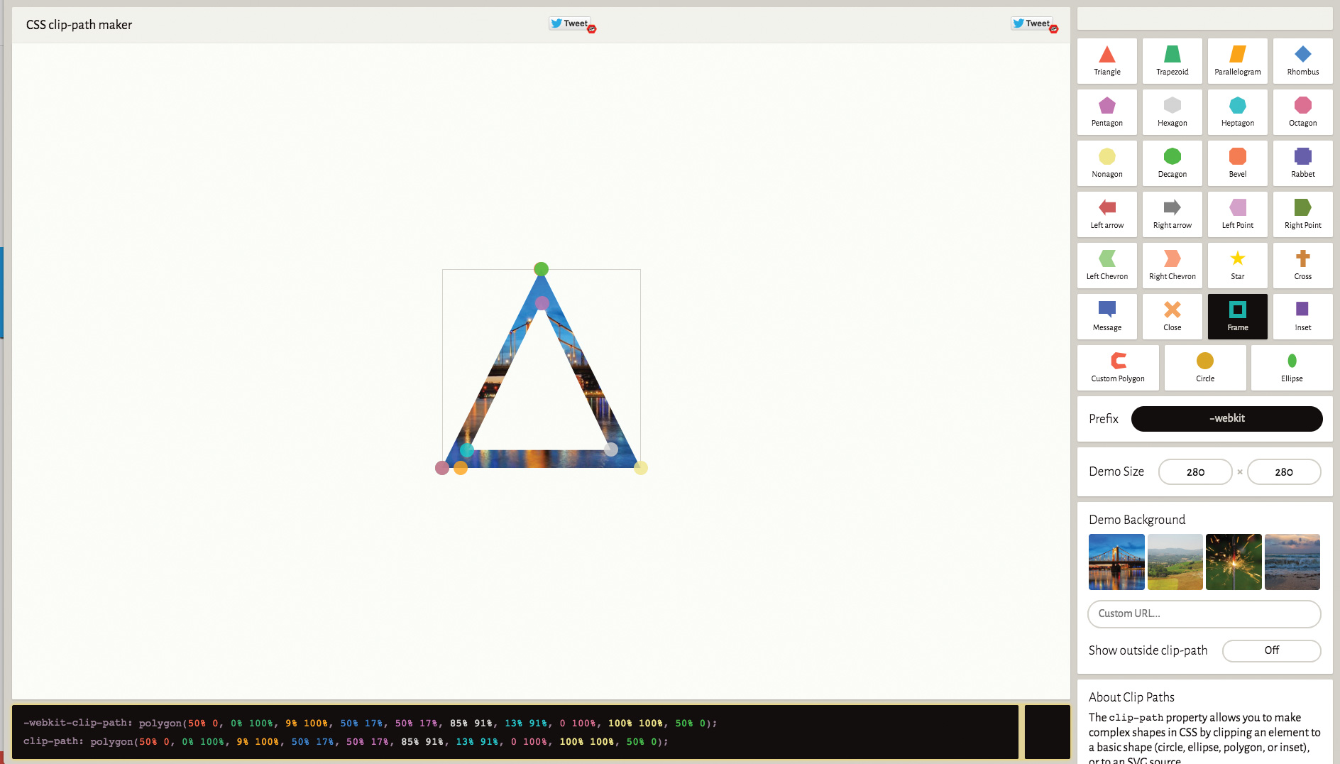
The next shape to be created will be a triangle with a hole in the middle. This sounds relatively straightforward, but the clip polygon needs to be one continuous line, so it’s more complex to create. If you need to create a similar shape, use Bennett Feely's clip-path maker to create the shape.
<div id="tri2"></div>09. Stack the shapes
The shape here is more complex because it was visually created in the link previously mentioned. The clouds image is placed into the shape and then the hue is adjusted to make this a little more yellow. Each shape is positioned absolutely, in the centre of the surrounding div, and stacked one on top of the other.
#tri2 {
	clip-path: polygon(50% 0, 0% 100%, 9% 100%,
	50% 17%, 50% 17%, 85% 91%, 13% 91%, 0 100%,
	100% 100%, 50% 0);
	width: 80vh;
	height: 70vh;
	background: url(../images/clouds.jpg)
	no-repeat center center;
	background-size: cover;
	position: absolute;
	top: 1vh;
	left: 50%;
	transform: translate3d(-50%, 0, 0);
	filter: hue-rotate(90deg) contrast(140%);
	opacity: 0.7;}
10. Try resizing the browser
The next triangle should be added into the shape_contain div. If you check the browser you’ll see that you can resize the browser and the shapes will resize perfectly, as they are based on percentages. The container is set with the viewport height so it will always fit in the screen.
<div id="tri3"></div>11. Style it up
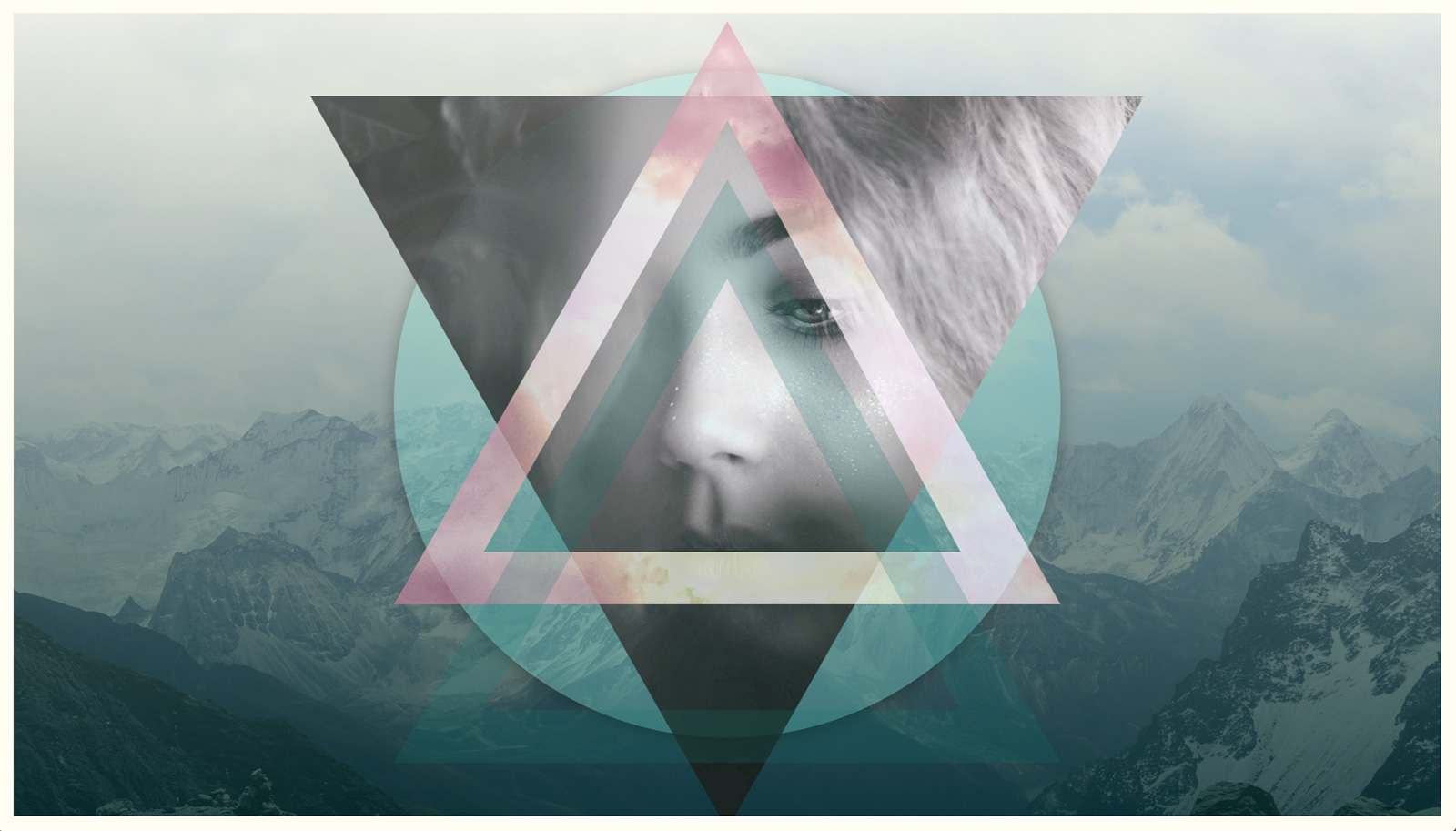
The final triangle uses the same shape as the previous one with the hole in the centre. This time it has just a simple shade of turquoise rather than an image. The transparency is set low to be able to see through this triangle to the other content below.
#tri3 {
	clip-path: polygon(50% 0, 0% 100%, 9% 100%,
	50% 17%, 50% 17%, 85% 91%, 13% 91%, 0 100%,
	100% 100%, 50% 0);
	width: 80vh;
	height: 70vh;
	background: rgba(0, 113, 110, 0.2);
	position: absolute;
	top: 20vh;
	left: 50%;
	transform: translate3d(-50%, 0, 0);
}
12. Create an angled strip
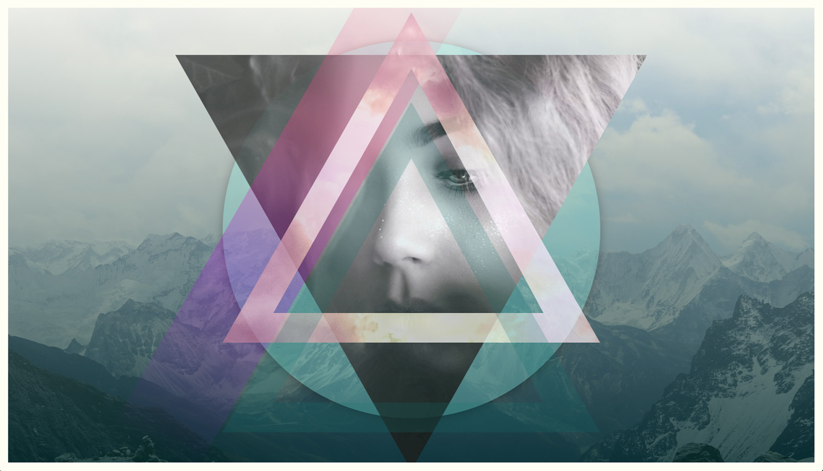
The next shape is an angled div shape. This will be placed in between triangle one and two in the shape_contain div tag. Blend it into the page using a semi-transparent gradient across the screen. These will also scale up and down to different-sized screens.
<div id="strip1" class="strip"></div>13. Make the angles
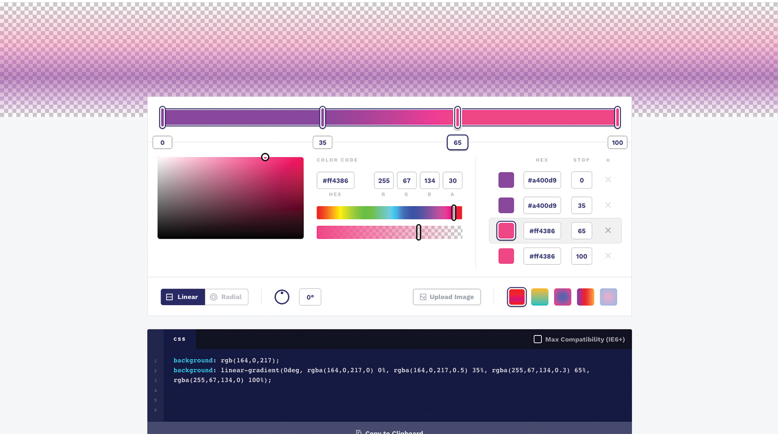
The strip class sets the background gradient. This is made using the online gradient editor CSS Gradient. The ID then sets the position of this particular angled gradient shape. It is placed in the centre and then offset slightly so that it retains consistent placement on different monitors.
.strip {
	position: absolute;
	background: linear-gradient(0deg, rgba(164,
	0, 217, 0) 0%, rgba(164, 0, 217, 0.3) 35%,
	rgba(255, 67, 134, 0.3) 65%, rgba(255, 67,
	134, 0) 100%);
}
#strip1 {
	width: 20vh;
	height: 120vh;
	left: 50%;
	transform: translate3d(-175%, -15%, 0)
	rotateZ(30deg);
}
14. Try more gradient angles
Two more div tags are now added that hold the class of strip. The ID will enable them to be placed in different positions on the screen. These are used as repetitive shapes that build up the overall aesthetic of the scene, while also adding a splash of colour.
<div id="strip2" class="strip"></div>
<div id="strip3" class="strip"></div>
15. Position the angle
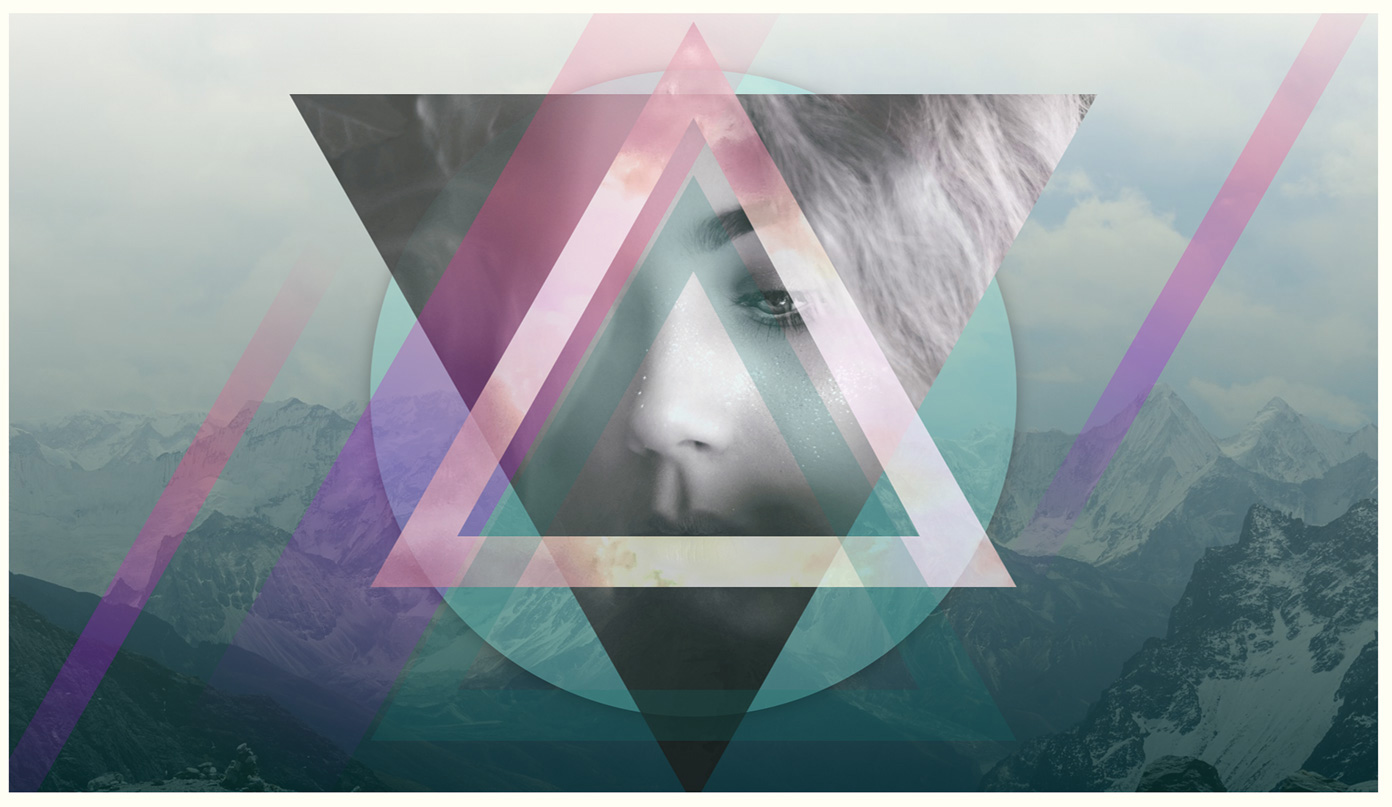
The two strip angle gradient shapes are positioned to each side of the main content on the screen. One is placed towards the lower left and the other towards the upper right so that it balances the screen out. Resize the browser to see these elements stick in place on the screen and scale to fit.
#strip2 {
	width: 5vh;
	height: 90vh;
	left: 50%;
	transform: translate3d(60vh, -15%, 0)
	rotateZ(30deg);
}
#strip3 {
	width: 5vh;
	height: 90vh;
	left: 50%;
	transform: translate3d(-70vh, 25%, 0)
	rotateZ(30deg);
}
16. Add some text content
This page doesn’t have a huge amount of text content, but the divs here have all of the remaining page content to be placed on the screen. The divs should be added before the closing div tag of the shape_contain panel. These text elements will be split into different corners.
<div id="leftside">Go beyond the rectangle
</div>
		<div id="rightside">Responsive shape
		layouts</div>
		<div id="topLeft">Web Designers
			<br><span>CSS Toolkit</span></div>
		<div id="topRight">2019</div>
		<div id="headline">CSS Shapes</div>
17. Rotate the text
The left-side div is positioned absolutely on the left-hand side of the screen, and it is rotated round anti-clockwise by 90 degrees so that it fits down the side. The transform origin is moved slightly to make the text fit closer to the edge of the screen.
#leftside {
	position: absolute;
	left: 20px;
	top: 70%;
	transform-origin: 10% 0%;
	transform: rotate(-90deg);
}
18. Position the right-hand text
The right-hand text is very similar to the left text except it’s positioned over from the right-hand side of the screen. The rotation should be pushed round clockwise so that the text sits better and reads easier on the right of the screen.
#rightside {
	position: absolute;
	right: 20px;
	top: 70%;
	transform-origin: 90% 0%;
	transform: rotate(90deg);
}
19. Stylise the text
Now the text for the top-left corner is stylised. The first two words are left at their default size, while the remaining words are enlarged and positioned on the next line down in order to provide some hierarchy to the text. This will stick to the top left corner through any resizing.
#topLeft {
	position: absolute;
	left: 40px;
	top: 40px;
	width: 180px;
	text-align: center;
}
#topLeft span {
	font-size: 1.8em;
}
20. Set the right-hand text
The text for the top-right corner is now set. This is set inside a black round circle, with the text set in white against the circle. This uses the line height method for aligning the text in the centre, by using the line height the same as the div height.
#topRight {
	position: absolute;
	right: 35px;
	top: 25px;
	line-height: 100px;
	font-size: 1.4em;
	width: 100px;
	height: 100px;
	background: #000;
	color: #fff;
	text-align: center;
	border-radius: 50%;
}
21. Set the headline text
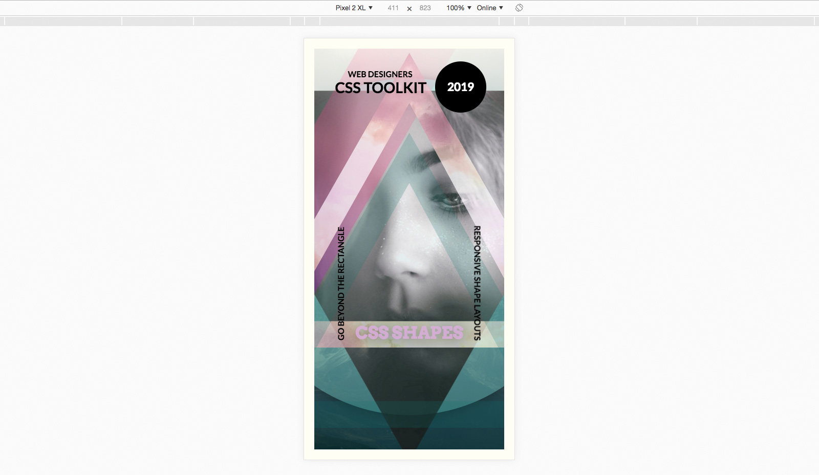
The very last text to be set is the main headline in the centre of the screen. The typeface is changed for this, and it is given a light pink semi-transparent colour so that it blends with the highlight colour of this page design. Save the page and refresh your browser to see the finished result. Want to save or share a copy of the page? Export it as a PDF and save it in cloud storage.
#headline {
	position: absolute;
	width: 100%;
	z-index: 200;
	padding-top: 65vh;
	font-family: 'Arvo', serif;
	text-align: center;
	color: rgba(233, 173, 255, 0.8);
	font-size: 8vw;
	text-shadow: 0px 3px 50px rgba(0, 0, 0, 0.5);
}
This article was originally published in creative web design magazine Web Designer. Buy issue 284 or subscribe.
Read more:

Thank you for reading 5 articles this month* Join now for unlimited access
Enjoy your first month for just £1 / $1 / €1
*Read 5 free articles per month without a subscription

Join now for unlimited access
Try first month for just £1 / $1 / €1

Mark is a Professor of Interaction Design at Sheridan College of Advanced Learning near Toronto, Canada. Highlights from Mark's extensive industry practice include a top four (worldwide) downloaded game for the UK launch of the iPhone in December 2007. Mark created the title sequence for the BBC’s coverage of the African Cup of Nations. He has also exhibited an interactive art installation 'Tracier' at the Kube Gallery and has created numerous websites, apps, games and motion graphics work.
