How to design isometric typography
Learn how to build a city of letters, using the Pen tool, selections and layers in Photoshop.
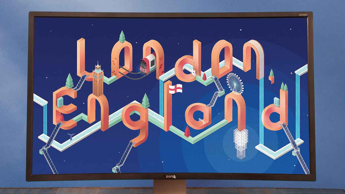
Perspective is everything in design. If something you’ve drawn has a perfect perspective, it will help your work look more realistic; alternately, Pablo Picasso made history by drawing with a very skewed sense of the reality around him.
Isometric drawing is as much of a science as anything, though. It has a very strict set of rules when it comes to what goes where. That’s pretty difficult to sit down and draw yourself, but when it comes to Photoshop, you can create a guide for anything.
Designing new typography for a site build? Get your build right with a website builder and the perfect web hosting provider.
In this Photoshop tutorial, we’re going to set out a perfect isometric grid before we build a world on hexagonally facing lines (be sure to back up your designs in cloud storage). In this London-inspired image, we’re going to trace the Thames isometrically, and even create isometric versions of landmarks. You’ll find that anything can be created on this grid, since it simply holds cubic shapes together. Curves can simply be drawn from corner to corner.
Everything in the image is going to follow this structure too. You can use images to copy, you can follow our steps religiously or you can design your own icons following isometric patterns. It’s entirely up to you – within the limits of isometry, of course.
01. Start the grid
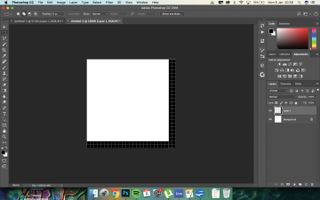
Begin by creating a new document of 20 x 20 pixels. Create a black strip down the right and bottom of the document with the Rectangular Marquee tool. Use the Grid if you need to, by hitting Cmd/Ctrl+’.
02. Define your pattern
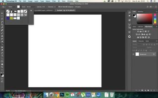
Go to Edit>Define Pattern. Name it and then click OK. Create a new 1920 x 1080 document by going to File>New, and then go to the Paint Bucket (G). Use Pattern fill and on a new layer, fill with the pattern you’ve created.
Get the Creative Bloq Newsletter
Daily design news, reviews, how-tos and more, as picked by the editors.
03. Transform the pattern
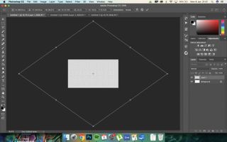
Now we’re going to make the pattern isometric! Make the width and height much bigger, the angle 35 degrees and place in the centre of the document. The grid should be made of diamond shapes.
04. Choose your palette
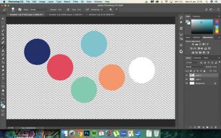
We’re going to use five different colours for this, but different shades of each. The colours are Royal Blue (#021574), Muted Red (#f22f50), Spearmint (#6ec5cf), Peppermint (#6ecfb0), Tan (#ff935e) and White (#ffffff).
05. Lay out your text
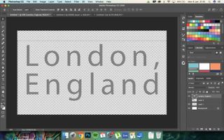
Use the Type tool and create the text that you want to use across the document; we’re going with ‘London, England’. This is important, as it will dictate the size, spacing and whole look of your isometric poster.
06. Create some letters
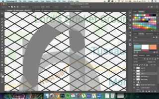
Create isometric letters with the Pen tool, following the guide that you created. This is a trial-and-error part of the process, and will take the longest of everything. Experiment with shapes and Fill with #808080 for now.
07. Work on the letters
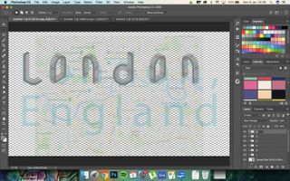
The isometric letters are going to have to have one side that predominantly faces forwards. Work out where the curves are on each of the letters by reducing the opacities. This might take some time to figure out, and you may need to redraw some letters.
08. Shade the letters
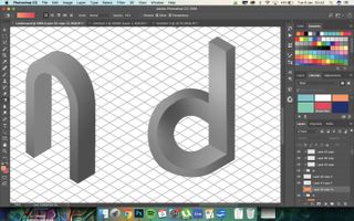
Group each set of layers for each letter. Create clipping masks for each, and add either light or shade to the letters so that they appear 3D. Work out where the light is in the image and judge accordingly.
09. Colour and build bridges
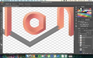
Create new Overlay layers above each of the letters and fill with one of your colours. Add Colour layers, clip, and brush in another colour to flesh it out. Next, create bridges between some of the letters. Colour this with another colour.
10. Create a speaker
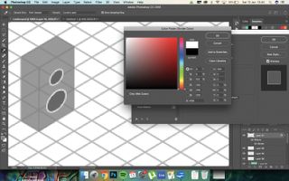
Now, we’re going to add objects to the scene. Create a box using the isometric guide, lightening and darkening either side of the box to create perspective. Create two circles, and Transform these to fit into the box along the guide; add a Stroke to the circles using Layer Styles.
11. Add a flag
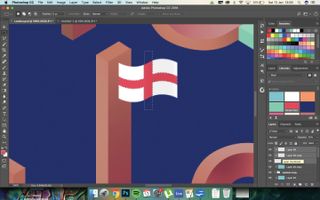
Next, we’re going to create a flag. Again, use the Pen tool to draw along the guide, and then fill with white. Clip layers to this, and touch soft black brushstrokes over one side of the flag to add shade.
12. Plant some trees
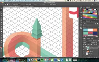
Trees are easy to create with the Pen; create a triangle with the two bottom sides lining up along the isometric guide and then darken one side. Repeat this twice, then add a stump. Colour with an Overlay layer.
13. Escalators and map planning
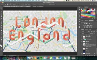
We’ve created escalators using the same methods we used to create the other objects, using the isometric guide to draw over. After that, we’ve used a real map of London to roughly trace the Thames and draw a white outline for some water to fill.
14. Curve the edges
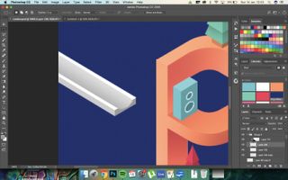
Use the Pen tool to curve the edges of the white structure that you’ve just created, and fill with #808080. Use a soft, black brush to create the illusion of a curved space for the water to sit in.
15. Fill with water
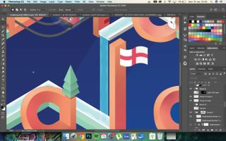
Use the Pen tool to select the grey space in each of the white structures and falling from the top structures, and fill with blue on a new layer. Set this layer to Hard Light to make it look like it’s actual liquid. Clip a white layer and delete a jagged pattern in the middle for added effect.
16. Start the chandelier
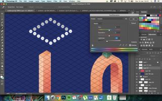
Create a new layer and add dots in the intersections of the lines like you can see in the screenshot. Select the back rows of these dots and reduce the Lightness to -10 by using Hue/Saturation (Cmd/Ctrl+U). Duplicate this downwards to create more dots.
17. Finish the chandelier
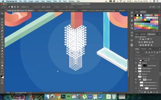
Create the same effect three times with multiple rows of dots, then resize the two latter ones. Stack these to create a chandelier effect. On new 20% layers, create white dots to suggest light emanating outwards.
18. Create Big Ben
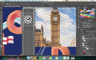
Use a stock photo of Big Ben to draw the clock with the Pen tool; you don’t have to be as detailed, though, of course. Draw it in shades of grey; draw the spire to one side of the building rather than straight upwards, too.
19. Place the landmark
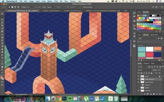
Colour Big Ben with some Overlay layers, duplicate the layer and then flip this new one horizontally. Resize both layers and Skew with Free Transform to fit along the guide that you have created.
20. Finishing touches
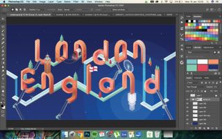
Make any final flourishes that you’d like to add more to the image; this might include stars in the background with little dots, a whale in the Thames or altering the colour with a Curves adjustment.
21. Add noise
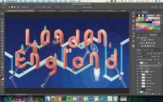
Finally, select black and white in your Swatches (D). Create a new layer, fill with black (Alt/Opt+Delete) and go to Filter>Noise. Choose 400%, check Monochromatic and click OK. Set this layer to Soft Light, 10% opaque.
This article was originally published in issue 271 of creative web design magazine Web Designer. Buy issue 271 or subscribe to Web Designer.
Related articles:

Thank you for reading 5 articles this month* Join now for unlimited access
Enjoy your first month for just £1 / $1 / €1
*Read 5 free articles per month without a subscription

Join now for unlimited access
Try first month for just £1 / $1 / €1
The Creative Bloq team is made up of a group of design fans, and has changed and evolved since Creative Bloq began back in 2012. The current website team consists of eight full-time members of staff: Editor Georgia Coggan, Deputy Editor Rosie Hilder, Ecommerce Editor Beren Neale, Senior News Editor Daniel Piper, Editor, Digital Art and 3D Ian Dean, Tech Reviews Editor Erlingur Einarsson and Ecommerce Writer Beth Nicholls and Staff Writer Natalie Fear, as well as a roster of freelancers from around the world. The 3D World and ImagineFX magazine teams also pitch in, ensuring that content from 3D World and ImagineFX is represented on Creative Bloq.
