Design a poster in Photoshop CC with Adobe Stock templates
Adobe Stock templates make it possible to design a professional looking poster in minutes.
Whether you’re new to Photoshop or a seasoned professional, Adobe Stock proves a welcome addition to anybody’s creative arsenal. Integrated directly into Creative Cloud platforms, Adobe Stock offers much more than your average stock library, allowing you to search, test, license and apply images without ever having to leave the app window.
As well as offering millions of royalty-free images, Adobe Stock has expanded their library to include other media types such as 3D models, vectors and video. And all this can speed up your workflow considerably.
In this tutorial we will be taking advantage of their artist-designed templates to create a striking poster in a fraction of the time it would take to design one from scratch. And note that many of these excellent templates are free, so there's no reason not to start giving it a try yourself!
01. Choose a template
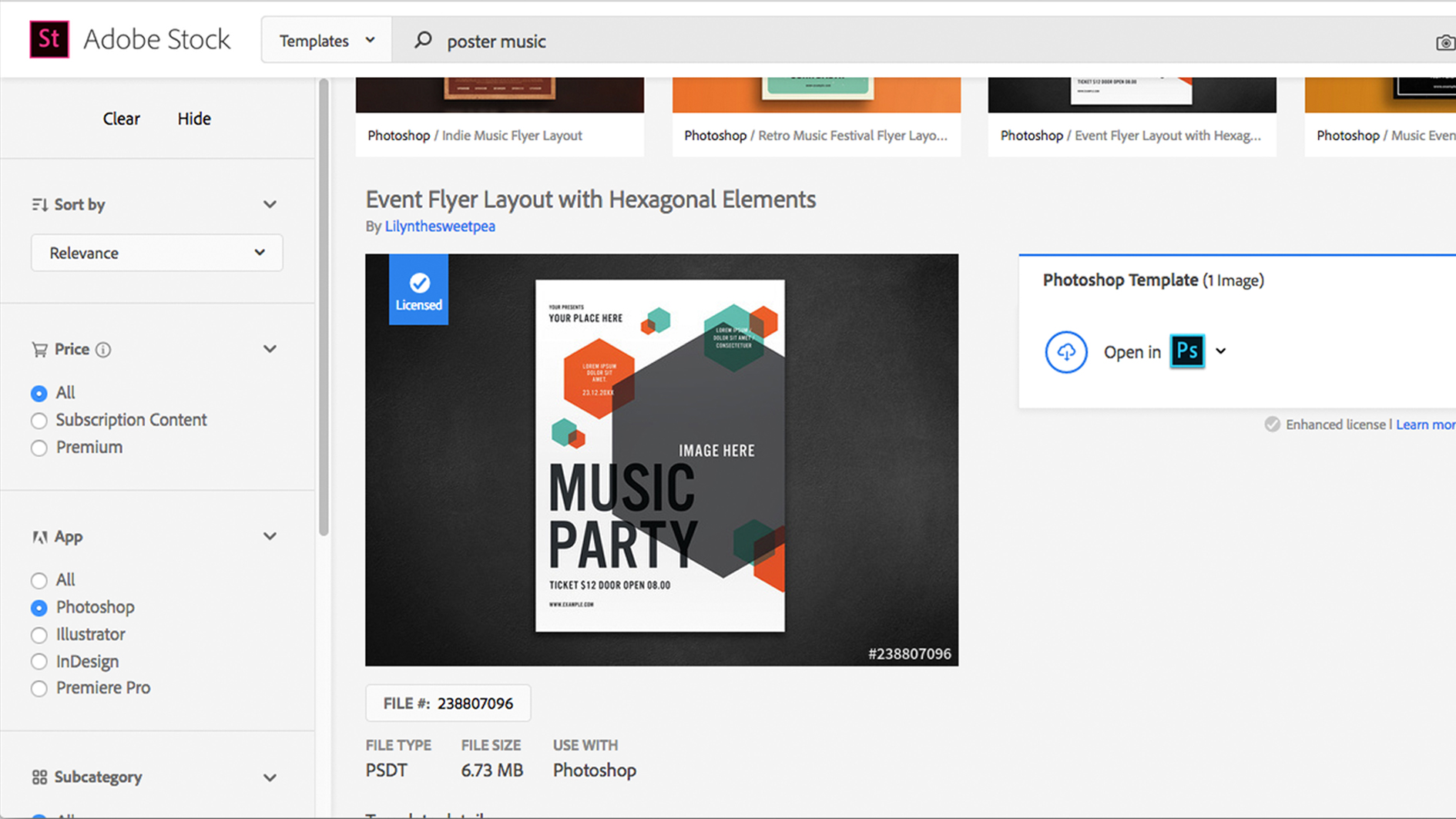
Begin by opening Photoshop CC and creating a new document. The New Document window displays a small selection of the templates available, but you will have to visit the Adobe Stock website to access their full range. You can do this easily by typing a search term into the bar at the bottom and pressing enter, which opens the results in a new browser window.
When choosing a template it’s important to consider what style will complement your own content, the type of images required and how much copy will need to fit in. You should aim to have a poster that will stand out, while presenting your information in a clear and readable format.
Once you’re happy with your choice, click on the template and license it. You will now be able to access this template in Photoshop’s New Document window. I chose a basic but versatile template that could be applied to a range of different projects, in this case an ‘urban fitness’ campaign.
02. Get to grips with the template
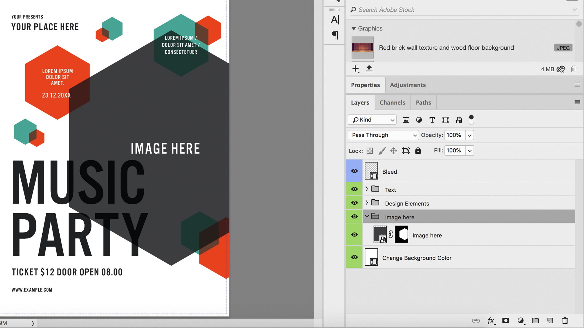
Open the template in Photoshop and save your document as a .psd file, assigning it a new name. If your computer is missing any of the document fonts then a window will appear allowing you to activate them with Adobe Typekit (available to any Creative Cloud subscription).
With all the layers named and grouped, it should be a simple task to work out which layer controls which object on the canvas. You will notice a layer at the top called ‘bleed’. This is a print term used to describe the area around the page that will be trimmed off by printing, allowing space for printing errors. You should turn this off when outputting the final image or it could show up in the final print.
Although the template is a good starting point, you should not view it as the finished article. Like any normal Photoshop document all elements are fully customizable and should be altered to suit your own content.
03. Add your own text
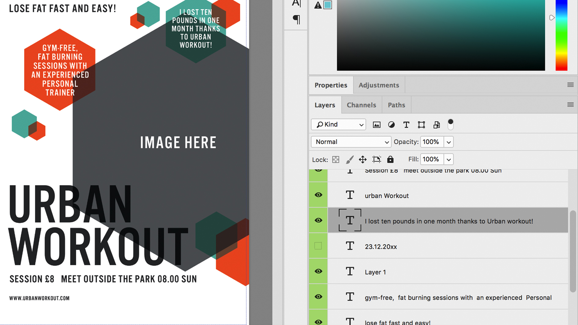
Start to populate the document with your own copy, using the Type tool to click into the text boxes. Although the typefaces are specifically chosen for the template you may have others you wish to try, especially if you have brand guidelines to follow. All the text in my template was set to ‘Alternate Gothic No3 D’ and I had no reason to change it. However I did adjust the size, leading and kerning where necessary to fit my new copy into the space.
Kerning tends to be less of a problem when using an all-caps, condensed font like Alternate Gothic. I removed hyphenation from the text in the hexagons and edited the text down to fill the space, making sure it was vertically centered in the shape.
If you’re worried about making changes and losing anything then you can always duplicate a layer and make it invisible, by clicking the eye icon to the left. This leaves you with an identical layer to edit, while retaining the original as a back-up. Alternatively you can rely on the undo option or history panel to retrace your steps.
04. Choosing images
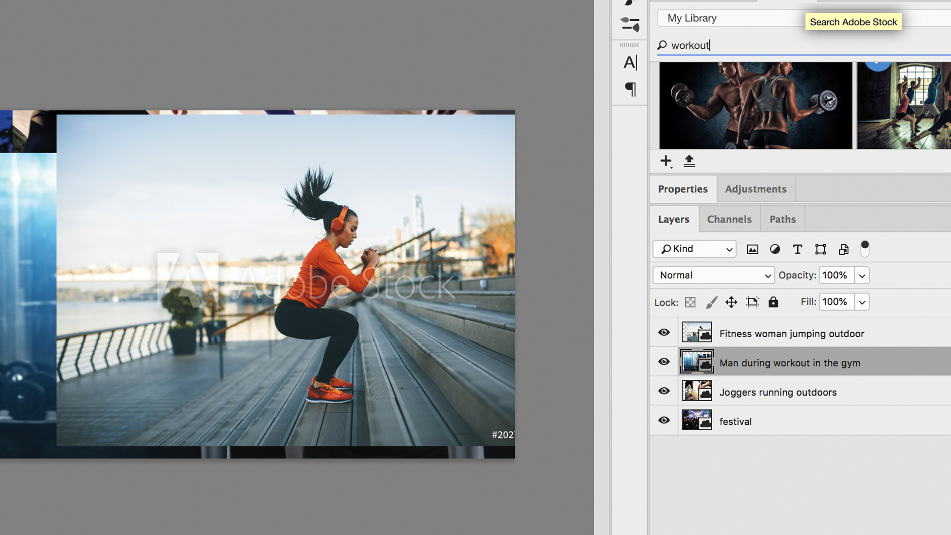
This is where Adobe Stock really comes into its own. Finding the right image is a simple task with Adobe’s integrated library, which allows you to browse and access a huge number of images in a matter of seconds. With Adobe Stock there’s no need to switch back and fourth, from app to website, when you can test multiple images directly on your design with low-res samples, before making any final decisions on purchasing.
In this template the large hexagonal hero image is a Smart Object, which can be accessed by double-clicking on the layer thumbnail. I searched for words like ‘exercise’, ‘fitness’ and ‘workout’ in the Library, dragging different test images onto my canvas before deciding on one I liked. I licensed the image and placed the high-res version into the Smart Layer file. Once this is saved and closed, the Smart Layer should automatically update in the main document, but you can also right-click on the layer and select ‘Update Modified Content’.
05. Final changes
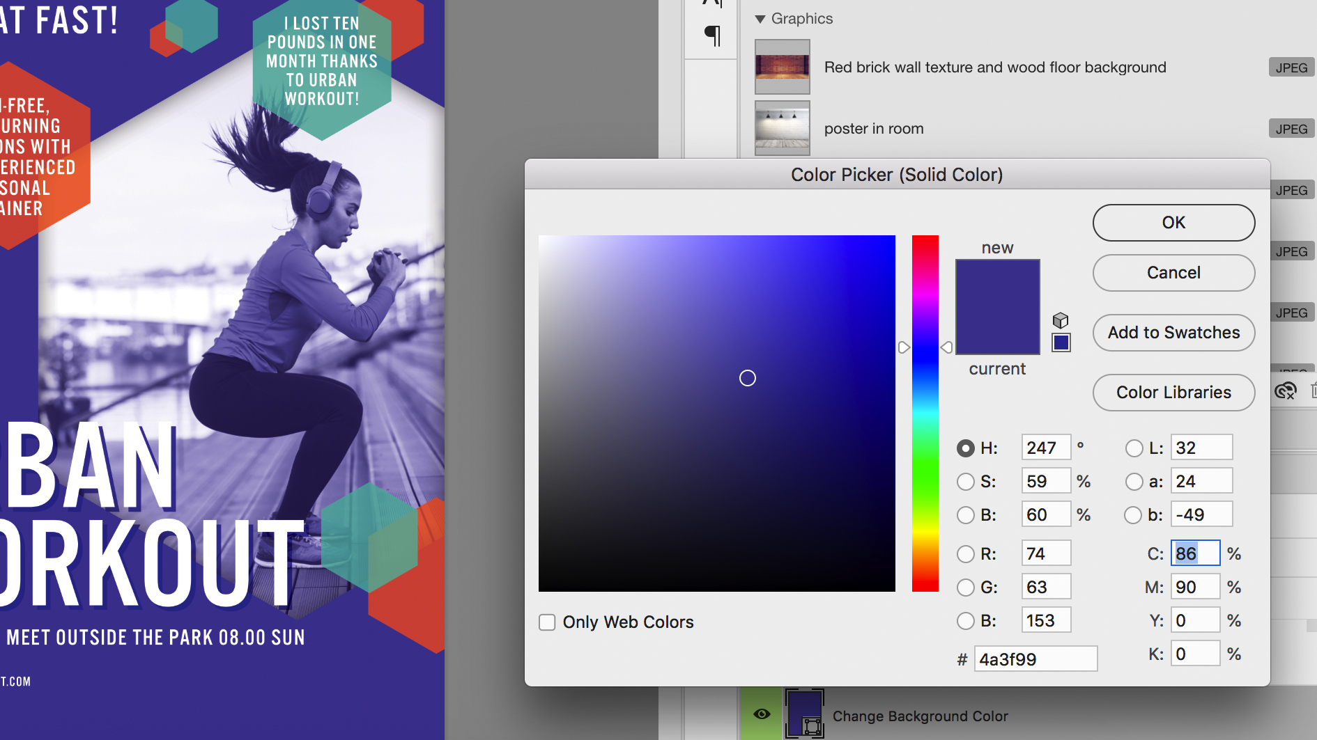
Once your images and text are placed it’s time for some fine tuning. Try to balance the structure, giving each element enough space to breathe as well as respecting vertical and horizontal alignments. You can then think about adding the personal touch and unleashing your creative side.
My first change was to add a splash of colour to the background, changing it from white to purple. This meant that the main headline was getting lost so I changed it to white, adding a hard Drop Shadow and switching its blending mode from Multiply to Normal.
Adding an inner shadow to the main hexagon brought it away from the headline and added depth to the design. The colour of the girl’s shirt complemented the purple nicely so I used the eyedropper to select it and apply to some of the smaller hexagons.
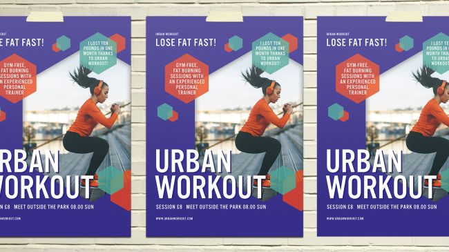
With this complete it was just a matter of saving a high-res jpg and sending to the printers, since the document was already set up for print (300dpi and CMYK).

Thank you for reading 5 articles this month* Join now for unlimited access
Enjoy your first month for just £1 / $1 / €1
*Read 5 free articles per month without a subscription

Join now for unlimited access
Try first month for just £1 / $1 / €1
Get the Creative Bloq Newsletter
Daily design news, reviews, how-tos and more, as picked by the editors.

Matt has worked for various publishing houses and design agencies, covering studio photography, video production, editorial design, branding, illustration and motion graphics. He currently works for Future PLC with brands such as T3, Woman&Home, Marie Claire, Music Week, TechRadar, Golden Joysticks, Cycling Weekly, Brand Impact Awards, Horse&Hound and Tech&Learning. In the past he has designed titles including Mac|Life, IQ, Bow International, Drummer, iDrum, Acoustic, Clay Shooting, Sea Fishing and GunTradeNews. He has experience across the full Adobe Suite and is currently spending a lot of time creating projects in Blender and After Effects.
