How to deliver originality in VFX
Master the art of true originality in your VFX.
With VFX becoming more prevalent and accessible than ever before, originality is increasingly important to audiences and artists alike. In order to capture the imagination of the audience, creators need to keep pushing boundaries – but how can this be done?
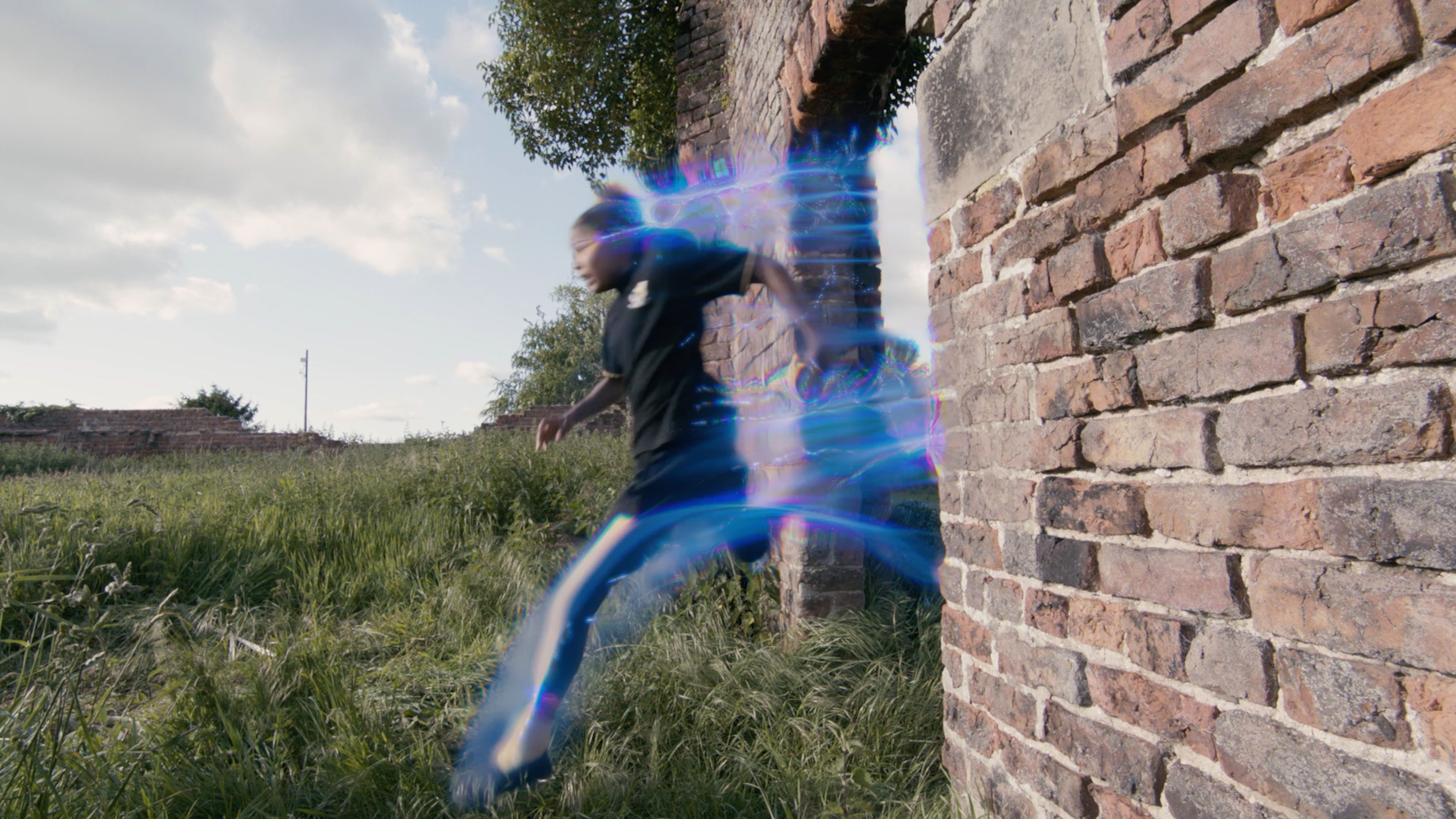
Ben Haworth, co-founder of Flipbook Studio, understands the challenge more than most. In this handy guide, Haworth breaks down how the VFX team at Flipbook used originality to tackle a challenging speed-running sequence in the fantasy TV series The Worst Witch.
If you need even more VFX inspiration, don't forget to check out our list of the best 3D movies, and for more 3D inspiration see our roundup of top 3D art and pick of the best 3D modelling software. But for now, read on as Howarth talks us through how the effect was accomplished at Flipbook Studio and how you can insert some originality into your own VFX.
01. Consider context
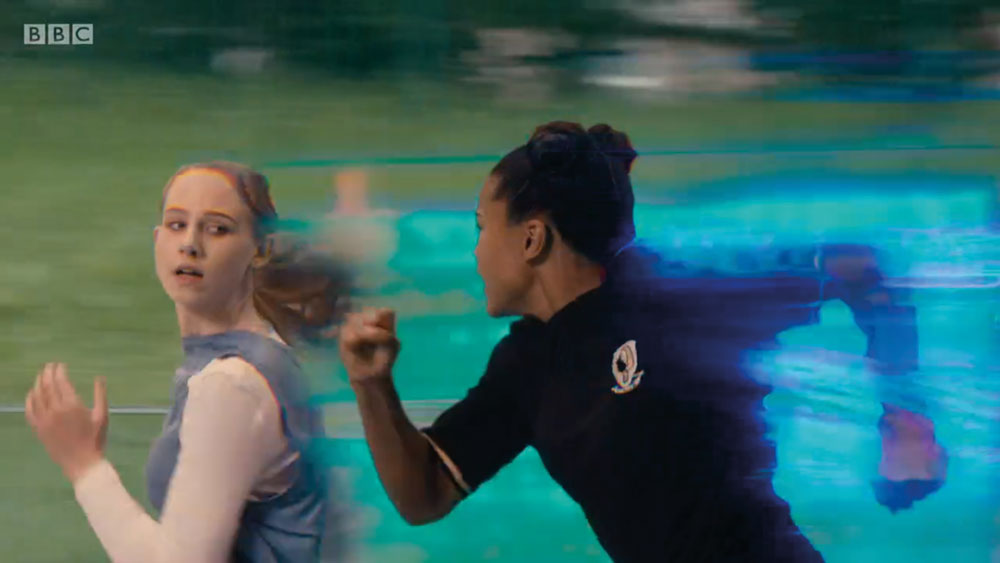
When we were tasked with creating 'witch speed running' for season four of The Worst Witch, we had that single line of script to take and 'run' with. There were a number of things to consider off the bat – this is magic, not a superpower. In the scripts there were multiple witches running at the same time, so we needed to think about how we conveyed who was winning to the viewer, as well as the shooting schedule.
02. Learn from your pitfalls
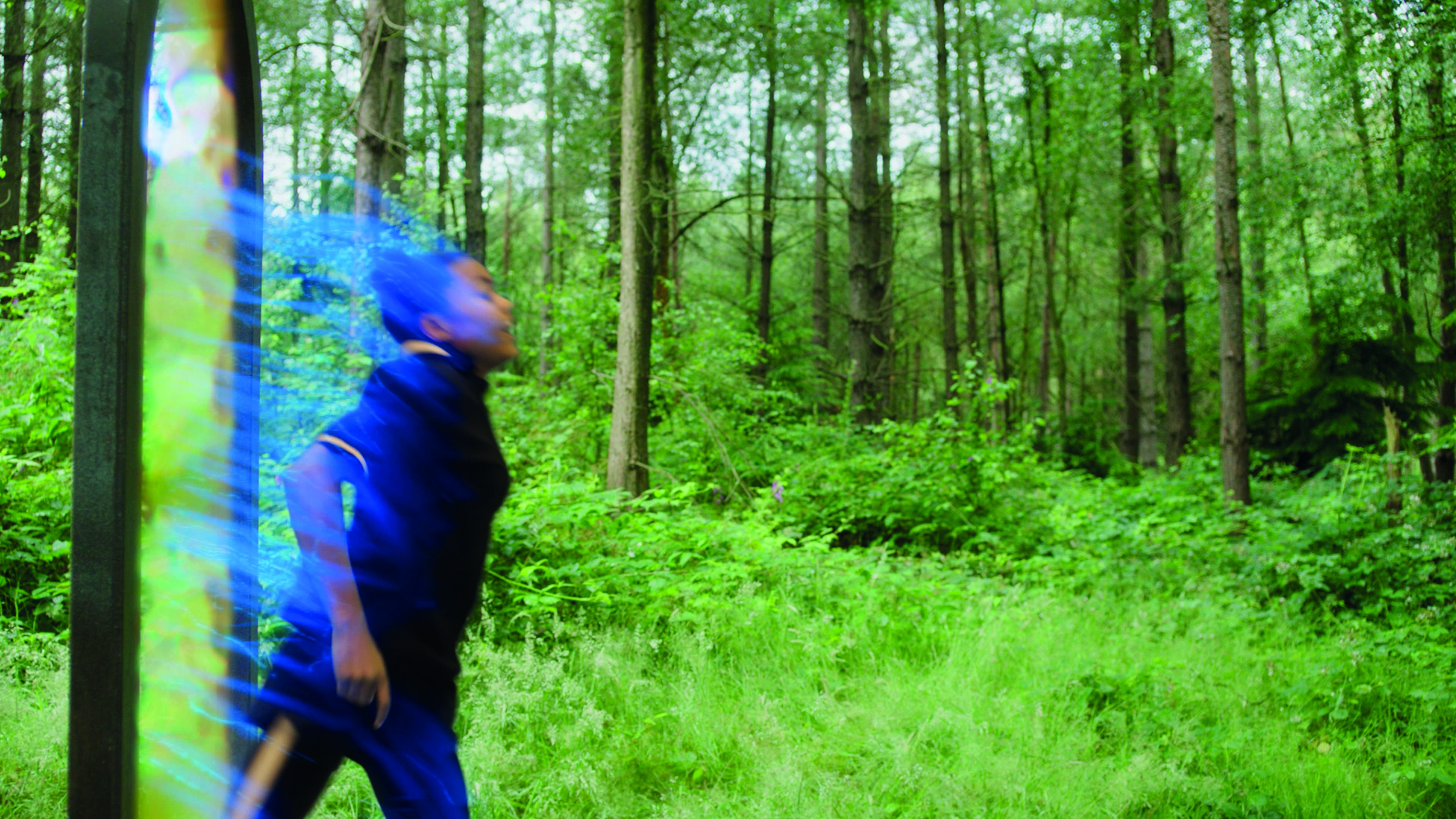
The many, many versions of speed running in movies is a double-edged sword. While this leaves plenty of examples of the pitfalls to learn from, coming up with something original is not so easy. Quicksilver in X-Men is done so well and from this, we developed framings for the shooting to be convincing. Not seeing the feet hit the ground overcame a lot of the issues with the physics of speed running; the problem is the person either has to have really fast legs or a really long stride to remotely work with ground contact. We aimed for the long stride approach, but without showing feet on the floor by using digi doubles on wide shots.
03. Make the impossible look 'real'
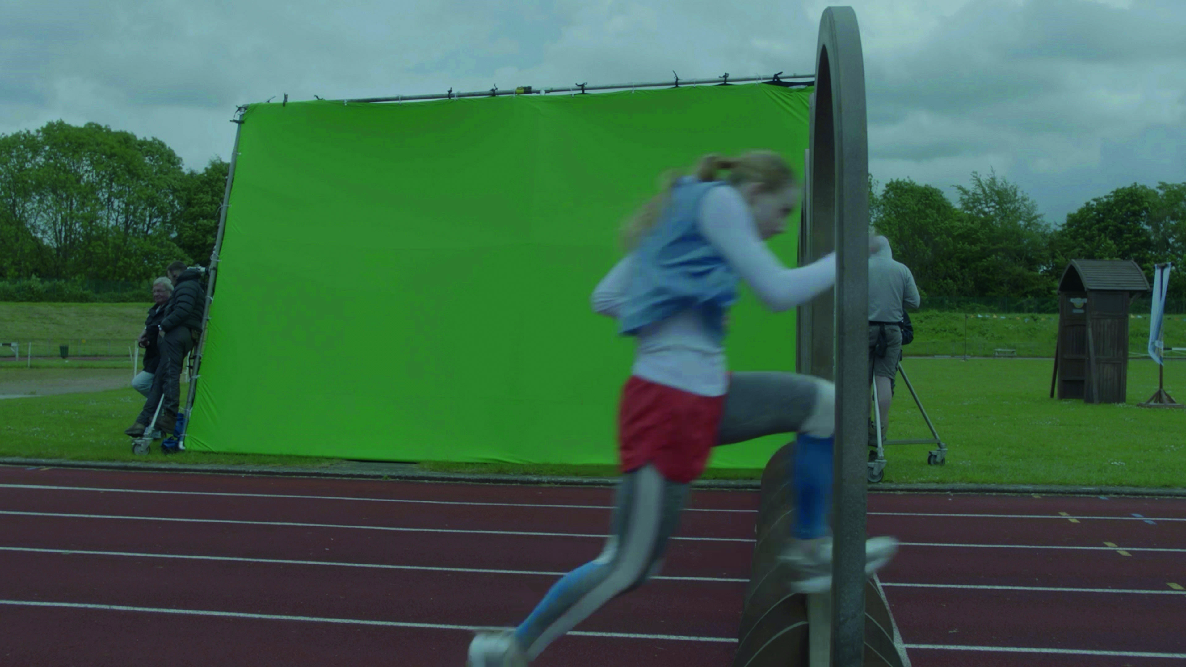
The next thing we looked at was the motion of running. There is a bounce to running, and a problem with some of the speed running we looked at is that if the plate is too smooth, then the character looks more like they're sliding. To get over this, we tracked the plate to the runner using Nuke to give it the bounce. This instantly improved the composite. In addition we added motion blur on this new translation and slight aberrations with the central point on the runner. These started to give the plate a feeling of being warped with time as if the viewer was moving, so even space began to distort, adding to the feeling of speed.
04. Learn to track at warp speed
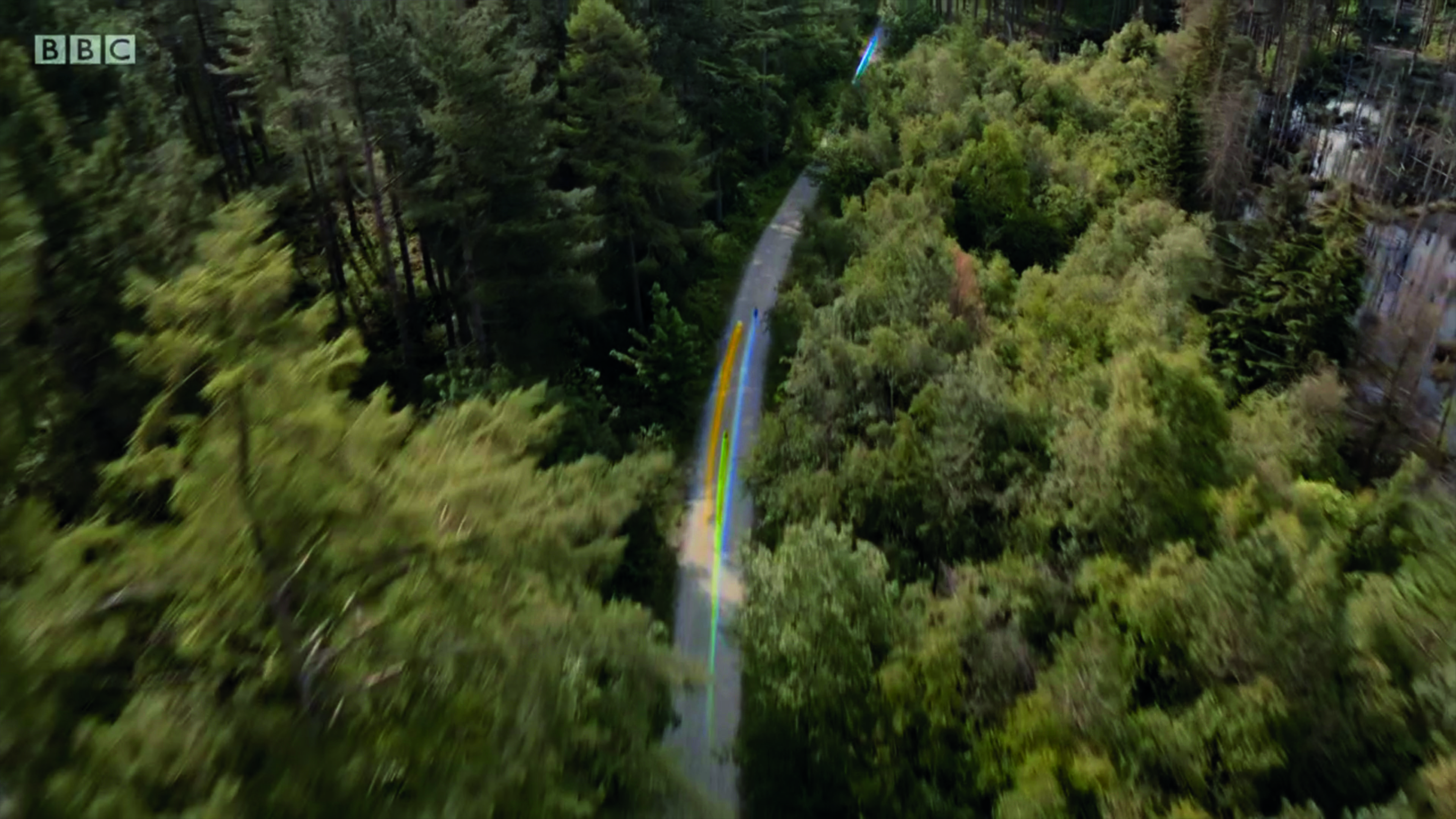
Next was creating the 'effect'. We needed something visible on a wide shot that could be seen on a running track, up hills, through forests, even if the character was moving faster than the eye could see. We created a trail of several layers of particles and ribbons flowing from them. Using tyFlow in 3ds Max, along with Phoenix, our artist created these trails, textured with light-emitting materials and construction of falloffs to add to the magical quality.
05. Disturb the air
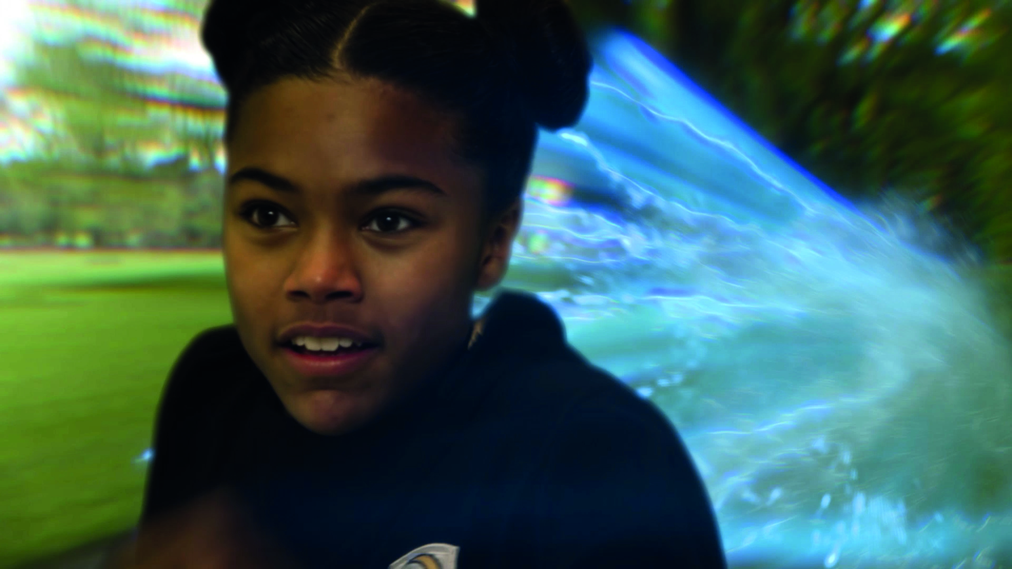
Using the layer of particles and ribbons, we warped the background in a sort of heatwave to make it look like the air was being disturbed or warped, taking inspiration from drag tunnels used to test aerodynamics and, more fantastically, the Tron bikes' signature deadly weapon – leaving a striking light trail behind them. Except in ours, the light trails didn't explode other witches into tiny pixels, for obvious reasons – this is a spell, after all, for a children's television series.
Within Nuke we used the Sapphire plugins due to their lovely optical quality to warp the background. Now we had a background bouncing to the runner with the edges of the frame beginning to distort and a trail of air flowing behind the witch. Now we were up and running.
06. Add the 'magic'
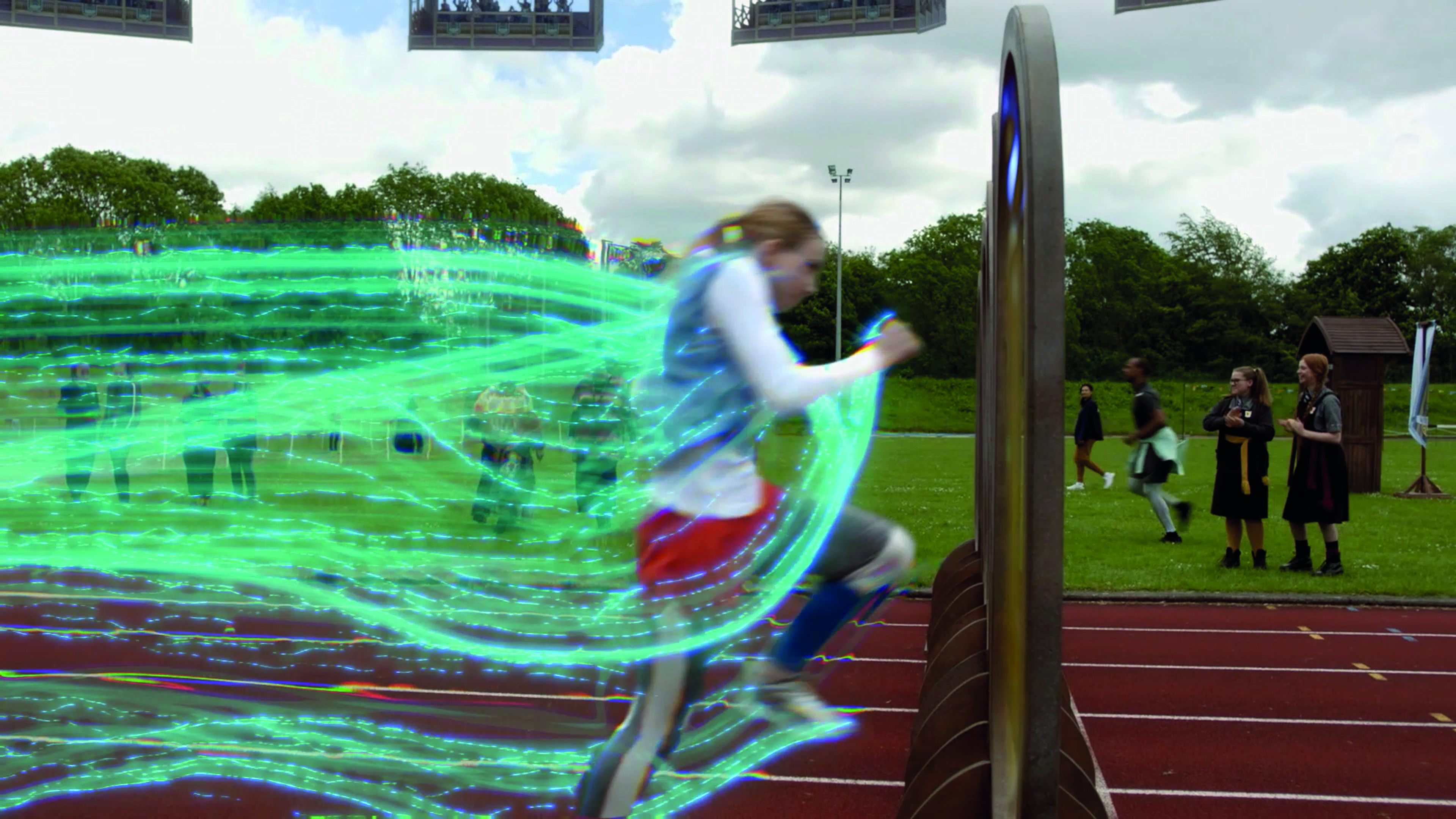
Once we were happy with how the effect looked and moved, we shifted focus to the magic. We added the colour and then the 'magic particles'. The colour needed to be added for clarity of the effect, and combined colour grading the background using the mattes of the particles and adding the coloured trail over the runner and the plate, integrating the runner into the effect. Any effect like this is always about the layers, very little in nature is simple and clean. In a fire you have flames, smoke, sparks, embers all moving in their own way. It creates a combination of different speeds and depth to give a dense richness to the fire. In the same way, we added in swirls of Phoenix particles to add a magic, smokey element and tiny dots to be the sparkle to the spell.
07. Put the layers together
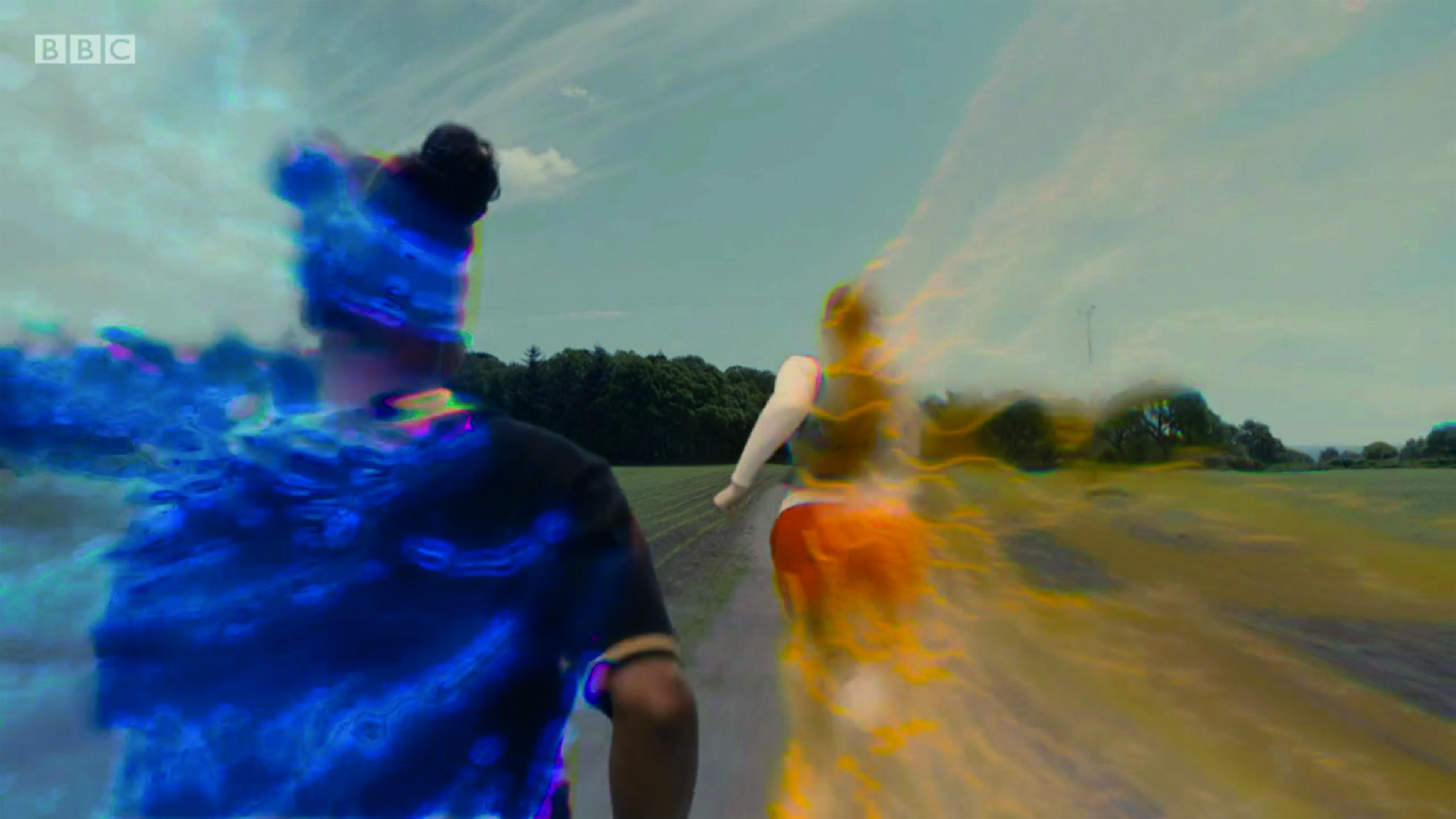
All these layers were emitted from a base geometry of a runner whose movement was rotoscoped. This gave us the bounce mentioned earlier to the stream. The pumping of the arms also enhanced the wind flow look of the particles. The more natural and realistic trail was the one created with ribbons – something grounded in the reality of our world. The thing we needed from the emitter was the bounce and the pumping limbs, not the trajectory. Our artist came up with the ribbons that would always look like they are being trailed behind them, giving us the ability to lengthen and shorten the ribbons depending on the framing and what would work best for that shot.
The magic particles were created using Phoenix to give a smoke-like quality to their movement. These were more chaotic in movement, like running through smoke and the curls and wisps that this would create. Within the comp, the magic particles then get glints and glows added to up their magic level and coloured to match the hue of the trail.
08. Master colour coordination
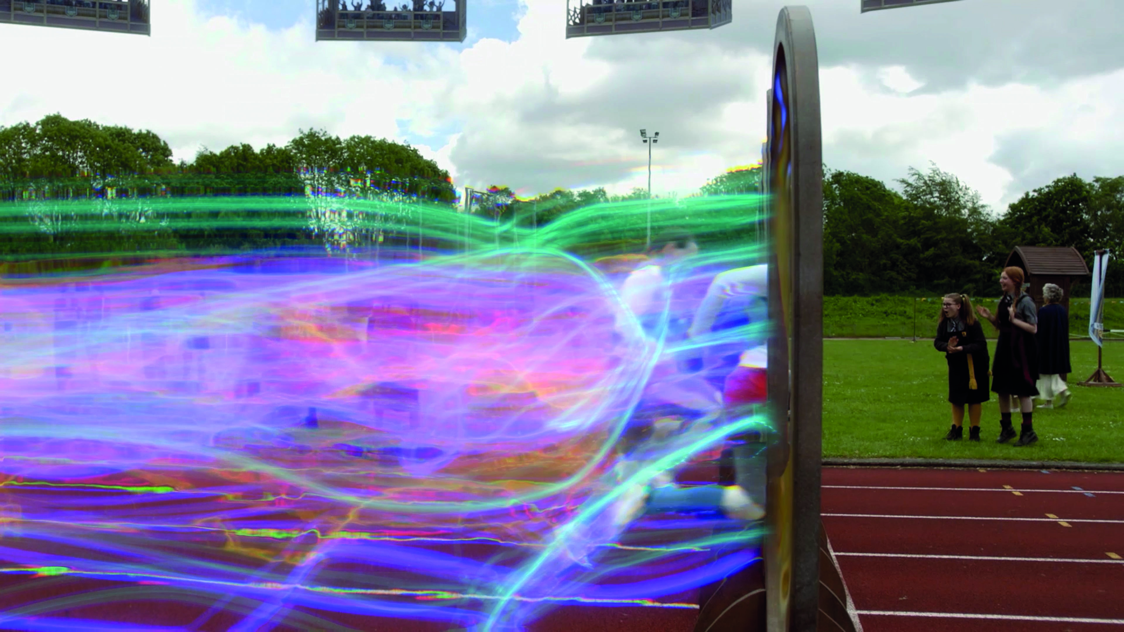
Finally we needed to help the audience figure out who was winning a race whilst maintaining the speed effect. We gave each a different colour, some of which were through the characters' personalities or traits which brought the VFX in line with the script and the show. The language of colour communicating the character is well established in film: red lightsabers = bad, green and blue = good, for example (for more on this, see these guides to colour theory and 12 colours and the emotions they evoke).
We'd developed this effect on Enid, the principal character in the running arc of the series, as a blue trail. It worked well against the backgrounds and looked cool, so we stuck with it as her colour. In the race in the academy the bad witch was red, her sidekick was purple and so on. Then in the big race Enid's rival would also take up the red mantle – it gave the largest separation of their trails.
09. Be inspired
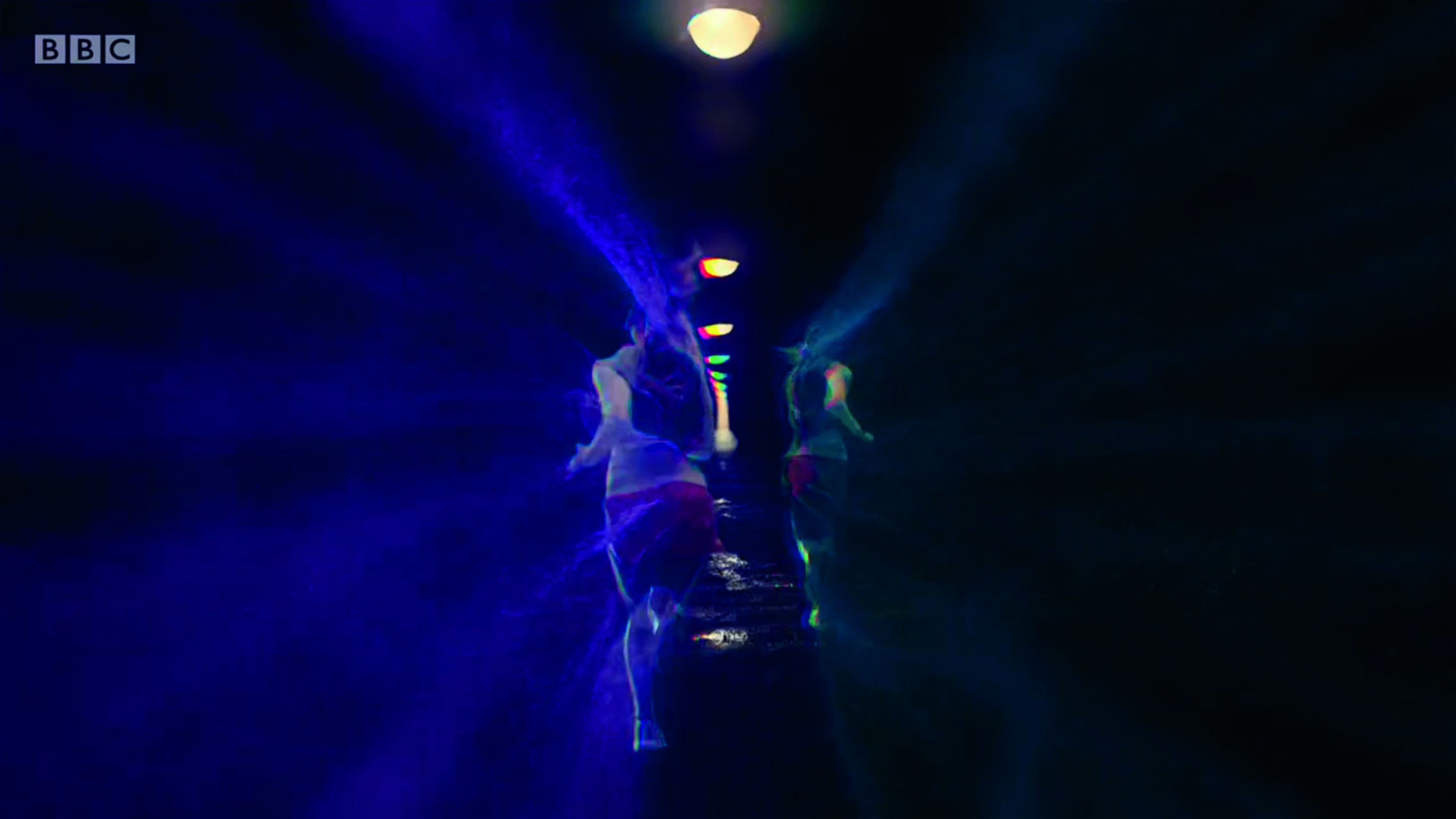
Creating original VFX is not easy to achieve, but the greatest inspiration comes from what is already around you. Locations such as most of Iceland, Lake Powell in Arizona or Finse in Norway are used as prime sci-fi locations because they're mesmerising and desolate at the same time. However, turning what exists into something that doesn't require an understanding of physics, but for VFX in general, the ability to creatively combine what is in front of you with new and different ideas, borne from a single line of script. It's the best part of the job.
This article was originally published in 3D World, the world's best-selling magazine for CG artists. Subscribe to 3D World.
Read more:
- How to make a music video
- Special effects in movies: The best visual effects that elevated cinema
- Essential VFX tools to get you creating
Get the Creative Bloq Newsletter
Daily design news, reviews, how-tos and more, as picked by the editors.

Thank you for reading 5 articles this month* Join now for unlimited access
Enjoy your first month for just £1 / $1 / €1
*Read 5 free articles per month without a subscription

Join now for unlimited access
Try first month for just £1 / $1 / €1
