How to create vintage art from He-Man 3D scans
Make striking vintage art digitally using 3D scanned He-Man toys.
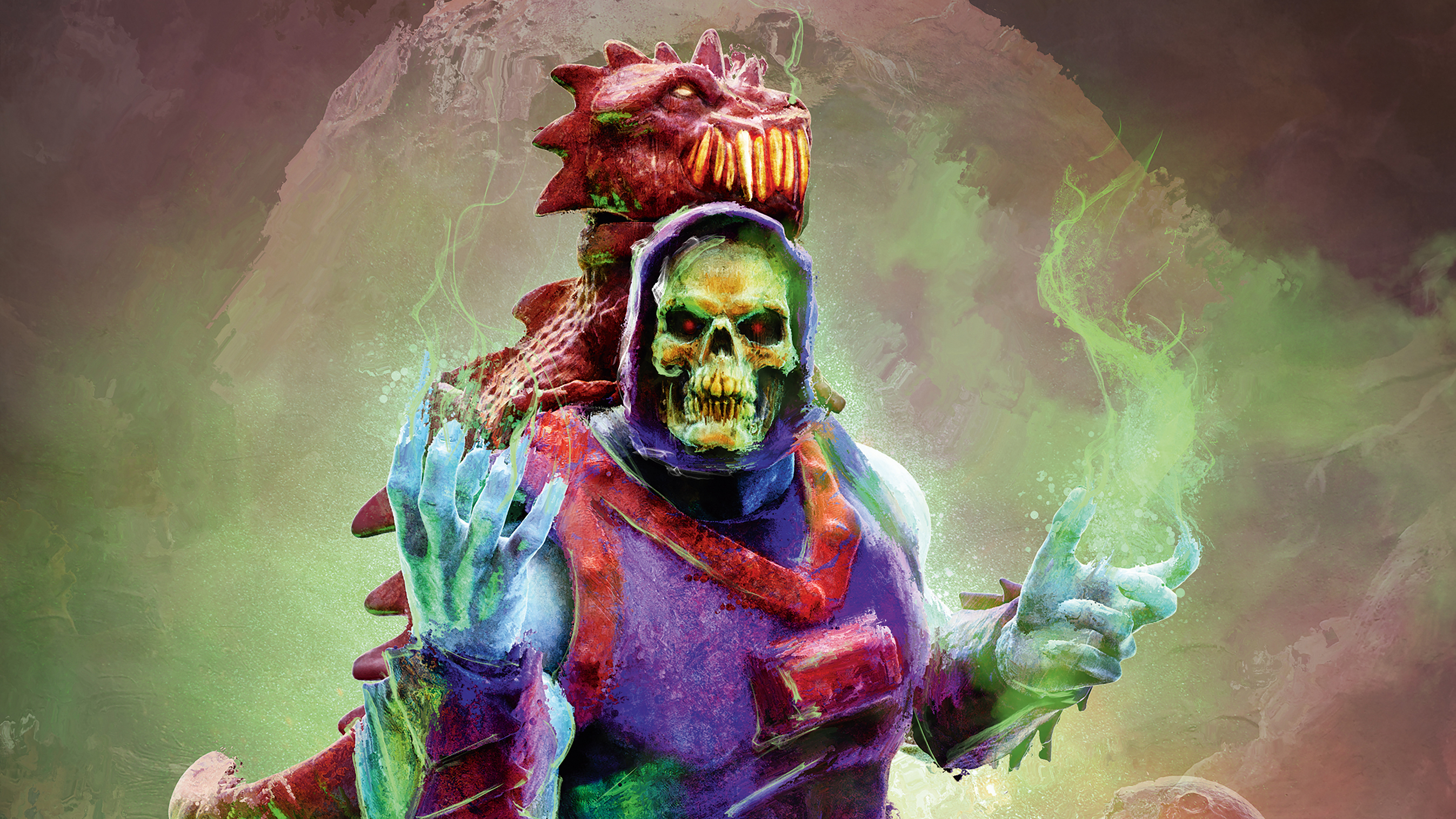
Creating vintage art can be achieved in many ways. But have you tried scanning old toys and painting over them to make unique digital art that recalls the 1980s heyday of the Masters Of The Universe? Combining his love of customising action figures and kit-bashing 3D models for concepts artist Ken Coleman will show you how to do just this.
Over the past year Coleman has developed an extensive library of 3D scanned assets, including character heads, armour and weapons to composite scenes of his favourite characters from the world of He-Man, Skeletor and the Masters Of The Universe.
Get 3 issues of ImagineFX for $3 / £3
ImagineFX is the leading title for digital artists. Its 13 issues per year offer exclusive inspiration, advice and interviews with some of the world's leading artists, and as a subscriber, you'll get access to every single issue, direct to your door or device!
Offer ends 10am, 17 October 2021 (GMT)
The vintage toy box art, 1980s iconic movie poster art and Frank Frazetta are strong influences on the type of finish Coleman is aiming for in his nostalgic imagery. In this workshop Coleman will explain his process, from how he 3D-scans and prepares the models, before importing them into ZBrush. He'll show you how to use basic ZBrush navigation tools such as Gizmo, Transpose, Subtools and Brushes to build a character, combining a model he previously posed and exported in Daz 3D.
The workshop will continue on the lighting and rendering of different passes of the model in KeyShot. These KeyShot renders will then be combined in Photoshop to build an image mixed with his own hand-painted backgrounds and textures and then given a final paint-over in Corel Painter to get that 1980s-style oil-painted finish.
Follow along with Coleman in his own words…
01. Preparing for the 3D scans
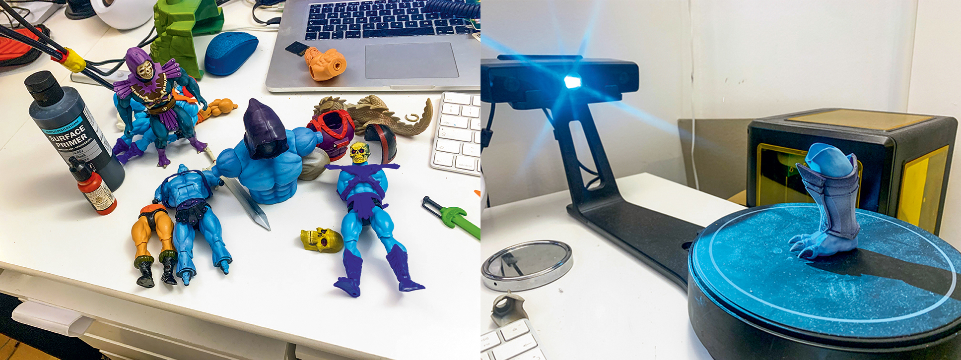
I prepare a figure in Daz 3D – I have a favourite for my Masters of the Universe projects called Dark Guard. I combine him with some animal and beast morphs to get the clawed hands and feet. I then export this as an object file to be used in ZBrush. I scan the various parts of the figures with my EinScan-SE 3D scanner. The larger-scale models are great for detail on the face, but the armour parts on the seven-inch scale figures are perfect for blocking in 3D.
02. Building the ZBrush figure
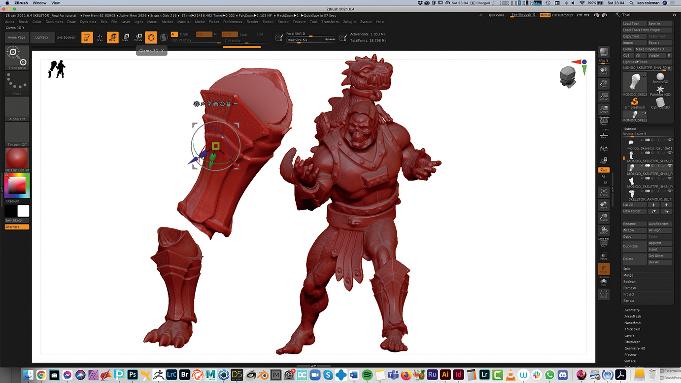
I import the Daz 3D model into ZBrush and press T to make sure the model is functioning in the 3D space. Using the Subtool palette on the right of the screen I duplicate the figure and press Import. I select the 3D scanned elements by repeating this process. Every time I duplicate a Subtool and press Import, the new model part will replace the previous one in the composition. I have to be careful to scale the 3D scanned parts using the Gizmo and Transpose tools – not all scanned parts are correct when imported.
03. Lighting in KeyShot

To import the model from ZBrush to KeyShot, I go to the Render menu, select External Render, turn on KeyShot and then press the BPR button. This will import the model directly to KeyShot. Once the model appears in KeyShot I go to Edit>Add Geometry>Sphere. I can then make a light source. To do this, I double-click the sphere model in the scene window in the top right of the screen. When I click the light bulb symbol that opens beneath it, I can change the material to Area Light>Set to Watts.
04. Creating materials in KeyShot
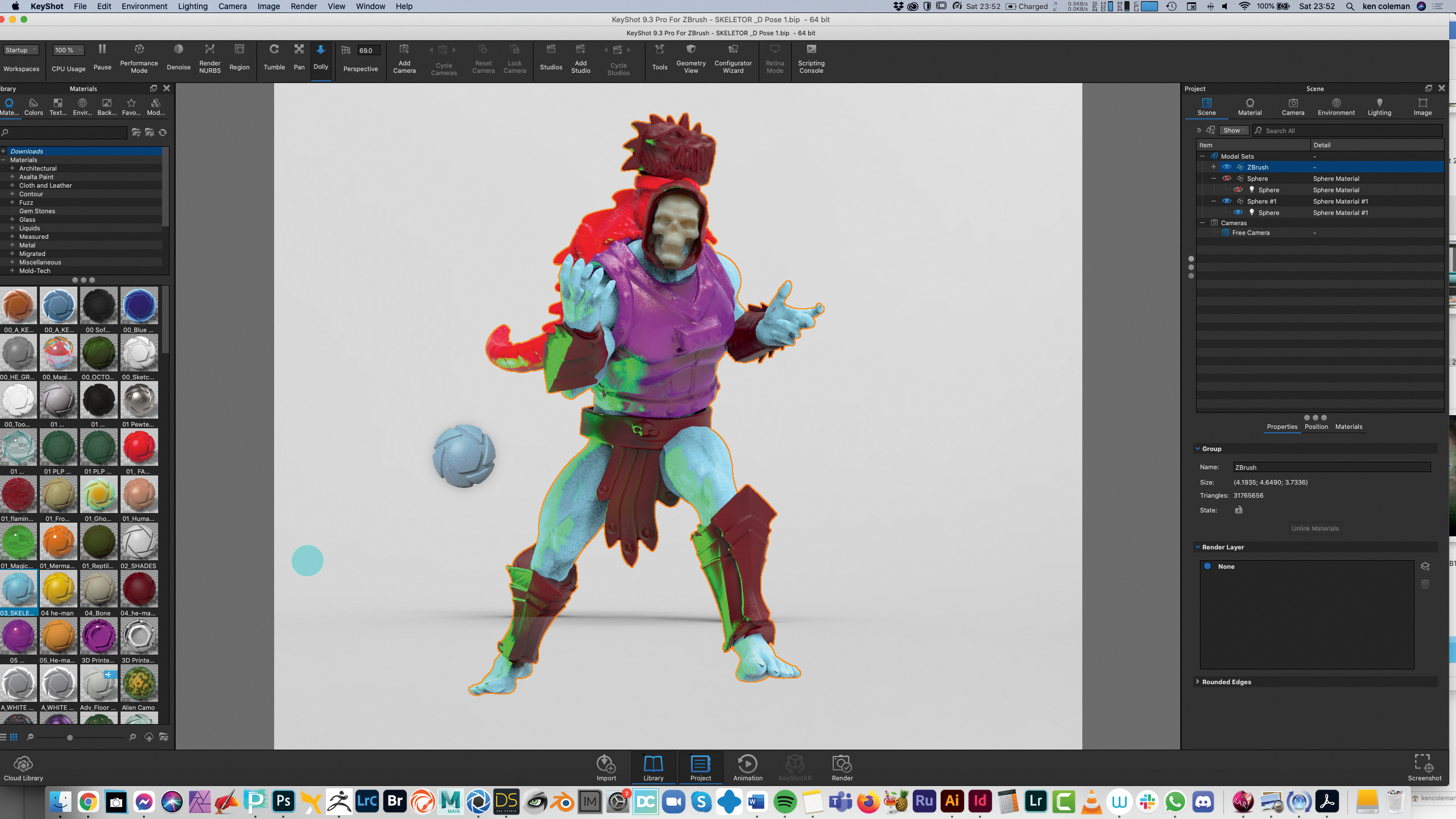
KeyShot enables you to drag and drop a material on to any of the separate Subtool elements to colour it. You can also apply a material to the whole model by dragging the material over to the Scene section and dropping it on to the ZBrush label, which is the model and all its elements. If you do this you must press the Lock button in the bottom window twice and Press Unlink Materials to add different materials individually.
05. Listing your KeyShot materials
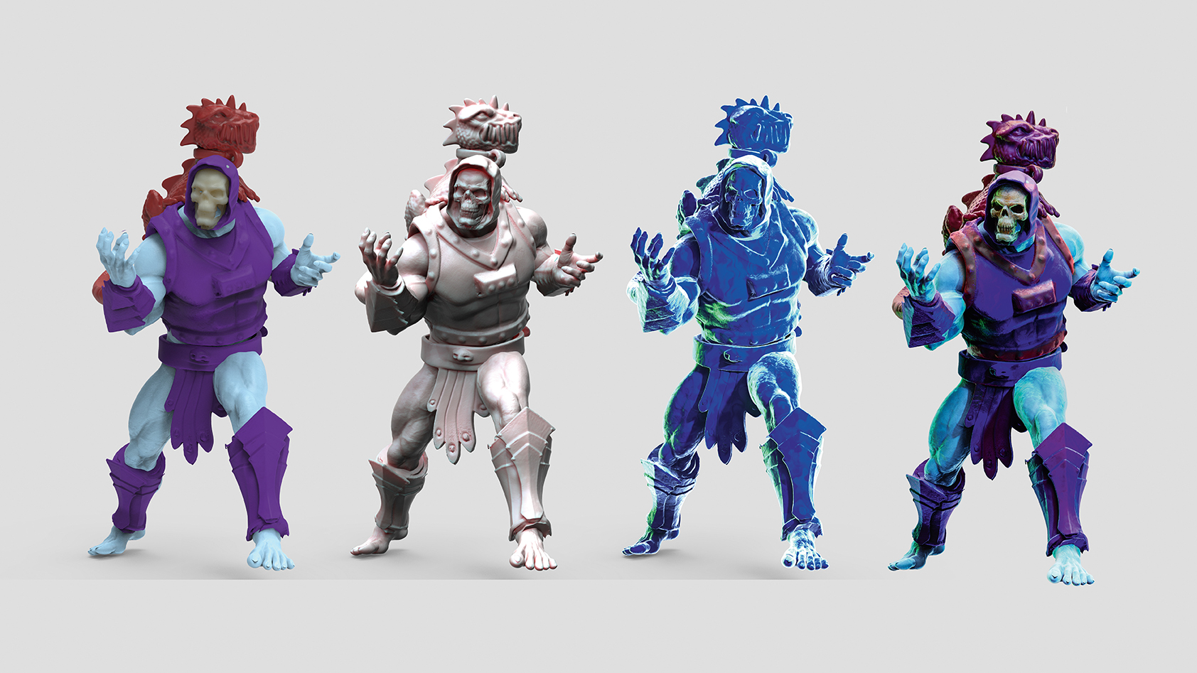
I use the same materials apart from the character colours to achieve the right look and translucency of light. Skeletor’s face is bone, his skin is electric blue and I use metallic and non-metallic colours for his armour. The other KeyShot materials are GOZ Human Skin and Blue WHITE RIM LIGHT. I export each render as a hi-res PSD file with the clown option turned on to create a silhouette to use for selections in Photoshop.
06. Combining the layers
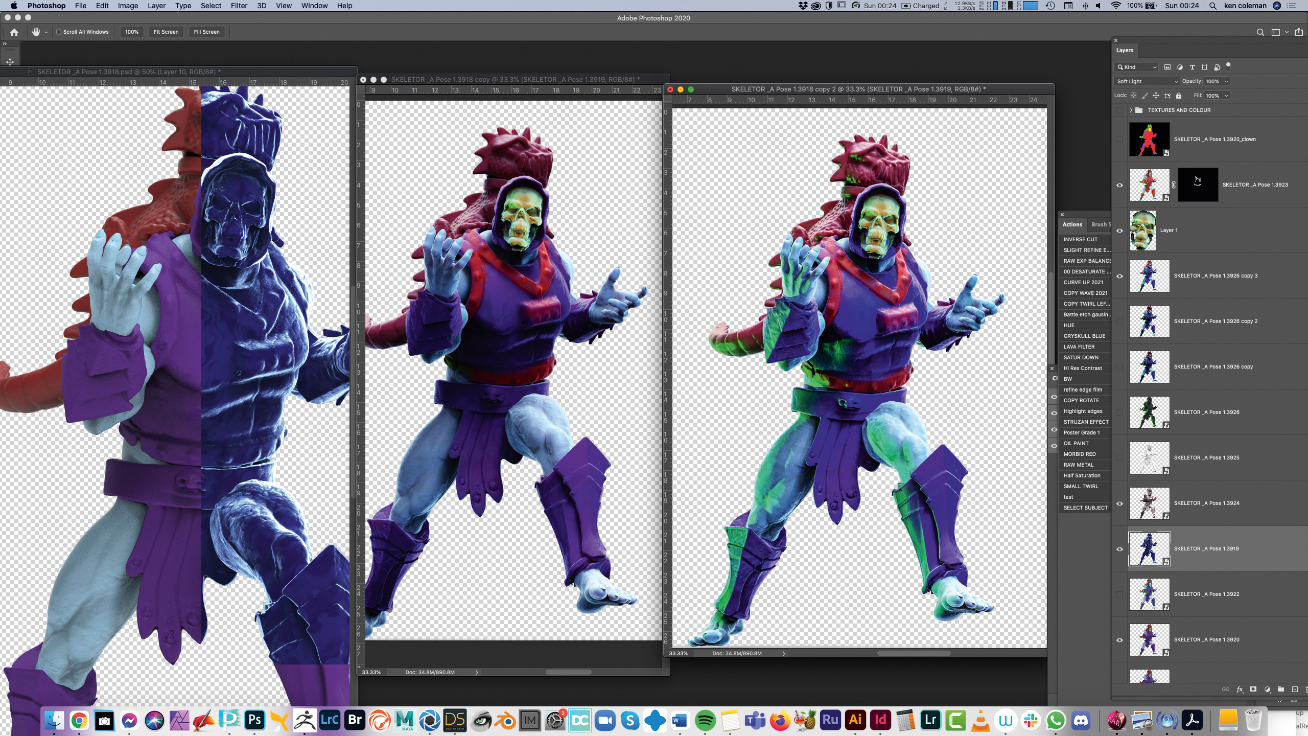
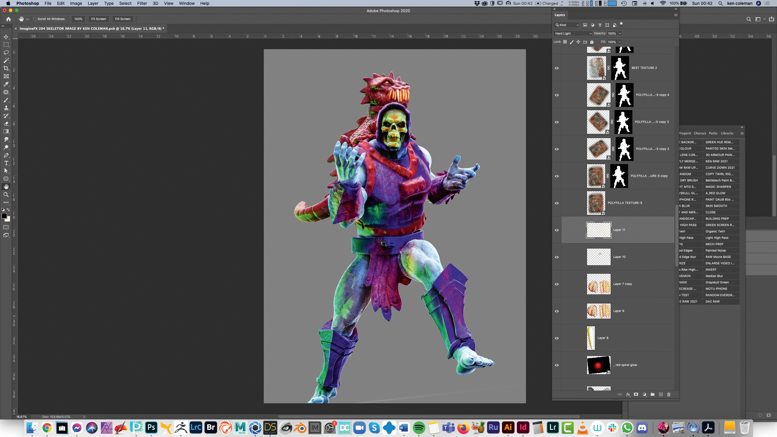
Once my renders have completed I open the basic colour one in Photoshop. Next, I drag the other layers into this file as Smart Layers. I set the GOZ layer and Blue Rim layer to Soft Light Blend mode. Once I’m happy with the level of translucency of all my layers, I select them all, copy them and merge them (the shortcuts are Ctrl/Cmd+J followed by Ctrl/Cmd+E). I duplicate this layer one more time for the next phase.
07. Using Camera RAW in Photoshop
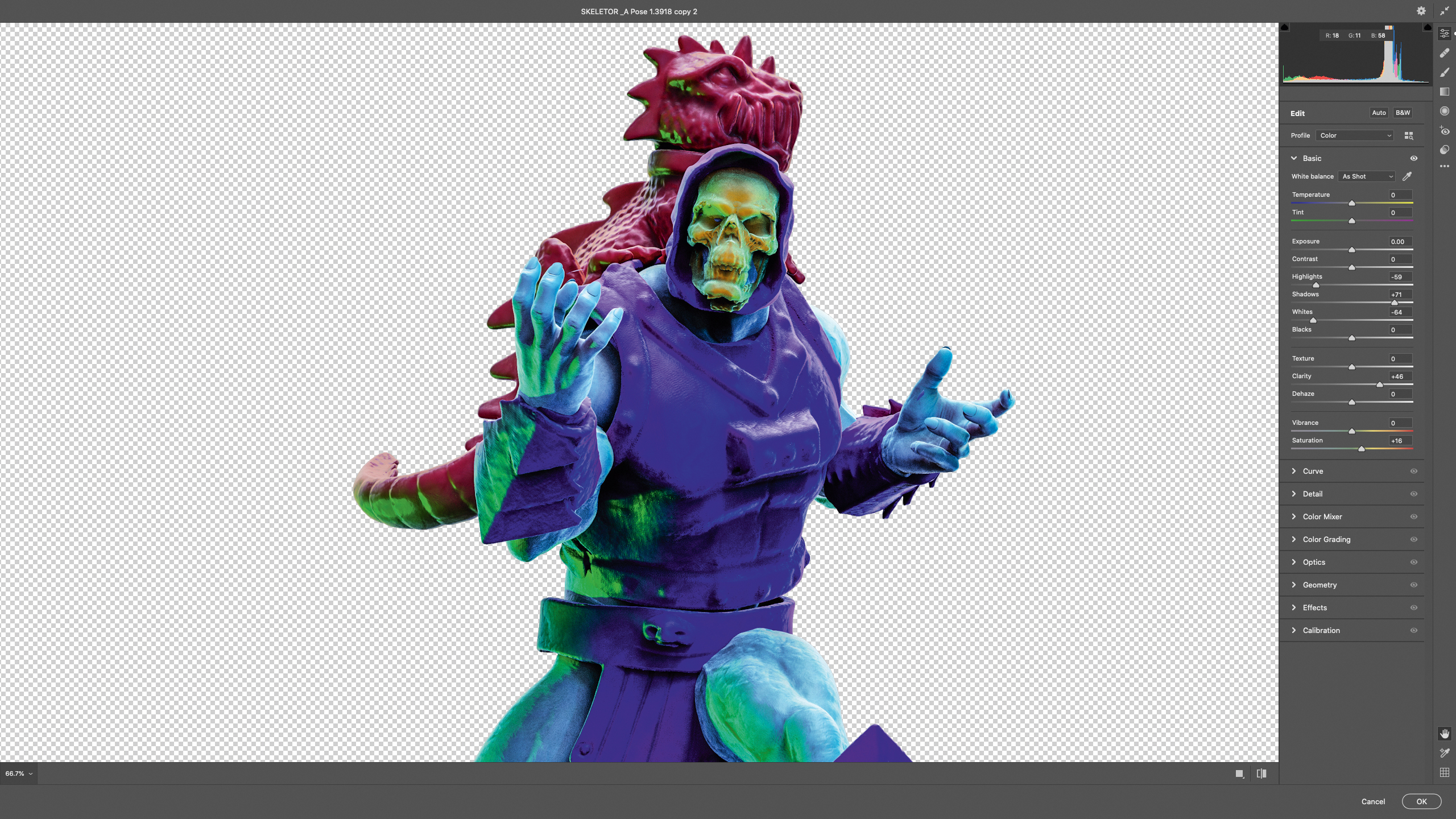
Photoshop’s Camera Raw filter is a powerful tool for adding a degree of punch to your illustrations. Select the top-most merged layer copy and press Filter>Camera Raw Filter. You can see from the image how I’ve placed my sliders. My approach is always Shadows up, Clarity up, Saturation up slightly and Highlights and Whites down. This extra tweak really gives a burst of colour and detail to your 3D render.
08. Adding texture and detail
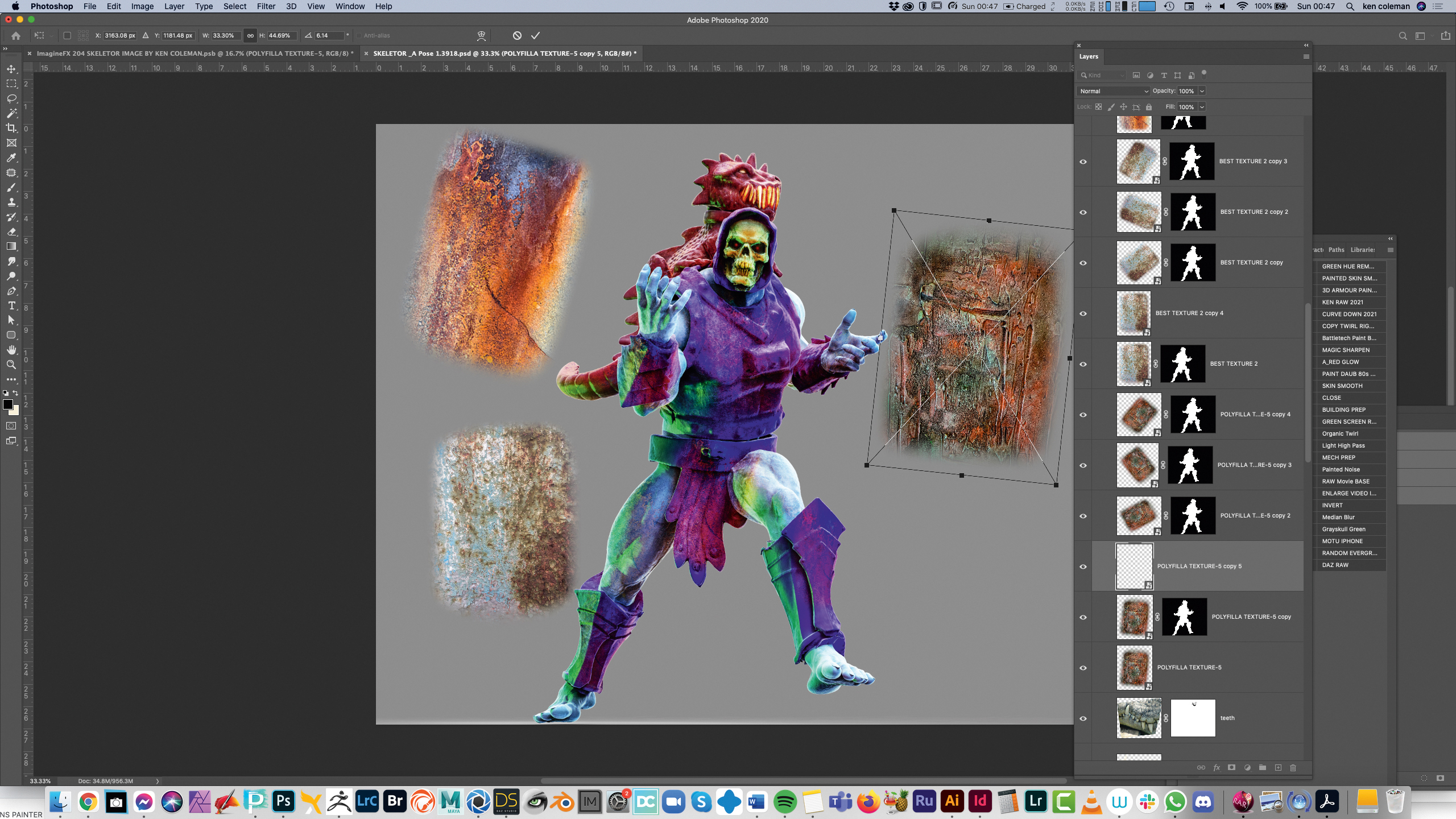
I find that using photos of rusty surfaces and stained concrete are fantastic
for creating detail and depth in images. The concrete and porous stone is my favourite textures for the skin. I drag these elements on top of the figure and I mask them using the silhouette from the clown layer that I exported from KeyShot. My painted Polyfilla layer is especially useful and fun for creating a bone-like effect on Skeletor’s face.
09. Composing the layout
Now that I’m happy with the overall figure, I group all the elements. I create a new file the same size as an ImagineFX page at 22x30cm but at 450dpi for higher resolution. Most of my work is at least A2 in size at 300dpi. I now drag the figure group across and start to place background elements and particles to build a scene. I have folders of hand-painted backdrops, particles and objects to help build scenes quickly.
10. Hand-painting the backgrounds
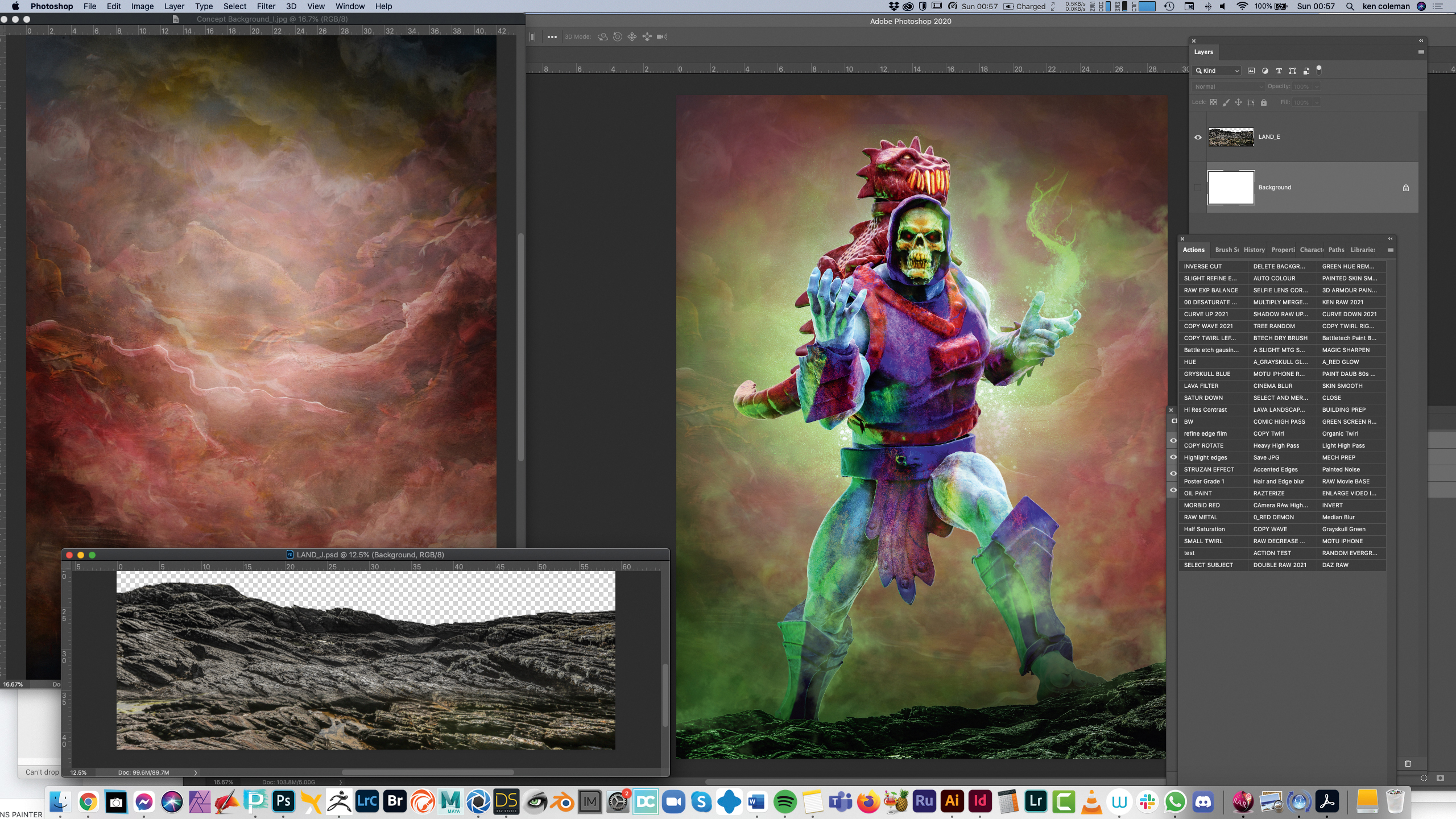
I add stock photos of some Irish coastal landscapes and one of my hand-painted backgrounds. I’m lucky that there are many local landscapes and textures to help enhance my work. Using my local environment in my art is important to me. My hand-painted clouds were created on various large canvas, photographed and combined in Photoshop to create a set of various backgrounds that I can drag and drop into my art.
11. Adding my own particles
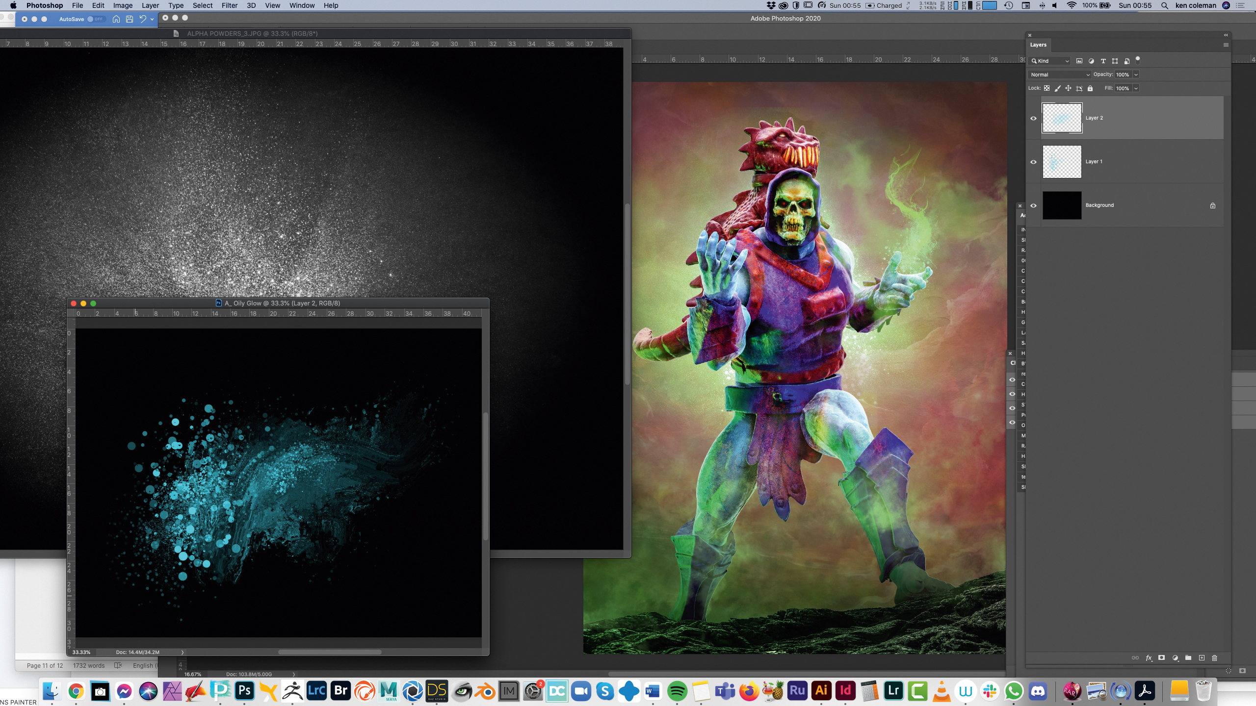
I create my own particles by taking a photo of baby powder on black craft paper, as well as creating particles with Painter’s Particle brushes. I add these elements by placing them in the scene and setting the Blend mode to Screen. I also create gradients of green by selecting the colour from the glows on the 3D figure’s body. Using the Gradient tool and cloud brushes I create directional light that matches the model.
12. Final prep before paint-over
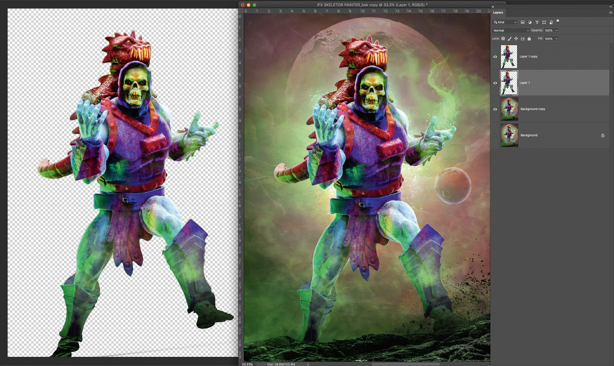
Before bringing the composition into Painter for a paint-over, I click Image> Duplicate to create a copy of the file. I select the figure’s outline, then flatten the image and copy and paste just the figure over itself. I now have options to use Blender brushes on the figure and background separately in Painter. Using large oil brushes for the background and more refined fractal brushes for the skin gives a nice sense of depth.
13. Breaking up the image in Corel Painter
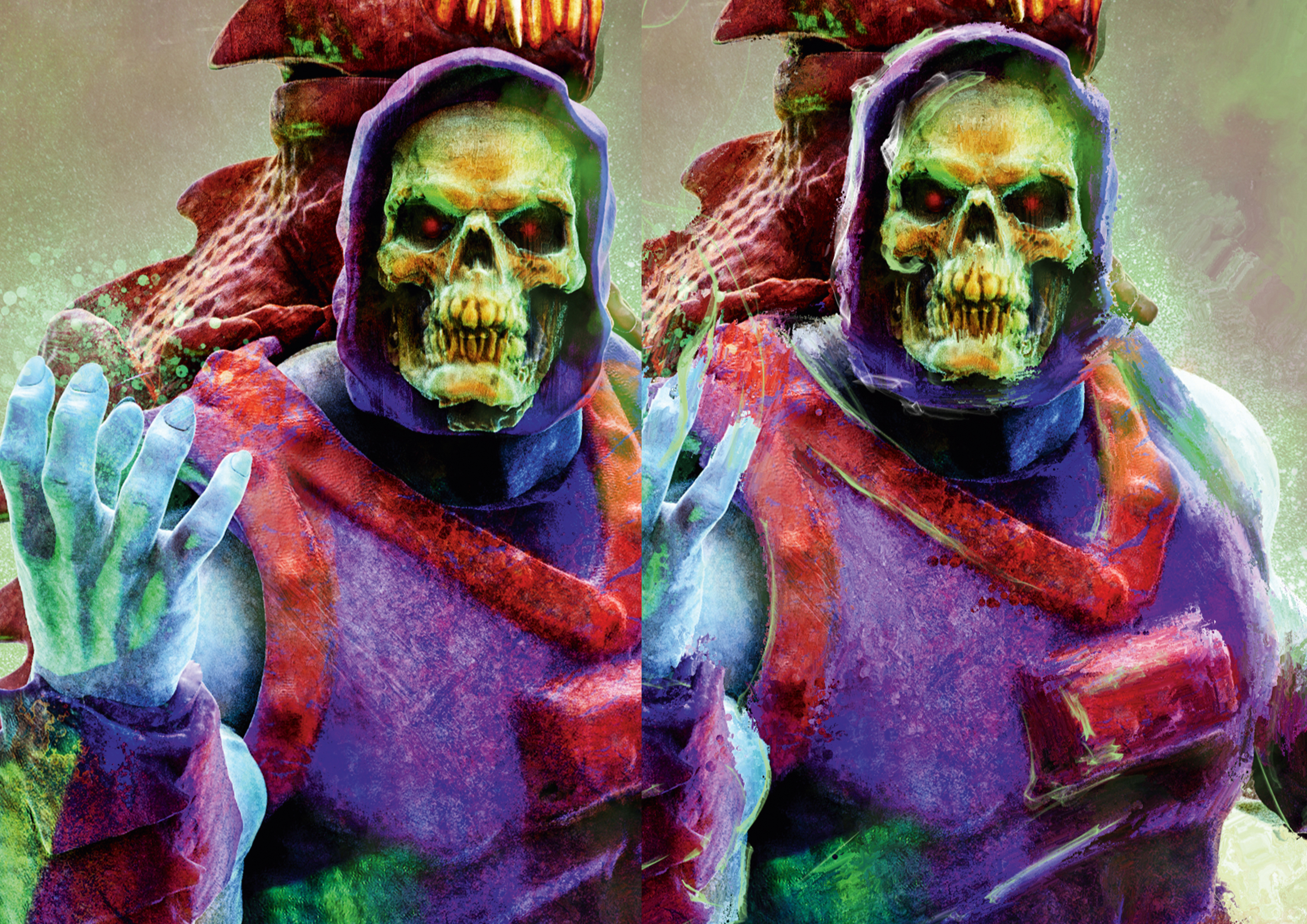
You can save the file to the cloud so you can open it on an iPad and use blender and fine art brushes in an art app such as Procreate or Fresco. However, I choose to use Painter on the desktop. I use a limited number of Brushes on the merged layers. My favourites are Stencil Oily Blender and Fractal Blender. I also place some white or brightly coloured, thin highlight lines on a new layer with the Spring Concept Creature brush. Shown here: the before and after versions in Painter.
14. Finishing the art in Photoshop
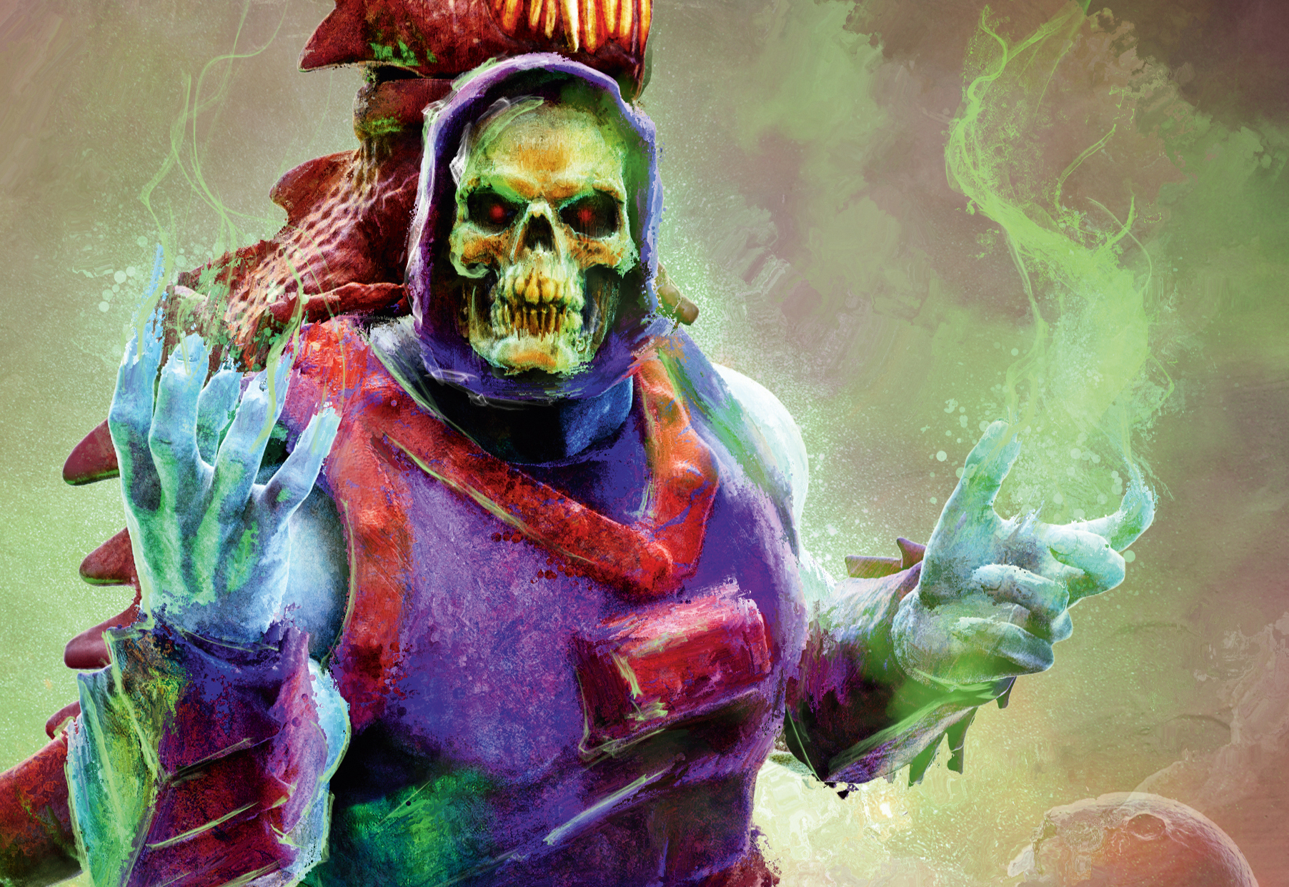
I reopen the image in Photoshop and set the highlights to a Soft Light blend mode. I also experiment with the Opacity of the painted layers and sometimes mask off areas where I may have gone overboard with Painter. The idea is to balance the abstract brush work with the detail and silhouette of the final image. Sometimes I merge and duplicate everything on one final layer and use an Unsharp mask set at 200 per cent at 0.2 pixels for clarity. Finally, my 3D scanner is costly, but try experimenting with smartphone apps such as Bellus3D and LIDAR 3D to create 3D models of everyday objects to use in your artwork.
Never miss an issue of ImagineFX
If you liked this piece, you'll love ImagineFX. The world's favourite digital art magazine is on sale in the UK, Europe, United States, Canada, Australia and more. Limited numbers of ImagineFX print editions are available for delivery to over 120 countries from our online store (the shipping costs are included in all prices).
Read more:
Get the Creative Bloq Newsletter
Daily design news, reviews, how-tos and more, as picked by the editors.

Thank you for reading 5 articles this month* Join now for unlimited access
Enjoy your first month for just £1 / $1 / €1
*Read 5 free articles per month without a subscription

Join now for unlimited access
Try first month for just £1 / $1 / €1

Ken Coleman lectures in game art and design at Clonmel Digital Campus in Ireland. He also designs for clients such as Catalyst Games and Morbid Angel.
