Create style frames in Photoshop
Make style frames to convey the mood of motion graphics.

A style frame is a snapshot of a finished frame as it would look within a longer animation. It aims to capture the overall look and feel of an animated or live action video, but in a still image.
Style frames can help capture the colours, mediums, textures, photography, and assets that you plan to use in your video. Showing a client both a storyboard and style frames is an excellent way to make sure you both are on the same page for what to expect with the project.
![These examples are very different, but all do a great job of communicating what the final piece will look like [click the icon to enlarge the image]](https://cdn.mos.cms.futurecdn.net/JZK5wzkaAqKn5Nmntea6V3.jpg)
You can see in the examples above that style frames don’t show every frame of the video, as a storyboard would.
Let’s get into what it takes to create style frames in Photoshop. We'll focus on some of the main techniques you need to know to make multi-photo composites all feel like they are part of the same piece of work.
For this tutorial we'll use an example for a title sequence that would precede a new TV show. This show has themes of mystery, preconceived notions about class, and it’s based near the ocean.
01. Start with a single image

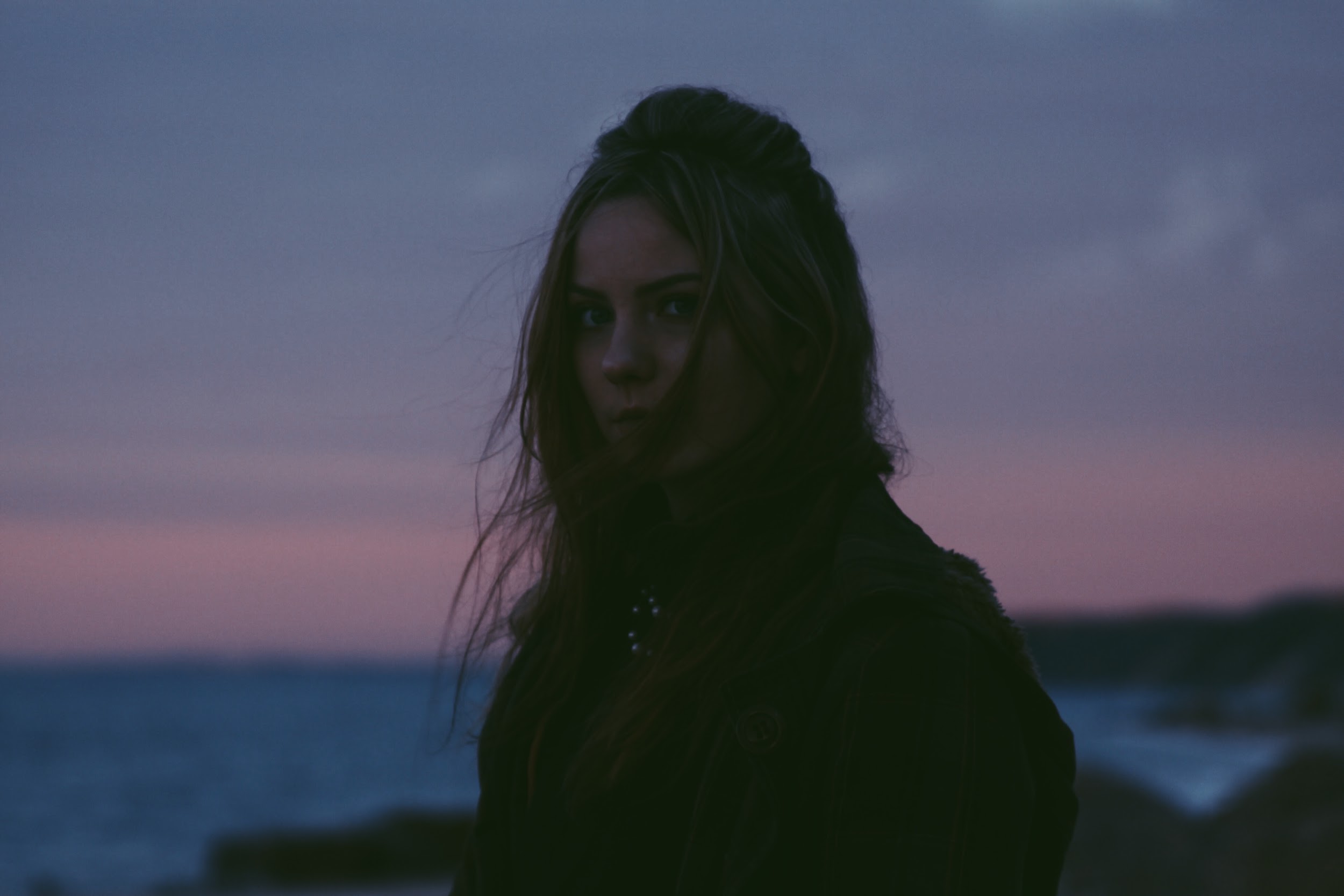
First, let’s take a look at the star of our show. The photo above will be our starting point, and I have a lot of plans for it. I want to isolate our hero from the background, wrap some neon light loops around her, and integrate them by adjusting the lighting.
02. Cut out the figure
![Start by quickly selecting the rough silhouette [click the icon to enlarge the image]](https://cdn.mos.cms.futurecdn.net/ytkma4LcPQQ7AGLZBhniM3.jpg)
Start by using the Quick Selection tool to get most of the figure’s silhouette. Click the Select and Mask button at the top, and a Properties dialog will appear. Make sure your view is set to Onion Skin and turn the Transparency slider down so you can see the area you’ve already masked out.
Get the Creative Bloq Newsletter
Daily design news, reviews, how-tos and more, as picked by the editors.
03. Focus on the hair
Now let's deal with those wispy hairs. It would have been tricky to cut these out using just the Refine selection tools, but Photoshop CC 2017's new Select and Mask functionality make things much simpler, even considering the low light conditions in our image.
Grab the Refine Edge brush tool and begin painting it over those hairs. Now crank the transparency back up to 100% to see where you need to use the Brush tool to bring back any areas where you’ve overdone it.
04. Finalise your selection
![Refine your selection until you're happy with the result [click the icon to enlarge]](https://cdn.mos.cms.futurecdn.net/JdjRLnSE8EceHdws4duAV3.jpg)
Repeat these steps back and forth until you’re happy with the hair selection. At this point, increase your shift edge just slightly, as well as the contrast, and add a bit of feathering (2px). Click OK. Click the Layer Mask button to commit this selection to a mask.
05. Adjust the background
Now add a solid background. Use the colour picker to match a dark shade on the figure’s jacket. You might notice that the selection doesn’t look as perfect now it’s isolated on a dark background – don’t worry, we’ll cover this up with the relighting.
06. Paint in some neon lights
![The swirls should both overlap the figure’s head [click the icon to enlarge]](https://cdn.mos.cms.futurecdn.net/Hc93DZcvVSRfQ8Ehym8kR3.jpg)
Before you get to any relighting, add those neon lights. Choose two colours from the subtle sunset in the original background: a soft pink and blue. Using the Pen tool in Shape mode, set the Fill to none and the Stroke to one of your colours. Set the Stroke Width to 26px.
Now you can have some fun – on two different layers, draw some pink and blue neon swirls.
07. Add a glow
![A narrower, white strip creates the illusion that the lights are glowing [click the icon to enlarge]](https://cdn.mos.cms.futurecdn.net/hoofdfUxBpD5gqG7ApkkM3.jpg)
Now duplicate both of the shapes, change the stroke colour to white and decrease the stroke width to 9px. This white stripe should sit in the middle of each swirl – if you notice it’s not lined up correctly, select all your strokes and use the Set Shape Stroke Type drop-down to choose Center Alignment.
Change the feather of the wider strokes to 9px and the feather of the narrow white ones to 5px. If you feel the effect isn’t vibrant enough, duplicate the coloured strokes and feather them at 6px.
Clean up and group all these by selecting them and hitting the Create Group button. Finally, add a layer mask to the group and paint out the area of the lights that goes behind the figure’s head.
08. Start relighting
![Use the neon shades to paint over the wispy hairs [click the icon to enlarge]](https://cdn.mos.cms.futurecdn.net/q5M8QWhaxJ93eA4pVbPrL3.jpg)
To begin relighting, create a few new layers and begin painting over the wispy hairs using the pink and blue swatches. It should look rough and crazy.
Convert all your painted layers for smart filters and add gaussian blur. You want to blur the biggest strokes the most – for the smaller strokes, you might even want to turn the opacity down.
09. Mask your layers
![Save time by reusing our mask from earlier [click the icon to enlarge]](https://cdn.mos.cms.futurecdn.net/exfXNcmqxhoBgXnVbcNvP3.jpg)
We need to mask these layers, but instead of making a new mask, we can simply reuse the one we made before for the background. Hold alt and click the mask on the original photo. Then hit cmd+A to select all, and cmd+C to copy. Select each of the layers you painted on individually and add layer masks to them. alt+click into each of those masks and hit cmd+V to paste the copied original mask.
10. Refine your work
![Change the blend modes on your relighting layers [click the icon to enlarge]](https://cdn.mos.cms.futurecdn.net/nCta8MjY6YLN6EdYaAjqR3.jpg)
Go into each of those masks and paint black over any areas you think have too much colour. You can also use the Smudge tool on the light painting section, in order to add some of that wispiness back in.
Change the blend modes for these layers to something like Lighten, Screen or even Colour Dodge. I added another layer of freehand painting on top of the hair to give it a little more depth of colour. Put all these layers in a group called 'Relighting'.
11. Add some dust
![Motion-blurred dust particles really bring the image together [click the icon to enlarge]](https://cdn.mos.cms.futurecdn.net/FDeaU5eMj2CEapXURZ6hV3.jpg)
Now to really pull it all together I want to add a layer on top of everything that looks like some motion-blurred dust (download this photo from Shutterstock).
Place the photo at the top of the layer stack and resize it if needed so it covers the whole canvas. Change its blend mode to Screen. Add a brightness and contrast adjustment layer and alt+click between the adjustment and the dust layer to clip the two together, so the dust layer doesn’t affect other layers. Decrease the brightness slightly and crank up the contrast.
Next page: Add two more images to your style frame and tie all the colours together

Thank you for reading 5 articles this month* Join now for unlimited access
Enjoy your first month for just £1 / $1 / €1
*Read 5 free articles per month without a subscription

Join now for unlimited access
Try first month for just £1 / $1 / €1

Laura is a passionate visual effects and motion graphics author at Pluralsight. Her favourite projects are her two in-depth After Effects introductory courses on Pluralsight, which were each built around training motion artists and VFX artists, respectively. Using her vast skill set, Laura has taught thousands of artists everything from shot-tracking and rotoscoping to motion design.
