Create slick UI animations
Use Bootstrap 4, CSS3, Sass and HTML to create cool UI animations for this team page.
More and more frequently, designers and developers are acknowledging the importance of motion design in the context of user experience. Animation on the web is no longer a way to delight and wow the user but a functional tool that makes experiences easy, fun and memorable. And there are a number of different tools and approaches available, from CSS animation to techniques using Bootstrap or HTML.
Animation in the context of user interfaces is still a very new field. There aren’t many resources out there that teach best practice or show common patterns of UI animation that we can follow. Most of the time, it’s about experimentation, user testing and perhaps a bit of trial and error.
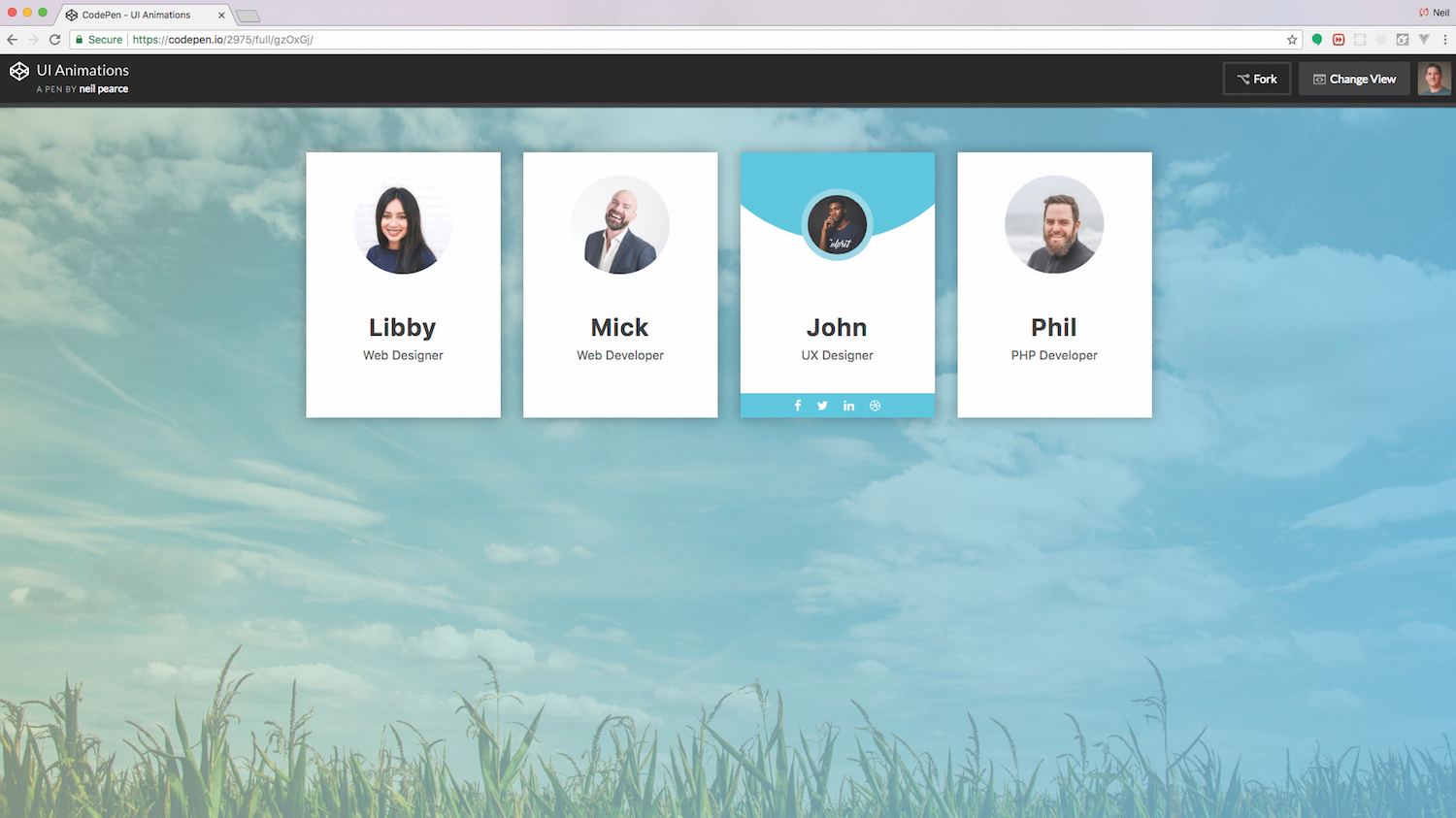
So in this tutorial, we will create something that doesn’t confuse, follows common patterns and is stylish. This will be the team profile section that you often see on company websites. The idea is to show a little more information on the team/staff member when each one is hovered over. Throughout the tutorial we will be using CodePen, but of course you can use your own favourite editor and development environment instead. Remember, creating a more complex site might change your web hosting needs so be sure you've got a service that works for you.
Would you like a straightforward tool for making a site? Use a brilliant website builder.
01. Get set up
Begin by opening up CodePen and creating a new pen. We’re going to be using Bootstrap 4 and Sass (.scss), so make sure that within the settings you include the Bootstrap CSS and JS as your resource links and also set the CSS to SCSS. Another resource link you will need to add is Font Awesome, which we will use for our social icons.
02. Create containers, rows and columns
Containers are what Bootstrap uses as its basic layout element and they are required when you’re using the default grid system. Within containers, you need to add in a row. Rows are wrappers for columns and you can specify the number of columns that you want out of a possible 12 and what the breakpoint will be. In our case, we want an element that has a medium-sized breakpoint and fills three columns in width.
<div class=”container”>
     <div class=”row”>
       <div class=”col-md-3”>
               <!-- add image link and colour here
        </div>
     </div>
</div>
03. Set profile image and colour
The first profile UI element we will start with will be for a female team member and she will be part of the blue team. The colour will be specified using a class called blue and the actual colour will eventually be defined using Sass variables, which we will do in a later step. Then we will need to add in a photo and give it a class called photo.
Get the Creative Bloq Newsletter
Daily design news, reviews, how-tos and more, as picked by the editors.
<div class=”team blue”>
    <div class=”photo”>
       <img src=”https://image.ibb.co/kcBGMS/profile_test02.jpg” alt=”Libby”>
     </div>
</div>
04. Add profile name and title
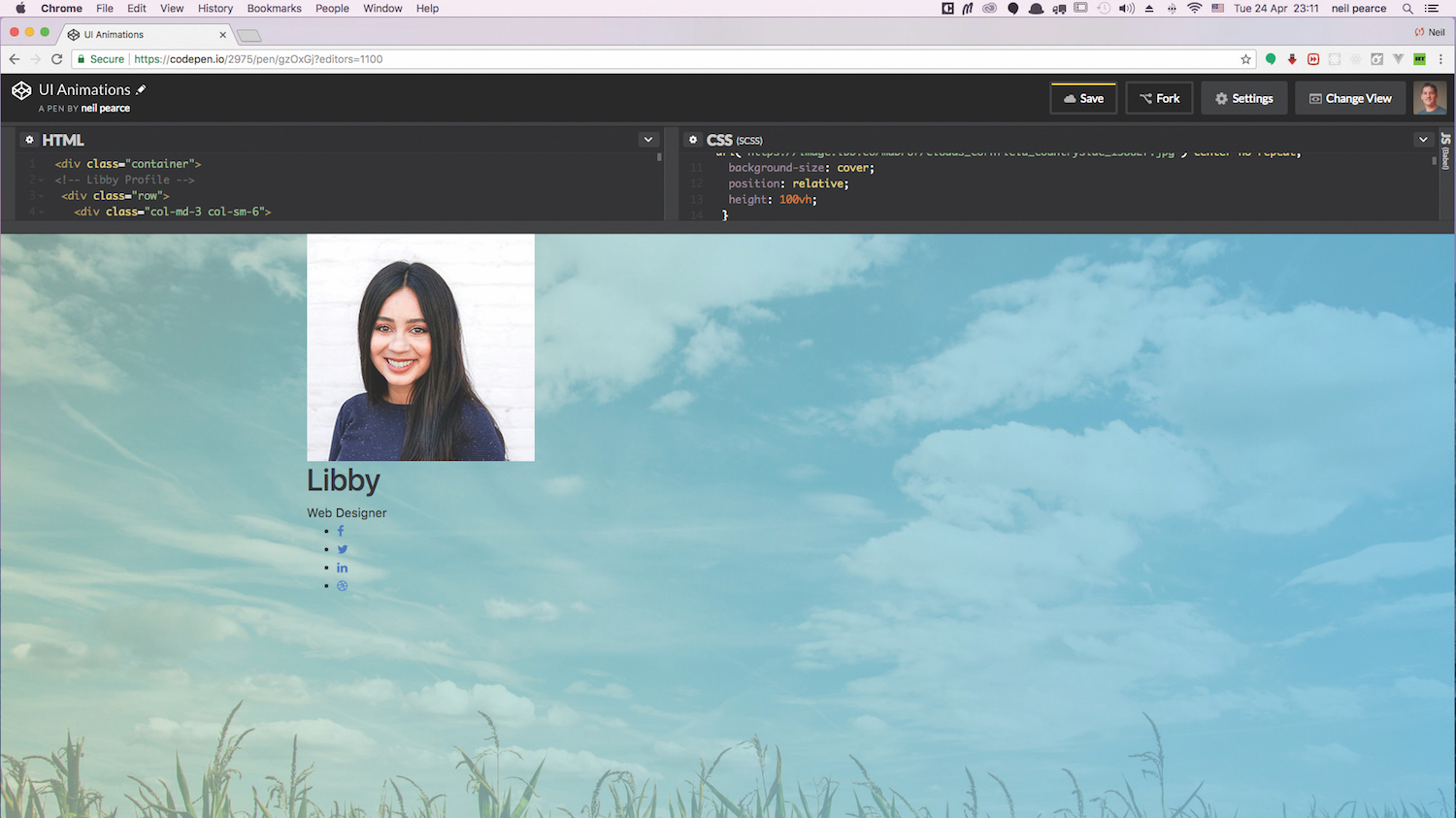
The last bit of HTML to be added will be for the name, title and social icons, which will be added underneath the last div tag we just added in the last step. For the social icons, we will be using Font Awesome and these will be placed within an unordered list.
<div class=”profile-txt”>
      <h1 class=”title”>Libby</h1>
      <span class=”position”>Web Designer</span>
   </div>
          <ul class=”social-icons”>
       <li><a href=”” class=”fa fa-facebook”></a></li>
       <li><a href=”” class=”fa fa-twitter”></a></li>
       <li><a href=”” class=”fa fa-linkedin”></a></li>
       <li><a href=”” class=”fa fa-dribbble”></a></li>
    </ul>
 </div>
</div>
05. Set Sass variables
If you are following along using CodePen, then you will already have Sass installed and ready to go. You just need to click on the pen settings icon/button and choose SCSS as your CSS preprocessor. Then we can go ahead and add in some variables that will store all of our colours. We’ve used rgba as the colour values to allow us more meaningful control of all the colours’ opacity.
$blueGradient: rgba(103, 188, 223, .8);
$lightGreen: rgba(188, 219, 183, .5);
$green: rgba(119, 180, 109, 0.5);
$green-border: rgba(171, 221, 164, 0.5);
$blue: rgba(80, 205, 227, 1);
$blue-border: rgba(147, 223, 236, 1);
06. Upload a background image
To make things look more appealing, we will place a nice background image on the body. Here we can use our first set of variables and give the background image a pleasing gradient overlay that goes from light green to blue. Then to make our background image fully responsive, we will set the view height to 100vh.
body {
  background: linear-gradient(to right, $lightGreen, $blueGradient), url(‘https://image.ibb.co/mdDPU7/clouds_cornfield_countryside_158827.jpg’) center no-repeat;
  background-size: cover;
  position: relative;
  height: 100vh;
 }
07. Pick a profile background and image
Each team profile will be given the same styles and the class team will be used for this. The background will be white, all content centred and we need to make sure the position is set to relative. Then we can include the CSS for the profile image. For best results, make sure the original image you use has dimensions no bigger than 200px square. However, we will change the height and width of these within the photo CSS rule.
.team {
    padding: 30px 0 40px;
    margin-top: 60px;
    background: #fff;
    text-align: center;
    overflow: hidden;
    position: relative;
    cursor: pointer;
    box-shadow: 0 0 25px 1px rgba(0,0,0,0.3);
      .photo {
        display: inline-block;
        width: 130px;
        height: 130px;
        margin-bottom: 50px;
        position: relative;
        z-index: 1;
      }
  }
08. Add the animations
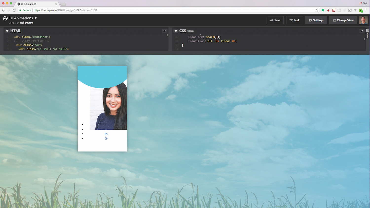
The first piece of animation we will add will be at the top of our profile element. The idea is that when we hover over the whole element, a blue circular shape will animate down. We can control how much of the blue we can see by specifying the position of this to have a bottom percentage. So play around with this percentage and you’ll get a better idea of how this works. You never know: you might even discover a better effect!
.blue .photo:before {
    content: “”;
    width: 100%;
    height: 0px;
    border-radius: 50%;
    background: $blue;
    position: absolute;
    bottom: 130%;
    right: 0;
    left: 0;
    transform: scale(3);
    transition: all .3s linear 0s;
}
.team:hover .photo:before {
   height: 100%;
}
09. Animate the team photo
The team photo is our focal point in this UI and is probably the most obvious element that you would expect to animate in some shape or form. The CSS we will add in this step will first turn the photo into a smaller circle, then when hovered over there will be a light blue border added to it and the photo will scale down together with the border. With the transitions added, we get a nice fluid animation.
.blue .pic:after {
  content: “”;
  width: 100%;
  height: 100%;
  border-radius: 50%;
  background: $blue;
  position: absolute;
  top: 0;
  left: 0;
  z-index: 1;
}
.team .photo img {
  width: 100%;
  height: auto;
  border-radius: 50%;
  transform: scale(1);
  transition: all 0.9s ease 0s;
}
.blue:hover .photo img{
    box-shadow: 0 0 0 14px $blue-border;
    transform: scale(0.6);
  }
10. Tweak the profile name and position
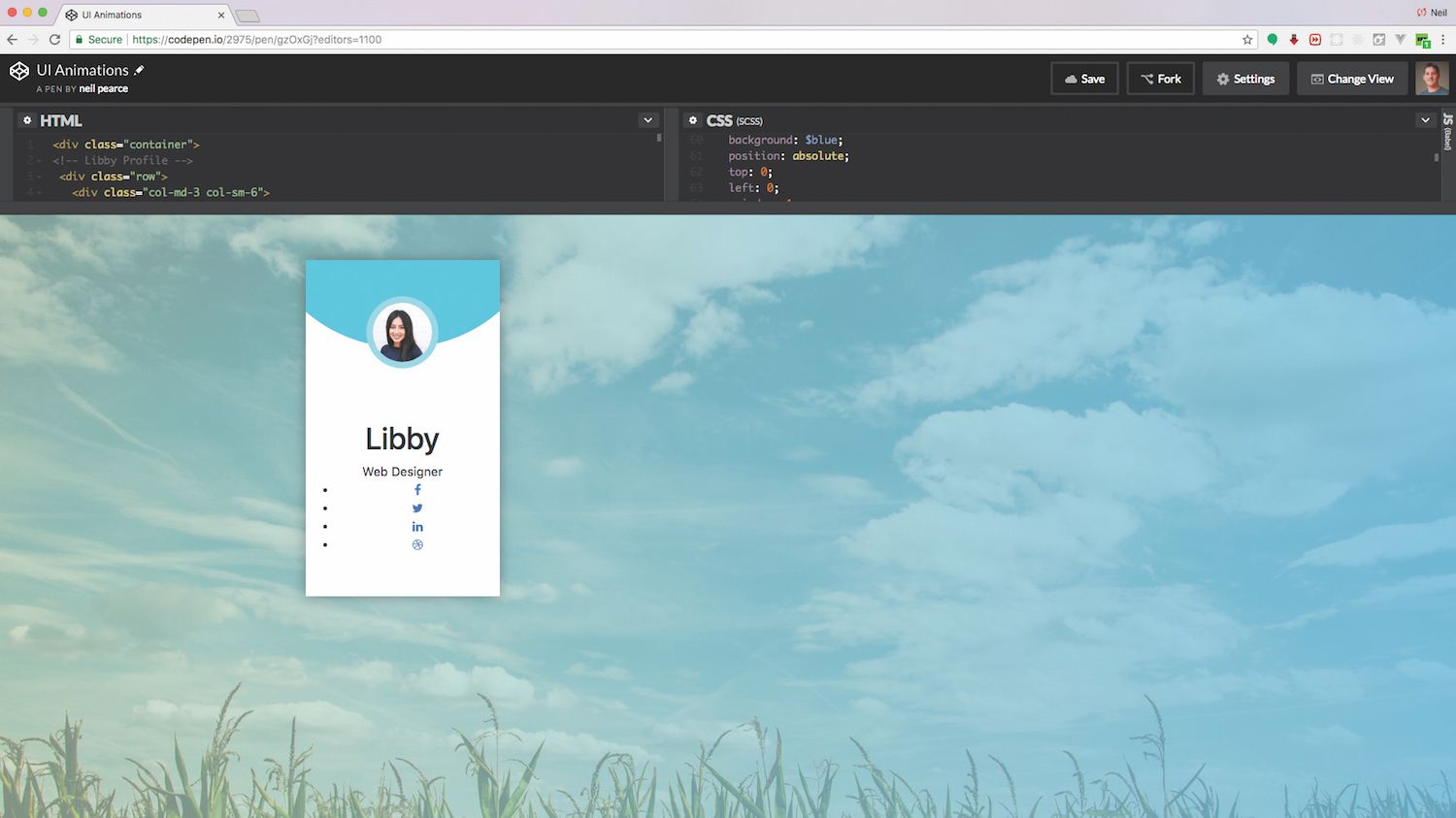
The profile name and position need a little bit of tidying up. These won’t be animated but that shouldn’t stop you from adding your own animation to these if you’d like. Perhaps scale them up slightly on hover, as you’ll have enough space due to the resizing of the photo.
.profile-txt {
  margin-bottom: 30px;
  .title {
    font-size: 2rem;
    font-weight: 700;
    color: #333;
    letter-spacing: 1.5px;
    text-transform: capitalize;
    margin-bottom: 6px;
  }
  .position{
    display: block;
    font-size: 1rem;
    color: #555;
  }
}
11. Add social icons
The social icons will first be positioned off the bottom of the page by -100px. Then when we hover over it, the bottom position will be set to zero and with a transition added, this will give us a nice smooth animation as it moves back up into view. The icons will be given their own hover state, setting their background to white and the icon to blue.
.blue .social-icons {
  width: 100%;
  list-style: none;
  padding: 0;
  margin: 0;
  background: $blue;
  position: absolute;
  bottom: -100px;
  left: 0;
  transition: all 0.6s ease;
  li {
    display: inline-block;

    a {
      display: block;
      padding: 8px;
      font-size: 1rem;
      color: #fff;
      text-decoration: none;
      transition: all 0.5s ease;
      &:hover {
        color: $blue;
        background: #fff;
      }
    }
  }
}
.team:hover .social-icons {
    bottom: 0px;
}
12. Make the green team member
To mix things up a bit, we can begin to add more members to our team. The colour we’ll use for this next one will be green. But first go back into the HTML section/file and all we need to do is copy the col-md-3 class – not the row – down to the last div tag under the social icons and paste it in.
<div class=”team green”>
    <div class=”photo”>
        <img src=”https://image.ibb.co/mpRLNS/mick_UI.jpg” alt=”Libby”>
  </div>
Once you have changed the blue class to green, we can finally add in all the CSS that will give us the same animation.
.green:hover .photo img{
    box-shadow: 0 0 0 14px $green-border;
    transform: scale(0.6);
  }
.green .photo:before {
    content: “”;
    width: 100%;
    height: 0px;
    border-radius: 50%;
    background: $green;
    position: absolute;
    bottom: 135%;
    right: 0;
    left: 0;
    transform: scale(3);
    transition: all .3s linear 0s;
}
.green .social-icons {
  width: 100%;
  list-style: none;
  padding: 0;
  margin: 0;
  background: $green;
  position: absolute;
  bottom: -100px;
  left: 0;
  transition: all 0.6s ease;
  li {
    display: inline-block;
    a {
      display: block;
      padding: 8px;
      font-size: 1rem;
      color: #fff;
      text-decoration: none;
      transition: all 0.5s ease;
      &:hover {
        color: $green;
        background: #fff;
      }
    }
  }
}
And the beauty of this approach is that you can repeat as required for many different colour classes, enabling you to subtly theme your UI animations as is required.
If you're building a site with a team, make sure you get reliable, secure cloud storage to keep things cohesive.
This article was originally published in issue 307 of net, the world's best-selling magazine for web designers and developers. Buy issue 307 or subscribe to net.
Want to learn more about the ins and outs of UI animation?

If you're interested in learning more about how you can make your sites pop and sparkle using sleek UI animation, make sure you've picked up your ticket for Generate London.
A front-end designer and developer currently working as creative developer for Asemblr.com, Steven Roberts will be delivering his talk – CSS Animation: Beyond Transitions – in which he will show you the best tools for the job and recreate some of the best animations the web has to offer, while discovering the possibilities and limitations of animating with just CSS.
Generate London takes place from 19-21 September 2018. Get your ticket now.
Related articles:

Thank you for reading 5 articles this month* Join now for unlimited access
Enjoy your first month for just £1 / $1 / €1
*Read 5 free articles per month without a subscription

Join now for unlimited access
Try first month for just £1 / $1 / €1
