Create quantity specific CSS styles and layouts
Use pure CSS to change styles and alter layouts to make them more adaptive based on the quantity of elements.
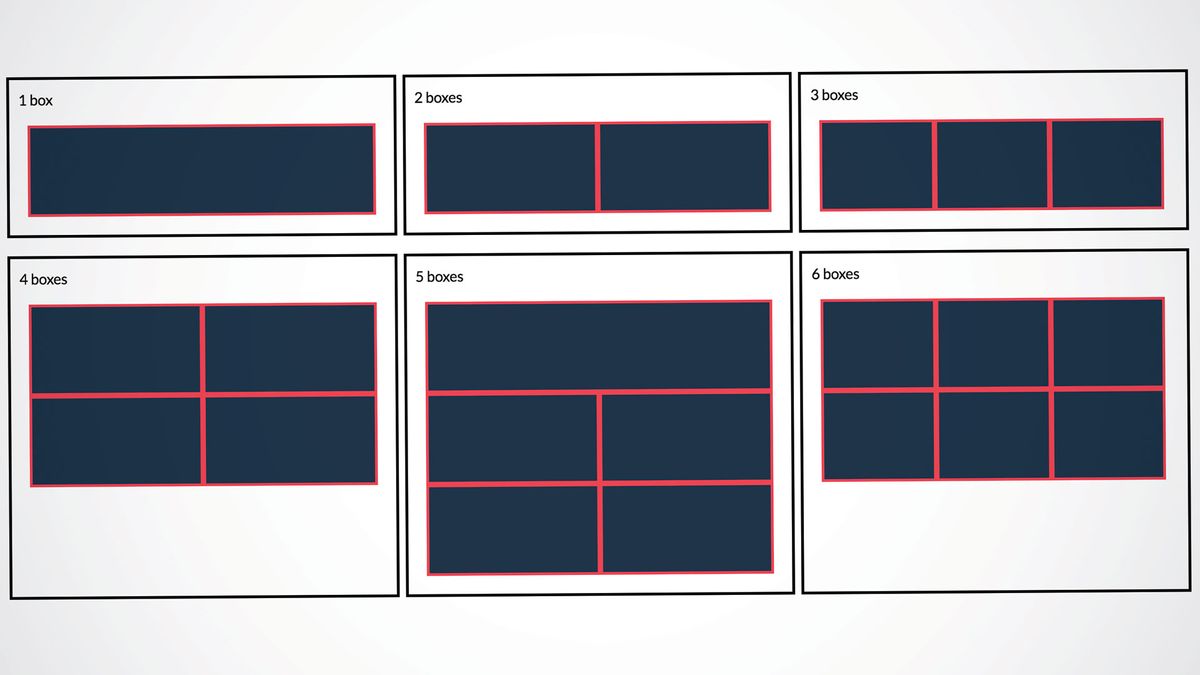
In this tutorial we will take a look at ways of changing the CSS styles of elements, as well as seemingly styling their parents, depending on the number of elements. We will also see how to change the layout of elements based on their quantity, in order to create a more adaptive website layout that makes better use of space.
Lastly we will cover the use of CSS counters to display an element's index within a set inside it, as well as displaying the total count inside the parent. All of this will be achieved with pure CSS only, without the need for JavaScript or frameworks, leading to simple and more efficient code.
To build a site without the need for endless code, you'll need a website builder. And whatever your site's capabilities, ensure your web hosting service is fit for purpose. For something different, get your cloud storage up to scratch.
Single element selectors
CSS3 only has a single pair of selectors that can determine the quantity of elements, namely the :only-child and :only-of-type selectors. Having said this, they are really only able to determine whether an element is on its own or has siblings. The :only-child selector matches elements that are the only child of their parent, while :only-of-type matches elements that are the only ones of their type.
Unfortunately, that's as far as single selectors go but there are a few other selectors that can target elements based on their order in a set of similar elements. These are :nth-child, :nth-of-type, nth-last-child and nth-last-of-type, which are typically used to target elements based on their order in a set of similar elements. The :nth-last-child and nth-last-of-type selectors are used to determine the order of elements counting backwards from the last element to the first. Combining these with other selectors enables us to build more complex chains that target specific elements based on their quantity.
Quantity-specific selector chains
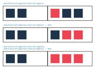
Of the four aforementioned selectors, the main one we will be using in this tutorial is nth-last-of-type. The difference between this and the nth-last-child selector is that the latter includes all the elements' siblings in the set, while the former only includes elements of the same HTML type and is therefore more selective. For the remainder of this tutorial we will use the -of-type selectors, however the -child variants are equally valid.
The nth-last-of-type can be used along with the more popular first-of-type selectors to create a chain that targets the first element in a set of a desired quantity. For example, we can use :first-of-type:nth-last-of-type(3) to target elements that are both the first and the third from the end of their type or, in other words, the first of a set of three. We can then extend this with the general sibling combinator ~ to select all siblings that follow the first of a set of three. Combining these two selector chains, we can create a complex selector that targets elements that are the first of three and all elements of the same type that follow it, thereby selecting all elements in a set of three.
Get the Creative Bloq Newsletter
Daily design news, reviews, how-tos and more, as picked by the editors.
.box:first-of-type:nth-last-of-type(3),
.box:first-of-type:nth-last-of-type(3) ~ .box
This selector chain not only works for a specific number of elements but can even be modified to target a range of quantities.
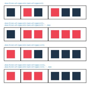
If we want to target elements in a set with a quantity more than or less than a particular value m, we can use the chain with the (n+m) and (-n+m) techniques respectively. For instance, to target all elements in a set of two or more elements we can use:
.box:first-of-type:nth-last-of-type(n+2),
.box:first-of-type:nth-last-of-type(n+2) ~ .box
Similarly, we can target all elements in a set of two or less elements using:
.box:first-of-type:nth-last-of-type(-n+2),
.box:first-of-type:nth-last-of-type(-n+2) ~ .box
As you can see this is a powerful selector chain that enables us to achieve very interesting and useful things without the need for JavaScript or other frameworks. It is especially useful when it comes to creating adaptive layouts that change based on the number of elements.
Dynamic, quantity-specific layouts

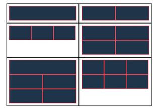
Let's say we want to display a group of boxes that show the results of a search or an API call in a two-column, grid layout. The problem lies in the fact that the results come from an external source and we have no way of knowing the number of results that will be returned, therefore we don't know how many boxes will be created. While the grid looks great for an even number of boxes, when applied to an odd number the last box sits on a row alone and looks… well, kind of odd.
This is especially problematic when using flexbox items with flex-grow applied to them as it causes the last element to grow into the empty space on the row, thereby taking up the full width. One way of preventing this could be to make the first of an odd number of boxes take up a full row by applying a width of 100% to first boxes that are also an odd number of boxes from the end, using :first-child:nth-last-of-type(odd). This provides a better layout as it gives the first and therefore most relevant or recent result more significance than the last one.
We can even add a special case for when the quantity is divisible by three using :first-child :nth-last-of-type(3n) to transform the grid into a three-column layout by applying a width of 33% to first boxes in a set with a quantity divisible by three and all boxes that follow it.
.box {
  width: 50%;
}

.box:first-child:nth-last-of-type(odd) {
  width: 100%;
}

.box:first-child:nth-last-of-type(3n),
.box:first-child:nth-last-of-type(3n) ~ .box {
  width: 33%;
}
Conclusion
As we have seen, CSS selectors can be chained together in a variety of interesting ways in order to apply styles and adaptive layouts that change based on the quantity of elements. The selector chains can also be used to seemingly apply styles to the parent of a set of elements of a certain quantity, by using ::before or ::after pseudo-elements that are positioned to take up the full size of the parent. Combined with CSS counters, these pseudo-elements can be used to display the total number of descendants in a parent element, as well as text that changes depending on the quantity of descendants.
These techniques offer a valuable way of creating dynamic, quantity based styles and layouts that are useful when handling an unknown number of elements, which is often the case when dealing with APIs.
This article was originally published in issue 308 of net, the world's best-selling magazine for web designers and developers. Buy issue 308 here or subscribe here.
Related articles:

Thank you for reading 5 articles this month* Join now for unlimited access
Enjoy your first month for just £1 / $1 / €1
*Read 5 free articles per month without a subscription

Join now for unlimited access
Try first month for just £1 / $1 / €1


