Create portrait art in Corel Painter
We run through a pro's portraiture process in Painter 2017, Corel's natural media art software.
This workshop will introduce you to the basics of Corel Painter, and I'll be using Painter 2017. I'll also guide you through my painting techniques and process.
The workshop is intended for all skill levels. The brushes I use are default brushes that I've tweaked slightly, and I also makes use of custom brushes from other artists such as Dan Milligan, Craig Mullins and Jaime Jones. These are Photoshop brushes that I've brought into Painter using its import feature. Let's get going!
01. Adjust the settings
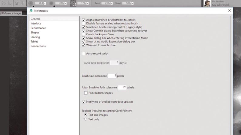
One of the most important things you should do before painting is to adjust some of Painter's settings: click 'Edit > Preferences > General'. On the General tab I check Create Backup on Save. This will create an additional backup file in case you experience a crash or decide to revert to an older version of your work.
On the Interface tab you can configure the Cursor Type; I set it to Enhanced brush ghost. I establish a darker interface via the Color Theme option, and adjust Default View Mode to Single Document View, which removes the additional scroll bar at the bottom. On the Performance tab, I set the number of processor cores used by Painter. I'd advise leaving the Undo levels at their default setting, though.
02. Set a colour profile
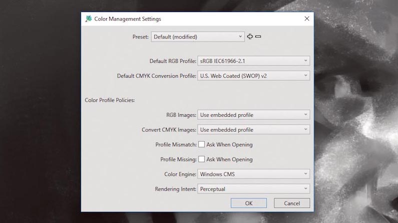
The default Color Profile I use for my work is RGB IEC61966-2.1. I have my screens calibrated using third-party hardware, but I always save my work in this default profile. This means my files can be opened in different programs without noticeable changes in the original colour values. This is important, especially if you send your files to your clients or export them for the web across various devices.
03. Customise your workspace
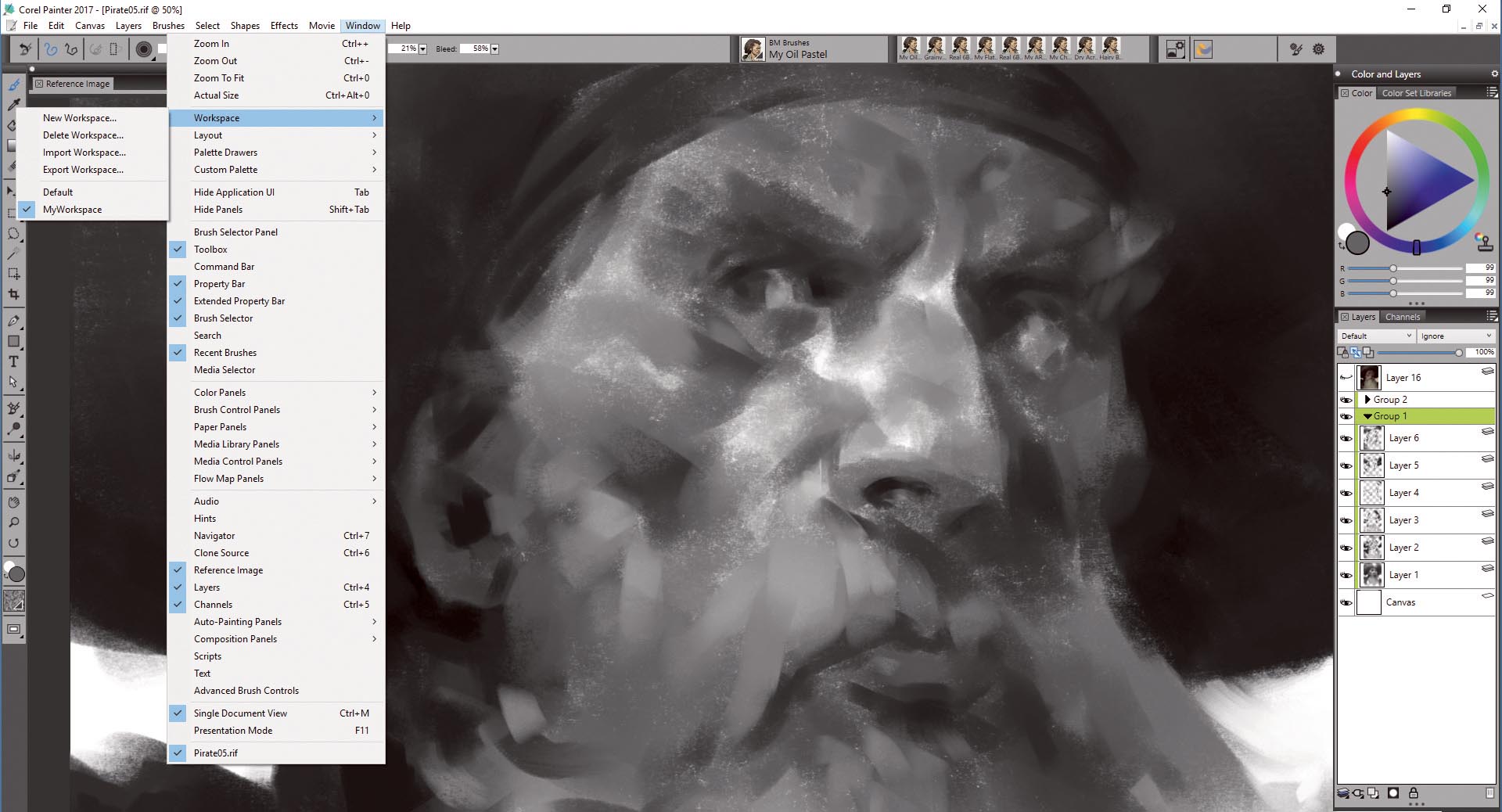
Painter enables you to save your interface layout, settings, brushes and paper textures library as a Workspace. It can be accessed from 'Window > Workspace', where you can Create New, Delete, Import or Export your Workspace and share it between devices or with other artists. You can also save your layouts and switch when necessary.
Windows and toolbars can be moved and repositioned; I prefer to remove the bars and menus I don't use often, but which you can open using shortcuts. My core tools are the Color wheel, Color Set Libraries, Layers and Channels and Reference Image window, with my brushes and settings on top, leaving a large area to work on.
Daily design news, reviews, how-tos and more, as picked by the editors.
04. Set up the canvas
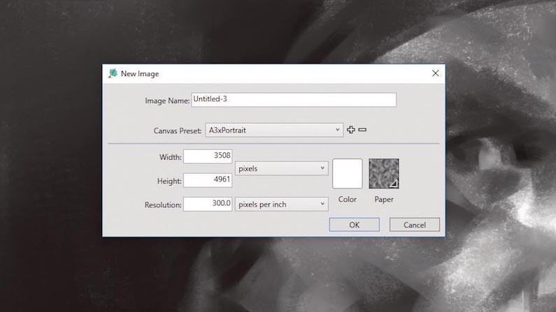
For this workshop I've decided to do a portrait, so I'm going to use A3 size and 300ppi resolution. If you prefer to work on a smaller-sized canvas, you can always go A4 or A5, and lower the resolution to 72ppi. The smaller file size will suit posting online.
In the File menu you can also select the colour of the canvas and the paper texture. I'll start in greyscale, which I'll turn into colour later using a glazing-like technique. For this, it's best to start with a simple white canvas, without any gradients or shade of colours. I find it's easier to build light and shadows using greys.
05. Produce rough sketches
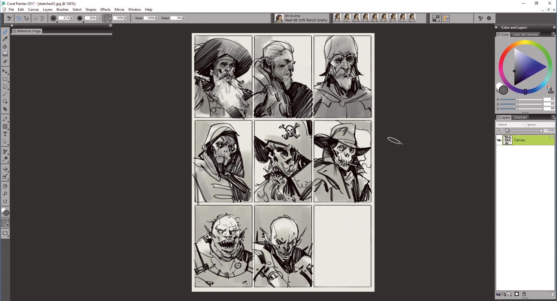
I've found that the easiest way to throw my raw ideas down on to paper is by creating quick sketches or thumbnails. Whether you do concept work, illustrations or storyboarding, the approach is the same. I always start with simple sketches, and prefer working with line – just creating hints of what I have in mind. I don't go into details because they belong in the painting process, which follows.
Imagine these sketches as small copies of what you'll have in your final painting. The Painter brush I use is called Real 6B Soft Pencil Grainy – it interacts with the paper texture to give the lines a more natural look. I also activate the Tilt function so it's easier for me to switch between thin and wide lines, just like a traditional pencil would do.
06. Go big
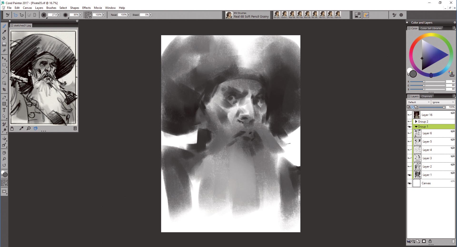
Once I settle on a character that I want to push further I take the thumbnail and place it in the Reference window. This is a great tool, which can be used either for references or picking colours. The purpose of this step is to paint the portrait as close as possible to the original idea and composition, although changes are possible further down the road, of course.
Working fast and rough at this point enables me to maintain the freshness and dynamism of the painting. I'm using a big brush and a grainy paper texture for blocking the first shapes of what is going to be a portrait of a pirate with a very fine beard.
07. Start in greyscale
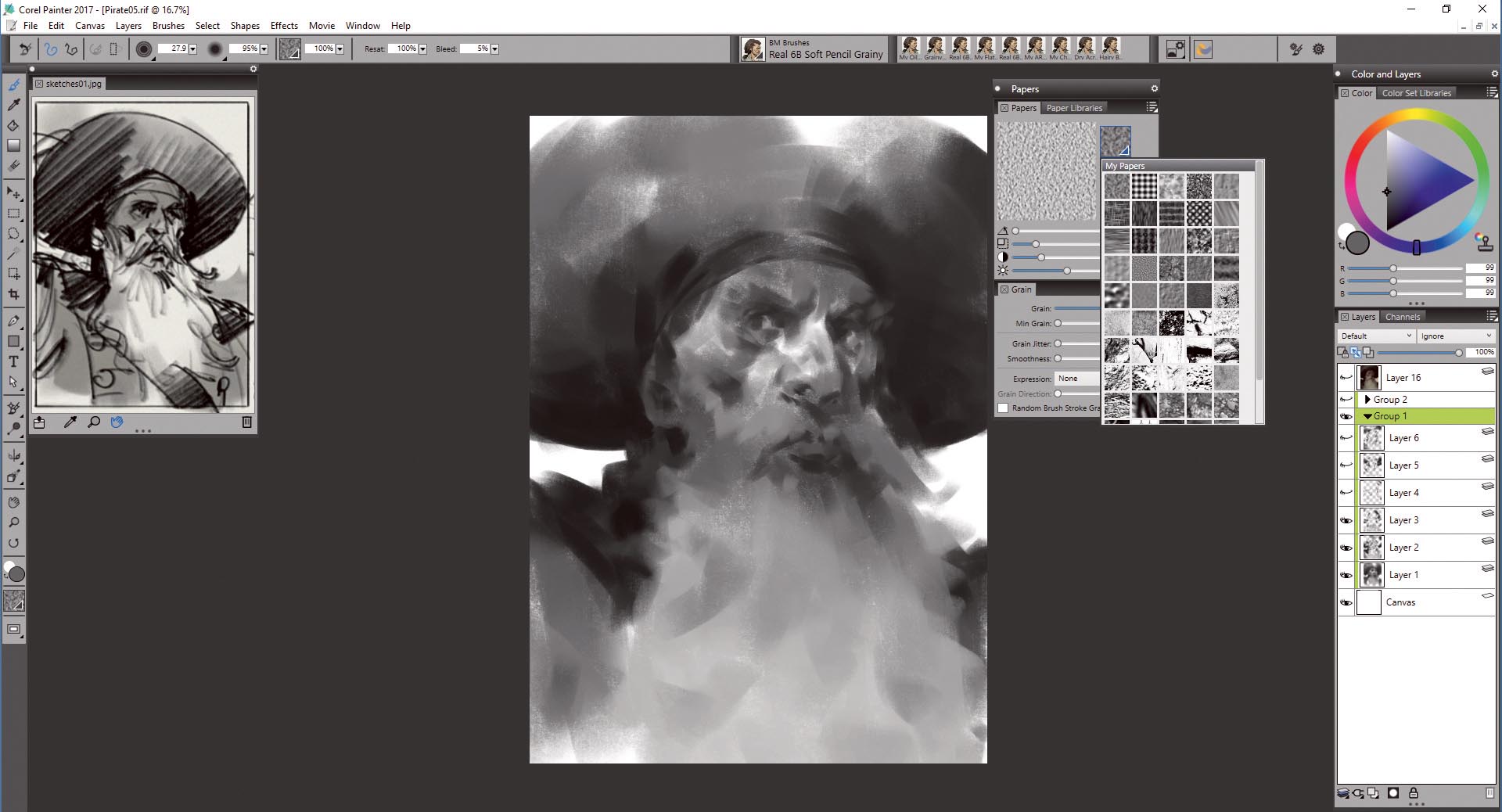
I'm not all that confident when combining colours in a specific palette. On the other hand I love greyscale, black and white: it's enough to create a good range of contrast and express my ideas. I believe that a good greyscale painting gives you the flexibility to make changes – and if you work in the game or film industry then changes are inevitable! This approach enables me to experiment with colours as much an I want once the final design is fixed.
08. Apply paper texture and brushes
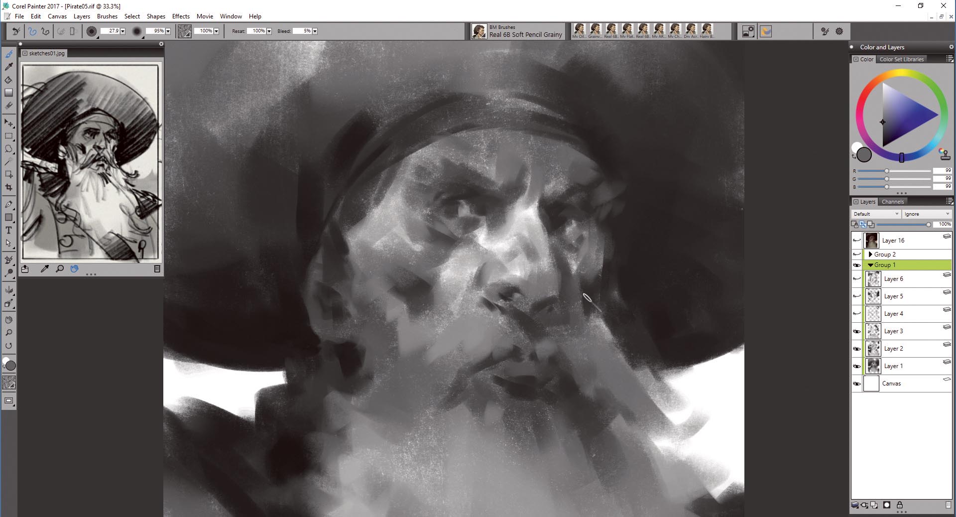
In Corel Painter, the texture of brush strokes comes from the brush interacting with the texture of the canvas. I can easily switch between the default and any custom-made textures using the Paper libraries or Paper Menu (ctrl+9). The brushes I use in this workshop are based on the Pastel brushes category. They're customised to suit my painting style, but also have two important features: they reveal the texture based on the pen pressure; and they blend colours perfectly.
Next page: Learn how to add colour and refine your portrait
