Create perfect messages in all email clients
We run down the tricks you need to ensure your marketing messages render properly in everything from Outlook to Apple Mail.
For any email marketing campaign to work, the email has to reach the inbox and stand out from the all the others. However, the story does not end there. Your email has to render well if you want your subscribers to open your email, click through the CTA and get converted.
Rendering is a problem because every email client and device perceives the code differently. Code that works well with one email client can create a rendering issue in another. To make things even more challenging, even the most widely used email clients come with rendering quirks and problems. In this article, I’ll take a look at the challenges and workarounds for each of the main email clients.
Outlook
It wouldn’t be a hyperbole to say that we email developers shudder at the thought of Outlook. The obvious reason is the numerous rendering challenges presented by this email client. What’s surprising is that any corporates still have Outlook as their standard email client and a small proportion of your subscribers are still loyal to it.
Have a look at some of the challenges and hacks for Outlook:
- Challenge: Outlook doesn’t support margins in <p> and <a>
- Hack: If you want to provide margins, use the <td> tag; uppercase should be used outside the tag, and lowercase inline
- Challenge: Padding is only supported on certain HTML attributes (not including on <div> or <p> tags)
- Hack: Table-based layout is the safest bet to overcome this issue

- Challenge: Outlook is the only email client that does not support GIFs
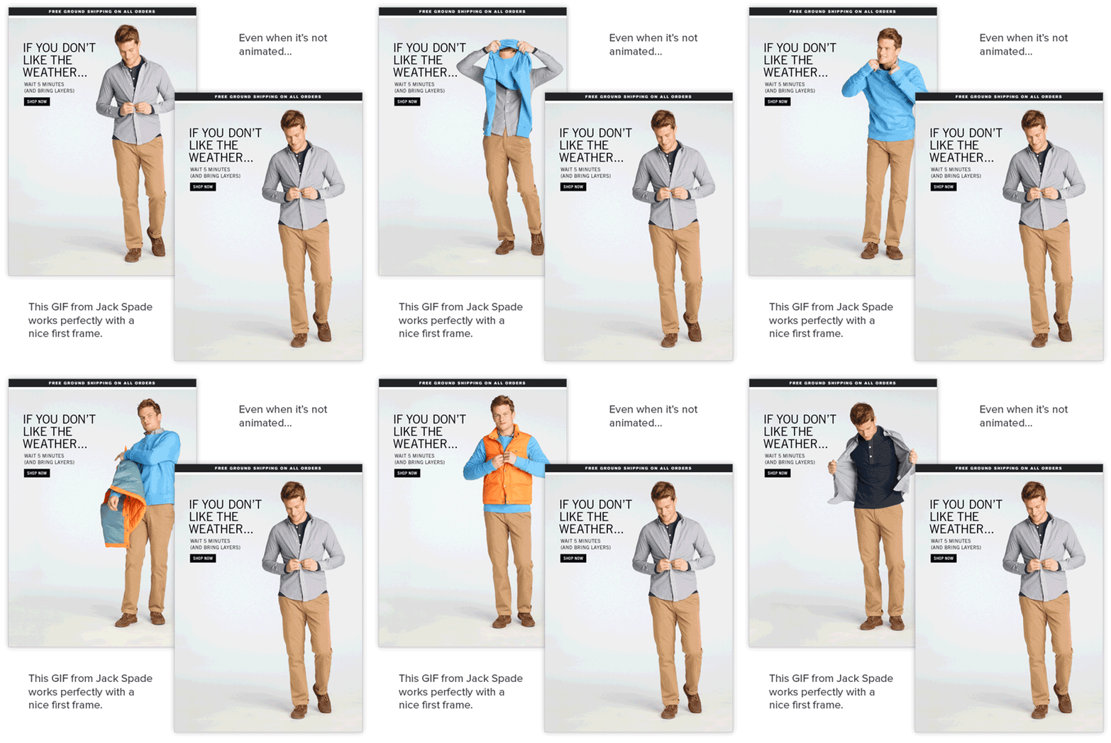
- Hack: As some clients will only see the first frame of your animation, this should include all the important information, run only for a few milliseconds, and make sense as a standalone image
- Challenge: Outlook does not support Google Fonts, and will implement Times New Roman as a fallback
- Hack: Embed the following code...
<!--[if mso]>
<style type=”text/css”>
.fallback-text {
font-family: Arial, sans-serif;
}
</style>
<![endif]-->
Outlook.com
A new version of Outlook.com was introduced in early 2016 but the legacy version is still not out of use. Here are the challenges and hacks particular to that client:
- Challenge: An unnecessary gap of 4-5px is added below images
- Hack: Set the display property as "img {display:block;}" to remove the padding

- Challenge: Does not support RGB borders
- Hack: Use HEX codes to set HTML background colour
- Challenge: Adding # in href links breaks the anchor tag and shifts the CSS to another place
- Hack: Use domain name rather than href #
iPhone native app
The native iPhone email app is the most used client, and it supports all the interactive elements you’d typically find in email: GIFs, menus, accordions, countdowns, sliders and so on. Moreover, it also allows the email marketer to use high-definition Retina images for an awesome user experience.
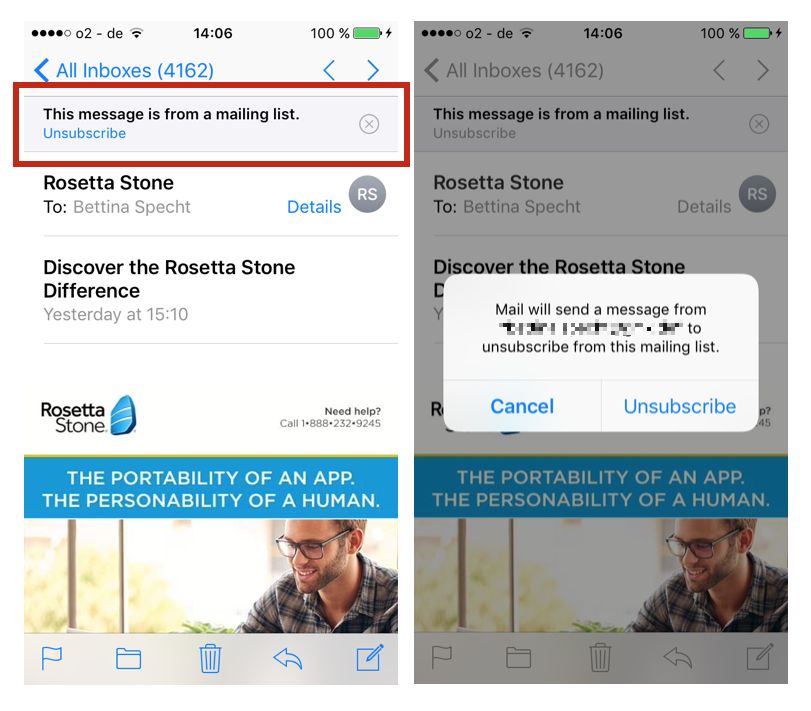
iOS10 has become all the more coveted because users can now adjust the number of lines of preview text in emails and even opt for list-unsubscribe. Nonetheless, despite these strong points, iPhone native app also has certain shortcomings. Let’s take a look.
Get the Creative Bloq Newsletter
Daily design news, reviews, how-tos and more, as picked by the editors.

- Challenge: Tiny text is automatically resized
- Hack: The minimum font size for headers should be 22px, and for body text 14px
- Challenge: The release of new iPhone models can cause rendering problems
- Hack: Fluid layout ensures emails display properly across all devices
- Challenge: In iOS9, when inline-block level elements are next to each other in the code with a space between the ends of two elements, it leads to wrapping issue
- Hack: Simply remove the space
- Challenge: iOS10 does not support fixed positioning
- Hack: No current workaround...
Gmail
Gmail is popular because it’s so convenient to use. However, that doesn’t mean it’s without its challenges.

- Challenge: If your HTML file exceeds 102kB, Gmail will clip it
- Hack: Avoid unnecessary style tags and attributes, and don’t copy the code from Microsoft word or other text editors as it is (this will add extra tags to the HTML file)
- Challenge: Gmail will remove CSS from the <style> block if it exceeds 8142 characters or includes errors or nested @declarations
- Hack: Make sure embedded styles are short and free of typos
- Challenge: Floats, margins, paragraphs, and padding are not supported
- Hack: Use a table-based layout with <td> for padding and margins
- Challenge: Background images do not work for non-Gmail IDs configured in Gmail
- Hack: Apply the background colour as fallback
- Challenge: Attribute selector does not work
- Hack: Use .class selector instead
Apple Mail
Apple Mail is perhaps the closest thing to a perfect email client we have. The main advantage of Apple Mail is that it is very forgiving when it comes to bad email coding. Moreover, just like iPhone Native App it supports interactivity in emails, thereby eliminating the need to view the email in browser.
You should keep in mind two things while coding emails for your Apple Mail subscribers:
- Avoid using Calibri fonts
- Host your email and provide the links to the server, as internal links do not work in Apple Mail
Yahoo! Mail
As new and better email clients have arrived, Yahoo! Mail is less frequently used these days. Some of its rendering challenges and the hacks are discussed below.
- Challenge: It does not support the centre-align HTML attribute
- Hack: Use align="center"
- Challenge: min-device-width and max-device-width are not supported by media queries
- Hack: Use width attribute &/or in style instead of min or max-width
- Use the width attribute instead of min- or max-width, either separately or embedded in the <style> tag
- Challenge: Float tags do not work
- Hack: Add align="top" to the image in question
On that note, we have reached the end of the discussion on most typical rendering challenges for email clients. Take a look here for more challenges and workarounds. Email marketing, if done right, can pave new avenues for your marketing strategy. Keep these simple workarounds in mind and your subscribers will never see a broken email layout in your emails ever again.
Related articles:

Thank you for reading 5 articles this month* Join now for unlimited access
Enjoy your first month for just £1 / $1 / €1
*Read 5 free articles per month without a subscription

Join now for unlimited access
Try first month for just £1 / $1 / €1
