Create illustrated portraits from photos
Follow this process for turning photos into stunning portraits.
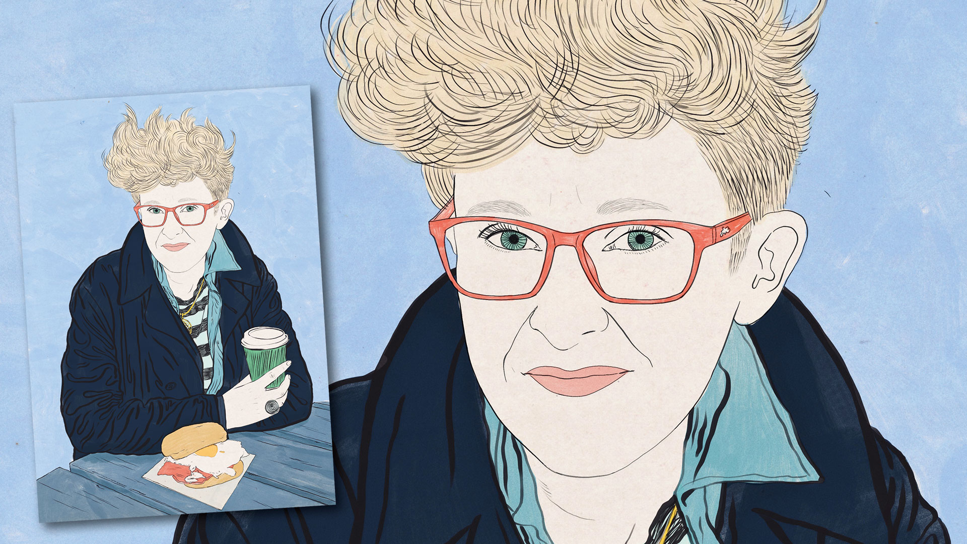
I studied fine art and painting techniques and for a long time was completely against the idea of going digital. I just didn't see the point of it until I started working professionally as an illustrator. I then had to start making changes to illustrations as requested by clients. This means you have to be quite flexible in the way you work, which makes traditional pen and paper drawing less practical.
I very gradually transitioned to digital drawing. Being able to work in layers is incredibly liberating, you suddenly have so much freedom to change things and experiment. I love the sense that no decision you make is permanent, everything can be undone, so it makes me a lot less precious about my work and braver about experimentation and play.
Now that I'm using Procreate on the iPad Pro, I feel like I've come full circle – the paintbrushes and pencil brushes feel so natural and loose, it's almost like I'm actually painting again.
01. Trace photo
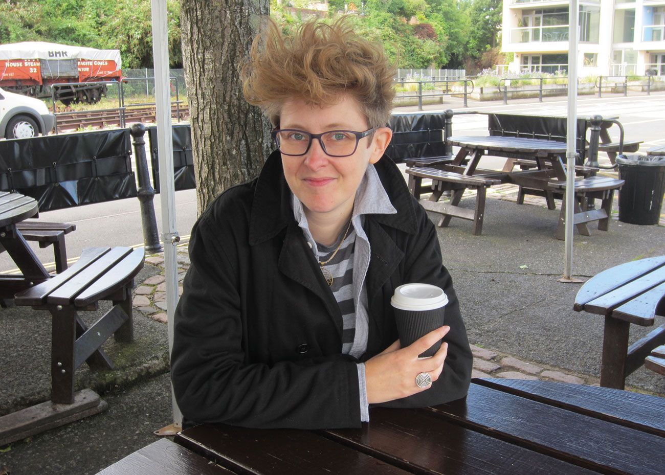
I used to also be quite against the idea of tracing a photo, or advising anyone to – as I do with the portrait in this guide. Tracing is kind of 'cheating', but if you are a confident drawer to begin with and know how to draw a face, then it can be an invaluable tool if you're in a hurry and need to capture an exact likeness – when doing quick editorial jobs, for example.
First, choose the photo you're going to use. Unless you want to create a portrait with a dramatic chiaroscuro effect and lots of dense shading, avoid images with a lot of bright light, dark shadow and contrast. Ideally you want one that is well lit with gentle, natural light.
I also think it adds a really nice texture to digital artwork if you use a natural paper texture as a base. You could scan your own at a high resolution and import it to Procreate, you could download this collection of free textures, or you can find lots on Google image search. Type in 'natural paper texture' or 'paper grunge texture' and find one that is high-res and legally available to use. Then open an A3 document at 400 dpi in Procreate, import the paper texture, and resize it so it fills the canvas in portrait format; then import the photo you have chosen.
02. Add elements
Resize the photo so it fills the canvas. Keep the subject fairly central but make sure you leave enough space around them. You want the negative space around your subject to roughly be the same area as the size of the subject. This creates a nice balance in the composition.
Get the Creative Bloq Newsletter
Daily design news, reviews, how-tos and more, as picked by the editors.
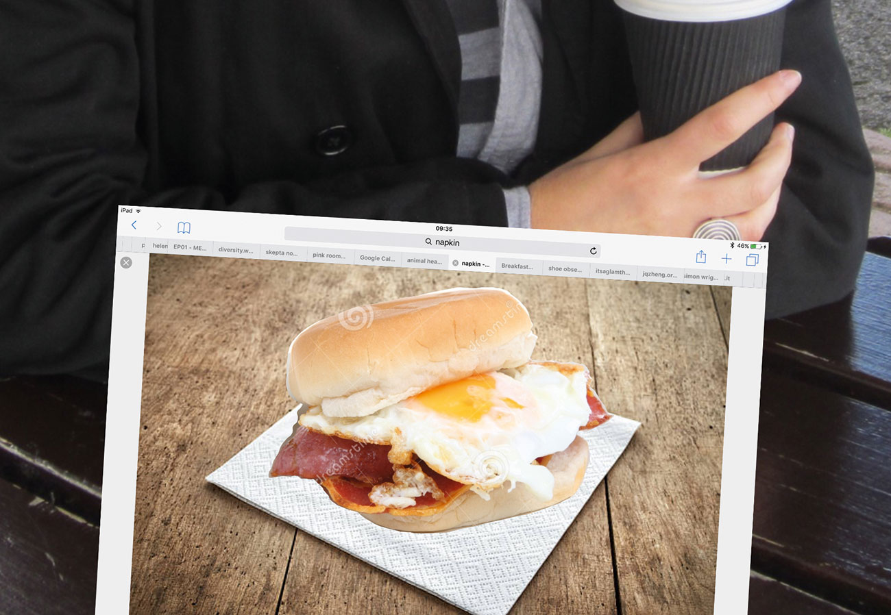
For this portrait, the client wanted the subject to be eating some breakfast – they suggested a bacon and egg bap. I found a stock photo of a bap on Google, saved and imported it, then resized it in proportion with the subject. Then I moved the bap photo down onto the table and used the Lasso tool to select the bap and cut away the background.
I wanted to add a napkin under the bap, so I repeated the process with a stock napkin photo. Once you have all the elements of your composition in place – you're ready to render!
03. Work with layers
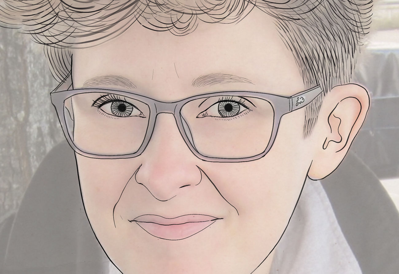
Merge the three Layers (subject and additional breakfast Layers) so they are one single Layer, then reduce the opacity of that Layer to around 40 or 50 per cent. Next, select your pen. For this illustration I used the Studio Pen. I also really like Ink Bleed for portraits, the Shale brush (under Calligraphy) and the Technical pencil. Then select black, or another very dark colour like grey, as your brush colour.
I always start with the most difficult thing to capture, the face and hair. I read an interview with Lucian Freud once where he said to 'always start with the eyes', and this has always stuck with me. I spend a long time fiddling to get them right. I also like to have fun with the hair. Let your mark making get really loose and flow along the curves of the hair. Accuracy is not important when it comes to hair. Really exaggerate the curves of the strands and get expressive!
Throughout the process, keep turning off the photo Layer to check how the drawing Layer looks on the paper – you'll see straight away if it's looking a bit weird and wonky. Though weird and wonky can be good sometimes!
04. Get expressive
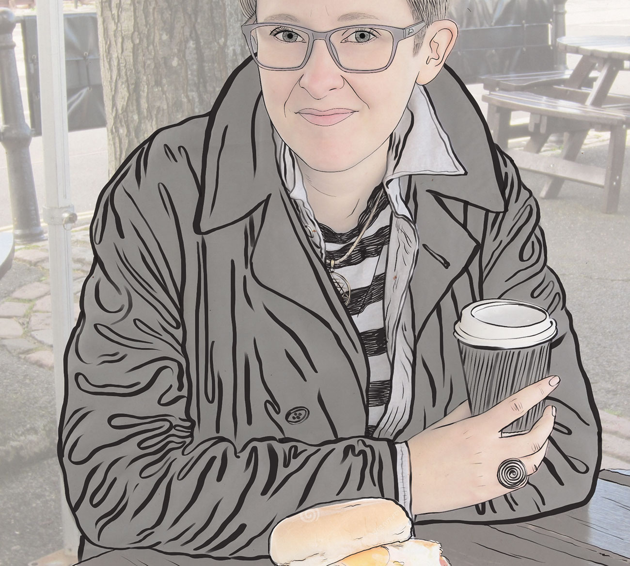
If you do want to erase something at this stage, I suggest taking the eraser down to 60 per cent opacity, so you leave a faint trace of what came before. This helps to avoid your digital drawing looking too digital, perfect and cold, and gives the end result a bit more movement and texture. Keep in those imperfections!
Draw in the rest of the subject and any objects you want to include, using the same brush at the same weight. For this illustration I chose to leave out the background elements. Turn off the photo layer, have a look at what you've drawn so far and check you're happy.
Next, increase the size of your brush to draw the clothing. I think it's nice to have contrasting line weights, it gives a more dynamic feel. A bit like with the hair, accuracy is not important when drawing the folds of the drapery. Enjoy using squiggly fat expressive lines and don't worry to much about getting it perfect. I usually do this mark making on a new Layer – and then erase the places where the lines overlap (on 100 per cent opacity this time to keep it clean).
05. Add colour
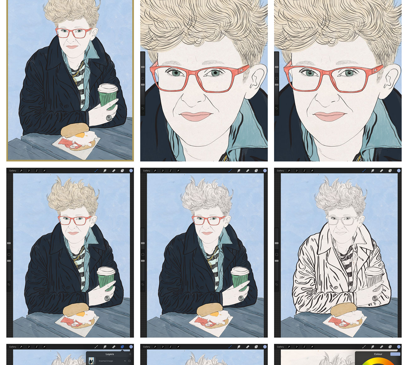
Now I'm going to add colour. To do so, I select my favourite brush for applying colour, the Wet Acrylic brush. I open a new Multiply Layer and apply the background colour first, in the negative space behind the subject. Then, so that you can easily tidy up the overlapping edges of colour, apply colour to the rest of the illustration on separate Multiply Layers.
I usually apply the colour quite messily with the brush on a large setting, and then tidy up the edges with the eraser. Zoom in and open a new Normal Layer, and add some flecks of white on the eyes. Reduce the opacity of the layer a bit if it looks a bit too bright and harsh. Then export your file as a flat jpeg, and import it into your photo editing software or app of your choice (I use VSCO) for some subtle adjustments.
This article was originally published in issue 278 of Computer Arts, the world's best-selling design magazine. Buy issue 278 here or subscribe to Computer Arts here.
Related articles:

Thank you for reading 5 articles this month* Join now for unlimited access
Enjoy your first month for just £1 / $1 / €1
*Read 5 free articles per month without a subscription

Join now for unlimited access
Try first month for just £1 / $1 / €1
