How to use a watercolour glazing technique
Use a watercolour glazing technique to produce translucent and luminous effects with a limited colour palette.
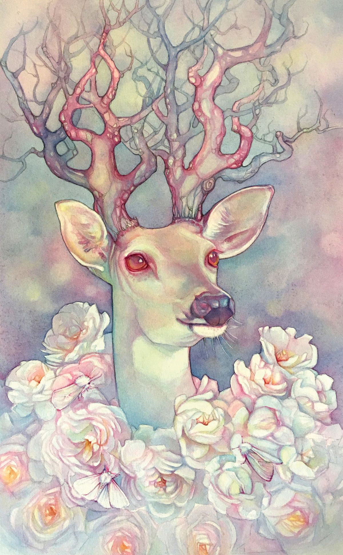
For this workshop on perfecting your watercolour glazing technique, I’ll be taking you step by step through one of my paintings – covering everything from concept sketching to watercolour techniques, as well as palette choices and tips on honing your skills and finding your own voice in watercolour.
Working with a fairly limited palette of mostly colours that stain into the paper enables me to keep my paintings clean and luminous through many glazes of colour. Need new resources before you start? See these top guides to the best watercolour paints and and best watercolour paper.
Now, because watercolour is transparent, and I’m working with staining colours, I want to get everything planned out in pencil before I start painting.
The first step is to get the drawing laid out as light as possible so that the pencil marks won’t show through in the finished painting.
How to use a watercolour glazing technique
Mixing colours on the paper
Then I begin working wet-into-wet in sections, by wetting the paper first and dropping in colours to let them mix on the paper. After the first layer is dry, I start building up layers of wet pigment on dry paper, adding more details and darkening up the background in sections.
People often say that watercolour is a difficult medium, but it just takes practice and some idea of the process. Letting the paper dry completely in between layers helps to keep the painting from becoming overworked and muddy.
This triad approach also helps me to retain a cohesive body of work, no matter what the subject matter. In working with galleries and in trying to get your work to be instantly recognised, a consistent palette and skill set can help you stand out in a crowd.
Get the Creative Bloq Newsletter
Daily design news, reviews, how-tos and more, as picked by the editors.
Creating a body of work that reflects your own vision is an ongoing work in progress. Think about all of the things you love, or what themes you’re repeatedly drawn to. Keeping a physical or online mood board of the images you love or recurring themes you’re interested in will help you put together a vision of what is unique to you.
For me, some of these elements have been my colour palette, nature, Art Nouveau, mythology and fairy tales, to name a few. Putting all of these elements together, along with daily practice, has helped me to find my own voice in my paintings and to create a cohesive body of work.
01. Planning it out
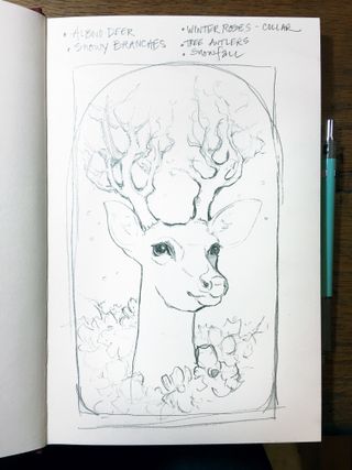
I make a quick concept sketch and makes some notes about the painting. These are really rough, just to quickly get the ideas down on paper. I keep in mind the arched shape of the antique frame I plan to use, although I’ll be painting the image to fill a rectangle for prints.
02. Gathering reference material

I usually work from a combination of my own photos and images I find online. Pinterest is wonderful for saving and organising reference photos and inspiration. I’m pretty low-tech when it comes to collaging my images: I print them out and play with the composition until I’m happy with it. Here’s my home-made reference source for my painting Omniscient – it did the job!
03. Working with a limited watercolour palette
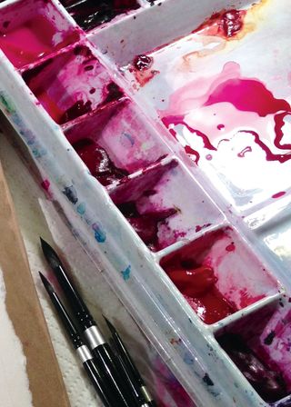
Almost all of my paintings are primarily made up of three colours: Quinachridone pink, Phthalocyanine blue (green shade) and Azo yellow. For this painting, I’ve also used Daniel Smith’s Napthimide maroon and Phthalo turquoise mixed to make a black/grey for the nose and final details. Mixing a chromatic black gives me the option to make it cooler or warmer, as required.
04. Other materials
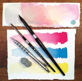
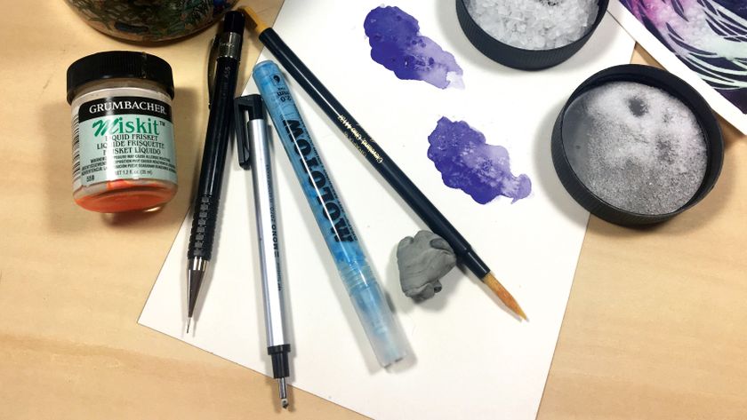
I use Arches 300lb Hot Press paper because I don’t need to stretch it, and the hot press finish is wonderful for details. And these Kolinsky Sable and Synthetic/Squirrel blends, pictured here, are my favourite brushes. Both hold lots of water and have wonderful points. Finally, a 0.5 mechanical pencil with an HB lead and a rubber kneaded eraser are a must!
05. Get the drawing down
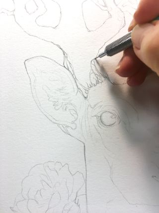
I try to keep the pencil marks as light as possible on most of the piece, especially in the areas where I intend to keep the painting light. In some areas, like the details on the trees, I plan on having the graphite show in the finished painting so I can leave it a little darker.
06. Why use a limited palette?
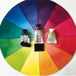
I love this triad of pink, blue and yellow because I can mix almost any other colour that I need while keeping my palette cohesive. To illustrate, I’ve created this colour wheel using just this triad. These three are also pretty staining, which enables me to do a lot of glazing without the layers lifting up and becoming muddy.
07. Working wet-into-wet
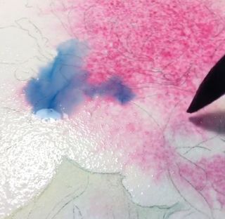
I start glazing by working wet-into-wet in sections. I saturating the surface with water and drop each colour in to mix on the paper. I use very little pigment on the face to keep some of it white and build up in layers. For the background, I’m dropping in a little heavier pigment and lifting out of focus shapes.
08. Lifting colour
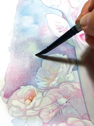
To create an out-of-focus effect in the background, you can lift out soft circles with a damp brush into the drying pigment. You’ll want it to be still wet, but not shiny wet. This takes a little practice to get the desired effect, so don’t be discouraged if it doesn’t work the first time.
09. Wet on dry
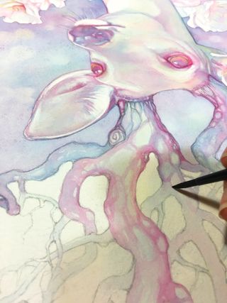
The following glazes are achieved with a wet brush on dry paper. This gives me more control to start building up the details and begin adding some depth. I start out light and create a kind of roadmap of colour and detail. As I go along, each layer becomes more intensely coloured as I use less water and more pigment.
10. Water to pigment ratio
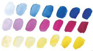
Having the right ratio of water to pigment is something that takes practice. Using the paper and clean water as your white, then add more pigment and less water in each step. Practising this can help you to create thin transparent layers or heavier applications of saturated colour when needed, without overworking or muddying your painting.
11. Introducing other colours
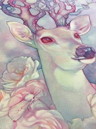
I work my way through most of this painting using my pink, blue and yellow triad until the final few layers. Then I add the black mixture to the nose and a little in the lower part of the background.
12. Adding and subtracting
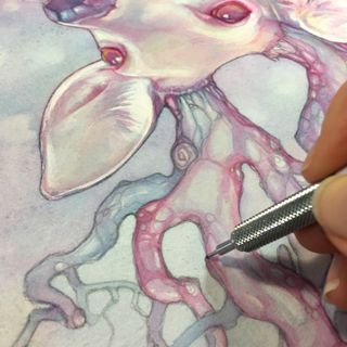
After I’ve created my roadmap in colour, I can then use my eraser to remove any unwanted pencil lines. On the other hand, I also go back in with the pencil to create delicate lines in the trees and do some outlining around the outside edges of the trees and the deer.
13. Finishing up and reviewing my progress
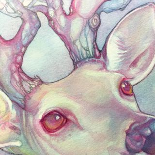
When I think I’m just about finished, I prop it up and look at it from a distance, or take a photo with my phone. This helps me to see the piece as a whole rather than looking at all of the details, and quickly enables me to see if there’s anything that needs to be adjusted.
14. A bit about framing
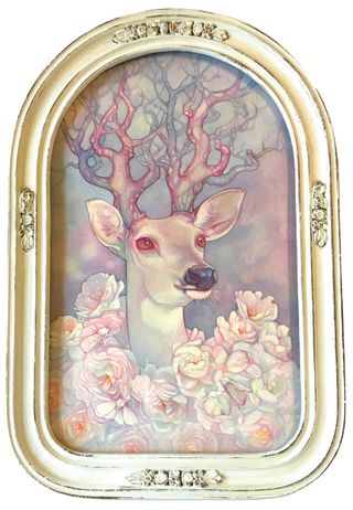
I often use antique and vintage frames to add another layer of interest to my finished paintings. Due to their odd shapes and sizes, I choose the frame before I draw out my image. I love shopping at flea markets and antique shops for them. They sometimes require repairs or repainting, but that’s a process I enjoy.
15. Practice, practice, practice
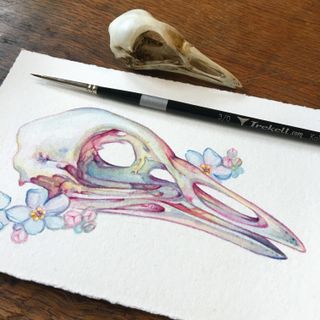
Putting in the time to do studies, sketching and working from life really pays off. I try to fit in a few little paintings and lots of sketching in between larger projects. Playing with watercolour techniques alone is fun and meditative. It’s a great way to improve your skills and try new things.
This article was originally published in issue 157 of ImagineFX, the world's best-selling magazine for digital artists. Subscribe to ImagineFX here.
Related articles:
- Oil painting techniques: Elevate your oil painting
- Best art supplies: All you'll need to buy to get started
- How to clean paintbrushes: A definitive guide

Thank you for reading 5 articles this month* Join now for unlimited access
Enjoy your first month for just £1 / $1 / €1
*Read 5 free articles per month without a subscription

Join now for unlimited access
Try first month for just £1 / $1 / €1
