Create an eye-catching CV with InDesign and Adobe Stock
Take the stress out of designing a CV by downloading a modern, accomplished template from Adobe Stock.
Distilling your life down into something that fits onto a single A4 page can be a formidable task, especially if you’re fresh to the job market and doing it all for the first time. Lots of CVs suffer from the Goldilocks issue – either trying too hard and ending up with a car crash of incomprehensible graphics, or doing too little to stand out from the crowd. Finding that perfect middle ground can be extremely difficult – most CVs will just end up in the bin.
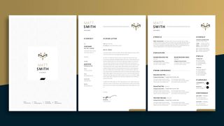
Using a CV template may appear a little defeatist, and this may be true for some of the more creative agency jobs, but often they can provide the perfect blank canvas to embellish with your own personal style. Adobe Stock provides a diverse selection of professionally designed templates, easily accessible and fully customisable. If you’re feeling uninspired or in a hurry, check out their website and follow this tutorial for a polished, confident CV that presents all the relevant information in a concise manner.
01. Choose a template
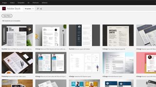
InDesign CC offers a limited choice of downloadable templates, found in the New Document window, under the headings Print, Web or Mobile. These range from cookbooks and brochures, to magazine layouts and menus, but you can also access a wider selection on the Adobe Stock website (you will also be directed here if you enter any keywords into the search bar at the bottom of the New Document window).
A CV is a reflection of your professional identity, so the choice of template will largely depend on your own stylistic preferences. Try to remain open-minded when picking – remember that templates are fully-customisable and are not necessarily the finished article.
For this tutorial I chose a simple modular template, which served as a good starting point to enhance with my own individual flourishes. The document features three pages: a title page, cover letter and CV (although I would only ever use the title page for a larger portfolio). The template displays a clear hierarchy of information, meaning the key information is easily accessible at a glance.
Restricting your CV to a single page makes it easier for the employer to print out and read, leaving you the option of providing a more extensive portfolio if requested. It’s worth considering that a lot of offices print CVs out in black and white, so make sure that your CV works both with and without colour.
02. Open the template
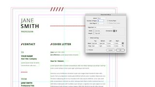
Once you license and download the template it will become available in your Downloads folder as an indt file (InDesign template). Double-clicking on the document will automatically open it in InDesign.
This template is set to fit an A4 page (210mm x 297mm), with 3mm of Bleed. Bleed is a print term used to describe the area around the page, which will be trimmed off by the printer. Adding Bleed leaves space for printing errors, so the edges of your pages won’t end up with a white fringe around them. You can check this in File > Document setup, where you can also adjust the page size. Since all the content on these pages is displayed as text or vector graphics, the file can be easily scaled up or down, if needed, without any loss of quality.
The Transparency Blend Space of this document is CMYK, meaning that it set up for printing inks. If you are aiming to create a digital CV, for sending by email, you should change the document to RGB.
Click on the Layers tab to view the content, labelled as Background, Elements and Text. You can toggle visibility of these on or off by clicking the eye icon next to them. You can also lock a layer if you wish to edit other objects around it without accidentally making changes to the wrong thing.
03. Insert your text
InDesign is an excellent app for editing text, with an extensive array of tools for all scenarios. This template comes with dummy text already placed, giving you an idea of what information to include and the appropriate lengths to fill.
Begin by writing your copy into the text boxes, either double clicking inside the box or using the Type tool. As you type you’ll notice that your text instantly adopts the style in the text box, since the document uses predefined character and paragraph styles. If you need more space, you can extend the text box by dragging the box handle down with the Selection tool. This will result in odd spacing between elements, so it is worth grouping similar items and realigning them to even up. You can also free up some space by removing empty lines and using indents to delineate paragraphs instead. Try to fill your text to the end of each line, avoiding any lines with only a single word on.
This template uses the typeface Open Sans throughout, which you can activate with Adobe Typekit, if it is not already available on your computer. Open Sans is a modern, legible, sans-serif typeface that works well on a CV, but you may prefer to experiment with others, especially if you have your own style in mind.
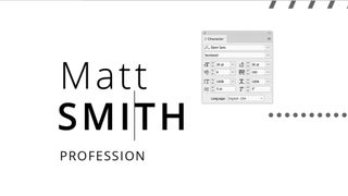
When applying for a design job it’s important to perfect the kerning on the most dominant words on the page, in this case the large textbox displaying your name. Kerning is the process of tweaking the spaces between characters in order to make the word more visually appealing. You can do this by clicking between letters and using the Kerning tool in the Characters tab. Alternatively you can use the shortcuts ‘alt+left’ and ‘alt+right’.
04. Create your own style
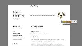
The benefit of using a stock template is that all of the hard work is done for you. Once all the information is updated, the CV is ready and can be used straight away in a job application. But simply downloading a template and entering text is hardly going to show off many design skills, so this is the point where you make it stand out by expressing your own distinctive style.
I began by choosing a colour scheme and designing a logo for myself, essentially giving myself a brand identity. InDesign has a Color Theme Tool that can help you decide on a colour palettes, while the Pen and Shape tools are more than adequate to create vector graphics for logos. Setting up swatches in the Swatches panel will keep the colours consistent across your document.
If you wish to add further images or graphics, you can access Adobe Stock directly from the InDesign app. Search for assets in the Libraries panel, which you can then drag straight into you document to test out, before licensing them. Drawing guides onto the page will help you maintain the structure of the page, while Smart Guides offer an alternative method for lining things up.
05. Refine
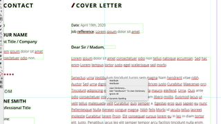
When it comes to designing a CV, you can never do enough polishing. It’s worth asking other people for their honest opinions, as well as leaving it for a day and coming back with fresh eyes – you will always spot things you didn’t see the previous day. Try to trim any needless fat from your copy, retaining only the key information and relevant details that explain who you are. Tailor the CV towards the industry you are applying, both in the writing and design.
Make sure your spelling and grammar is up to scratch. If you aren’t confident about this, InDesign has a spelling tool under Edit > Spelling. You can either go through each word in the copy manually or turn dynamic spelling on and check as you go.
This template includes a candidate’s signature at the bottom of the cover letter. If you don’t have a graphic tablet, you could draw it out on paper, scan to the computer, then draw over the top with the Pen tool, adding a stroke.
06. Export
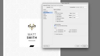
For most jobs a PDF is a suitable file format to send across. Go to File > Export (or Command + E ) and select Adobe PDF (Print) from the drop down menu, which will open the Export Adobe PDF window. High Quality Print will give you the best quality PDF, but will result in a larger file size. This may be a problem for some applications, which have a file size limit. If this is the case, you can use a lower quality PDF (in this case it won’t make too much difference either way as we are not using any pixel-based images).
If you’re getting it printed professionally, go into the ‘Marks and Bleeds’ tab and turn on Document Bleed settings (check with your printers in case they require any additional marks). If you’re sending it digitally, make sure these are turned off. Check the PDF carefully to make sure you’re satisfied with the results.
Try Adobe's 30 Day Free Trial here

Thank you for reading 5 articles this month* Join now for unlimited access
Enjoy your first month for just £1 / $1 / €1
*Read 5 free articles per month without a subscription

Join now for unlimited access
Try first month for just £1 / $1 / €1
Get the Creative Bloq Newsletter
Daily design news, reviews, how-tos and more, as picked by the editors.

Matt has worked for various publishing houses and design agencies, covering studio photography, video production, editorial design, branding, illustration and motion graphics. He currently works for Future PLC with brands such as T3, Woman&Home, Marie Claire, Music Week, TechRadar, Golden Joysticks, Cycling Weekly, Brand Impact Awards, Horse&Hound and Tech&Learning. In the past he has designed titles including Mac|Life, IQ, Bow International, Drummer, iDrum, Acoustic, Clay Shooting, Sea Fishing and GunTradeNews. He has experience across the full Adobe Suite and is currently spending a lot of time creating projects in Blender and After Effects.