How to create an app with Vue.js
Learn how to create a full-featured Vue.js blog app.

The JavaScript ecosystem has been changing for over a decade, meaning front end developers have had to track new technologies. After testing JavaScript frameworks and libraries for over five years, I have found the one that works for me: Vue.js.
In this tutorial, I will explain the basic structure of a Vue app. In addition, I am going to define components in detail and touch on more advanced features like mixins to demonstrate how to start a blog running on your own simple app.
Want more advice? We've got guides on everything from web hosting services to cloud storage options and the best website builder around.
The advantages of Vue.js
The main selling point of Vue.js is how easy it is to learn, as it is written in plain HTML, CSS and JavaScript. The library is supported by a set of documentation that is constantly updated. The size of the library is small compared to competitors. Moreover, its CLI 3.0 has been rewritten to be future-proof.
Get started
To follow this tutorial, you just need an internet connection as all development is going to take place in CodeSandbox, a full-feature web code editor. The link to the code can be found here.
Our app will include configuration files such as package.json, an index.html page that is the entry file of our app and an SRC folder that is the core of our application. The content of this folder is going to be explained throughout the tutorial.
Components in Vue
Vue offers the ability to create components. These are custom elements used to encapsulate reusable code and can vary from a simple button to a full-featured page. A component consists of three main sections, <template>, <script> and <style>, which will be explored further on.
Get the Creative Bloq Newsletter
Daily design news, reviews, how-tos and more, as picked by the editors.
Create App.vue
We are going to start our app by creating an App.vue file that is our root. This component will enclose all our future components. The first component is going to be very simple, as it does not have any dynamic data but simply includes the three sections previously mentioned (template, script, style).
<template>
<div id="app">
<img class="logo" src="./assets/logo.png" alt="Vue js official logo" />
</div>
</template>
<script>
export default {
name: "App",
components: {}
};
</script>
<style>
#app { //Normal css here }
</style>
Create article.vue
To create our blog application, we need articles. This involves creating a file called article.vue and storing it within a components folder. This component is going to be more complex, as it will include some basic Vue features that will enable it to be dynamic.
The first feature we are going to introduce is called a directive, the double curly braces, that will replace the title value with a dynamic property passed to the component. This is a specific token that is added within the HTML and used by the Vue library to modify the DOM to produce HTML.
<template>
<div class="article">
<img src="./../assets/logo.png" />
<h1>{{ title }}</h1>
<p>{{ value }}</p>
</div>
</template>
For the component to be dynamic, we need to be able to pass data to it. This can be achieved by declaring properties. A component also has access to its own private instance variable called data.
<script>
export default {
props: {
title: String,
value: { type: String, required: true }
},
data() {
return { likes: 0, showingSnippets: true };
}};
</script>
This component just needs some basic style to display properly.
To display our first article, we need to take three steps: include the file in App.vue, add it in the Vue instance and refer it as part of the template section:
<template>
<div id="app">
<img class="logo" src="./assets/logo.png" alt="Vue js official logo" />
<articleContainer />
</div>
</template>
<script>
import ArticleContainer from "./components/Article";
export default {
name: "App",
components: { ArticleContainer } };
</script>
Unfortunately, running this code will produce an error, due to the fact we have not provided all properties that are set as required within the article component. To fix the issue we need to declare a data object and use a new directive called v-bind to pass the object to the article component.
<template>
…
<ArticleContainer v-bind="post"/>…
</template>
<script>
…
name: "App",
data: function() {
  return { post: {
    title: "My first post",
    value: "Lorem ipsum dolor sit amet,….",
    img: "./assets/logo.png" }
  };
},…
</script>
Computed properties
To make our component more complex, we will introduce a new feature of the Vue API called computed. This is usually referred to as 'computed properties', as its value is converted into a real property. In order to show how computed properties work, we are going to enhance our component to support a snippets view and full article view.
<template>
<div class="article">
<img src="./../assets/logo.png" />
<h1>{{ title }}</h1>
<p v-if="showingSnippets">{{ snippets }}</p>
<p v-else>{{ value }}</p>
<button v-on:click="toggleArticle">{{ buttonText }}</button>
<button v-on:click="likes++;">Likes: {{ likes }}</button>
</div>
</template>
<script>
export default {
props: {
title: String,
value: { type: String, required: true },
snippetsLength: { type: Number, required: false, default: 20 }
},
data() {
return { likes: 0, showingSnippets: true };
},
computed: {
snippets() {
const fullArticle = this.value;
const articleSnippets = fullArticle.substring(0, this. snippetsLength);
return `${articleSnippets}...`;},
buttonText() {
return this.showingSnippets ? "Show full article" : "Show snippets";}
},
methods: {
toggleArticle() {
this.showingSnippets = !this.showingSnippets; }
}};
</script>
This example is providing a new directive v-if and v-on, which will automatically show or hide components, using a private variable called showingSnippets. The value of snippets is computed on the fly and will change if any of the properties it uses (snippetsLength, fullArticle) changes.
MainComponent.vue
The next step involves a new component that is going to be the body of our application, used to emulate an API call and introduce us to a new directive v-for. The Vue API provides access to a comprehensive list of hooks to load and trigger events at the right time (in our case mounted). These are out of the scope for this tutorial but details can be found here.
<template>
<div id="MainContent">
<articleContainer v-for="(item, index) in Posts" :key="index" v-bind="item" />
</div>
</template>
<script>
import articleContainer from "./article.vue";
import FakePosts from "../data/posts.js";
export default {
data: function() {
return { Posts: [] };
},
methods: {
fakeApiCall() {
//here we are emulating the possibility to load the value with an api
this.Posts = FakePosts;}
},
components: { articleContainer },
mounted() {
this.fakeApiCall();}
};
</script>
Build a mixin
Another powerful feature of Vue.js are the mixins. These are reusable JS methods that expand the features of a specific component. Mixins have access to most of the Vue API (properties, data, methods). They are usually stored in a mixins folder, created within the SRC directory and, as mixins are purely JS, saved with a .js extension.
At first, the power of this feature may not be obvious. However, as you get familiar with Vue and its API, mixins will start to take shape and support your application. I have seen this feature used to define input validation, internationalisation and provide product functionality, such as file uploader.
The main difference between a normal component and a mixin is that the latter can be included and applied to any component. For example, you could add a file upload mixin to a button or an image and they will all have access to the new feature.
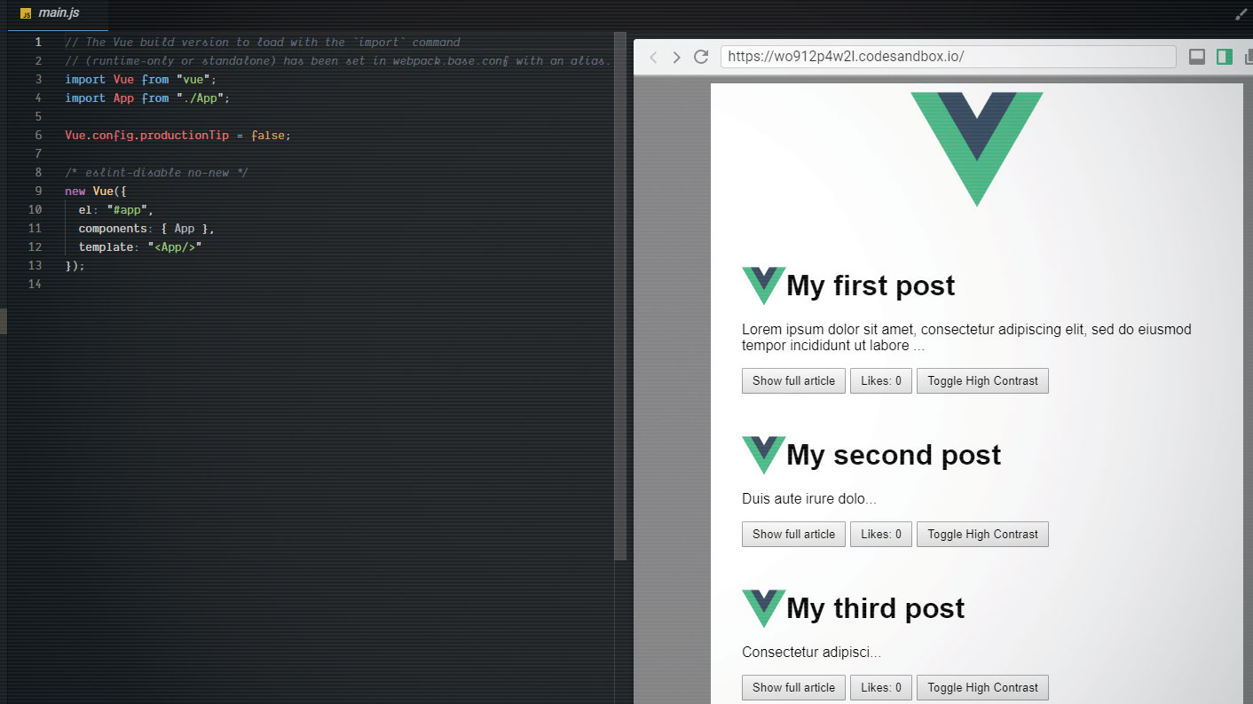
We are going to build an accessibility mixin. This will provide a toggleContrast method that can be applied to any of our component.
export default {
props: {
lightTextColour: { type: String, default: "#252525" },
lightBackgroundColour: { type: String, default: "#fff" },
darkTextColour: { type: String, default: "#fff" },
darkBackgroundColour: { type: String, default: "#252525" }
},
data() {
return { isLight: true };
},
methods: {
toggleHighContrast() {
this.isLight = !this.isLight;
if (this.isLight) {
this.$el.style.backgroundColor = this.lightBackgroundColour;
this.$el.style.color = this.lightTextColour;
} else {
this.$el.style.backgroundColor = this.darkBackgroundColour;
this.$el.style.color = this.darkTextColour; }
}}
};
Now our code is defined, we can include it in any components and use its methods and properties as if they were defined in the actual component. Mixins could be properties driven, enabling them to offer it as soon as they are included in the component, or they may need some action to take effect (eg. having to call a specific method).
To take full advantage of this feature, we need to make the following modification within our code:
<template>
<div class="article">
…
<button v-on:click="toggleHighContrast">Toggle High Contrast</button>
</div>
</template>

<script>
import Accessibility from "../mixins/Accessibility.js";
…
mixins: [Accessibility]
};
</script>
We can now toggle the contrast on the individual component using the new defined button. It is important to understand that even if no extra properties have been defined, our article component is actually able to accept lightTextColour, darkTextColour, lightBackgroundColour and darkBackgroundColour. These are defined within the accessibility mixin.
Our small prototype is now fully working and can be used as a reference for future projects.
This article was originally published in issue 316 of net, the world's best-selling magazine for web designers and developers. Buy issue 316 here or subscribe here.
Related articles:

Thank you for reading 5 articles this month* Join now for unlimited access
Enjoy your first month for just £1 / $1 / €1
*Read 5 free articles per month without a subscription

Join now for unlimited access
Try first month for just £1 / $1 / €1
