Create an animated steam text effect
Introduce text content with a blur text effect that appears line by line.

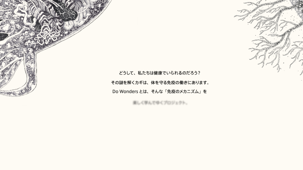
Adding effects to text can add a whole new level of engagement and interest. Effects such as kinetic typography will grab a viewer's attention, aid user experience and help tell the story that is being told. The text effect on the Do Wonders site brings the web font into focus line by line. Read on to find out how to recreate something similar.
Get the project files to help follow this tutorial.
01. Initiate HTML document
The first step is to define the document structure that will store the HTML content. This consists of the document container, which stores the head and body sections. While the head section stores inks to the external CSS and JavaScript resources, the body stores the visible content created in step 02.
Article continues below<!DOCTYPE html>
<html>
<head>
<title>Blur Text</title>
<link rel="stylesheet" type="text/css" href="styles.css" />
<script src="code.js"></script>
</head>
<body>
*** STEP 2 HERE
</body>
</html>02. HTML content
This step defines the visible HTML content. Take note of how the texts designated to have the blur effect are all contained within a container that has the ‘blur’ class. This class is used by JavaScript to reference the text items in step 03, and by CSS in later steps.
<h2>
  Discipline comes from
  <ul class="blur">
  <li>commitment</li>
  <li>perseverance</li>
  <li>dedication</li>
  <li>training</li>
  <li>aspiration</li>
  <li>education</li>
  </ul>
</h2>
03. Automated animation delay
Create a new file called ‘code.js’. Each item inside the blur container is to be presented three seconds after the previous item. JavaScript is used to automate the application of unique CSS attributes. The first step of this is to select all of the first-level items inside the blur container – after the page has loaded.
window.addEventListener("load", function(){
  var nodes = document.querySelectorAll(".blur > *");
  ***STEP 4 HERE
});
04. Number of seconds
A ‘for’ loop is used to reference each item returned to the ‘nodes’ variable in the previous step. The index counter of the ‘for’ loop is used to calculate the number of seconds to assign to the animation delay attribute. As a result, each item has a delay that is three seconds longer than the previous item.
for(var i=0; i<nodes.length; i++){
  nodes[i].style.animationDelay = (i*3)+"s";
}
05. CSS blur
Create a new file called ‘styles.css’. The first step for defining the CSS presentation rules initiates each of the text items as invisible. An animation called ‘animationBlur’ is also applied that will animate the item into view over a five-second duration. The animation mode must be set to ‘forwards’ so that it stops on its last frame.
Sign up to Creative Bloq's daily newsletter, which brings you the latest news and inspiration from the worlds of art, design and technology.
.blur > *{
  opacity: 0;
  animation: animateBlur 5s forwards;
}
06. Initiate animation
The animation applied to the ‘blur’ elements in Step 5 are defined in this step. The reference to ‘animationBlur’ is made as a keyframes animation. The first frame ‘from’ sets the elements as visible with a text shadow – but with a transparent text colour. This is what produces the blurred text effect.
@keyframes animateBlur {
  from {
  opacity: 1;
  text-shadow: 0 0 1em rgba(0,0,0,.5);
  color: rgba(0,0,0,0);
  }
    *** STEP 7 HERE
}
07. Final animation frame
The ‘to’ frame within the animation defines the final frame that the text will be animated to. This frame sets the text shadow to disappear, along with a text colour that’s fully visible. Combined with step 06, the animation frames between ‘from’ and ‘to’ will be automatically calculated by the browser.
to {
  opacity: 1;
  text-shadow: 0 0 0px rgba(0,0,0,0);
  color: #000;
}
This article originally appeared in Web Designer magazine. Subscribe here.
Remember - always think of the user

When introducing fancy effects to a page it needs to have a purpose, you need to be thinking of the user experience. And this is what freelance front-end UI developer Sara Soueidan will be revealing in her 'Using CSS (and SVG) for the Good of UX' talk at Generate London 2018.
In her talk she is going to show a wide range of possibilities that CSS offers to improve the overall user experience of your UI, using CSS (with sprinkles of SVG and JS here and there).
Make sure you don't miss out. Get your ticket now.
Related articles:

Leon is a freelance web developer and trainer who assists web developers in creating efficient code for projects. He has worked on front-end and server-side web applications, having taught himself to code using an Amstrad computer in the 1990s. Leon has written an extensive selection of tutorials on web design for Web Designer Magazine and .Net, as well as introductions to programming concepts for beginners.
