Create a stunning web banner in Photoshop CC
Learn how Adobe Stock can help save you time and money when making web banners in Photoshop CC.
Getting a web banner designed professionally can give your brand that much needed ‘sparkle’ to stand out in the mad clutter of cyberspace. But enlisting the services of a design studio can prove costly and frustrating – after all – nobody knows your brand quite as well as you do.
Adobe Stock provides all the tools you need for the best of both worlds, a quick and easy solution that doesn’t cost a lot of money. In this tutorial you will learn how to use one of Adobe Stock’s professionally designed templates to create your own personalised web banner, populated with stock images from its extensive library.
01. Choose a document template
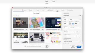
Open Photoshop CC and create a new document. For these banners I used one of the free templates made available in Adobe Photoshop CC, but you can browse the Adobe Stock website for a wider variety of options. Click on the ‘Web’ tab in the New Document window and scroll down to the ‘Modern Web banner Layout’.
This template presents a simple and clean layout, allowing plenty of space for words and images. Double-click on the template or on the Download button in the bottom corner. This will make the template available in your New Document window.
Open the template in Photoshop CC. This file uses the typeface ‘Roboto Slab’ for all of the text. If this is missing from your computer then a window will open letting you resolve the missing font issue with Adobe Typekit, available to all Creative Cloud subscriptions.
The canvas contains four banners in basic display advert sizes, which are written above the top edge of each artboard. Pick one to work on and perfect that design before applying it to any others. It’s possible that you have different size requirements for a specific website. You can change the dimensions of the artboard in the Properties panel or by clicking on the artboard in the Layers panel and using the Move tool to drag the corner points. Some of the layers will need to be resized to account for these changes.
02. Add your own text
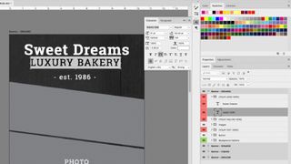
Each layer is named and grouped to make it easier for you to edit. Use the Type tool to click into text boxes and insert your copy. If you already have your own logo you may want to insert a graphic into the document to replace the top two layers, which currently read ‘Company Name Here’. You can do this by clicking their eye icon off in the Layers panel or simply deleting the layer.
Don’t be afraid to experiment with different typefaces, especially if your company has its own brand guidelines. I used a combination of 'Brush Script Std' and 'Adobe Caslon Pro' to add style to my company name ‘Sweet Dreams’. Use the Character panel to adjust the size, leading and kerning of your text to fill the space, focusing on making the text as readable as possible.
03. Experiment with images
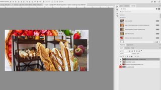
This document uses smart layers for image placement, allowing nondestructive editing of the layer while preserving the original image data. You can access the smart layer source file by double-clicking on the layer thumbnail or through Layer > Smart Objects > Edit Contents, which opens the file in a new window.
It’s possible that you already have a selection of your own images to use, but it is unlikely you can match the quality and variety of Adobe Stock’s library. I used the image search function in the Library panel to browse for images of cakes, breads and tarts, without ever having to leave the app window. You can test low-res versions directly on your design, by dragging them into the canvas, before making any final decisions to purchase. When I was happy with my choices I right-clicked on them and licensed them, making high-res versions available. If you have already placed these images into your file, simply right-click on the image thumbnail and select ‘Update Modified Content’.
04. Personalise the style
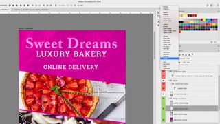
With all the content in place it’s time to transform the banner into something that really sings of your own style. Start by changing the background. Under the group labelled ‘Background Options’ you can edit both the colour and texture of the background (from three textures supplied). I chose a punchy magenta that would stand out in digital format, but you may have your own brand colours or prefer to use the eyedropper to pick a colour from one of the images.
I chose the Marble Texture and switched it to a Divide blend mode. It may be worth experimenting with other blend modes as they can often lead to unpredictable results. If you have more specific textures in mind, you can always import your own images and experiment with different blending modes and opacities.
Edit the other elements, in this case the text and button, to complement the colours you have already chosen. I don’t like to confuse a design with too many colours so I stuck with a simple scheme of magenta, white and black.
05. Save and export
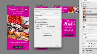
Save the document in .psd format. The file will already be RGB and ready for digital platforms. To export one of the artboards, without the surrounding pasteboard, go to Export > Artboards to Files. After designating a file name and destination, you get the option to export all artboards or just the one selected. Change the filetype to jpg and turn the quality up to 12 in the Export options. Then press Run and upload the finished banner to its desired location.

Thank you for reading 5 articles this month* Join now for unlimited access
Enjoy your first month for just £1 / $1 / €1
*Read 5 free articles per month without a subscription

Join now for unlimited access
Try first month for just £1 / $1 / €1
Get the Creative Bloq Newsletter
Daily design news, reviews, how-tos and more, as picked by the editors.

Matt has worked for various publishing houses and design agencies, covering studio photography, video production, editorial design, branding, illustration and motion graphics. He currently works for Future PLC with brands such as T3, Woman&Home, Marie Claire, Music Week, TechRadar, Golden Joysticks, Cycling Weekly, Brand Impact Awards, Horse&Hound and Tech&Learning. In the past he has designed titles including Mac|Life, IQ, Bow International, Drummer, iDrum, Acoustic, Clay Shooting, Sea Fishing and GunTradeNews. He has experience across the full Adobe Suite and is currently spending a lot of time creating projects in Blender and After Effects.