Create a self-portrait with just 4 colours
We guide you through capturing your own likeness in oils using a limited palette.
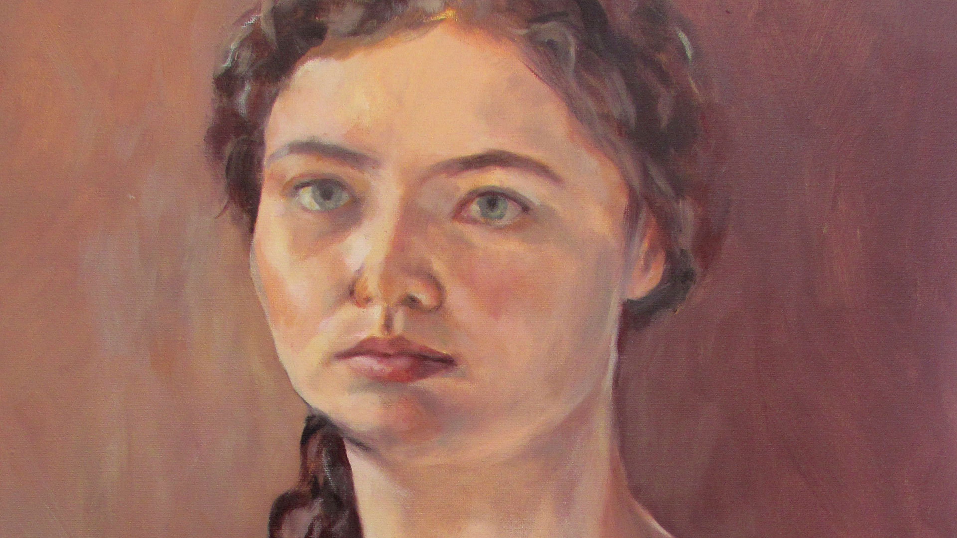
Self-portraiture is one of the most rewarding challenges an artist can attempt. Because we know the landscapes of our own faces better that anyone else, we know when the painting looks right. While self-portraiture can be a way of projecting a certain image of yourself onto a canvas, it can also be a process of self-discovery and a great way to explore painting techniques.
Capturing a likeness takes practice, but the trick is not to get frustrated. I don't tend to use drawing aids such as a projector or grid (though these can be useful). I like the process to feel organic, and making mistakes is part of that.
Here, I'll be using a palette of Lamp Black, Titanium White, Yellow Ochre, and Cadmium Red. It's surprising how great a range of tones can be created with just four colours and a limited palette often creates a subtle, harmonious portrait.
To set up, position a mirror on a table or wall so that you can easily glance between the canvas and your reflection. Make sure your workspace has plenty of natural light – if the light hits one side of your face and casts the other in shadow, it will help you find form.
01. Draw it out
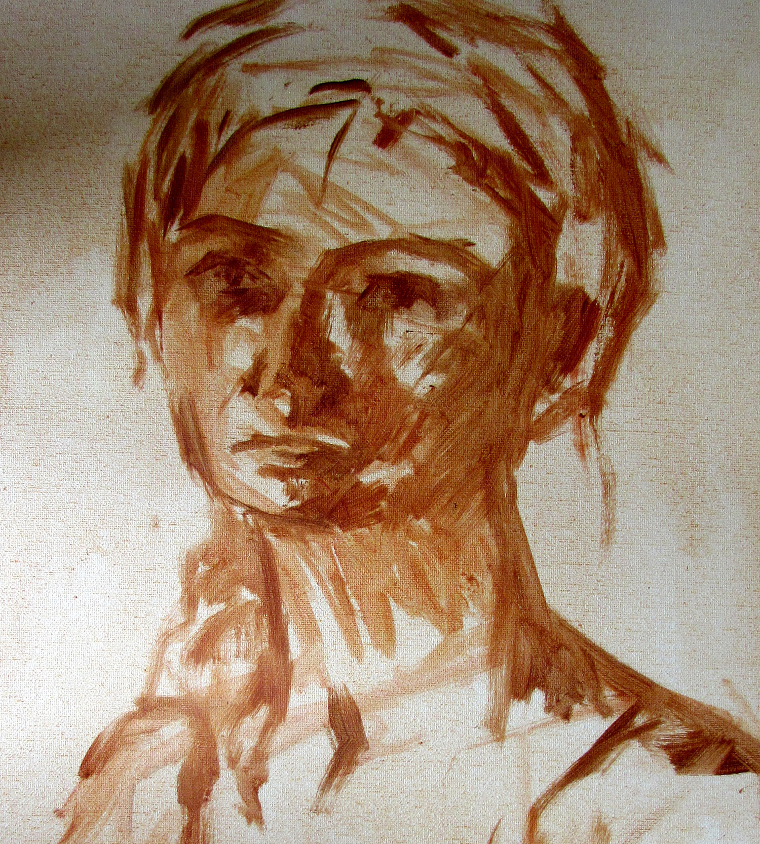
Using a thin mix of Cadmium Red and Yellow Ochre, I start sketching what I see in the mirror. At this point, I'm trying to capture the basic movement of the figure, as well as the angles where the head meets the neck and torso. I build up the sketch, using expressive strokes to mark out the areas of light and dark, and use these areas to find the eyes, nose, and mouth. A likeness isn't important at this stage – you just need to see how the portrait will take shape when you begin to add colour.
02. Test your colours
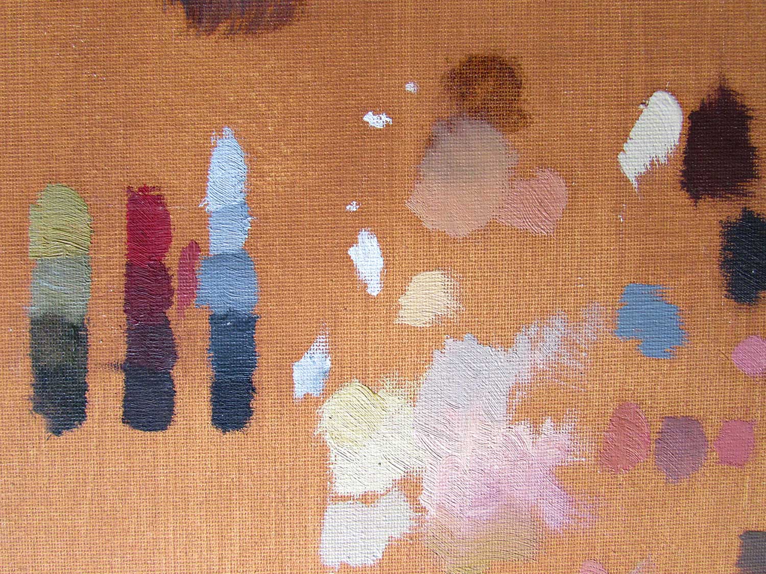
Before adding colour, I explore the range and qualities of the four colours I've chosen. On a separate canvas, I try out different combinations in a grid, as well as mix a few skin tones to see what the effect is.
03. Blocking in
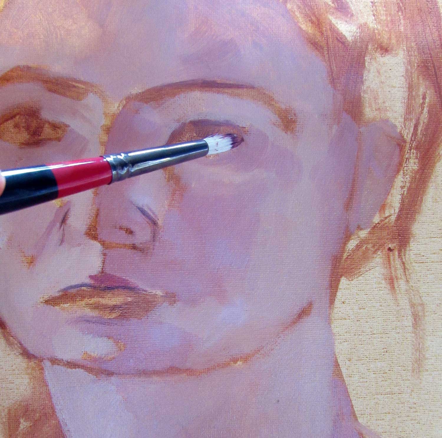
Adding the first blocks of colour really breathes life into a portrait. Using the red, yellow and white, I mix a light, mid and darker skin tone. Using these mixes I roughly block in the colours using my tonal sketch as a guide. Keep looking in the mirror and be receptive to changes and discoveries.
Get the Creative Bloq Newsletter
Daily design news, reviews, how-tos and more, as picked by the editors.
04. Lips, hair and eyes
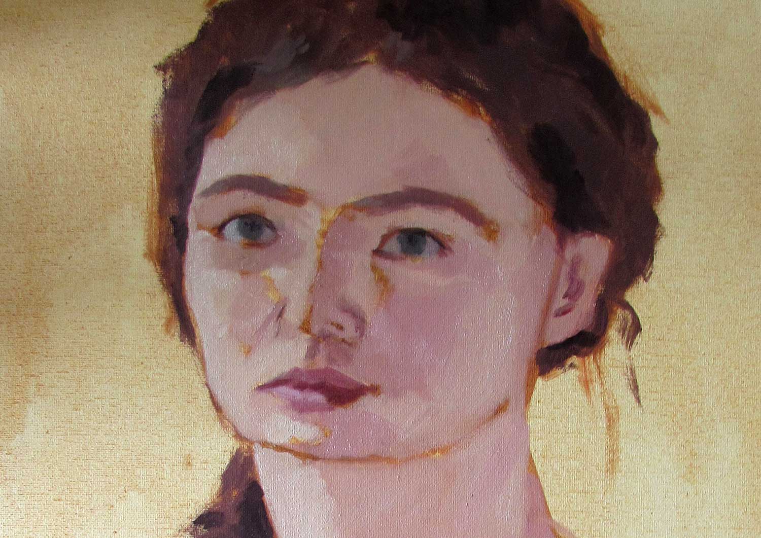
I mix light, mid and dark tones for the hair and the lips. For both, I'm using proportions of red, black and white. To paint hair, keep it light and suggestive without painting heavy blocks of colour or tiny individual strands. My eyes are blue-green, but there's no blue or green in my palette. However, a mix of black and white creates a blue grey. I've added a small amount of Yellow Ochre to the grey to create a greenish hue. I mix an off-white for the whites of the eyes.
05. Deepening and darkening
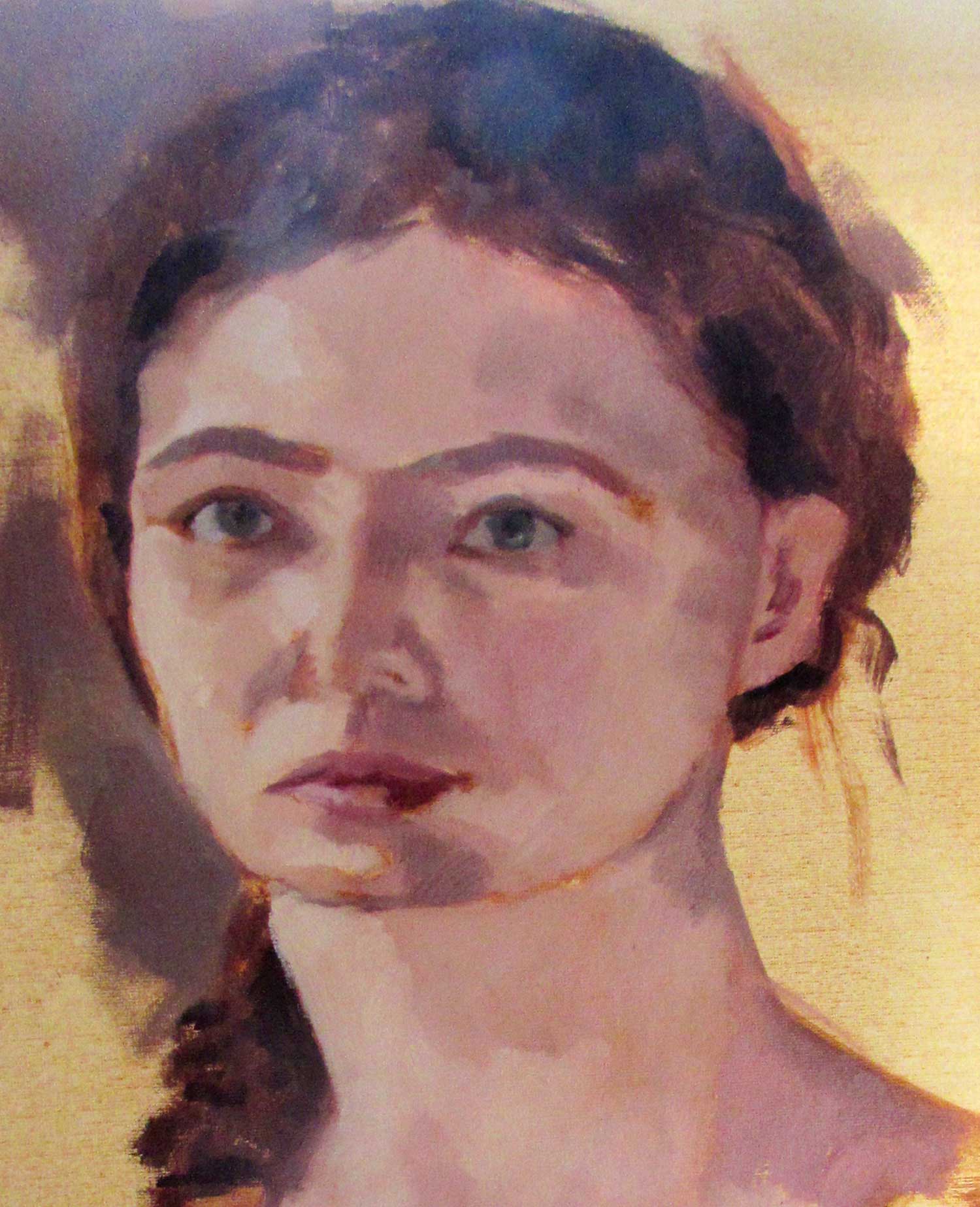
Now that I've added the dark hair, the balance of tones in my painting has changed, and suddenly my face looks pale, even where it is in shadow. To restore the balance, I'm darkening the shadows on the right side of my face, using tones similar to those in the hair. I've also started trying out a colour for the background to see how it looks against the skin tones.
06. Time for the background
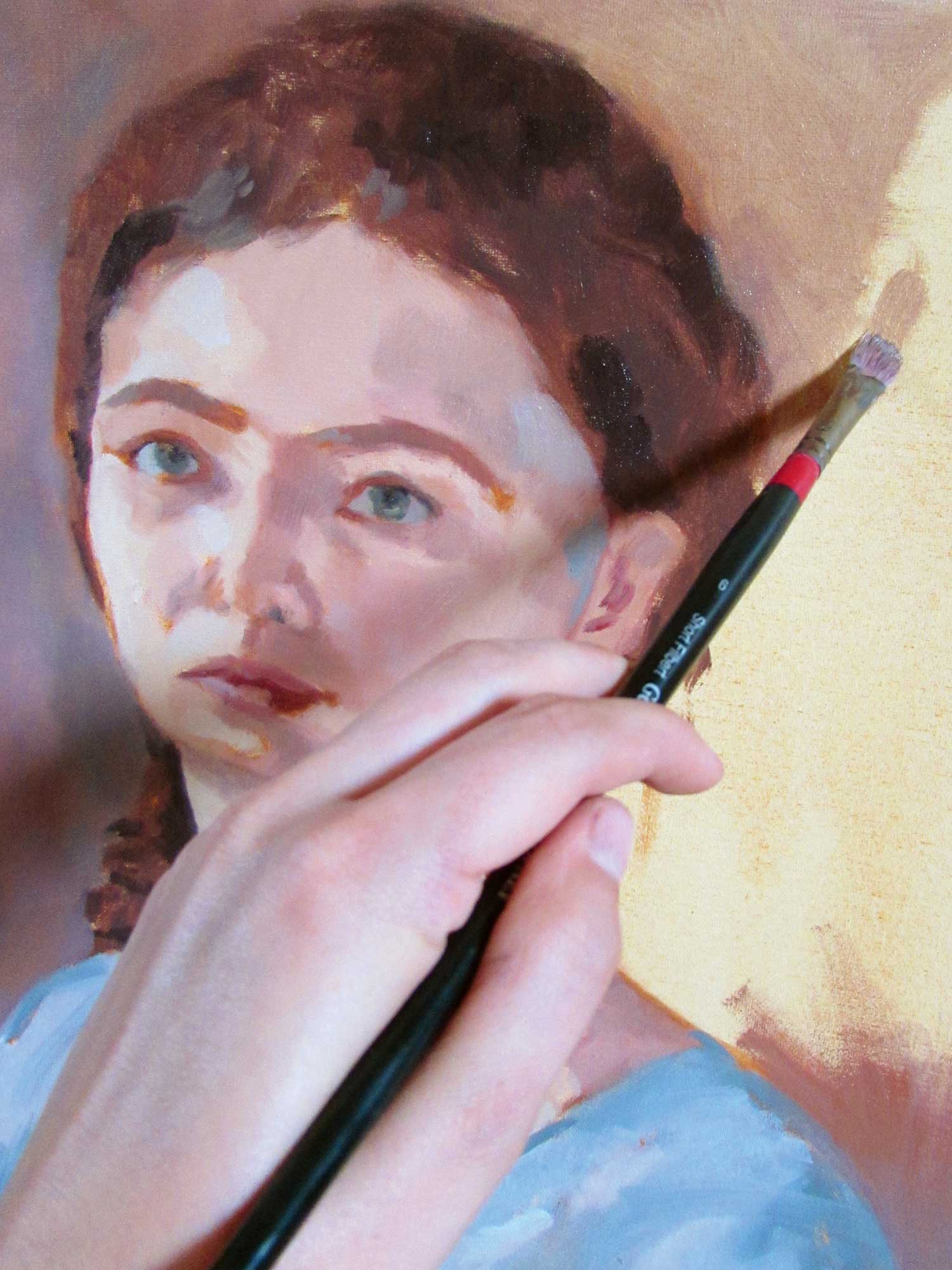
You need the background colour to set off the foreground without upstaging it. I've decided on a warmish brown, which I want to pick up some of the purple and orange tones in the face. Once I've chosen the colour, I start picking it up in the right-hand side of the face and neck, which helps make the shadows recede, bringing them closer to the background.
07. Colouring clothing
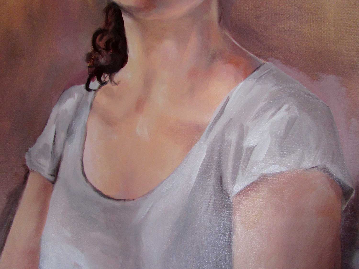
I am wearing a white top but, as with the whites of the eyes, I don't want to use pure white to block it in. Instead, I use all my colours to create a warm grey, which I block in with three tones. I can now add establish lights and darks on the neck, and bring out some of the more yellow tones.
08. Devilish detailing
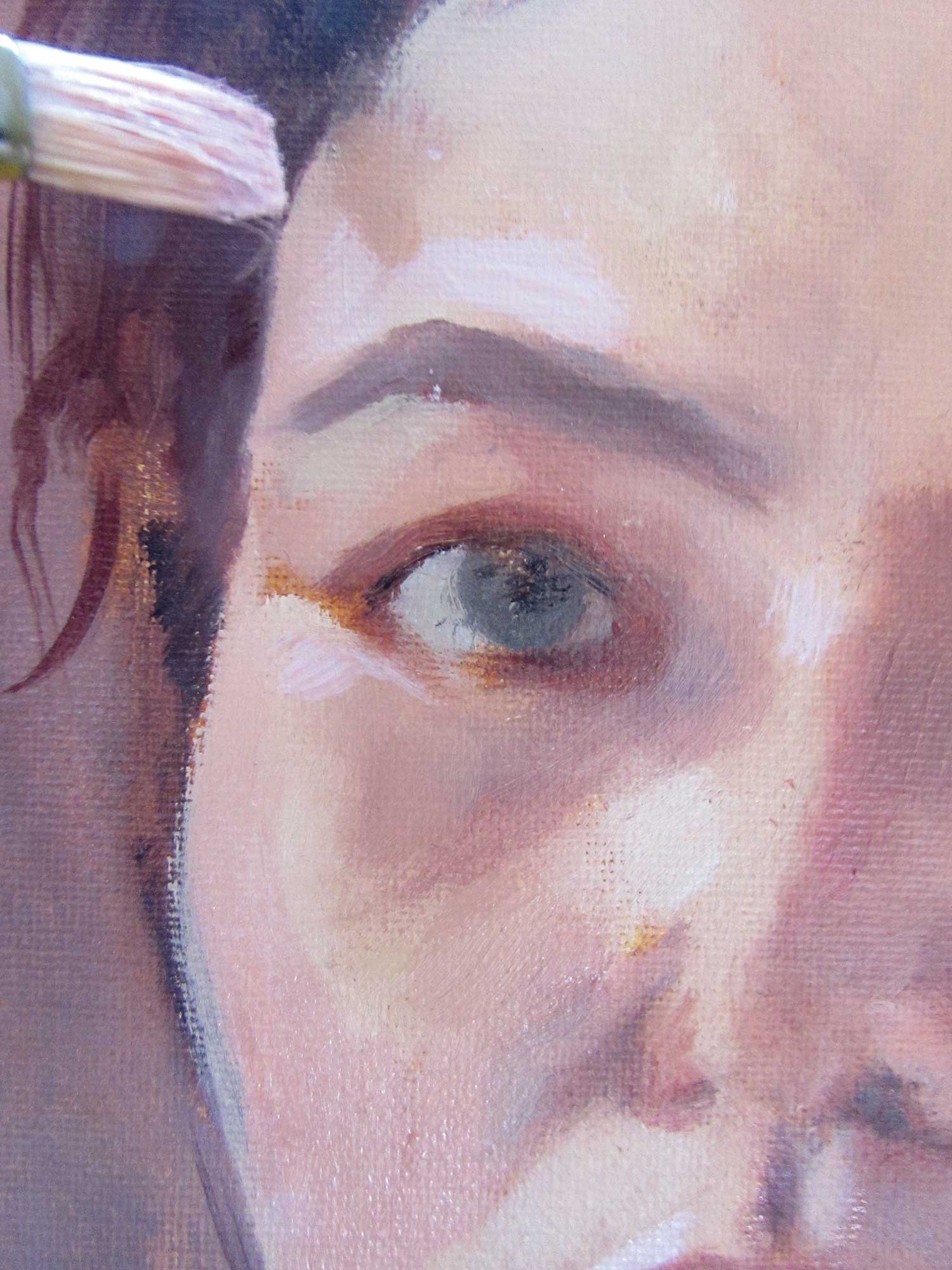
It's time to work on the detail. I pay attention to where the shadows might be more blue or yellow, and to where the highlights fall on the face, defining the features. I add warm, orangey tones around the eyelids. Here, I take a lighter touch with my brush, and blend the colours carefully without losing the individuality of each stroke.
09. Nip and tuck
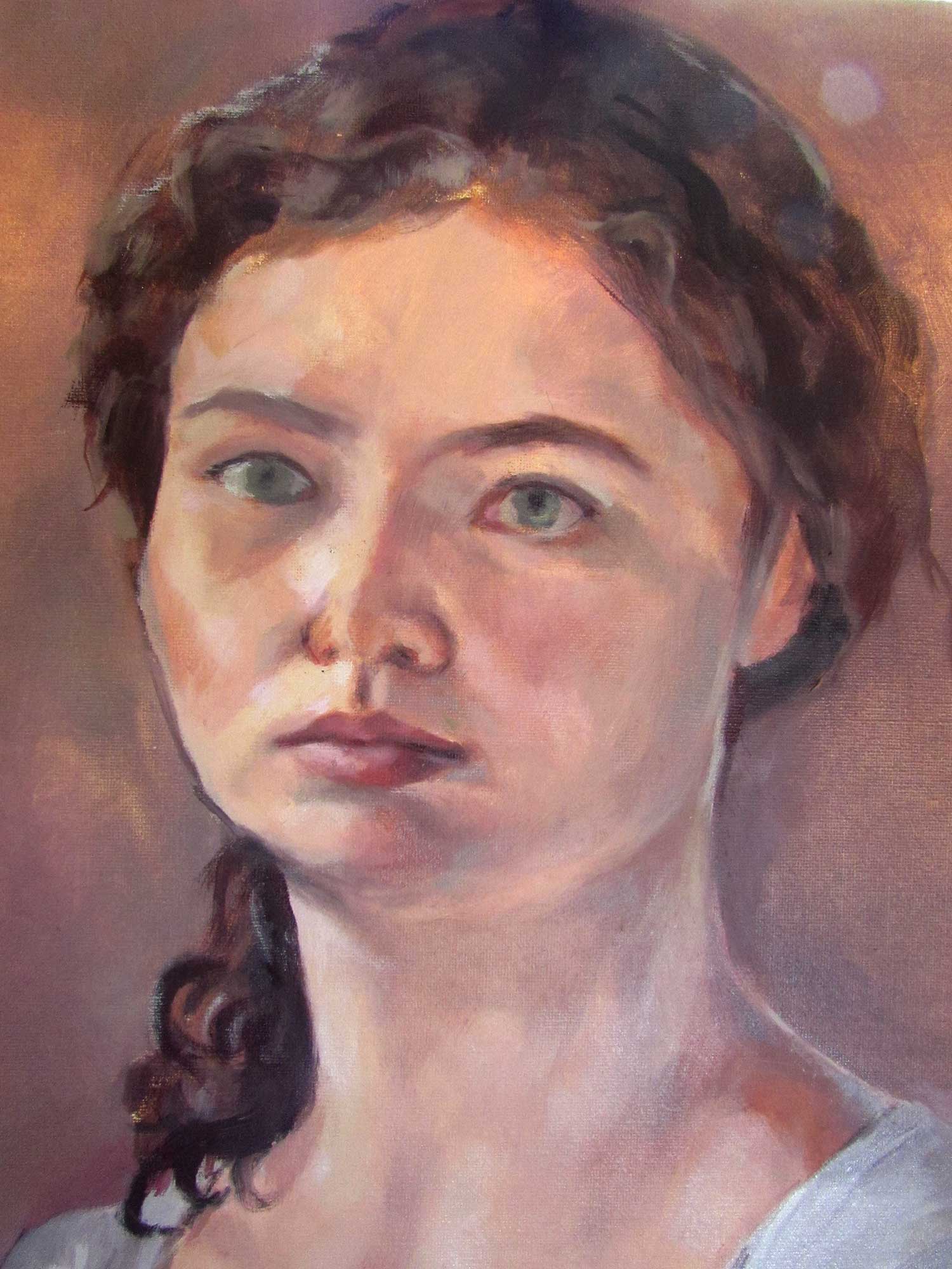
As I've been working, I have inadvertently thinned the neck, lowered the left shoulder and lowered the chin. My left eye is also too high up and needs repositioning. As you make tweaks, don't worry if you lose the likeness at this stage.
10. Highlighting
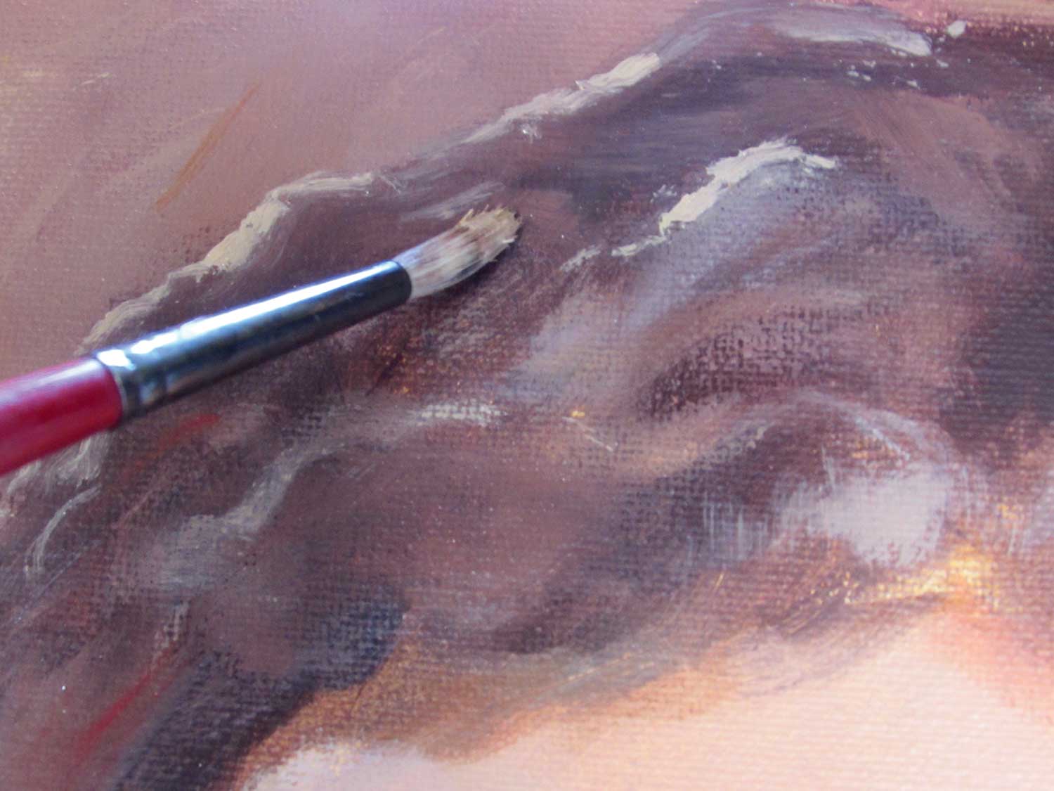
Using a small round-tipped brush, I add some highlights where the light hits my hair – again, not pure white, but a very light ochre. Don't be afraid to use thicker paint.
11. Softening up
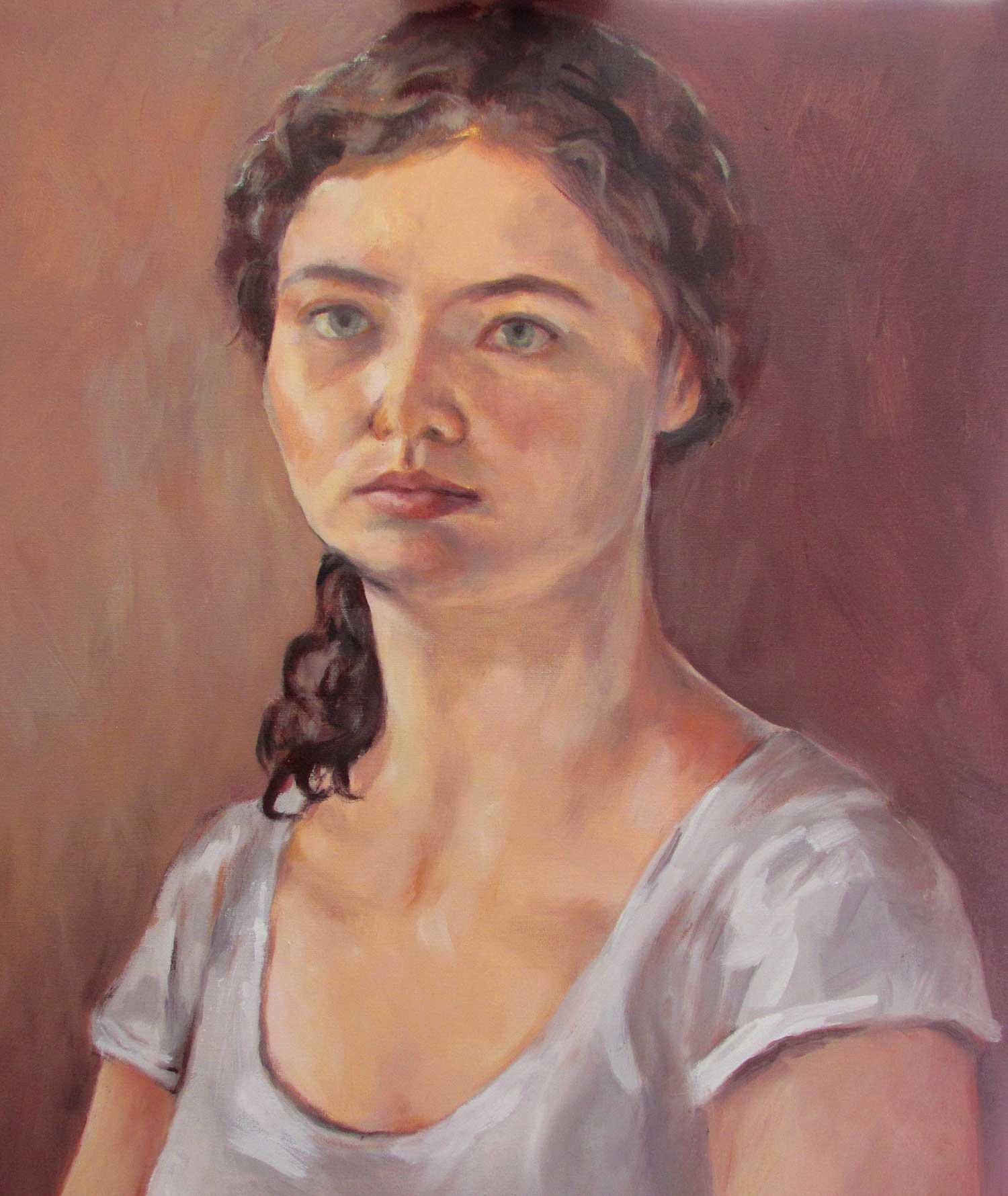
I am getting close to finishing, and don't want to overdo the painting. I start to add thin layers of paint to areas of dry canvas, which helps to soften, unify, and add finish to the painting. I'm creating the layers by adding plenty of Liquin to my paint until the mix is almost transparent. This technique also works well for the background, deepening its texture without making it distracting.
12. Sleep on it
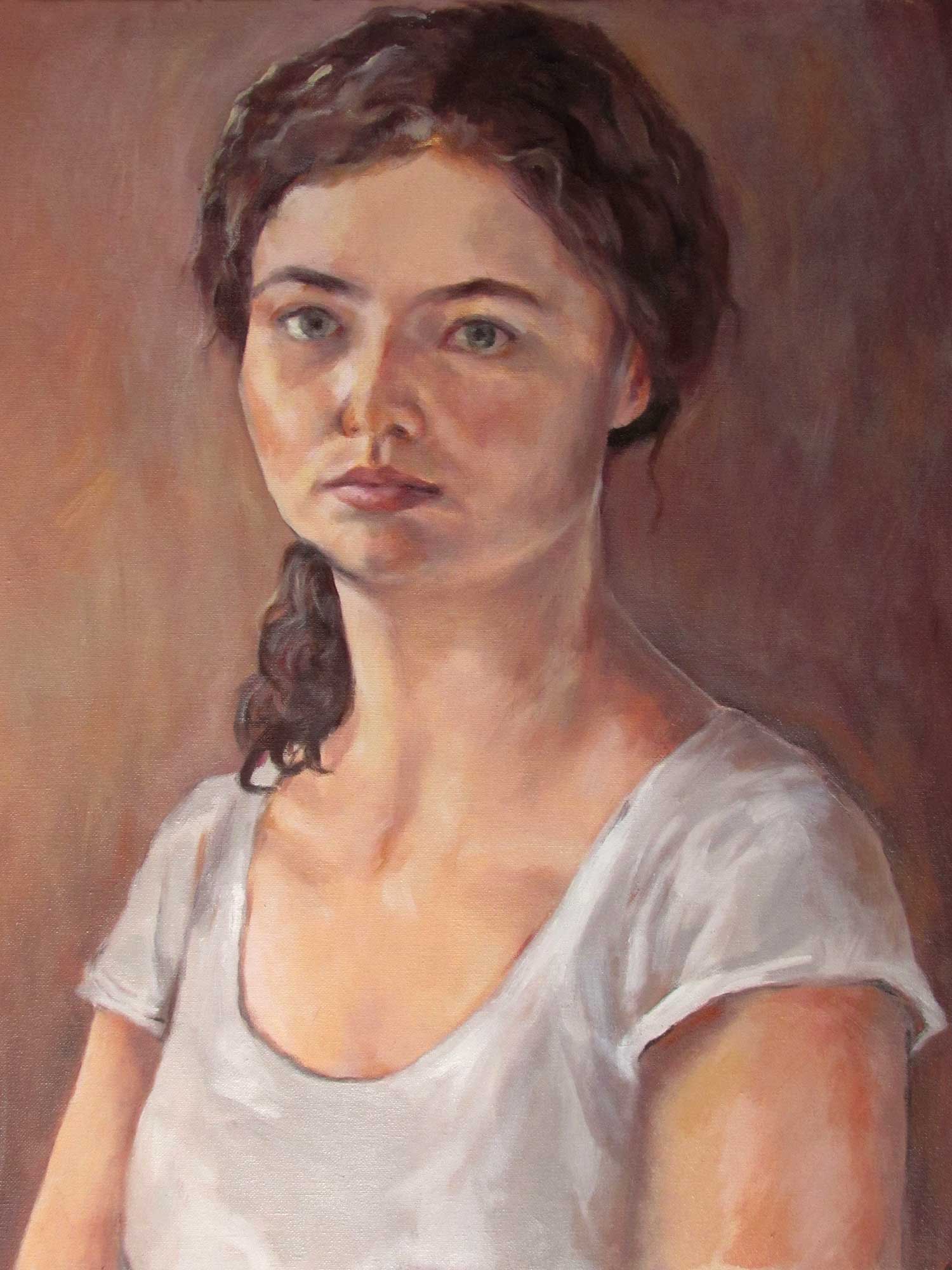
When I went away from the portrait and came back to it in the morning, it became clear what wasn't quite right. So, I thicken the hair, raise the right shoulder, change the direction of the gaze, and darken the eyebrows, hair, and neck. I've also added some small curls of hair. Small details can make all the difference.
This article originally appeared in Paint & Draw issue 2; buy it here!
Related articles:

Thank you for reading 5 articles this month* Join now for unlimited access
Enjoy your first month for just £1 / $1 / €1
*Read 5 free articles per month without a subscription

Join now for unlimited access
Try first month for just £1 / $1 / €1
