Create a responsive layout with CSS Grid
A step-by-step guide to building a portfolio website with Grid.

CSS Grid Layout is growing in browser support every day and we can ship CSS Grid to production. The quick adoption of CSS Grid has been truly remarkable.
Before we get to making a responsive portfolio site layout with CSS Grid, let’s clear a couple of things up: CSS Grid is not a replacement for Flexbox. It’s not even a replacement for floats. In fact, you might realise that we’ve been using Flexbox to do things that CSS Grid does much better. But instead of thinking in terms of replacement, we can think in terms of combination.
Imagine a peanut butter and jelly sandwich. Peanut butter and jelly are pretty great on their own, but when they come together, a new thing is born and magic happens.
This is what our website layout tools are like. They are great at the things they do individually, but when they’re combined, magic happens and we can create new and exciting layouts. In this instance, we’ll make a web development PB&J of our own with CSS Grid and Flexbox. Want to simplify your process even further? Choose a decent website builder.
01. Set up your markup
In this tutorial, we're going to use CSS Grid and Flexbox together to create a responsive portfolio layout. Each of these boxes are a different size, some of them span across rows and each box has a title that sits at the bottom. We’ll use some of the great alignment tools that come with Flexbox to make that happen.
Let’s start by setting up our markup.
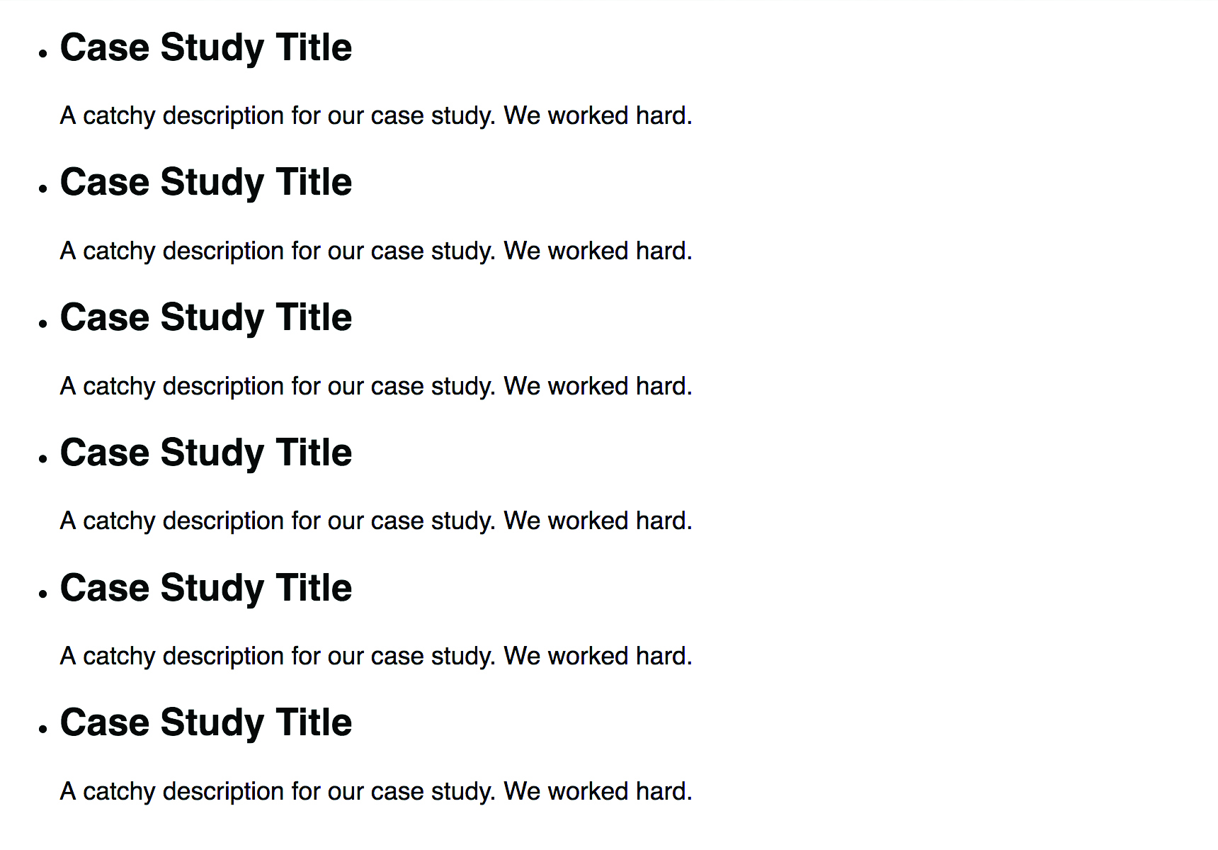
<ul class=”boxes”>
<li>
<div class=”boxes__text-wrapper”>
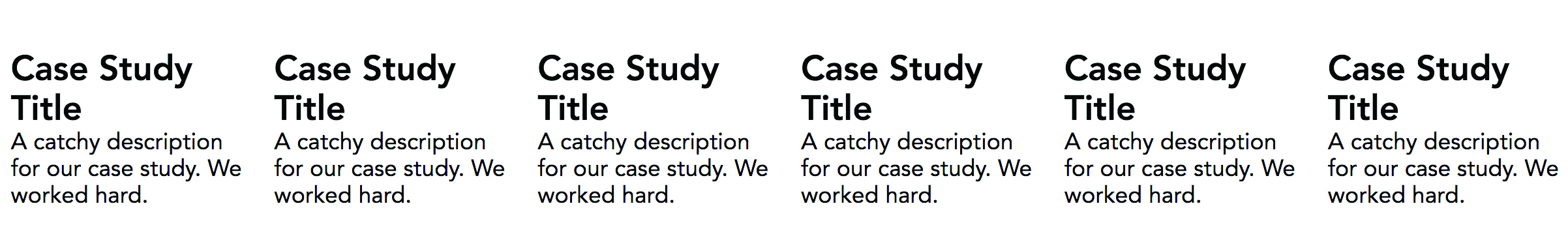
<h2>Case Study Title</h2>
<p>A catchy description for our case study. We worked hard.</p>
</div>
</li>
</ul>We’ll duplicate that list item and everything in it six times so we have items to play with. In case you’re wondering, we’ve decided to use the ul element here because this is a list of entries. Feel free to use whatever feels right to you.
Get the Creative Bloq Newsletter
Daily design news, reviews, how-tos and more, as picked by the editors.
Inside of the list item we have a div with the class of .boxes__text-wrapper that will contain the title of the case study and its accompanying description.
02. Write base styles
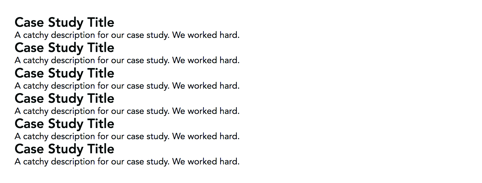
Now let's set some base styles to work with.
body {
  font-family: Avenir, sans-serif;
  margin: 2rem auto;
  width: 95%;
}
h2,
p {
  margin: 0;
}
ul {
  list-style: none;
  padding: 0;
  margin: 0;
}
.boxes > * {
  padding: .5rem;
  background-color: #333;
  color: white;
}
We’ve changed the font to be Avenir. We’ll remove margin from our heading and paragraph, and reset the unordered list. We’ll also give each list item some default styles to help us see where each one is.
03. Set up your grid
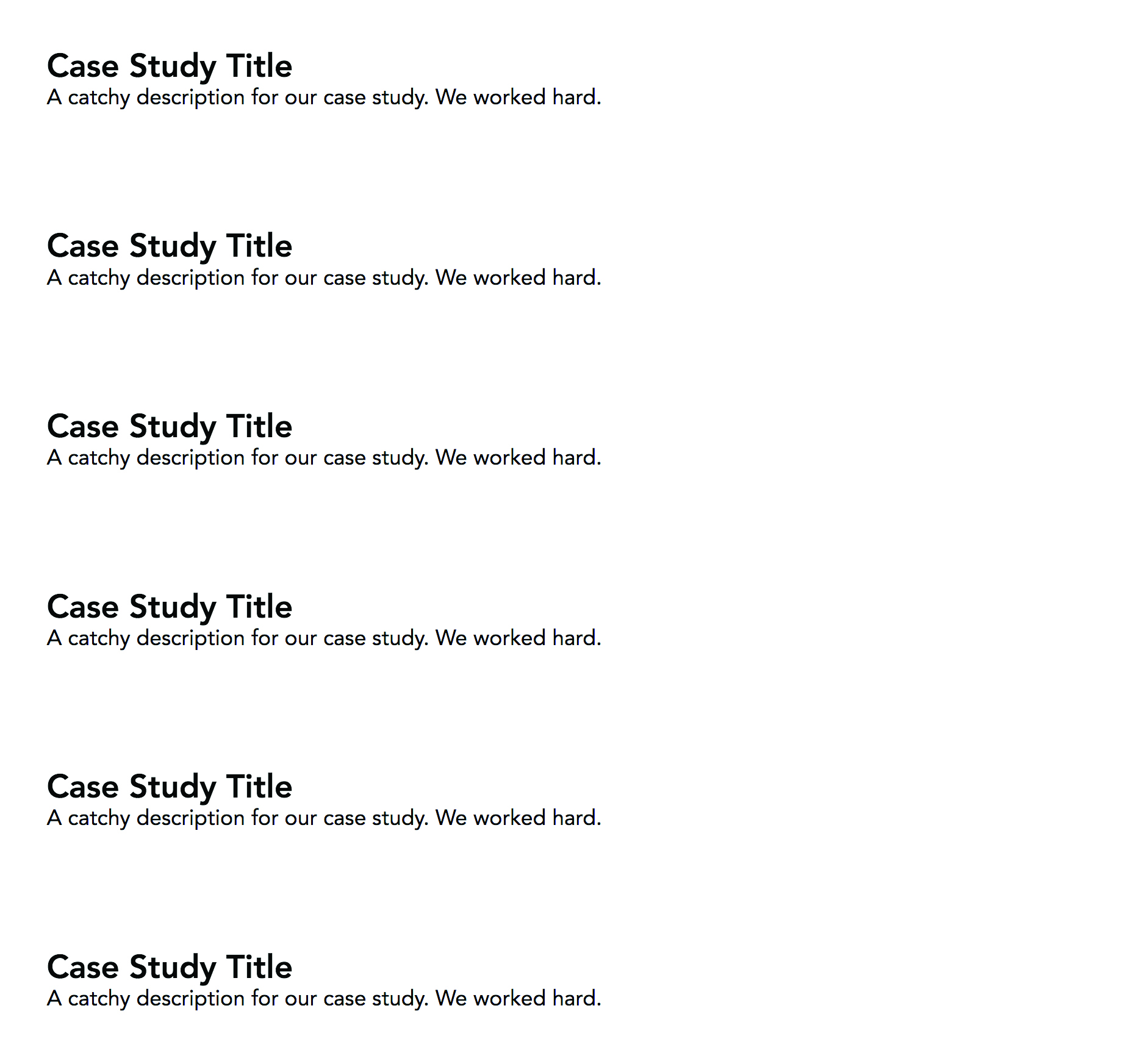
We want to build our layout for mobile first. Setting up our grid on small screens is as easy as this:
.boxes {
  display: grid;
  grid-auto-rows: minmax(125px, auto);
  grid-gap: .5rem;
}
Grid will stack our items on top of one another because by default there is only one column. We’ll create some space between each case study by using grid-gap – this lets us add a gutter between rows and columns.
Forget adding a margin to columns only to need complex nth-child selectors; gutters only appear between columns or rows, never after or before a column or row.grid-gap is the shorthand of grid-column-gap and grid-row-gap. Usually we’d use the longhand, but we’re going to overwrite both as the browser grows so we’ll use the shorthand.
Next, we’ll use grid-auto-rows to tell our grid container the height of new rows. Grid will create new rows to place all of our content. We can control the size of these automatically-created rows with the grid-auto-rows property. We’re using a new function available to us: minmax(). With minmax() we can specify a minimum size and a maximum size.
With our code we’re saying that we want our rows to be a minimum of 120px and a maximum of auto. We’re using auto here because we want our rows to grow if the content warrants it.
04. Set up large browser compatibility
Let's set up our page so that when our browser is 40em or larger, our grid container has six columns of one fraction each.
@media screen and (min-width: 40em) {
  .boxes {
    grid-template-columns: repeat(6, 1fr);
    grid-gap: 2px;
  }
}
grid-template-columns is the property we use to tell our grid how many columns should exist. It accepts all the length units we know and love such as rem, em, px, percentages, vw, vh and fr.
The fr is a new unit that we get with CSS Grid Layout. With it, we can tell the browser to do maths instead of us – excellent.
By telling the browser to create six columns of one fraction, the browser will calculate the width of our grid container and split it into six equal columns. Also, because Grid is smart, it’ll only divide the space left over after calculating the gutter that we specified.
05. Style individual items
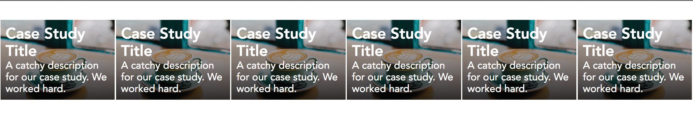
Our case studies look a little drab as just grey boxes. Let’s add a background image, get our titles to display at the bottom of these boxes and add a gradient so that our title stands out.
.boxes li {
  background-image:
    linear-gradient(rgba(0,0,0,0), rgba(0,0,0,0.8)),
    url(path/to/image);
  background-size: cover;
  display: flex;
  align-items: flex-end;
}
This background image was a free image from Unsplash, but feel free to use whichever image you’d like. I’m also bringing Flexbox into the mix to align our text to the bottom of our boxes. You won’t see that yet, but as we place each different box you’ll eventually see it work.
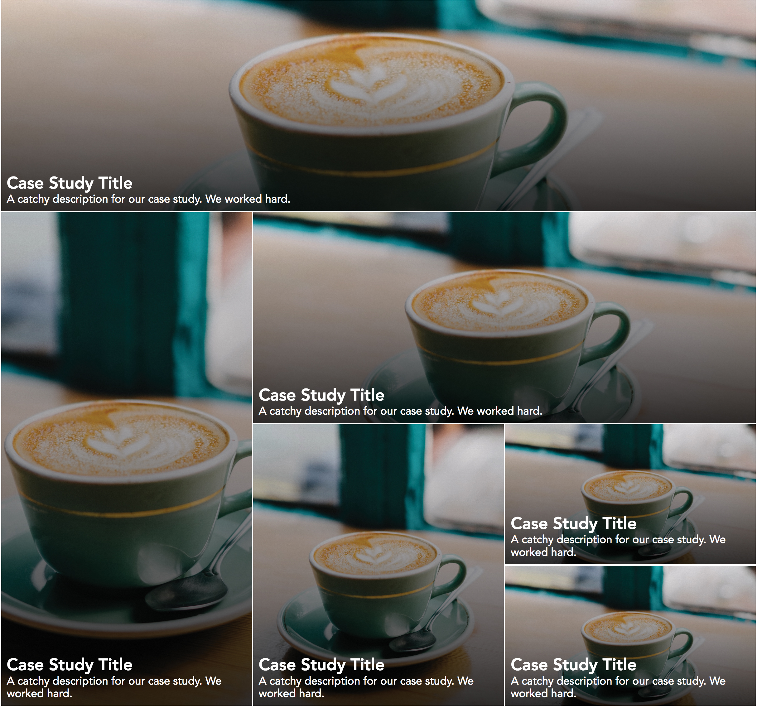
06. Place items on the Grid
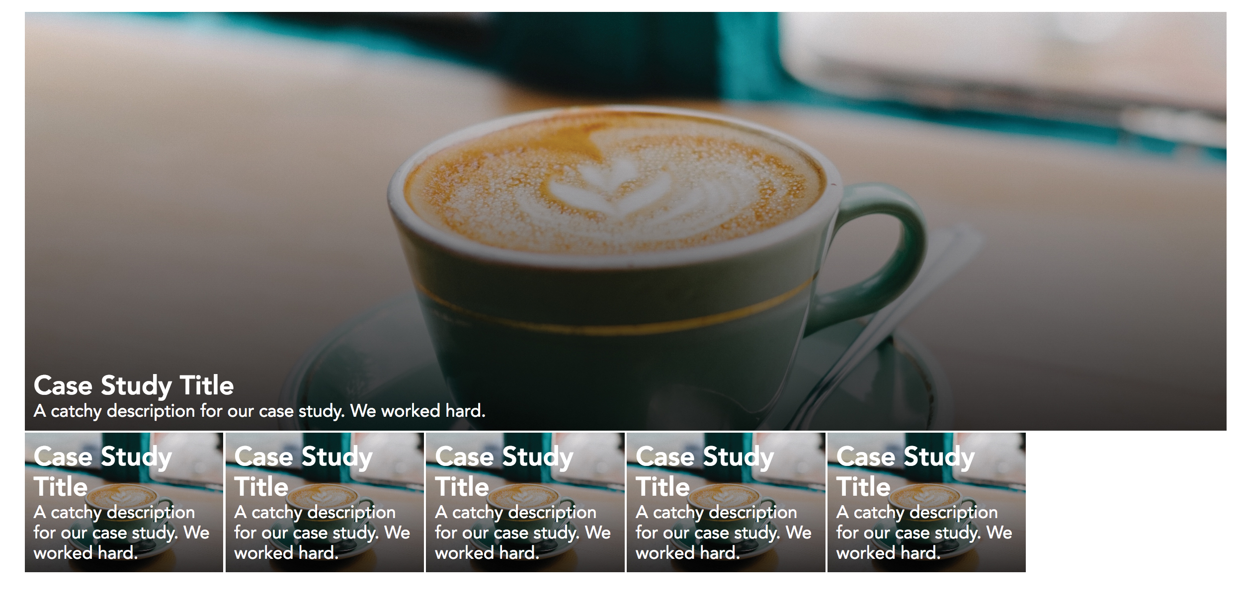
Unfortunately, Grid does not have a way to automatically place items in the grid layout that we saw at the beginning. Fortunately for us, however, Grid does give us the tools to do it manually quite easily. In this tutorial, we'll use nth-child to place each list item. In a production website, we would advise to use a class that, given the right planning, could make it possible to automate layouts like this in a content-heavy site.
Let’s get started with our first item.
@media screen and (min-width: 40em) {
  .boxes li:nth-child(1) {
    grid-column: 1 / -1;
    grid-row: span 3;
  }
}
We’ll be putting all of our placement styles inside of that media query we wrote earlier because we want this layout to happen after our browser is 40em or larger. With nth-child we’re targeting the first list item. CSS Grid lets us easily place our items with grid-column and grid-row. There are many different ways to specify where items should be, but here we are telling our item to start at column line one and span the whole container with -1.
Then, with grid-row, we are telling the item to span three rows. How do we know that three rows will be the size we want? Well, we specified the size of these rows with grid-auto-rows a few moments ago, and if we’re not happy with them we can change the minimum size.
Let’s place the rest of our items.
@media screen and (min-width: 40em) {
  .boxes li:nth-child(2) {
    grid-column: span 2;
    grid-row: span 7;
  }

  .boxes li:nth-child(3) {
    grid-column: span 4;
    grid-row: span 3;
  }

  .boxes li:nth-child(4) {
    grid-column: span 2;
    grid-row: span 4;
  }

  .boxes li:nth-child(5),
  .boxes li:nth-child(6) {
    grid-column: span 2;
    grid-row: span 2;
  }
}
Isn’t it amazing how much control Grid Layout gives us? With only a few lines of code, we can put together a completely responsive layout that won’t break if any more items are added.
Sure, they might look a little wonky because they’ll only take up one grid column and row by default, but it doesn’t break our layout. If we were doing this with floats, and fixed widths and heights, we’d be in a bind if more content were to be added.
A quick aside about older browsers
OK, it’s time to address the elephant in the room. ‘What about older browsers?’ The answer to this question is the same as it is for any new feature in CSS: use feature queries and embrace the cascade. Feature queries are very well supported, and where they’re not we can place our fallback first. For example, we’d write something along the lines of:
.your-selector {
  display: flex;
}

/* Your Grid code */
@supports (display: grid) {
  display: grid;
  grid-template-columns: repeat(3, 1fr);
  grid-gap: 1rem 2rem;
}
Writing our code in this way means that if the browser understands Grid Layout, it’ll use that instead of Flexbox. Also, because we’re embracing the cascade, browsers that don’t understand feature queries will ignore them and already have the information they need. We might need to plan how we write our styles a little more than usual, but by doing it we can create great-looking layouts with sensible fallbacks. If you want to save your old pages, export them as PDFs and save them in cloud storage.
Also, as time goes on, there will only be more and more support for CSS Grid. Just think how great it would be to later delete our fallbacks and leave all the Grid-related CSS. As you learn more about Grid, you’ll realise that it does lots of things we do right now with many fewer lines of CSS. Remember, if you've got a particularly complex site, your web hosting service must be up to scratch.
This article originally appeared in net magazine, the world's leading magazine for developers and web designers. Subscribe here.
Read more:

Thank you for reading 5 articles this month* Join now for unlimited access
Enjoy your first month for just £1 / $1 / €1
*Read 5 free articles per month without a subscription
Join now for unlimited access
Try first month for just £1 / $1 / €1