Create a lifelike digital human
Learn the secrets of making digital portraits without tumbling into the uncanny valley.
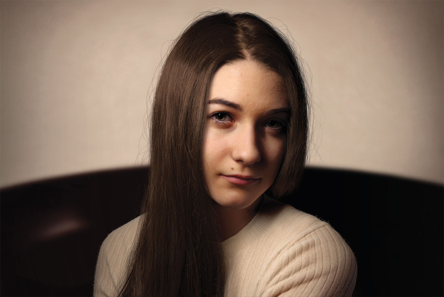
You might know how to draw people, but creating a digital portrait that's indistinguishable from a photograph – like the one above – is another matter altogether. It's difficult to get right, but it can be an incredibly rewarding exercise in 3D art.
Portraits are like a window into the subject's life; you really have to know someone to be able to represent them well, as it is not only facial features you are representing, but also their personality. It is also said that behind every portrait is a self-portrait, as it is also the story of the artist; throughout all my portraits hopefully you will also learn a little about myself.
My work is inspired by the great masters, Rembrandt, Caravaggio, Vermeer – these paintings were done hundreds of years ago, but we still connect to them as if these people were still alive today. The fact that we are in the digital age we now get to use new tools in creating these portraits, which has never been done before – we are creating a new form of portraiture (see our piece on the ethics of digital humans).
Download the files for this tutorial.
01. Add personality
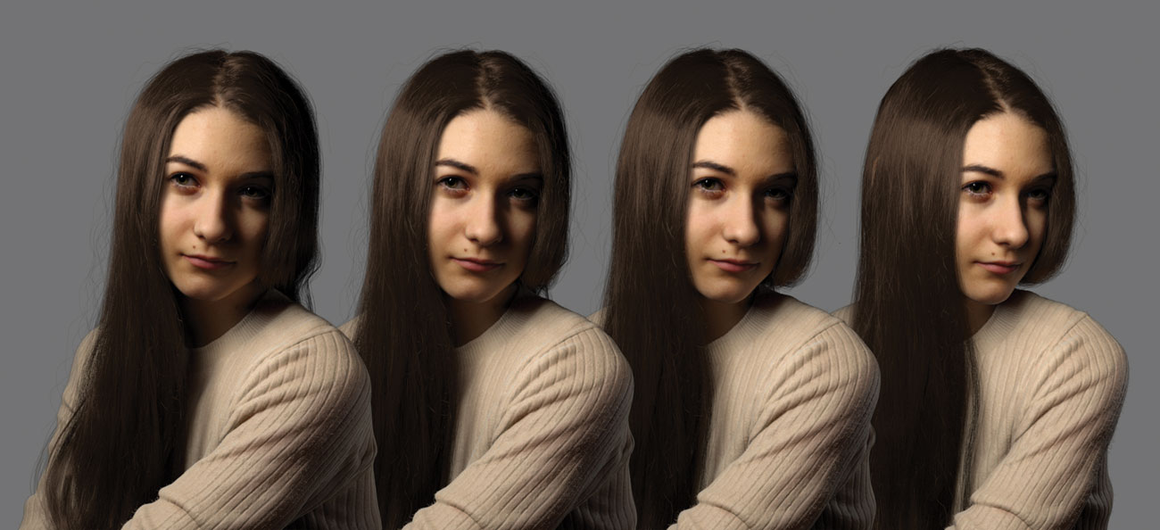
The reason every portrait I do is a family member or friend is because I know them, and by knowing them I can add their personality. Digital humans need a personality to make them believable; characters in a T-pose might look real, but we won't connect with them. When we see people, we try to read them, we want to know who they are, and we should do the same with digital characters – make them as real as possible, not only on the surface but also under the skin.
02. Use breakdowns
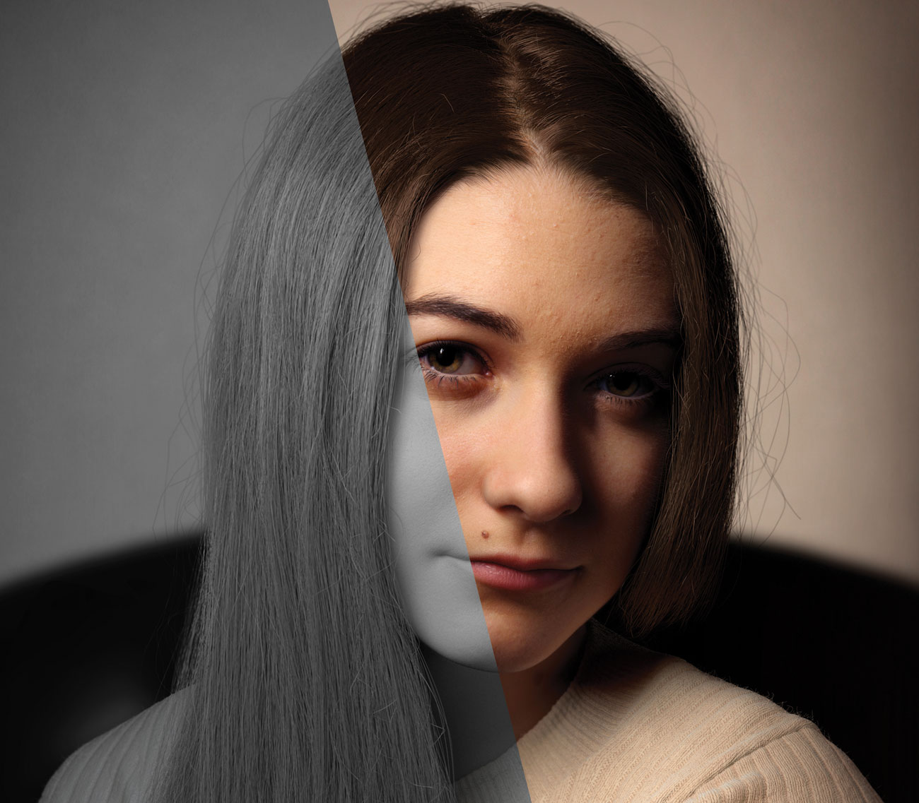
Breakdowns are a really good way to help promote digital characters. They reveal behind the curtain and show exactly what you are looking at. By demonstrating that we use tools like a paintbrush or a chisel, it shows that the work is not just a click of a button. Digital humans are new and people want to see the magic behind them. A breakdown clears any confusion that it could be a photograph, and hopefully people will spend a little longer appreciating the hard work that went into it.
03. Look to the masters for inspiration
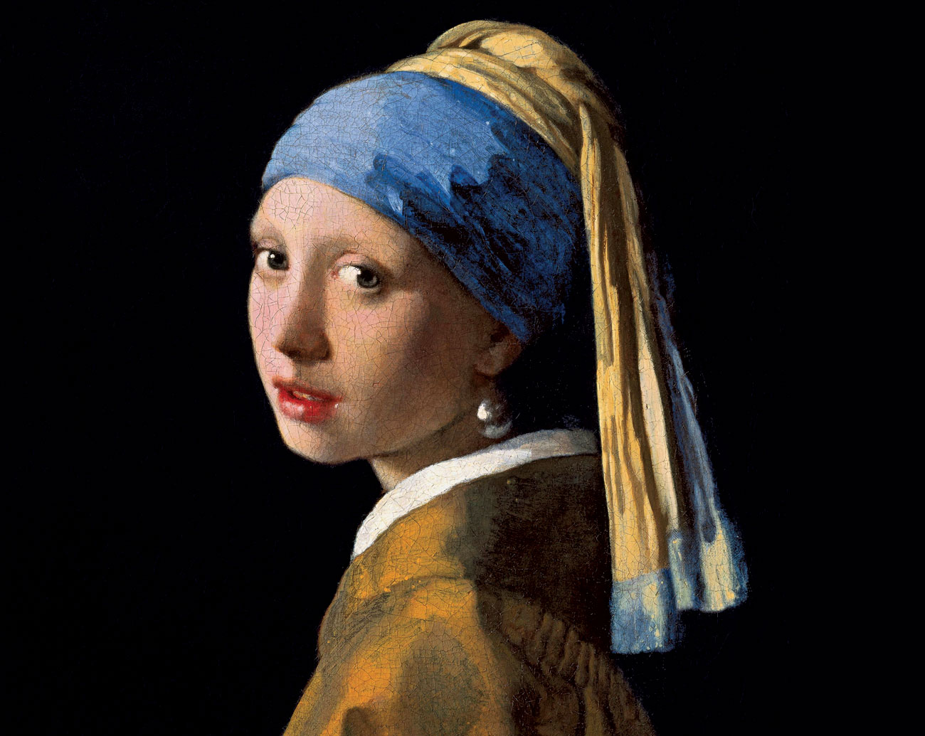
It is always important to have inspiration. My inspiration comes from the masters. For example, Rembrandt's style creates a mood that you can feel; his subjects are relatable and every one of his portraits feels alive. Another inspiration is Vermeer, and a perfect example is his Girl with a Pearl Earring painting. This woman has a pearl earring even though she looks like a maid; she obviously could not afford this yet she is wearing it, so it makes you question whether Vermeer had a love interest in her, posing her with his wife's jewellery. This creates a back story that we want to know more about; adding a story to our digital humans will make them more believable.
Get the Creative Bloq Newsletter
Daily design news, reviews, how-tos and more, as picked by the editors.
04. Make it personal
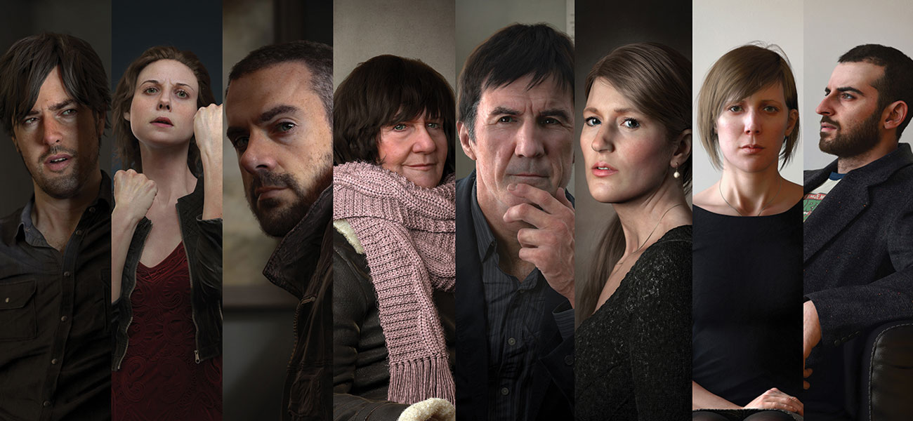
Personal work should be personal. If you are going to go home to work and you're creating something someone else wants to see, that is just work, as you are making some else's dream come true. It is not sustainable if you want to continue doing work outside the hours of 9am-6pm. If you want your digital humans to connect to the audience, loving what you do will show in the work, so make it personal – the more you care about it, the more it will stand out. By doing so you will create something original.
05. Avoid the uncanny valley
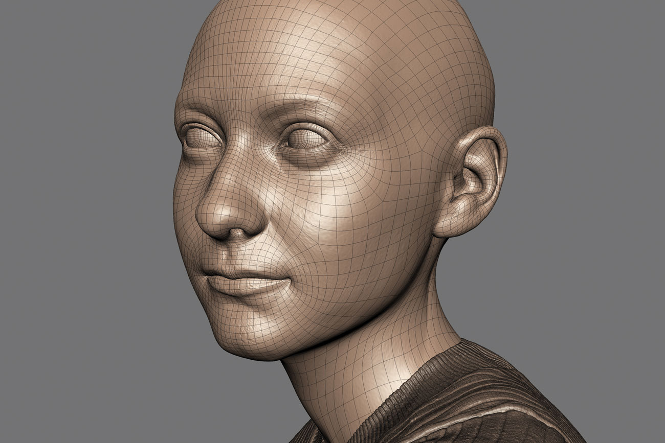
The uncanny valley is still a huge valley we have yet to cross. There are an infinite number of variables that make us human, yet when we try to create them we pick and choose the top few that we know about. I have seen cartoon characters feel very real despite the fact that they don't look real at all – these artists are phenomenal at expressing the emotional side of us. Create an emotion you want to express. With Cassidy, I tried to imagine what she was thinking and have that thought as the base for the portrait, and everything stems from this one thought.
06. Focus on anatomy
Learn your anatomy. Even though we look different, every person has the same anatomy, the same bones, the same muscles, the same building blocks. In photos, it is sometimes hard to determine the shape and forms, so using your knowledge of anatomy will help fill in these areas. The first thing I look at in a digital character are the ears – something easily skipped, but once you notice flaws like this it is hard to believe that these are real people, and they become almost like a mannequin.
07. Do a photoshoot
I always do a photoshoot of my subjects, roughly between 100-200 photographs. First I will take photos from every angle, and these photos are used to model and texture. Second I pose and light the subject to create a mood, and I try multiple ways to best represent who the subject is. When creating a portrait, it is important to refer to these photographs; it is easy to get caught up in making our work stylised, but to create a likeness you need to be true to the subject, and that means you cannot flatter them and try to make them better.
08. Model your subject
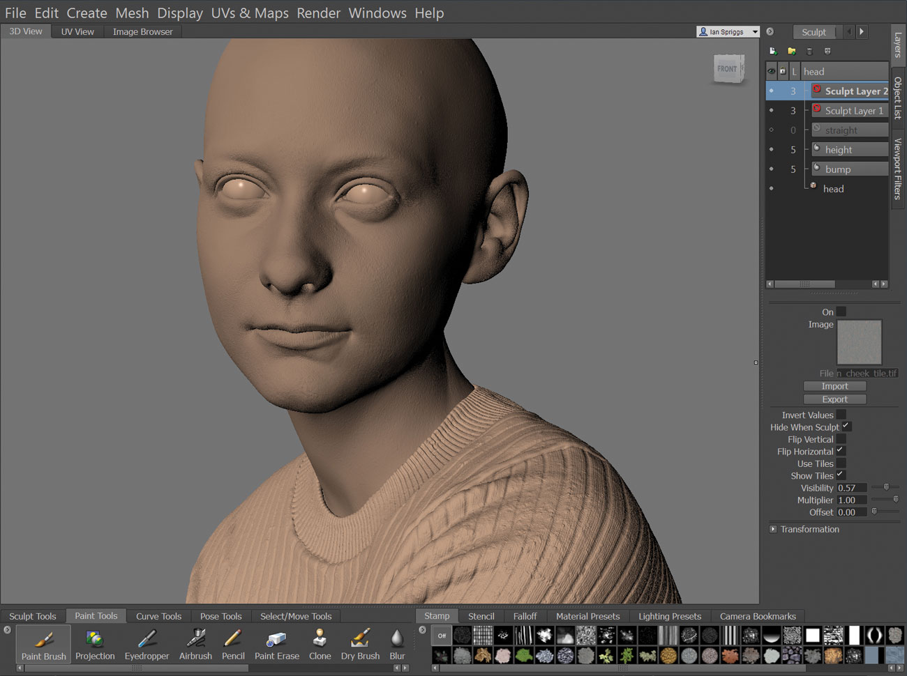
I pose a pre-rigged base mesh in Maya then take this geometry to Mudbox for sculpting. I don't use scans, but my modelling process is much like how a scan is made. Since I took photos from every angle I will align these photos in Mudbox. I will match the model to the front angle, then the profile, then the three-quarter view, and so on. I will have at least 8-10 photos I use to sculpt from. Once the likeness is there I will start to focus on the expression and body.
09. Keep textures simple
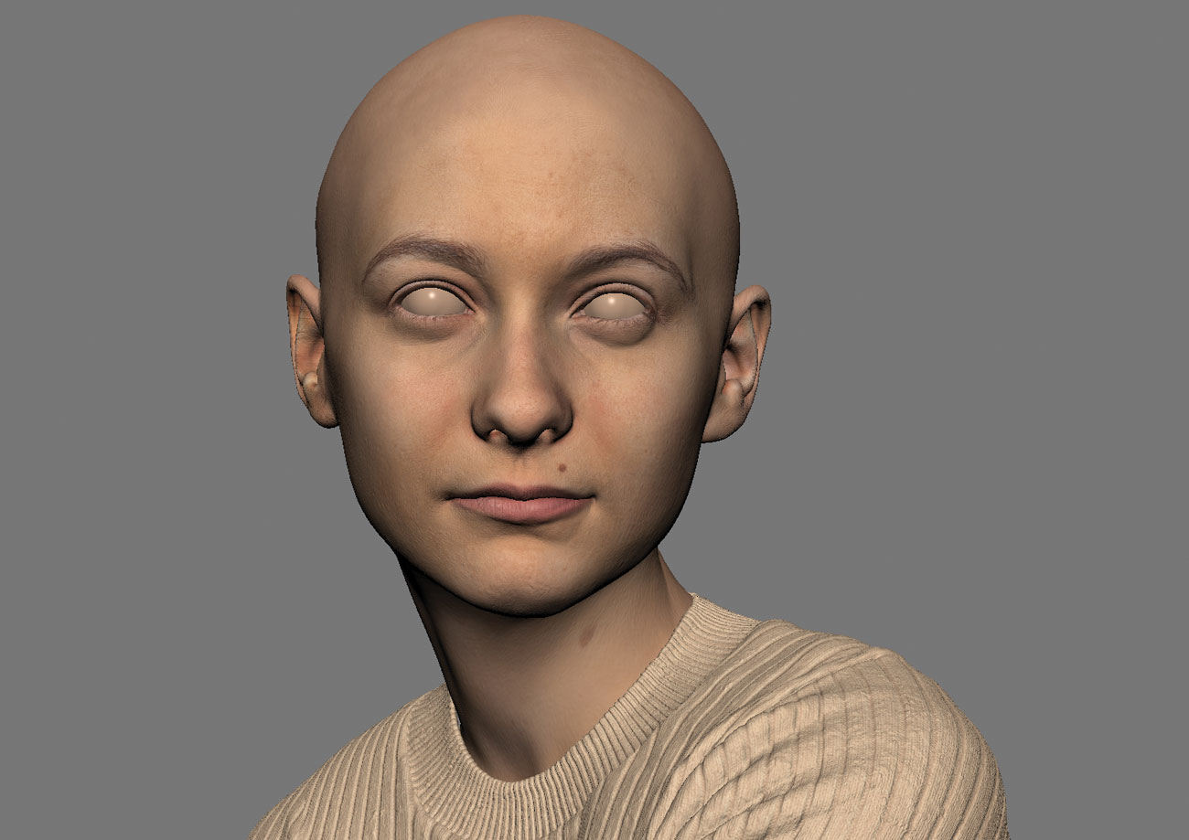
I do all the texturing in Mudbox; I use each angle of the photos to project onto the model. There is a lot of cleanup, repainting and colour correction which Mudbox is great for. I have started to use XYZ texture maps to help bring out the details in the pores. I use the VRayFastSSS2 shader for the skin. I will push the diffuse map as far as I can before I worry too much about the spec, bump and the SSS maps. I believe in simplicity when it comes to texturing, as the simpler it is, the easier it is to make changes during the lookdev stages.
10. Spend time on the eyes
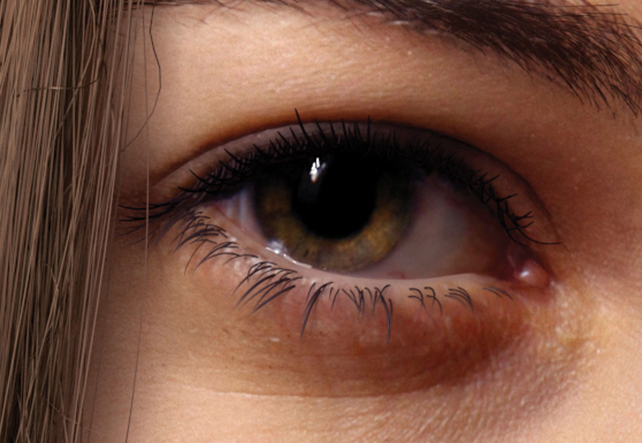
The eyes are the heart of the piece, as the eyes are usually the first thing we look at when we interact with others. The slightest change will completely change the expression. Every human knows what an eye looks like; from birth we understand the subtlety of an expression, and even someone who has no experience in art will notice any flaws. It is the reason why the uncanny valley is so hard to overcome – one mistake and it will fall into the uncanny valley. I spend a long time just working on the eyes and go through many variations before I can get them looking decent.
11. Don't overdo the details
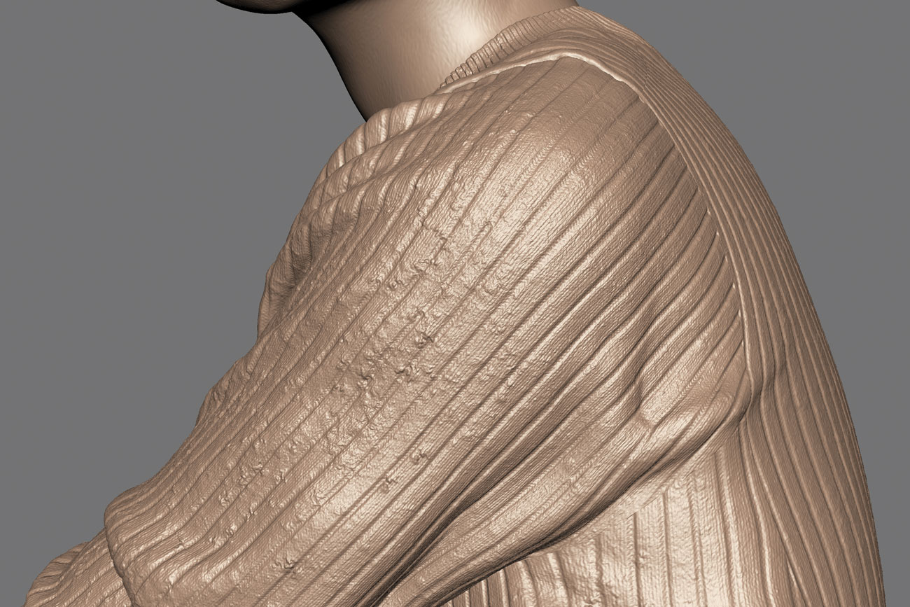
Your eye loves detail; a lot of it we read subconsciously, and a lack of detail will stand out. But if you overdo it you might take attention away from what is important. Detailing is used to create realism and support the overall image, but it is not meant to be shown off. In my portraiture work my main focus are the eyes and face; everything revolves around this and supports it, if it doesn't then I will get rid of it.
12. Use X-Gen for the hair
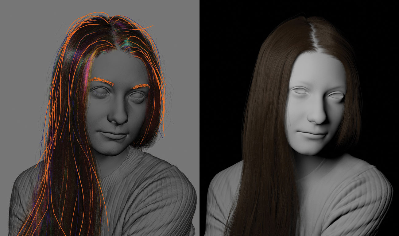
Cassidy's hair was the biggest challenge I had in this portrait, as it covers most of the canvas. It was my first time using X-Gen but I am happy with the results. X-Gen enables you to create hair that is random from strand to strand and is great in creating those flyaways. It is great at creating that peach fuzz too – it's subtle, but adds that realism. I added a V-Ray hair shader to the hair with colour variation to each strand. By making hair random it loses the clean look that sometimes digital work can have.
13. Create a mood with lighting
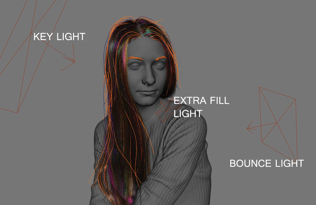
The lighting is key to the mood of the work, as it drives and magnifies the emotion you are trying to portray. Caravaggio is an example of how a hard light can change an image; his work has strong high-contrast lighting making his work dynamic and aggressive. Alternatively Rembrandt usually uses soft lighting, which gives his work a welcoming warmth to it. In Cassidy's portrait I wanted to show youth, so I used a warm, soft light to show her as a person of compassion. The piece is actually inspired by the soft lighting of the Mona Lisa.
14. Think about your composition
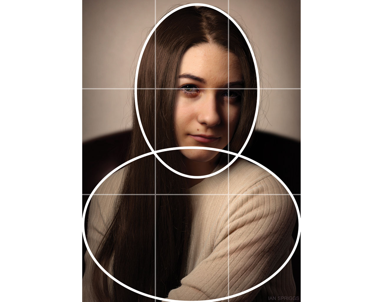
To reinforce the soft lighting I made sure not to have any hard lines in the composition. The composition is created from ovals and the rule of thirds. The background divided into two, the light allowing her head to pop out, and the dark to allow her jumper to stand out. Being able to read the silhouette creates less distraction from her face and her gaze, which is the main focus point. Composition and lighting is what really defines a portrait – these are great tools to use to help create a connection with the subject.
This article was originally published in issue 236 of 3D World, the world's best-selling magazine for CG artists. Buy issue 236 here or subscribe to 3D World here.
Related articles:

Thank you for reading 5 articles this month* Join now for unlimited access
Enjoy your first month for just £1 / $1 / €1
*Read 5 free articles per month without a subscription

Join now for unlimited access
Try first month for just £1 / $1 / €1
