Create a flexible carousel component
How to create a simple, flexible carousel component in Vue.js.

Vue.js has come on leaps and bounds recently, becoming the sixth most forked project so far on Github at the time of writing, even ahead of Facebook’s own ReactJS. It’s safe to say that it’s fast becoming a mainstay in web development, and a reliable go-to JavaScript framework for use in projects.
In this tutorial, we’re going to be using Vue.js to create a simple carousel component. This component will accept a number of different properties, enabling you to tweak some basic settings such as transition speed, transition type, and whether the carousel should automatically transition slides.
If all this sounds too tricky, a website builder tool might be more your thing. Happy to create a more complex site? You need web hosting that can cope.
Article continues belowTo get started, download the project files here (and save them in cloud storage) and open the 'website-template' directory in your preferred text editor. Meanwhile in terminal, CD into 'website-template' and then run 'npm install' to install the projects Node.js dependencies. Finally, run 'npm run dev' to start up a development server so that you can view your project in the browser. Typically this would be at 'localhost:8080'.
01. Create carousel slide files
In 'src/components', create a new directory called 'app-carousel-slide' and in it two files: 'app-carousel-slide.vue' and 'component.app-carousel-slide.scss'. These will contain the first of two new Vue.js components that we will be creating, which when used together will create our carousel component.
02. Add carousel slide SCSS
From the filesilo package, copy the contents of '/support-files/step-02-slide.scss' into 'component.app-carousel-slide.scss'. This is the SCSS for the slide component, and uses the 'flex-grow' property to make sure each slide expands to fill its parent element.
03. Create the slide component
In the empty 'app-carousel-slide.vue' file, add the snippet below to create the structure of the Vue.js component. We’ll use this as a foundation to build the carousel slide.
Sign up to Creative Bloq's daily newsletter, which brings you the latest news and inspiration from the worlds of art, design and technology.
<template></template>
<script>
export default {
  name: 'app-carousel-slide'
}
</script>
04. Add a template slot for the carousel slide images
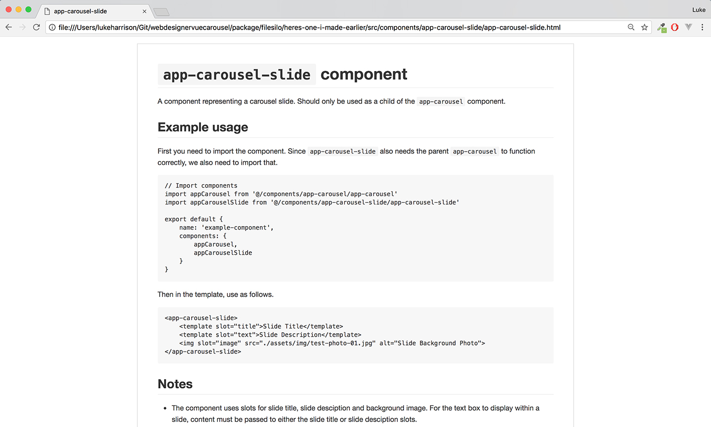
In the empty <template> element of the carousel slide, we’ll add a 'div' element to represent the slide, along with a special slot element which we will name 'image'. In Vue.js, slots enable you to interweave your own content with the component’s template without editing it. In this instance, they are used so we can later pass the image for the slide background, so the end result, when ultimately used, would look like '<app-carousel-slide><img src=’’ alt=’’></app-carousel-slide>'.
<div class="c-app-carousel-slide">
  <slot name="image"></slot>
</div> 
05. Add the slide text container
All that remains for the slide component is to build the text container. We will be using slots again, one for the larger slide title and one for regular text. We will also be using a Vue.js directive called 'v-if' to add logic, which only renders the text container if at least one of the slots is passed content. Add this snippet in 'c-app-carousel-slide', just before the ‘image’ slot.
<div class="c-app-carousel-slide__text-block"
v-if="this.$slots[‘title’] || this.$slots['text']">
  <h1 class="c-app-carousel-slide__title"
  v-if="this.$slots['title']">
  <slot name="title"></slot>
  </h1>
  <div class="c-app-carousel-slide__text"
  v-if="this.$slots['text']">
  <slot name="text"></slot>
  </div>
</div>
06. Create carousel files
Back in 'src/components', create a new directory called 'app-carousel' and then within it two new files: 'app-carousel.vue' and 'component.app-carousel.scss'. These will hold the second of the two Vue.js components: the main carousel itself.
07. Add Carousel CSS
Copy the contents of '/support-files/step-07-slide.scss' into the empty 'component.app-carousel.scss'. This is the SCSS for the main carousel component.
08. Create carousel component
Next in 'app-carousel.vue', we’re going to build the structure of the carousel component. We’re importing the ‘appIcon’ component and the 'arrow' svg for later use in the carousel's next and previous icons. These work together with the 'svg-sprite-loader' dependency to generate a basic SVG icon system, which works using SVG 'symbols' and its 'use' element.
<template></template>
<script>
import appIcon from
'@/components/app-icon/app-icon'
import arrow from
'./../../assets/img/arrow.svg'
export default {
  name: 'app-carousel',
  components: {
  appIcon
  },
  data() {
  return {
  arrow
  }
  }
}
</script>
09. Build the carousel template
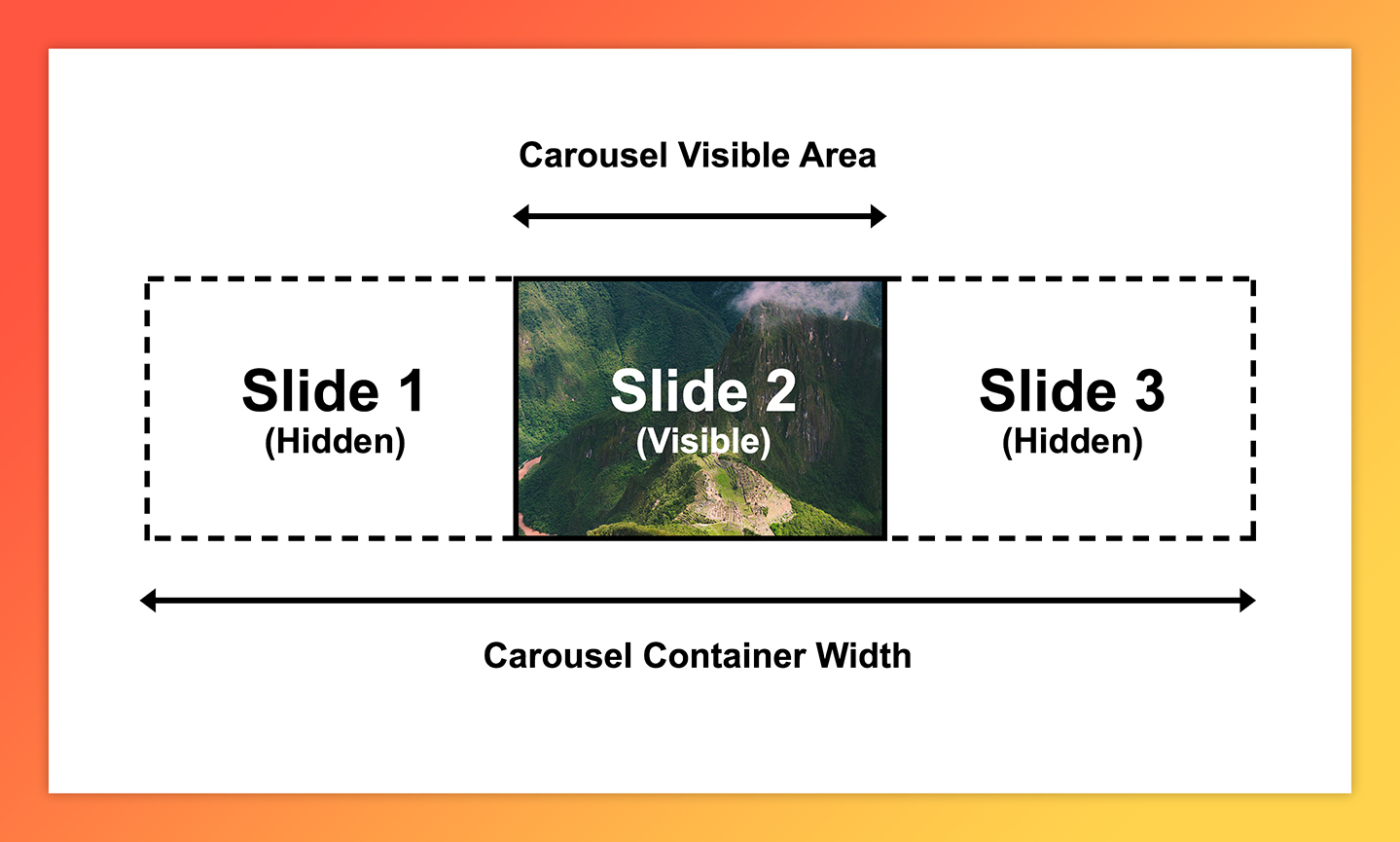
Let's start adding content to the empty template element. The main area of interest here is the 'c-app-carousel__container' element, which we'll shortly calculate a width for based on the number of slides found within it. We'll then move the container using CSS transform:translateX and transitions to simulate slide movement.
<div class="c-app-carousel">
  <div class="c-app-carousel__wrapper">
  <div class="c-app-carousel__container">
  <slot></slot>
  </div>
  </div>
</div>
10. Add the carousel controls and arrows
We then need to add the HTML for the carousel controls container and the previous and next arrows; the latter using the icon system and svg imported in Step 8. Add these after the 'c-app-carousel__wrapper' element.
<app-icon class="c-app-icon-arrow-prev c-app-carousel__arrow" use="arrow" />
<div class="c-app-carousel__controls">
</div>
<app-icon class="c-app-icon-arrow-next c-app-carousel__arrow" use="arrow" />
11. Create the carousel data store and add properties
We’re going add three new properties to the component’s data store: 'slideTotal' will hold the total number of slides; 'activeSlideIndex' will record the index of the visible slide so it can be used to calculate the container’s position; while autoInterval will record the interval timer which will trigger an automatic slide transition. All of these are set to null, with the exception of 'activeSlideIndex', where the '0' value indicates that the first slide should be the default slide.
data() {
  return {
  arrow,
  slideTotal: null,
  activeSlideIndex: 0,
  autoInterval: null
  }
}
12. Calculate slideTotal
Add 'ref=”container”' to the 'c-app-carousel__container' element in the template and then add the snippet below as a property of the component object itself. 'ref' is used to give easy access to an element, which in this case is the container so we can count how many child elements (aka slides) it has. The presence of this logic in a 'mounted()' function means it is then automatically run when the component is first rendered.
mounted() {
  this.slideTotal =
  this.$refs.container.children.length;
}
13. Calculate container width
In the component, create a new object property called ‘computed’ and within it, a new function called 'containerWidth()'. We’ll use this to calculate the width of the carousel container based on the 'slideTotal' figure.
computed: {
   containerWidth() {
      return this.slideTotal * 100 + '%';
   }
}
14. Create methods
Next, create another object property called 'methods' to store our carousel's functions. 'goToSlide()' is an easy way of setting 'activeSlideIndex' from Step 11, 'isControlActive()' returns true when a control's index matches 'activeSlideIndex', while 'nextSlide()' and 'prevSlide()' will simply cycle through the slides.
methods: {
  goToSlide(slideIndex) {
  this.activeSlideIndex = slideIndex;
  },
  isControlActive(controlIndex) {
  return controlIndex - 1
  === this.activeSlideIndex;
  },
  nextSlide() {
  this.activeSlideIndex === this.
  slideTotal - 1 ? this.activeSlideIndex
  = 0 : this.activeSlideIndex++;
  },
  prevSlide() {
  this.activeSlideIndex === 0 ? this.
  activeSlideIndex = this.slideTotal - 1
  : this.activeSlideIndex--;
  }
}
15. Calculate the carousel’s container position
The carousel uses a percentage value with transform:translateX and CSS animation to simulate slide transition. Add the below snippet to the 'computed' object so we can calculate this value.
activeSlidePosition() {
  return '-' + (100 / this.slideTotal)
  * this.activeSlideIndex + '%';
} 
16. Compose inline CSS
Now we have all the values to correctly position the carousel slide container, we need to construct the CSS which we'll then add to its 'style' attribute. We'll add this logic as another function in the 'computed' object.
containerStyle() {
  return 'width:${this.containerWidth};
  transform:translateX(${this
  .activeSlidePosition});`
17. Bind inline CSS
Add the below snippet to the 'c-app-carousel__container' element in the template. This will bind the returned value of 'containerStyle()' from the previous step to the 'style' attribute of the carousel container, meaning that its CSS and therefore its position will automatically be updated when things change.
v-bind:style="containerStyle"18. Hook up next/previous arrows
We now need to add logic to the next/previous arrows so that the correct method from Step 14 is called when each respective arrow is clicked. The 'prevSlide()' snippet belongs on the 'c-app-icon-arrow-prev' element, while 'nextSlide()' belongs on the 'c-app-icon-arrow-next' element. The 'v-on' directive is just an easy way to set up event listeners in Vue.js, with 'click' being the DOM event that we are targeting.
// Prev
v-on:click.native="prevSlide()"
// Next
v-on:click.native="nextSlide()"
19. Generate carousel controls
Let’s generate the control elements and make them show the corresponding slide when clicked. Add the below element in 'c-app-carousel__controls' . The 'v-for' directive is used to create an amount of control elements matching the 'slideTotal' variable, whilst the 'v-bind' directive enables the 'is-active' class only when the 'isControlActive' method from Step 14 returns true. Finally, we're creating another event listener through 'v-on' so, when clicked, the control calls the 'goToSlide' method and passes its index, which should match the index of corresponding slide.
<div v-for="n in slideTotal"
:key="n" v-bind:class=
"{'is-active': isControlActive(n)}"
class="c-app-carousel__control"
v-on:click="goToSlide(n - 1)" ></div> 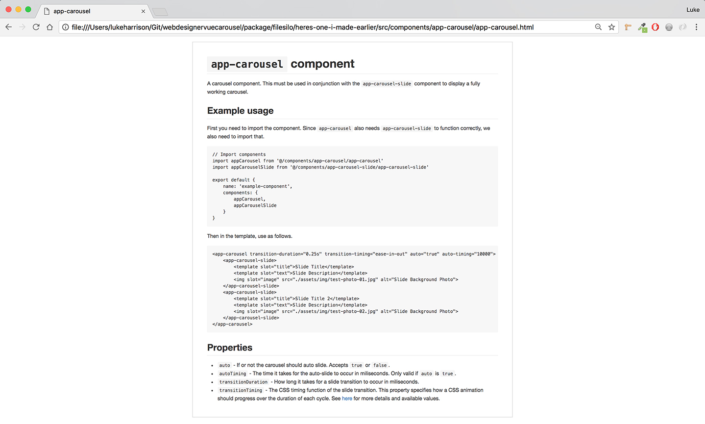
20. Import components
Let's now go back to the top level 'app.vue' component and import everything. Just after the opening <script> tag, import the component '.vue'. files:
import appCarousel from '@/components/app-carousel/app-carousel'
import appCarouselSlide from '@/components/app-carousel-slide/app-carousel-slide'
Next, amend the 'components' object so it references these newly imported components.
components: {
   appButton,
   appCarousel,
   appCarouselSlide
}
Finally, in the <style> tag, import our new SCSS with the rest of the component imports.
@import "/components/app-carousel/
component.app-carousel";
@import "/components/app-carousel-slide/
component.app-carousel-slide";
21. Add carousel and slides
Finally, let’s add our new carousel component and some slides to the main app. Still in 'app.vue', replace the 'Under Construction' with the snippet below. Each <app-carousel-slide> element represents a single slide. Add as many as you like, replacing the text or image where desired. Included are 'test-photo-01.jpg' to 'test-photo-05.jpg'. Once that's finished compiling, everything should now work. Huzzah!
<app-carousel>
  <app-carousel-slide>
  <template slot="title">My Slide
  </template>
  <template slot="text">
  <p>This is a carousel slide.</p>
  <app-button>Let's Go</app-button>
  </template>
  <img slot="image"
  src="./assets/img/test-photo-01.jpg"
  alt="My Carousel Photo">
  </app-carousel-slide>
</app-carousel>
22. Add flexibility to the carousel
Now we have a working Vue.js carousel, let's add some additional functionality so we can easily customise the duration of the slide transition, its timing property, declaring if slides should auto-slide, and if so how often. Reopen 'app-carousel.vue' and add the properties in the snippet below to the component object.
props: {
  transitionDuration: {
  type: String,
  default: '0.5s'
  },
  transitionTiming: {
  type: String,
  default: 'ease'
  }
}
23. Amend containerStyle()
The values passed to these properties should make their way to the carousel's inline CSS from back in Step 17. Now let's amend the 'containerStyle' computed function to make sure that this happens.
containerStyle() {
  return `width:${this.containerWidth};
  transform:
  translateX(${this.activeSlidePosition});
  transition-timing-function:
  ${this.transitionTiming};
  transition-duration:
  ${this.transitionDuration};`
}
24. Pass data to the carousel properties
The below snippet illustrates how we would pass data to these new properties to the <app-carousel> element in 'App.vue'. Once added, you should be able to pass whatever values you wish. For example, a "3.0s" duration would result in a very slow slide transition!
<app-carousel
transition-duration="0.25s"
transition-timing="ease-in-out">
25. Adding auto-slide props
For auto-slide, we need to add two additional objects to 'props' in 'app-carousel.vue'. 'auto' is either 'true' or 'false', which corresponds to if the carousel should continue to auto-slide. 'autoTiming' controls the time before auto-slide triggers, with the default value being 5000 milliseconds.
auto: {
  type: String,
  default: 'false'
},
autoTiming: {
  type: String,
  default: 5000
}
26. Initiate auto-slide
Now we need to initiate auto-slide on component load. In the carousel's 'mounted()' function, after the existing content, check if the 'auto' property is set to 'true'. If so, create an interval which triggers the 'nextSlide()' method repeatedly once the 'autoTiming' value has passed.
if(this.auto === 'true') {
  this.autoInterval = setInterval(() => {
  this.nextSlide();
  }, parseInt(this.autoTiming));
} 
27. Cancel auto-slide method
Obviously, we need some way for the user to disable auto-slide if they have expressed a desire to operate the carousel manually. The first step towards this is a new carousel method called 'cancelAutoSlide'. This will simply cancel the interval created in the previous step.
cancelAutoSlide() {
   clearInterval(this.autoInterval);
}
28. Trigger cancelAutoSlide
If the user clicks an arrow or control element, it's reasonable to assume that they wish to operate the carousel manually, so let's call the 'cancelAutoSlide' method if any of these elements are clicked. To do this, simply add '+ cancelAutoSlide()' to each elements 'v-on' directive. See the snippet below for an example using the 'previous' slide arrow.
v-on:click.native="prevSlide() + cancelAutoSlide()"29. Pass values to the auto-slide props
Finally, let's pass some values to the auto-slide properties we've created. Back in 'app.vue', add the below snippet to the <app-carousel> element to enable an auto-slide every three seconds.
auto="true" auto-timing="3000"
30. Finish building the carousel component
Cancel the development server, or open a new terminal window, and run 'npm run build' to create a compiled, production-ready version of your Vue.js powered carousel component in the 'dist' directory.
This article was originally published in issue 269 of creative web design magazine Web Designer. Buy issue 269 here or subscribe to Web Designer here.

Web design event generate London returns on 19-21 September 2018, offering a packed schedule of industry-leading speakers, a full day of workshops and valuable networking opportunities – don’t miss it. Get your generate ticket now.
Related articles:

Web Designer is the premier magazine for aspiring online creatives and industry professionals. The monthly title offers cutting-edge practical projects spanning XHTML, CSS, Flash and WordPress as well as hosting features and interviews with the web community’s most influential people. Each issue also has a dedicated Industry section covering news and views from the trade, website showcases featuring the finest design talent and a free CD of valuable resources.
