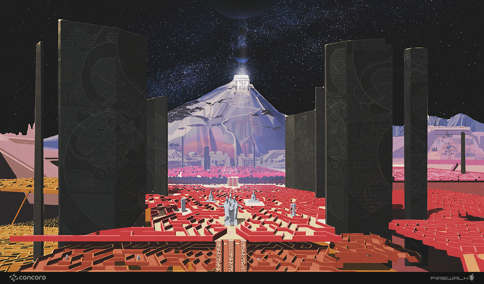
Create a chromatic aberration effect
Give your work depth by adding a little colour distortion.
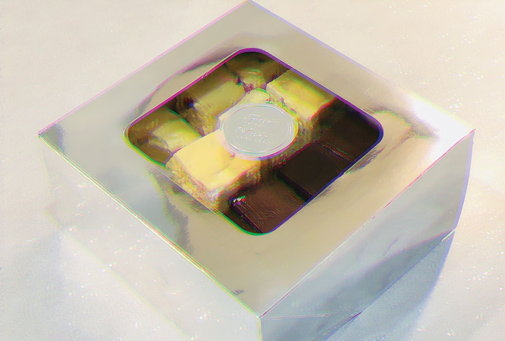
Chromatic aberration (distortion), also known as 'colour fringing' is a common optical problem. It occurs when a camera lens fails to bring all colour wavelengths to the same focal plane, or when the wavelengths of colour focus in different positions on the plane.
It is caused by a lens dispersion, with different colours of light travelling at different speed while passing through a lens – in effect, producing a blurred image with coloured fringes (a rainbow edge in areas of contrast).
There are two types of chromatic aberration: axial (longitudinal) and transverse (lateral). Without going into too much detail, axial aberration occurs consistently throughout the image, whereas transverse does not occur in the centre and increases towards the edge of the image. There are a few ways to minimise or remove these with photo editing apps or Photoshop CC.
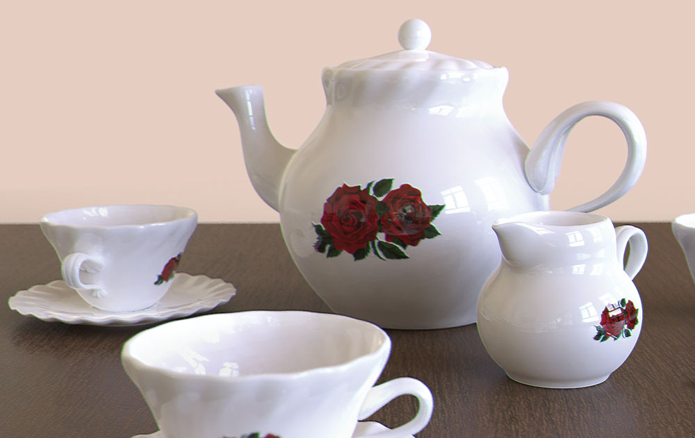
You may also notice this effect in some movies. Yes, it is there on purpose. It looks much better in motion than on a still, as it actually helps sharpen the picture as opposed to blur an image in photography.
So, if photographers do everything to avoid chromatic aberration in their work because it is deemed 'incorrect', why would you want to add it to your 3D art? Because, if used correctly, it can make your image 'pop' and look more realistic. Here's how you can manually achieve this effect in Photoshop.
01. Prepare your image
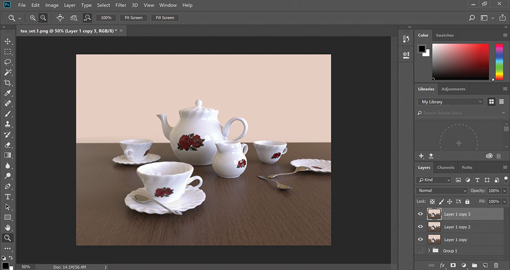
Chromatic aberration is best added at the end, so first, complete your usual image composition. Put a copy of your layers in a folder for safekeeping (optional) or just start a new project. Make sure your composition is merged down to a single layer, then duplicate it twice. Set the duplicates to Lighten.
02. Choose your channels
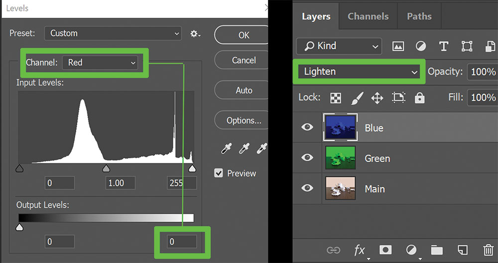
Decide which colours you want to create the effect with. Green and blue work here. Select the first duplicate, go to Levels and change the Red and Blue output levels to 0, leaving the Green levels untouched. Select the second duplicate and set Red and Green levels to 0, leaving Blue as it is. Rename layers accordingly.
Get the Creative Bloq Newsletter
Daily design news, reviews, how-tos and more, as picked by the editors.
03. Add distortion
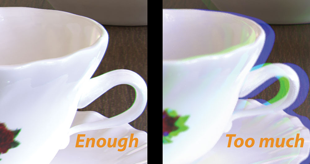
Select the Green layer, activate the Move tool and press the left arrow on the keyboard (twice should be enough). Select the Blue layer and shift it to the right. Do not shift them by too many clicks because it will make the distortion too great, and your image will be painful to look at.
04. Emboss the image
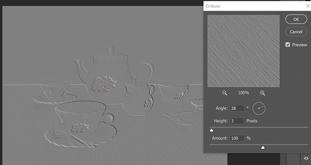
If you want to boost your image details even more, you can try adding an overlay of Filter/Stylize/Emboss on top. Experiment and play with the options for the angle, height and amount of Emboss, to see what works best with the lighting of your scene.
This article was originally published in 3D World, the world's best-selling magazine for CG artists. Subscribe to 3D World here.
Related articles:

Thank you for reading 5 articles this month* Join now for unlimited access
Enjoy your first month for just £1 / $1 / €1
*Read 5 free articles per month without a subscription

Join now for unlimited access
Try first month for just £1 / $1 / €1

Maya is a 3D artist with a broad set of skills, diverse portfolio and extensive experience creating 3D assets for games and learning programmes. She has an excellent knowledge of Blender, ZBrush, Keyshot, Autodesk 3ds Max and Maya, Substance Painter and Designer, Photoshop; and integrating assets into Unity and Unreal Engine.
