How to correct a flawed composition
Fix a painting that doesn't look quite right with these 6 steps.
I created my original painting around this time last year, having been inspired by the vast fantasy landscapes by artists like Dongbiao Lu and Ruxing Gao. It was my first stylised environment artwork.
A year later I was interested to see how I could improve the piece. There was something very successful about it that was most likely a happy accident at the time, but had continued to evade my understanding until now.
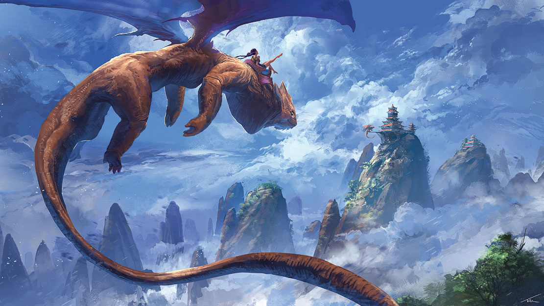
Looking back at it, I started to notice errors in the art techniques used, including the lighting, design work, composition and shape design. My challenge was to try and preserve what had worked then, while fixing the composition to make a better painting.
01. Create a stronger foundation
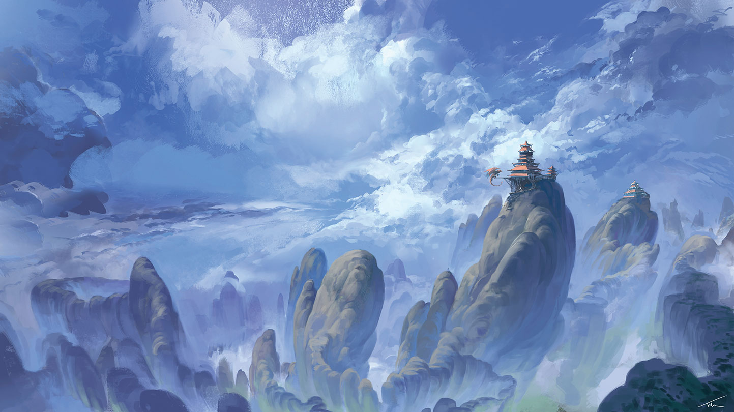
The lighting in the original scene is inconsistent, which makes it difficult to understand how the objects occupy the space they’re in. This is particularly noticeable on the mountains and so I start to paint over these first. I choose a light source – the sun coming from the top left – and some rough camera settings. To encapsulate the expanse of the environment, I attempt to emulate a fish-eye lens effect by having the base of the mountains converge at the bottom and then adding a slight curve to their trajectory upwards.
02. Tackle the big shapes
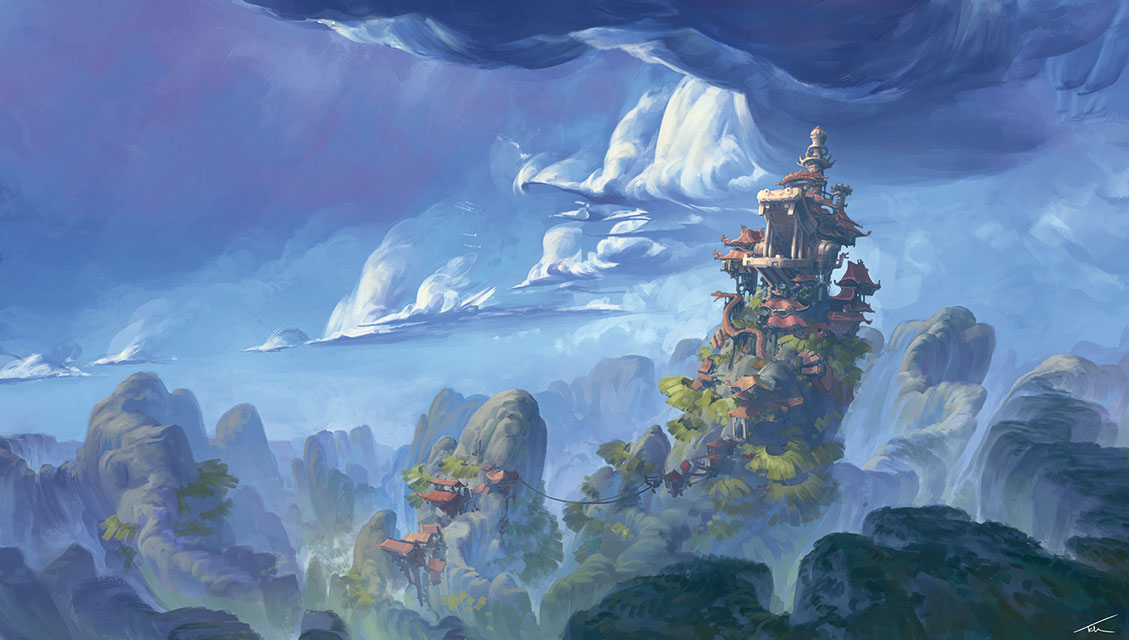
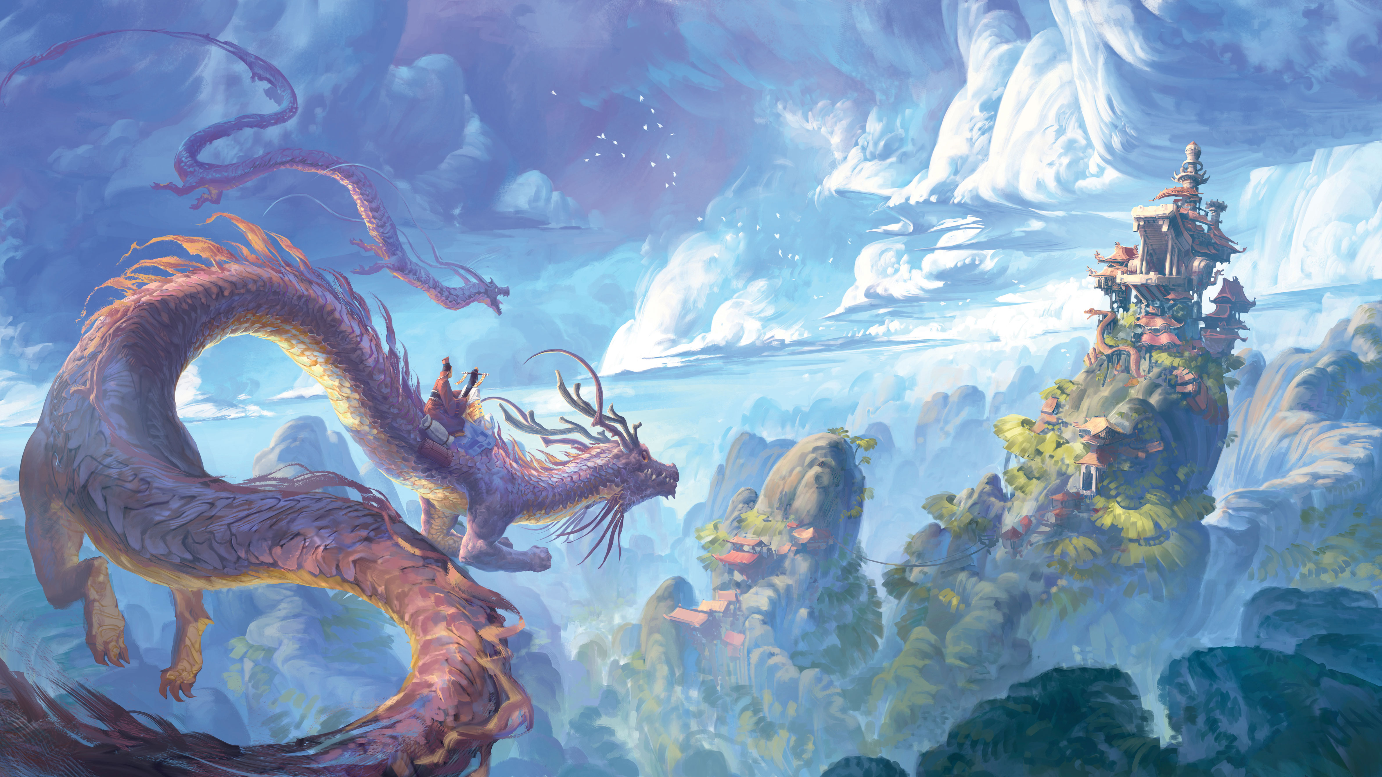
The clouds follow a curve that helps convey their scale and position. I keep the shape design consistent with the mountain range because it creates an interesting repetition between the ground and sky. I then redesign the monastery as a stylised dragon’s head, which fits the whimsical fantasy mood I’m trying to achieve.
Simplifying clouds into large, rounded forms is great for selling their scale, but it starts to make them appear like solid, hard-surfaced objects. To bring back the softer feel I break up the hard edges with smooth gradients and smaller brush strokes, some of them overlapping to indicate translucency. This finer detailing was also present in the original and explains a lot of why it remains a decent image, despite some technical flaws.
03. Adjust the focus
I want to keep the focus on the environment, so I paint the characters with an almost graphical approach. The folds in their clothing are represented with flat-coloured shapes rather than detailed, high-contrast shadows. This made them feel more like a continuation of the dragon’s patterning rather than entirely separate objects.
Get the Creative Bloq Newsletter
Daily design news, reviews, how-tos and more, as picked by the editors.
04. Redesign elements
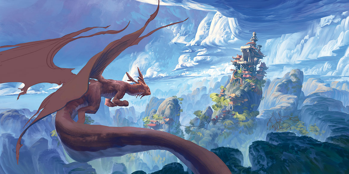
The dragon was the most interesting design in my original painting. I tried to update this design, but found it didn’t fit the Asian theme influencing the rest of the image. It also took up a lot of the space, making the environment feel cramped. So I switched it out for a traditional Chinese dragon, but kept some of its Western features.
To merge the sharp triangles in the rooftops with the rounded shapes present in the environment, I give their outer edge a slight curve and emphasise the size of the decorative ornaments at the roof tips. This removes the hard, architectural feel and enables the buildings to sit in the organic forms of the mountain more comfortably.
05. Add elements to create balance

Adding the second dragon completes the composition by creating a pleasing triangle of interest with the larger dragon and the buildings. It also reinforces the direction in which the dragons are heading, helping to convey the distance between the three objects.
This article originally appeared in ImagineFX 163. Buy issue 163 or subscribe here.
Read more:

Thank you for reading 5 articles this month* Join now for unlimited access
Enjoy your first month for just £1 / $1 / €1
*Read 5 free articles per month without a subscription

Join now for unlimited access
Try first month for just £1 / $1 / €1
