Draw on the power of contrast in art
Learn how to use contrast in art with this step-by-step guide.
Learning to use contrast in art will transform your projects and the way you work. My favourite aspect to work with in art is contrast. This usually occurs when working with colour through hue, saturation, and value. Since we're working with pencils, we can't harness contrast with hue and saturation. Instead we're forced to work with value contrast and it's key to creating a drawing and illustration that's easy for the viewer to navigate.
We can work within the value limits by concentrating on the level of contrast in the drawing's detail, focus and edge control. This can be implemented through something as simple as a dark to light gradation. The human eye tends to be attracted to high levels of contrast: bear this in mind when you add your light and dark values.
Make sure you've got the right tools to draw contrast with the best pencils around. And for more drawing advice, check out this post on how to draw.
01. Create a focal point
I try to create a focal point in most of my work, which relies heavily on high contrast, and then the rest of the drawing will be more subtle and have fewer value shifts. This will create a place of interest and a foundation for you to build your contrasting values. Note that having subtle contrast can be equally entrancing when used correctly. You'll learn this as you experiment and this installment is meant to help understand the importance of contrast and how to harness its ability to create engaging and powerful work.
02. Understanding high and low contrast

It's crucial to first know the difference between low and high contrast, and when to use them. Low contrast usually has similar surrounding values between subjects and may even blend together. High contrast has a stark difference in value and attracts the viewer's eye as a point of interest.
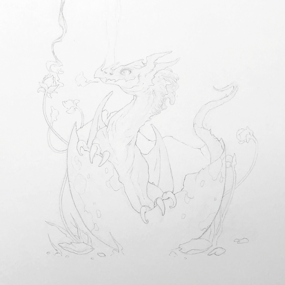
03. Start lighter either way

Regardless of whether you want to add high or low contrast to your drawing, I recommend keeping it light at first either way. Having a better foundation laid out to then decide which direction to go throughout the composition will help keep your values in check.
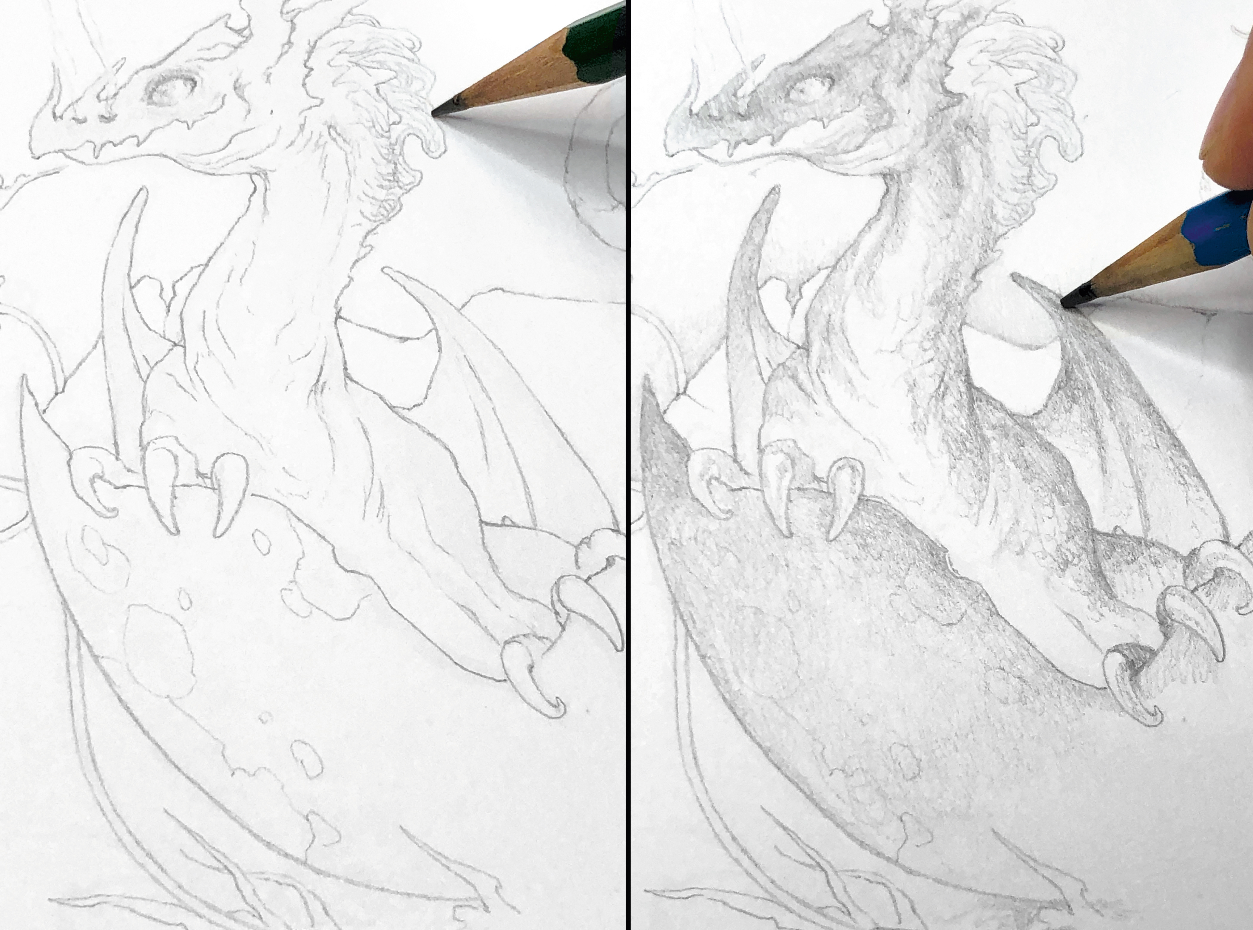
04. Separate form with contrast

Having a dark value pushed up against a lighter value will separate the two forms to the viewing eye. This can be a tool in your work when attempting to better separate forms and distinguish subject matters. Having an effective use of contrast will create a piece that's easier to read.
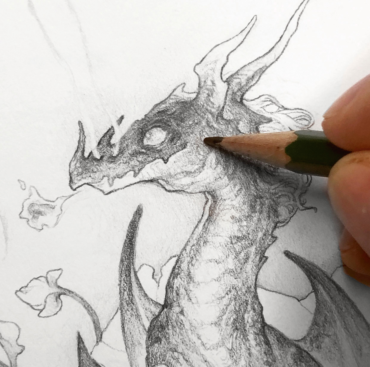
05. Direct the eye

Using contrast enables you to control how the viewer will see your drawing and where their eye will be directed. By creating a source of
well-placed high contrast, you're also creating a source of interest that may be the focal point of the piece simply because of the contrast.
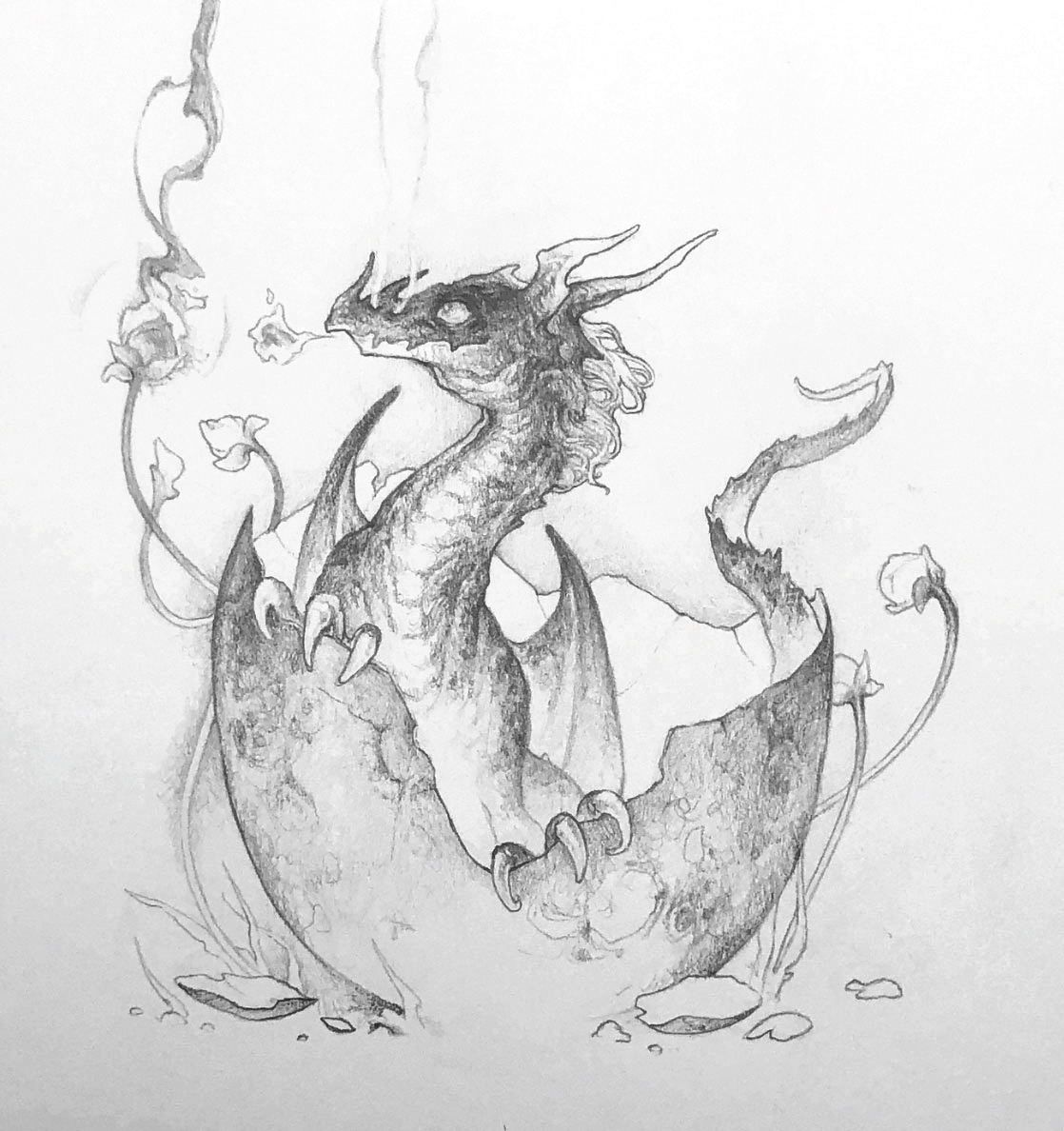
06. End boldly by pushing your dark values

After you've been building up your drawing with values, you should know where your highest points of contrast are. But if you want to create a bold finish, grab a pencil with a higher number on the B scale and punch up your dark values to drive that extra bit of contrast.
This article was originally published in issue 180 of ImagineFX, the world's best-selling magazine for digital artists. Buy issue 180 or subscribe to ImagineFX.
Read more:
- 21 unbelievably realistic pencil drawings
- The 12 best drawing books
- Draw Disney characters with these FREE pro classes
Get the Creative Bloq Newsletter
Daily design news, reviews, how-tos and more, as picked by the editors.

Thank you for reading 5 articles this month* Join now for unlimited access
Enjoy your first month for just £1 / $1 / €1
*Read 5 free articles per month without a subscription

Join now for unlimited access
Try first month for just £1 / $1 / €1
Timothy is an independent artist showing and selling his work at various conventions across the United States.
