How to create a stellar concept art portfolio
Enhance your concept art portfolio with these top tips from Atomhawk principal concept artist Dario Jelušić.

A great concept art portfolio can mean the difference between landing your dream job or not getting noticed. Regardless of whether or not your work is the best of the bunch, not putting together an appealing concept art portfolio could sabotage your chances of getting hired by an established studio. As its popular art competition returns for the fifth year, we spoke to Atomhawk's principal concept artist Dario Jelušić to get his top tips for assembling your concept art portfolio (level up your concept art skills with these inspiring drawing apps).
The Atomhawk Art Competition challenges you to test your craft and the bounds of your ideas by showing Atomhawk your storytelling ability with a piece of your art. This year entrants are asked to design a character, environment or key moment inspired by the concept: The Return.
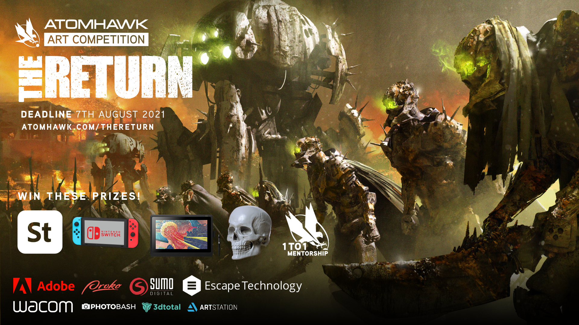
Don't forget to use the hashtag #atomhawkreturn to get your work seen. Winners will receive the choice of a portfolio review or paintover, and one up and coming artist will be chosen by the judging panel to win a one-on-one mentorship with a senior Atomhawk artist. Submissions close 7 August 2021. Head to the Atomhawk website to find out more.
Now, read on to discover Jelušić’s top tips for creating a winning concept art portfolio and landing your dream role in the process.
01. Showcase quality
The first and most important thing for any portfolio is quality. For instance, if you want to get an industry job you should have an industry-standard portfolio, meaning the quality should be high enough for you to be able to showcase any visuals and any ideas that you want to show and for other people who are not in the art industry to be able to understand those ideas. You always want to maintain quality and whatever you can show with that quality range put that in your portfolio. Essentially your best work.
02. Keep it focussed
Your portfolio should be focused on something that you enjoy working on. For instance, if you're a horror artist and you like gritty monsters and creatures, then in your portfolio you drop some cutesy stuff and get a job drawing cutesy stuff and you're not enjoying it, I don't think that's the best way forward. There's a balance between what you like and the type of job you want to get.
You need to make sure your portfolio looks like something that can be used in the industry. If you want to get a job at Riot, you need to look at the portfolios of people working at Riot. If you want to get a job at an outsource studio like Atomhawk then expertise is great but versatility comes in handy. Every artist at our studio has their own expertise. We have an artist who can do really cool environments but can also do vehicles. Versatility is great to have but you don't want to stretch yourself so thin that you lose the quality of your work.
03. Don’t forget the fundamentals
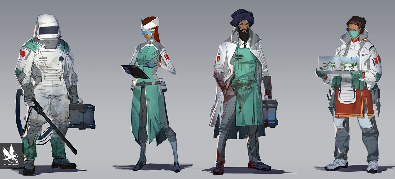
Fundamental knowledge, of course, needs to be seen in a portfolio. So understanding of perspective, composition, values, lighting, colour, anatomy, and functionality. Those things are really important to showcase in some way or another. The fundamentals are fundamentals, if you know anatomy you know it. When you're showing a character you definitely want to have the anatomy correct in and placed in a 3D space and inside of the perspective you want to get a really nice composition.
04. Show your process
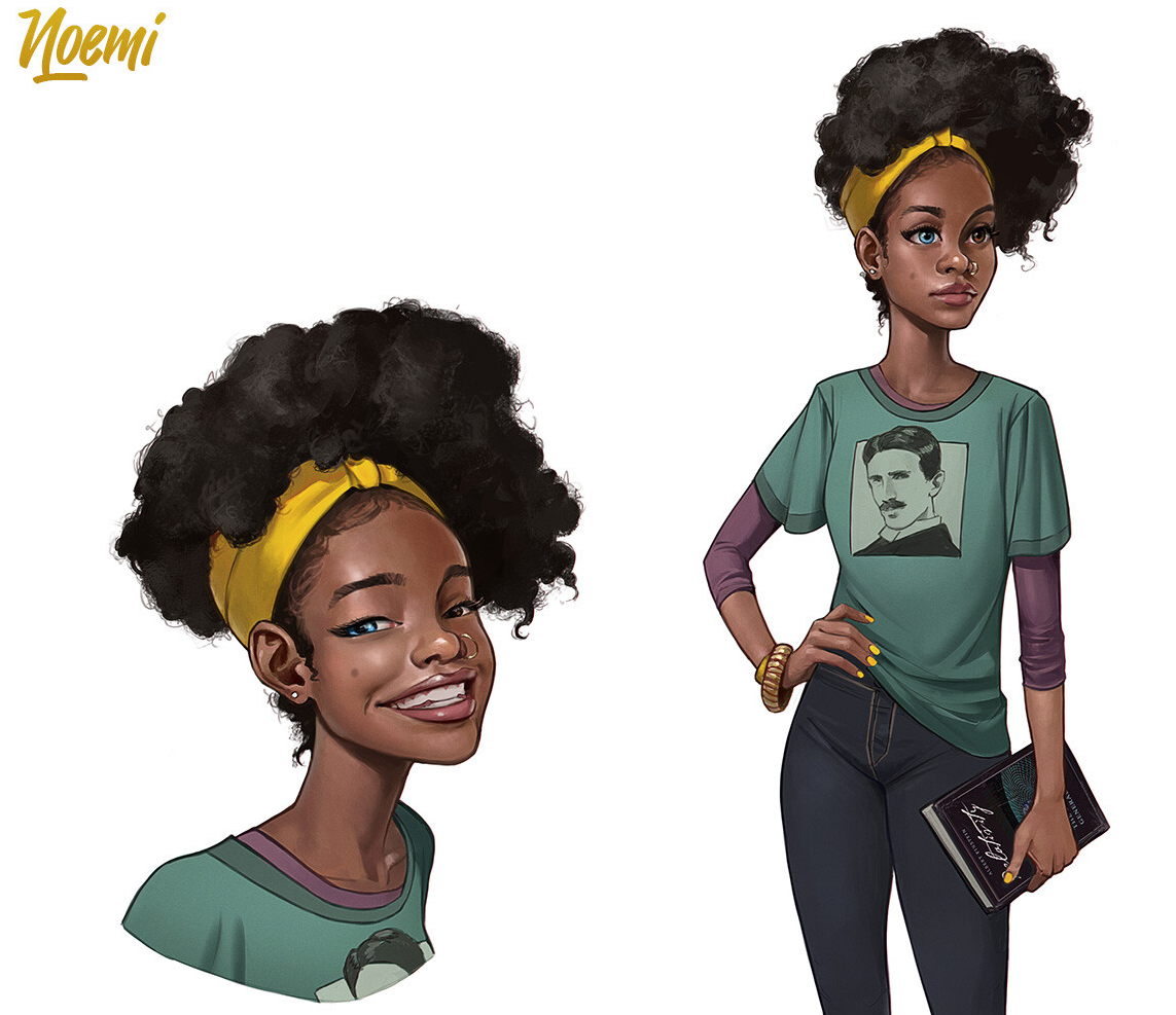
Process is a must. You want to imagine that the person looking at your portfolio doesn't know anything about you and your work, and the only thing they can see about you and your expertise in the work that you're showing. If you're showing a final piece that's amazing then you can get some interviews with that and, of course, you could get the job but it's even better if you show how you got the end result. Showing the sketches, thumbnails, mood boards, work in progress stuff, writing some notes down for us to understand your workflow and what your process looks like. Always, if you can, include at least the starting sketch and then the final piece. But the more the merrier, of course.
05. Tell a story
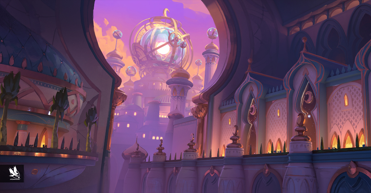
Storytelling is one of the most important things to show in characters, even if it's just a character standing doing nothing. Storytelling is paramount. If you can get storytelling elements in the characters or environments or a couple of sequential images. Story is really important because we all grew up on stories and humanity as a whole grew up on myths and legends. The entertainment industry is based on stories, and cool effects and lots of explosions, but beneath all of that is a strong story. So every piece should tell us some kind of story.
06. Don’t rely on your notes
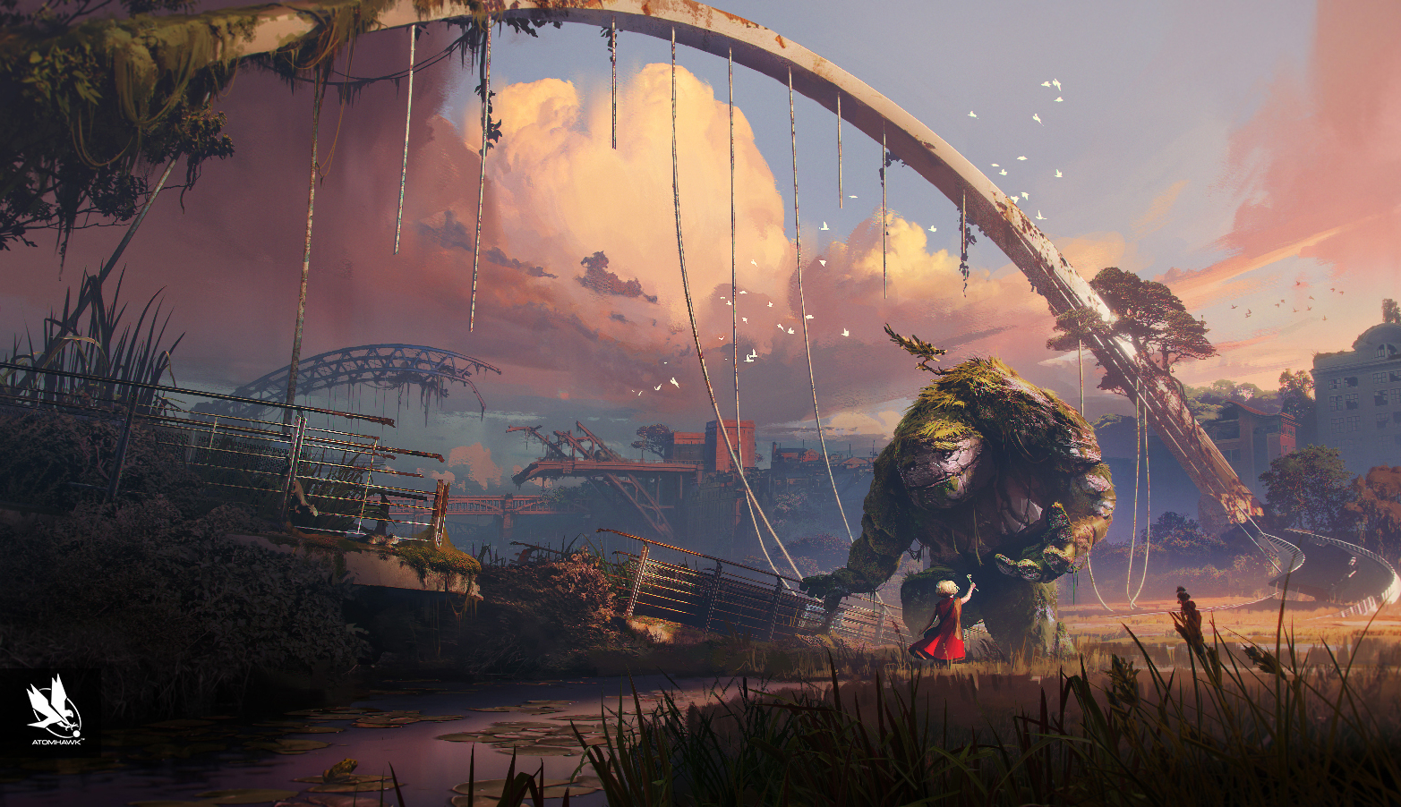
Personally, I don't care about notes because everything is visual but whatever you've written down, you can show it. For instance, you can write down: 'I have an idea about this,' and 'I was inspired by that,' and you can show that in your mood board. If notes are there, I will try to read them but I wouldn't say they are important. You're telling stories through visuals and if you can't tell a story with visuals then no amount of notes will help because, in the end, you're not a writer, you're an artist.
07. Stay true to yourself
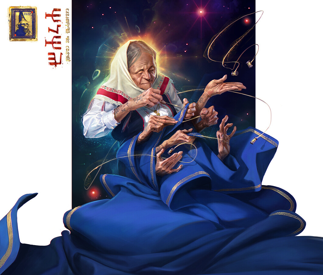
I've seen dozens and dozens of portfolios where there is a little bit of 2D, a bit of 3D, stylised stuff, environment stuff, a mishmash of everything and when I'm looking at the portfolio I really can't tell what that person is all about, what the person enjoys. The uniqueness of being yourself is one of the best things that you can do. You want people to get to know you through your work. If you're all over the place and it seems like you want to appease everyone then you lose that quality, you lose that edge and you lose your uniqueness.
08. Balance quality and quantity
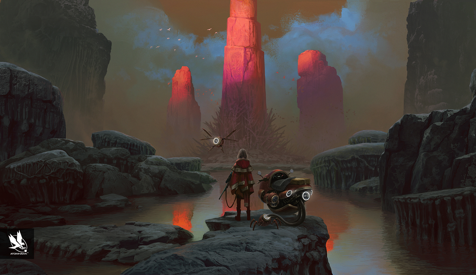
One amazing image can take you so far. Let's say it's a knight on a horse and it's amazing. Yeah, it's amazing but we would like to see more, just to understand if you are capable of taking that quality level from image to image, or was it just a lucky strike? I would say a minimum of five to seven images should be in a portfolio that showcases your best work. Not less than five. If a person is really good, we will look at about ten images but after three or four, you can really see if that person is up to the quality or not. If you want to have 50, you can have 50, but we will look at a couple and again if you have 50 there is always that opportunity for you to have older pieces that don't represent you today. Maybe just remove them and have a nice focused package.
09. Demonstrate your technical ability

Within sketches you can show your understanding. If you're working on an environment and in the sketches there are perspective lines, vanishing points, this will tell us you understand perspective. Or if you're working on an action scene with characters jumping and doing crazy things and we can see in the sketches that you took time to understand how muscles work in different positions in 3D space it's nice to see that you understand why those decisions were made. If you're working on a knight on a horse, take a couple of horses from the internet and study how the skeleton of a horse works and show us those studies. With those studies we can see your dedication, professionalism and understanding of subjects. That's really important for us to see.
10. Be willing to learn
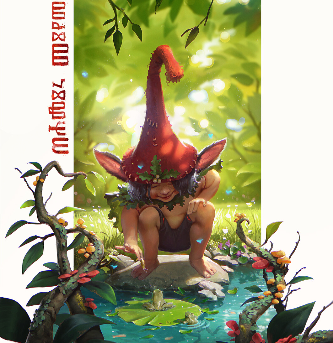
I give dozens upon dozens of portfolio reviews. Within ten people, you will see five to seven portfolios where if that person put in a little bit more they could get somewhere. After giving feedback I would usually tell people to get back to me within next three to six months. Unfortunately, most of the people do not take that opportunity. If you think about it, getting back can leave good impressions on a people with whom you are doing interviews with and in a long run it can help with their prospects. Applying to a position again and again if you didn't manage to get in first time can be beneficial. Just make sure you are adding to your portfolio and making sure is at least bit better than last time around.. If you are willing to get the job you should work for it.
To find out more about the Atomhawk Art Competition and to submit your artwork before August 7th 2021 head to the Atomhawk website.
Related articles:
Get the Creative Bloq Newsletter
Daily design news, reviews, how-tos and more, as picked by the editors.

Thank you for reading 5 articles this month* Join now for unlimited access
Enjoy your first month for just £1 / $1 / €1
*Read 5 free articles per month without a subscription

Join now for unlimited access
Try first month for just £1 / $1 / €1

Brad Thorne was Creative Bloq's Ecommerce Writer, and now works for a PR company specialising in 3D and VFX, Liaison. He previously worked as Features Writer for 3D World and 3D Artist magazines, and has written about everything from 3D modelling to concept art, archviz to engineering, and VR to VFX. For Creative Bloq, his role involved being responsible for creating content around the most cutting-edge technology (think the metaverse and the world of VR) and keeping a keen eye on prices and stock of all the best creative kit.
