Combine traditional and digital skills to create a comic cover
Learn how to compose an image with pencils and colour it with inks and Photoshop.
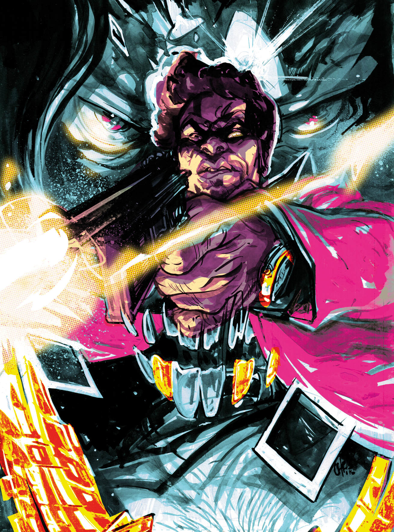
For years I was intimidated by working digitally. Something about the plastic nib on a plastic surface felt too jarring to me. I love the scratch of my best pencils and the sway of brushes on paper too much, the pop of the ink from a pen nib – there’s a romance in traditional work that I can’t separate myself from.
Now, Cintiq’s and Kyle Webster brushes make this gap a little more bridged for me, but I still love paper. So here I present you with a process that enables you to keep your traditional connection strong, while utilising the power of digital.
I dance back and forth in the beginning, drawing my sketch in my sketchbook, scanning and changing my lines to blue, and then printing it out to give it more detail traditionally again. I encourage you to keep a sketchbook: this is the place where you can hone your skills, play with different paper types and drawing materials, and see how you can lay layers and washes.
I encourage you to keep a sketchbook: this is the place where you can hone your skills
Go crazy in your sketchbook and enjoy yourself. You’re making art, an act that rewards innovation and the new. Not only do your skills come out in your final pieces, but the fun you have in a piece naturally shines through as well. Learn to enjoy your process, and keep that level of excitement high and the skill will come.
Going back to my sketch, you may notice there’s no strong mid-tone. This is because I was working a certain way with pen, had an idea in my head on how the lighting would work, and I was itching to start the piece. Be sure to use reference, and use a mid-grey or coloured marker to act as a mid-tone in the layout stage. Your presto pen will also be handy in this stage to mark your light areas as well. That foresight comes from a lot of drawing and a lot of observing.
So, after I’ve printed out the sketch, it’s on to the inking, which I love. This is where you really mould your piece, much like a sculptor. I like to jump around, building up the whole piece, not just focusing one area. This keeps your piece balanced. Working with washes and strong values enables me to build my form, which you’ll find guides you throughout your digital colouring, and works towards your goal of creating a striking piece.
Find the resources for this tutorial here.
Get the Creative Bloq Newsletter
Daily design news, reviews, how-tos and more, as picked by the editors.
01. Layouts and concepts
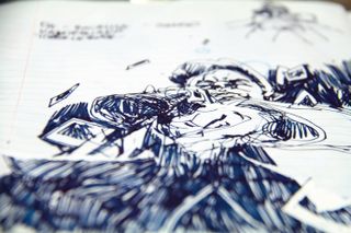
I play with shapes and values on paper to create an interesting composition. I stay loose – sometimes doing literal scribbles, moving my pen around and falling in love with the motion of the marks. Here’s a rough one, which enables me to have fun in the inking stage. I like to play with three values: dark, medium and light. This helps to create depth and balance.
02. Scan and tweak
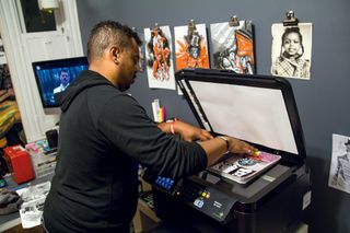
Next I scan in my sketch at 600dpi and print it out larger to save time redrawing the image. First, I take it into Photoshop, scale it to size, and add a layer of Cyan, with the Lighten or Screen layer option. You’ll see a lot of options in your Layer dialog that you’ll be able to play with in later steps.
03. Print your blue sketch
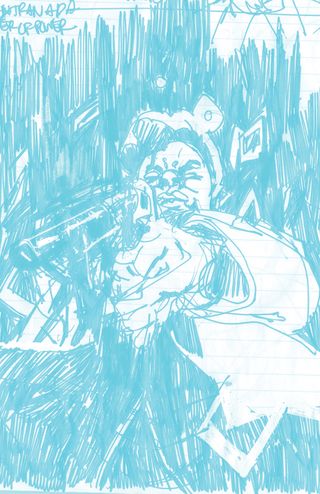
I use Strathmore Comic Art Boards (100lbs/270g/m2), but there are so many options with paper, and it’s fun to explore. I mainly use this because of the guideline, but with a large enough printer you can make your own. The only trouble is that the blue lines sometimes peak through, and need an additional clean up in the digital phase.
04. Blue pencil touch ups
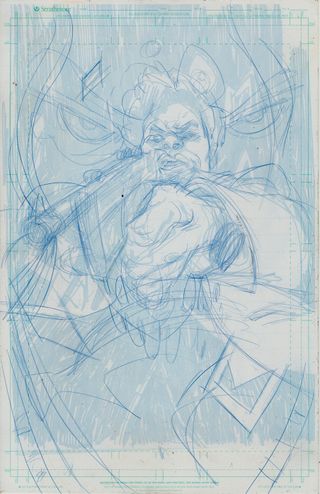
Now I have a large physical copy of the sketch and can touch up any details. I’ve been able to retain the energy and looseness in my sketch by working smaller, but now it’s about the details. Reference is highly recommended for beginners. Col-Erase Indigo Blue pencils are great: dark enough to see, but light enough not to stain the paper.
05. It's inking time
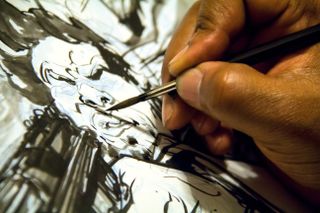
This is my favourite part of the process. Here I like to jump around the piece, starting in areas that grab my interest first, going through and moulding my image. I love Sumi Ink, and keep Copic's Super Black in on the side to get those solid black areas. Some people can’t stand the smell of Sumi, but I love it, like gasoline or liquorice. It comes in black and Chinese red, which enables you to create areas that can be easily selected in the computer. But more on that later…
06. Washes
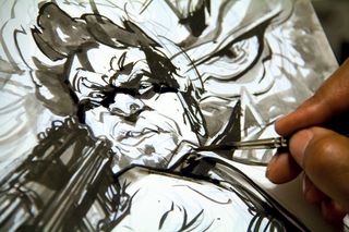
My wash is a 40 to 60 per cent grey mixture in tone (0 per cent water, 100 per cent ink), a consistency that enables me to start relatively light, but I can add layers to achieve a darker grey. It's important to know how much water your paper can take, so test, test, test!
07. Keep your values strong
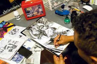
I check my values, trying to not have too much grey, and keeping a nice balance of black and white. Contrast is important. Squint at your image and if you can still make out your shapes, it’s good. If it loses contrast and focus, punch up black and white areas. I use White-Out pens and FW Acrylic ink to resurrect highlights and white areas.
08. Scanning in the artwork
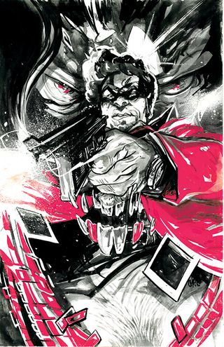
Now I scan in my inked image at 600dpi to capture all those details. I don't mess too much with the settings quite yet – I can do that in Photoshop, where you can fine-tune it a little more accurately.
09. Duplicate layer to create your first tone
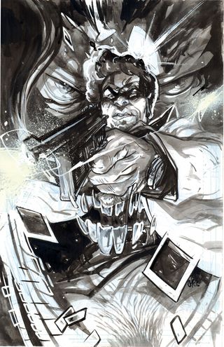
I open the scan in Photoshop and duplicate the inked art layer. I adjust levels (values) and contrast. On a second layer I exaggerate the dark levels, so the dark range overtakes the piece. I create a new layer, choose a base colour (cyan), and select the Screen layer option. Then I merge this layer with the darkened image.
10. Make selections and save them
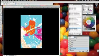
This is where the red ink comes in handy. I select those areas by using Color Range and the stylus turns into an eye dropper, for selecting and adjusting colour ranges. Selections can be saved by clicking Select Menu>Save Selection. Label them to cut down on confusion.
11. Adjusting the order of layers
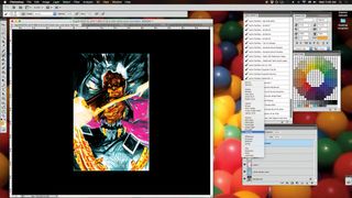
Now you can start filling in flat colours and playing with how your shapes lay on top of each other. In the comics industry this is know as flatting. I usually use cyan, magenta and yellow, as they are bright and different enough that you can easily select them with the Magic Wand. Layer order also enables you to play with how your layers affect each other, depending on the layer option you use and what’s below it.
12. Finding your palette
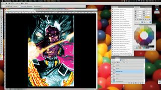
I like to have a set palette that reflects the mood of the piece, and sometimes I like to just find it. I start to shift Saturation, Lightness and Color using Ctrl+U. Colour is relative, meaning your perception of one colour will change depending on its surroundings. So a lot of the action here is shift, react, shift, repeat. If you feel stuck, search the internet.
13. Fine-tune your lighting
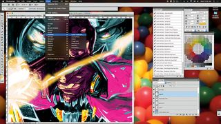
Thankfully with all the work I’ve done in the traditional stage, my values and lighting are set. But now, it’s time to make them sing. I pop them out with Color and Layer options. I want the muzzle flare to be softer, so I go to Filter>Blur>Gaussian Blur and adjust. To give it some texture, I go to Filters>Pixelate>Halftone.
14. Final touches
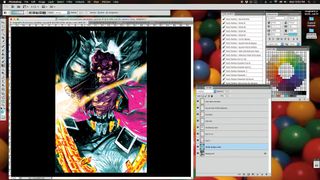
Now I save a layered file, and then save a flattened file. Having a layered file enables me to go back to make bigger edits, but if I think that the image is good to go, then now I can flatten and edit the piece as a whole, playing with Color Balance. This makes the piece more cohesive and ready for print.
This article was originally published in ImagineFX magazine issue 137. Buy it here.

Thank you for reading 5 articles this month* Join now for unlimited access
Enjoy your first month for just £1 / $1 / €1
*Read 5 free articles per month without a subscription

Join now for unlimited access
Try first month for just £1 / $1 / €1
