How to code smart text effects with CSS
Liven up your site with this playful text animation.

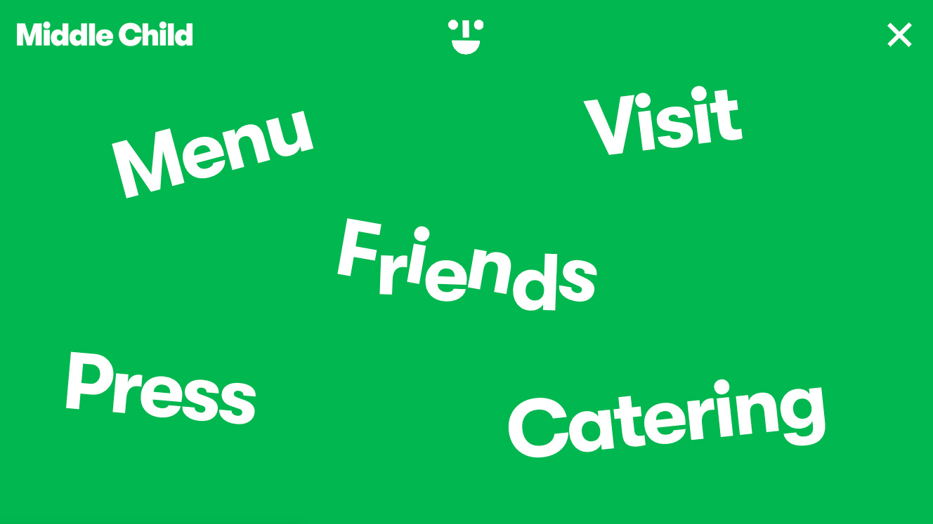
Rollover links are a great way to grab a user's attention, especially if they do something unusual or original. Middle Child has a great effect, seldom seen elsewhere, that captures each letter and splits them apart with animation, which kicks in when the visitor hovers over the word. The animation helps convey the sandwich brand's playful character.
In this article, we show you how to recreate the effect on your site. For more inspiration, take a look at our guide to the best CSS animation examples (with instructions on how to code them). For something a bit different, try a top website builder or our pick of the best cloud storage. And if you're making your site more complex, make sure your web hosting is on point.
01. Rollover text effect
One of the great text effects on the Middle Child website is for the rollover effects on the menu, where the letters split apart on the text and rotate slightly. Start this with some simple HTML tags.
Article continues below<div class="wrapper">
<div class="word">Breakfast</div>
</div>02. Create CSS
Use a separate CSS file or style tags to add the following CSS rules and make the page fill the full size of the browser by ensuring the body and the wrapper take the full height available.
body {
	width: 100%;
	height: 100%;
	margin: 0;
	padding: 0;
}
.wrapper {
	display: grid;
	height: 100%;
}
03. Position the word
The word class centres the word in the grid. Any text that is given the word class can have this applied. The up class is going to be applied to every other letter and these will move upwards.
.word {
	font-size: 3em;
	margin: auto auto;
}

.word .up
{
	display: inline-block;
	transform: translate3d(0px, 0px, 0px)
	rotate(0deg);
	transition: all 0.5s ease-in-out;
}
04. Up and over
Now the down class shares very similar settings to the up but the hover shows the movement upwards for the up rollover. Upwards is also rotated slightly to enhance the look.
.word .down
{
	display: inline-block;
	transform: translate3d(0px, 0px, 0px)
	rotate(0deg);
	transition: all 0.5s ease-in-out;
}

.word:hover .up
{
	transform: translate3d(0px, -8px, 0px)
	rotate(12deg);
	color: #058b05
}
05. Hovering down
When the user hovers over the text, the down class moves the text downwards. Later in JavaScript the text will be split into separate spans with the classes added automatically to alternate spans.
Sign up to Creative Bloq's daily newsletter, which brings you the latest news and inspiration from the worlds of art, design and technology.
.word:hover .down {
	transform: translate3d(0px, 8px, 0px)
	rotate(-12deg);
	color: #058b05;
}
06. Automatic for the people
It's a bit of a hassle to have to put every letter in alternating spans with different classes, so we'll automate the process by getting JavaScript to query the selector and take each letter. Here the str variable grabs the current letter as it loops through the text.
<script>
var elements = document.querySelectorAll
('.word');
for (var i = 0, l = elements.length; i
< l; i++) {
	var str = elements[i].textContent;
	elements[i].innerHTML = '';
07. Add alternating classes
Now another loop places each letter in its own span element and adds either the up or down class to the spans. If you look at this in the browser you will see the text split by each letter up and down, while rotating slightly.
You can see the effect in action on the Middle Child website.
	for (var j = 0, ll = str.length; j
	< ll; j++)    {
		var spn = document.createElement('span');
		elements[i].appendChild(spn);
		spn.textContent = str[j];
		let pos = (j % 2) ? 'up' : 'down';
		spn.classList.add(pos);
	}
 }
</script>
This article was originally published in creative web design magazine Web Designer. Buy issue 286 or subscribe.
Read more:

Web Designer is the premier magazine for aspiring online creatives and industry professionals. The monthly title offers cutting-edge practical projects spanning XHTML, CSS, Flash and WordPress as well as hosting features and interviews with the web community’s most influential people. Each issue also has a dedicated Industry section covering news and views from the trade, website showcases featuring the finest design talent and a free CD of valuable resources.
