Brand typography: A complete guide
Deliver your message with the perfect brand typography.
Make the right choice
Why do certain types of brands adopt certain types of fonts and font pairings? Partly, at least, this can be attributed to a ‘trend effect’. This is a collective interpretation of design, absorbed through our familiarity with – and understanding of – the culture we happen to be part of.
But there’s also the way brands from different industry sectors choose to position themselves. Trends within specific sectors don’t follow a strict rulebook, but certain styles of fonts represent specific emotional attributes.
For instance, geometric fonts with homogenised proportions tend to represent design purity, cleanliness and simplicity – values that many technology brands are currently keen to express.
Many fashion brands, on the other hand, have an ongoing love affair with high contrast modern designs with their elegant hairline strokes, bracketed serifs and smooth arching curves, expressing a timeless style.
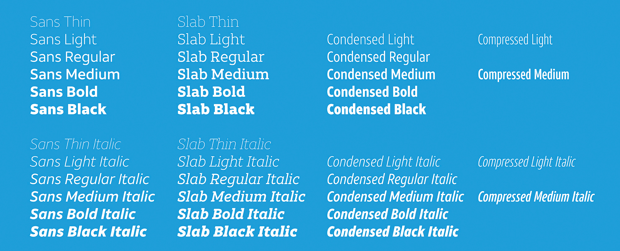
Consumer banking also offers an interesting example, as these brands have been progressively moving away from authoritarian serif designs in favour of softer expressions, perhaps to appear more human and friendly as they aim to rebuild trust following the financial crisis.
In 1923, when Poffenberger & Franken conducted research into how readers perceive different typefaces used to advertise products, they discovered that people responded almost uniformly to typeface and product combinations, and mostly used similar adjectives to describe what they felt about the different fonts they were asked to comment on.
Subliminal messages

Through a lifetime of exposure we learn, or are prepared to be seduced by, the subliminal messages presented to us through branding and communication. Fonts, and typography in general, contain layers of subliminal communication, and carry a wealth of meaning, even for viewers who are not well-versed in typography.
Get the Creative Bloq Newsletter
Daily design news, reviews, how-tos and more, as picked by the editors.
The contrast and modulation of the strokes, how a stroke termination is shaped, and height to width proportions determine whether a design is perceived as warm and friendly, or cold and mechanical.
This is why picking the right font is key to a brand’s successful communication. Just like a logo or colour palette, the right font can help consumers identify the key characteristics behind a brand’s attitude and encourage them to make positive associations with its products and services.
Developing an ownable brand font
Typographic consistency across different communication channels establishes a sense of empathy and loyalty between the brand and its audience over time, and is an unquestionable asset in a brand’s toolkit. So how do we choose, or develop an ownable brand font? This is a question that we’re asked every day.
A multitude of parameters and features affect the stylistic and functional properties of a typeface: some are global, affecting all glyphs within a font family; some are specific to style variants, such as Regular, Italic, Bold, Bold Italic; others apply to shared elements within each style variant; while a few relate to just individual letters.
With the democratisation of type design tools and the boom of available designs you can pick from, there are a number of criteria to take into account if you choose to license a font family for a brand. Being aware of the conventions at play behind our interpretation of the emotional qualities conveyed by a typeface will always be helpful.
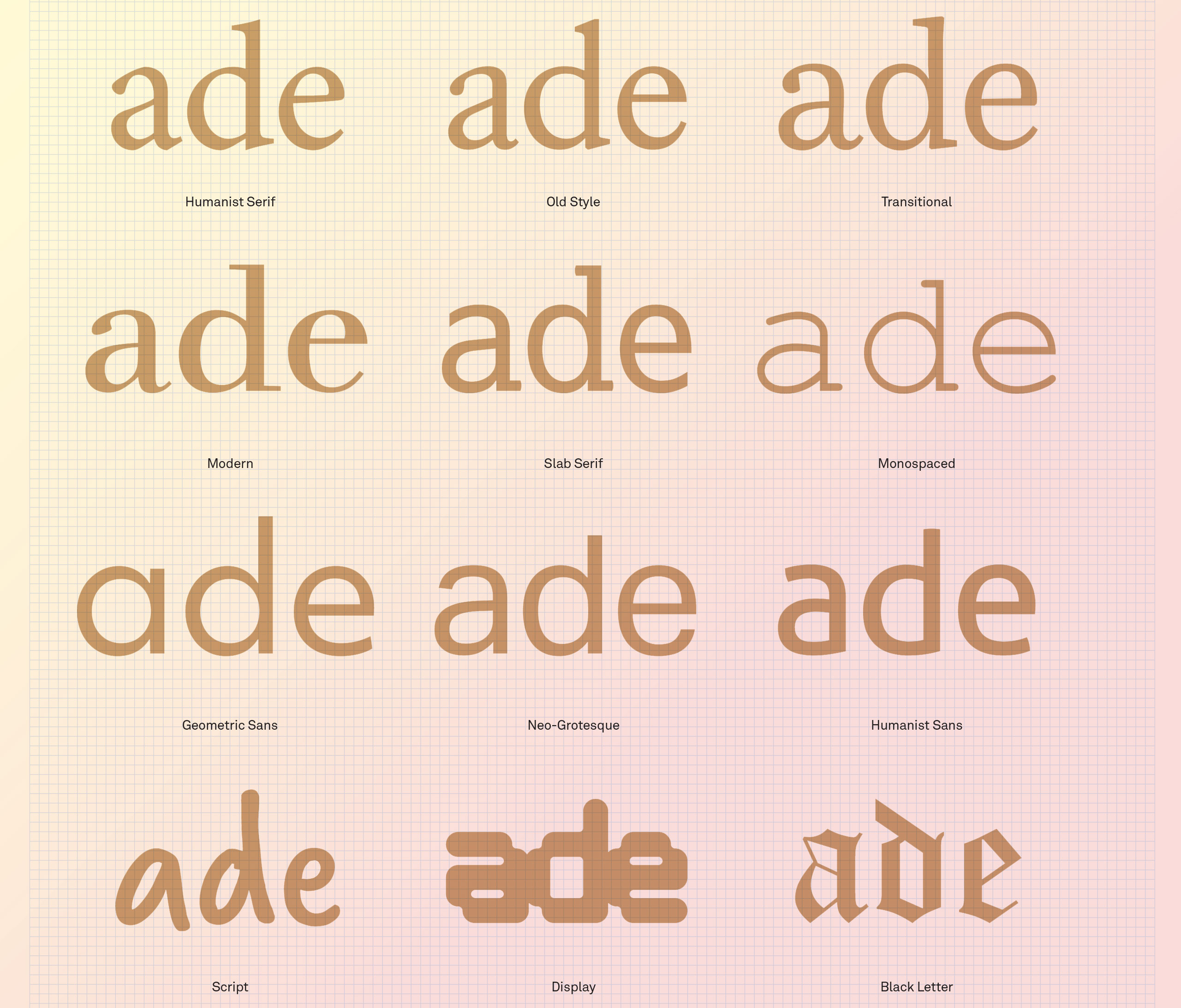
First off, you could start by considering whether a serif or sans serif design is suitable. Serifs originate from carved inscriptions, mostly from the Roman Imperial period, and while lowercase letters have since evolved into a variety of other letter shapes, capitals and their associated serifs have survived with very few fundamental changes.
This deep-rooted history brings with it an inescapable association between serifs and their antique origins, making serif fonts more suited to cultivated, academic and more thoughtful communication.
The advantage of serifed letters has been understood for hundreds of years of print-based typography: they help to combine or ‘glue’ letterforms together into word elements. The internal density that serifs provide also creates more clearly defined horizontal rows of text, making the process of switching from the end of one line of text to the beginning of the next more efficient.
The boom of screen-based technology over the last decade or so has brought a resurgence in the popularity of the sans serif.
Sans serifs, for their part, made their first appearance in the 19th century and were used initially for commercial headlines and advertisements. In the age of print, their low contrast and absence of serifs made most sans typefaces harder to follow for general reading and so they were not a suitable choice for the text of a book, magazine or newspaper.
But the boom of screen-based technology over the last decade or so has brought a resurgence in the popularity of the sans serif.
The complex texture and density of the serifed fonts did not always perform well in digital form, and screen resolutions were not sufficient to render as accurately the reading sizes we normally find comfortable in print media.
In this context, the monolinear stroke weight and functionality of the sans serif made it an appropriate choice for their association with a more rational and industrial ideology and their functionality in digital environments.
02. Consider the font contrast
Next, you should consider which contrast in a font will be more appropriate for your brand. Despite the passing of many generations, the same calligraphy inspired stroke modulation between thick and thin strokes that was incorporated into those earliest forms of movable type is still recognised today, informing the construction of digital type.
High contrast fonts generally are more effective when used at display sizes, where their elegance can be appreciated. However, their use for text can prove problematic due to the delicacy of their thin strokes, which have a fracturing effect at small sizes, reducing visual definition.
Low contrast fonts can also present limitations, but for different reasons. In display and larger text sizes they perform well, but for text use in general, their reduced internal space also reduces visual definition. Both extremes have an important role to play in display typography: high contrast designs can provide an impression of classical dignity and grace, while lower contrast designs can contribute a sense of robust solidity, confidence and permanence.
03. Think about font stress
You should consider the stress or axis of the font, which refers to the angle at which contrast occurs in a letterform, usually ranging from vertical to a somewhat back-slanted diagonal. This can best be noted by looking at the letter ‘O’ and noting if the bottom left is thicker than the top left, and if the top right is thicker than the bottom right.
If this difference exists, the letter has diagonal stress. The reason for this angled stress is due to calligraphic construction and principles applied to traditional Roman type styles we use for text copy. These ‘old style’ designs are generally considered warm and friendly with their angled stress providing a slightly coarse, organic texture on the page.
The flowing rhythm of the text, enhanced by naturally occurring oblique ascender and x-height serifs, serve to combine individual letters more readily into clearly defined word elements. The irregularity and down-to-earth familiarity of these designs seems to invite the reader to enter the text and read.
04. Don't forget vertical stress
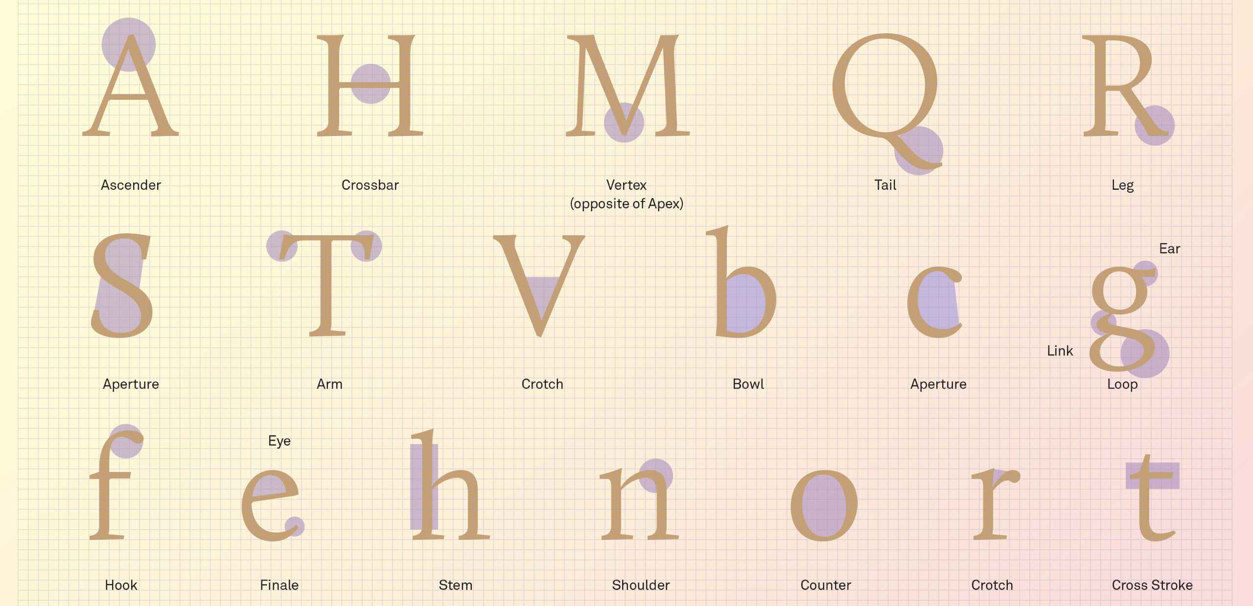
If the two halves of the ‘O’ are horizontal mirror images of each other, with the sides thicker than the top and bottom, then the letter has vertical stress. Unlike the Roman typefaces, which developed naturally over time, a more rational approach to verticality emerged in the 18th century with the development of typefaces we now call ‘modern’.
Aside from their functional properties, vertically stressed moderns have a more refined, austere elegance about them, qualities that are best appreciated when used at display sizes for magazines and posters. At text sizes, however, they seem to convey a sense of cool clinical detachment, inviting the reader to look at the text rather than read.
A tall high x-height will help maintain clarity of the characters, but this may come at the expense of word and line definition.
Another element that should influence your font choice is a font’s vertical parameters (ascender, x-height and descender). If we are familiar with most words we encounter, when our eyes scan the page we look for clues based around the context of the passage we are reading. This makes us able to guess collections of words within a phrase or sentence based on their length, architecture and context as our eye moves forward and backward in saccades.
A tall high x-height will help maintain clarity of the characters, but this may come at the expense of word and line definition. A short x-height will restrict definition within the x-height portion of a font, particularly in bolder weights, but will define more clearly the silhouette or shape of words within a text.
The ideal x-height for your brand font will allow sufficient space to build lowercase letters, including the more complex ‘a’, ‘e’, ‘s’ and ‘x,’ without compromising their definition at whatever range of sizes the font is designed to cover, as well as taking into account its relationship with the ascender height.
05. Counter balance
The architecture of the letters is also heavily influenced by whether the designer opted for open or closed counters. This is particularly relevant for corporate branding needs, where fonts are required to perform effectively over a wide range of media and sizes with an economy of space.
Since these fonts are often monolinear, the designer is required to ensure that there is sufficient internal space within the letterforms and to consider restrictions to their width proportions. To overcome these constraints, designers will often resort to humanist designs, where the construction and architecture of the letters helps provide more internal space.
There is no overarching formula as to which designs are right or wrong.
Closed counter styles are available in the form of grotesque (grotesk) designs in which the outer loops of ‘a’, ‘c’, ‘e’ and ‘s’ are hooked in towards the middle of each letter. To maintain their flexibility and legibility at small sizes, these fonts are generally made with an enlarged x-height and with the widths of the enclosed characters increased but, as discussed earlier, there is a corresponding reduction in legibility at text sizes.
These are just a sample of the criteria that should be considered in your choice of a brand font and there are many features which will influence a decision that should be articulated around a solid understanding of the brand’s identity.
There is no overarching formula as to which designs are right or wrong and the most important thing is to thoroughly map the requirements and context in which the typeface will be used. This will very much be determined by how expressive or functional it should be, what it should look like, and in which digital environments, operating systems and screen resolutions it will be used.
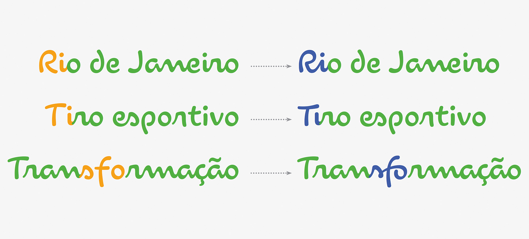
Considering which required writing systems will be needed at an early stage is also paramount. After all, it would be a shame to pick a font family that looks good, but doesn’t cover all the script systems that the brand will need to communicate in its other markets. It’s possible to pair or match a Latin font in another script system, but this is at the risk of diluting the brand’s expression.
In a nutshell, picking the right brand font should come from discussing emotional features, visual language, technical, linguistic and logistic requirements with the brand.
If possible, you should also liaise not only with the client’s design and marketing departments, but also with IT and legal, as each team often has different or additional needs. Ultimately, the sweet spot where brand expression and functionality meets is where you’ll find the right typeface for your brand.
This content originally appeared in Computer Arts magazine.
Related articles:

Thank you for reading 5 articles this month* Join now for unlimited access
Enjoy your first month for just £1 / $1 / €1
*Read 5 free articles per month without a subscription

Join now for unlimited access
Try first month for just £1 / $1 / €1
- 1
- 2
Current page: How to choose the right typeface for a brand
Prev Page How to define your brand through typography