Character sheets for 3D modellers: 15 top tips
Learn how to design a character sheet for a 3D modeller-friendly character.

Character sheets are the order of the day in this tutorial, which covers how to create one for a 3D modeller-friendly character. By 3D modeller friendly, I mean a very clear and accurate detailing of the character’s clothes and accessories, and a body proportions guide to help with setting modelling boundaries.
The full sheet will include close-ups on the character’s items, some expressions to get a full idea of how the face should be rigged for animation, texture presentation, front, back and side views, colour options, functionality, and 2D modelling wireframes. These are considerations that underpin some of the most amazing 3D art we've seen.
Harajuku shapes and colours will be the main inspiration for our character design, in order to make it more eye-catching in any game or animation. We will be working with Procreate and Photoshop (some of the best software for digital artists), learning how to use suitable brushes and the editing tools in both software.
This tutorial will give you an insight into creating character sheets, which you will be able to use in your own work.
01. Start by using shapes

Shapes are an integral part of sketching any of your character designs and they can help you set the personality and attitude. Big shapes can give off the sense of a kind or firm and strong presence, while small and thin shapes might show speed, flexibility or timid uncertainty!
Shapes and psychology are connected, so for this concept of an underground street racer, we will be going for a strong but slow character. Choosing big circles and wide shoulder formations will help to portray an impactful personality.
02. Connect shapes to make a basic form

Once we have decided on the shapes, we move on to setting the smaller shapes connecting to the main body. Here we can see how the arms and feet are going to look. To make your character more whimsical, try to work with juxtaposing the limbs and extremities. Here we will go for a big body, but very thin legs and small hands. This contrast will add a funnier spirit to your character.
Get the Creative Bloq Newsletter
Daily design news, reviews, how-tos and more, as picked by the editors.
03. Build a 2D body wireframe

A common overlooked step is presenting the body in the character sheet with no details or clothing. Drawing the original body shape provides a good base for any future 3D sculpt, without the distraction of form and outlines caused by the layering of several clothing pieces or accessories.
Using the circles and body sketch as a base, we start to draw the anatomy of the character in raw form. This will allow the modellers to add the outfit as separate layers on top of the basic sculpt.
Another tip is to draw the wireframe lines wrapping around the model in 2D form; this will give you a better understanding of how the clothes will fall around the character’s body.
04. Detail then finalise line art

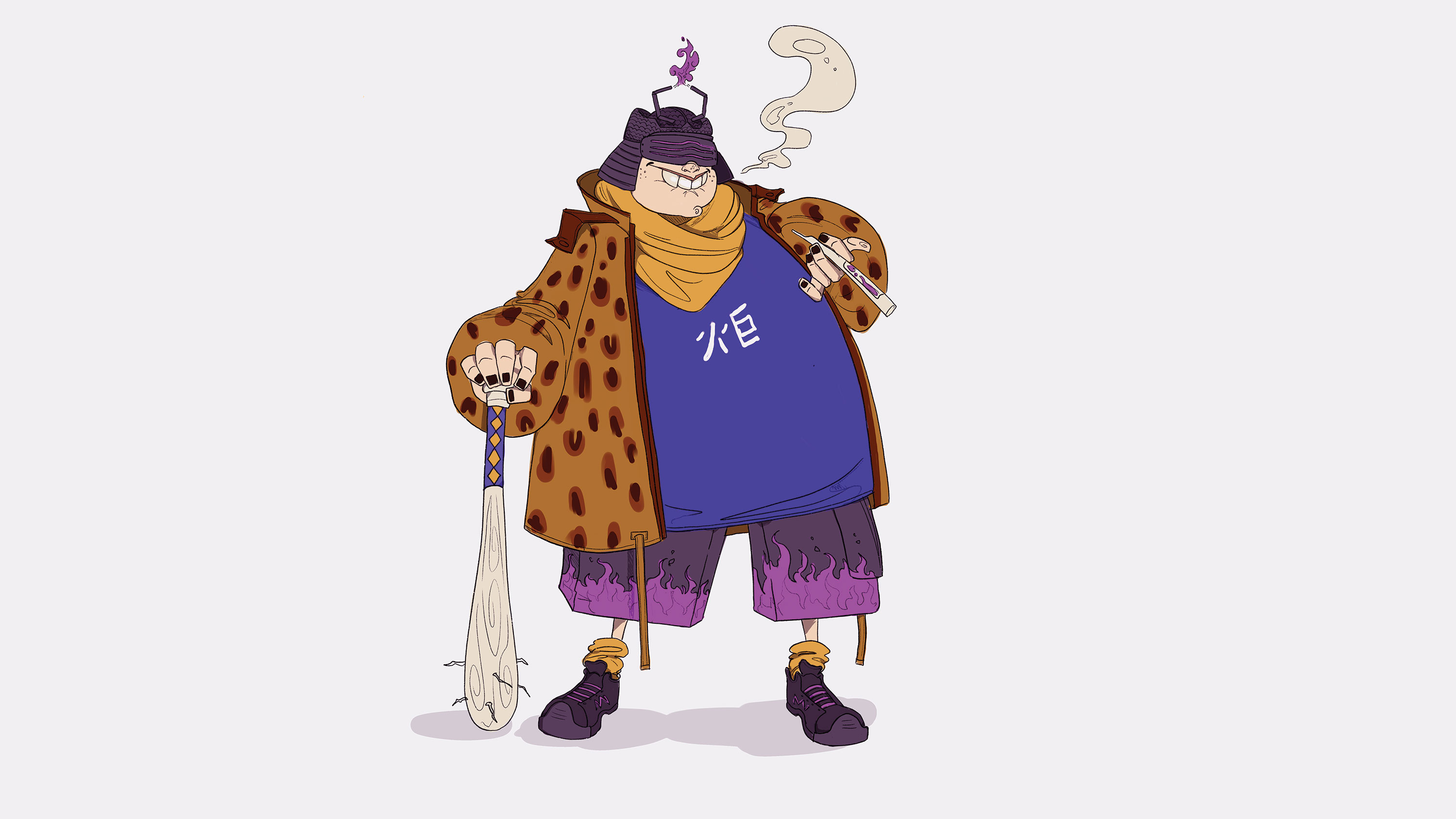
Once the basic shape of the character is set, you can start with detailing the character. As mentioned, Harajuku fashion wear was chosen to create the outfit for this character. The character will be called ‘Torch’, so we can choose fire to be the striking element of his design.
Drawing fire on his outfit will be a classic thing to do, so for that, we are going to add a gas-powered helmet igniting fire all the time. The helmet design is based on the kabuto samurai helmet with gas tubes instead of the classic ‘maedate’ piece.
05. Reveal character through accessories

Torch is a racer who plays dirty so he can win. For that, we are going to give him a weak weapon to show his deteriorated sportsmanship. A classic bat pimped up to his style will be a perfect weapon. Since Japanese accessories are the inspiration, we will go for a katana-style handle. The textures are also presented in the sheet so the 3D modeller can visualise the end result.
06. Personalise your designs

When designing a character accessory, choose a known item and give it your own personal twist. Here, the classic kabuto helmet includes several parts we can change to fit our character. The gas tubes that replace the classic ‘maedate’ will be a perfect addition to reflect his fiery character. The design needs to still be functional, so the gas tubes placement needs to make sense.
07. Specify texture details

Providing the modeller with your preferred textures is always a plus. Torch will be wearing a leopard-print fur jacket with a simple shirt and fire shorts. It is preferable to paint the textures in squares in the full sheet to get the desired look. Some designs require custom-made textures, so this will be the job of the development team to change the 2D texture into one fitting for the model.
08. Explore different character angles

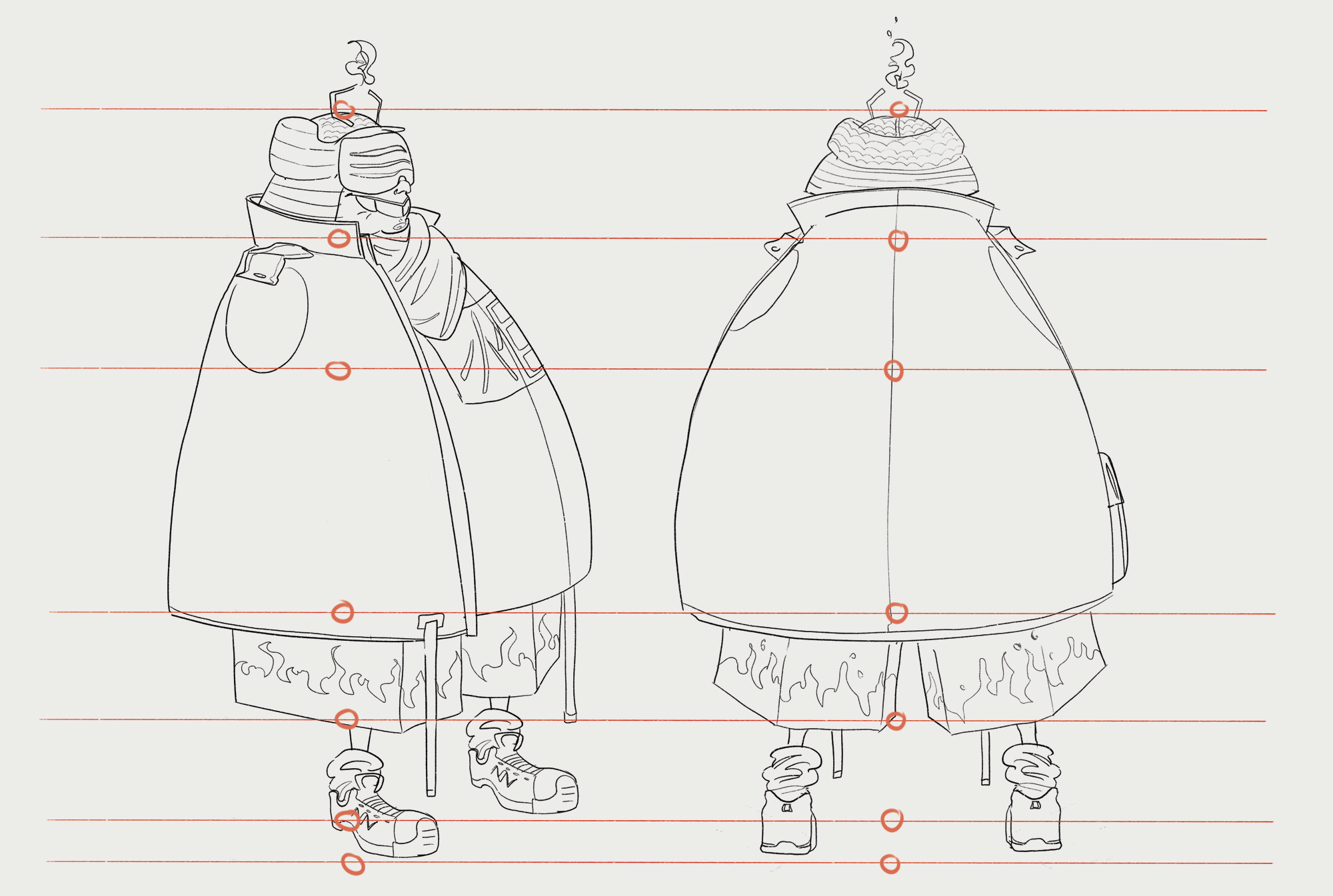
Next we will work on the side and back view of the character. A tip to drawing the different views is to draw guides positioned on the joints. For example, we have a line that shows how tall the head is, or where the elbows are located, or even the body height.
Once the lines are drawn over the main character, you can use the guides to paint him in all the angles, like front, side, three quarter and back. The poses should be drawn in the classic T-pose, excluding the arms, to make it easier for the modellers to identify the anatomy.
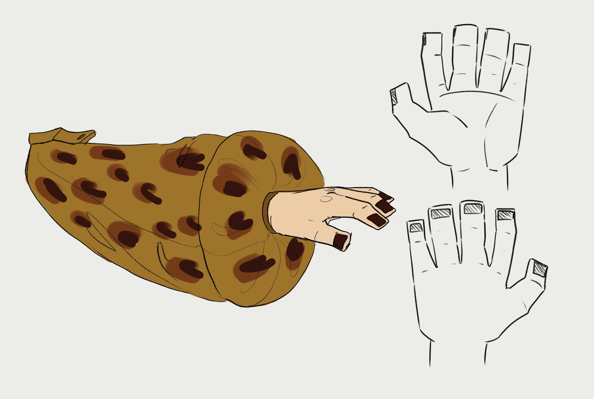
09. Detail limbs separately

When drawing the character in side view T-pose, you exclude the arms so the side seams will show and won’t be hidden by the limbs. In that case, we’ll draw the arm in a separate piece; this is a good way to present, especially if the limbs of your character include complex seams and folds. The hand is even drawn in a flat perspective as an easier guide.
10. Play with colour variations

Your chosen colours will not always be the final decision, especially when working in a team. For that, you need to present several colouring options and discuss what would be best to give both visual impact and memorable combinations. In a character sheet, you can get help from your mood board (see mood board tips here) and choose several colour designs.
If you want your character to look visually stronger, you can choose to combine flat colours with a pattern or an animal print. This always looks more rich and aesthetically pleasing.
11. Include multiple facial expressions

We will be drawing Torch in the three basic vital expressions: happy, sad and angry. Here we can play with how the gas tubes ignite the fire depending on how he feels: when he is happy, the flame will appear a pink colour; anger can be a sharp fire shape with sparks igniting from the tubes; sadness can be shown as a small and timid blue fire.
12. Present ambient occlusion layers

Ambient occlusion, or AO, is a rendering method to determine the darkest shadowed areas in a neutral diffused light setting. For example, AO could be added underneath his chin, between his fingers, above his knees, etc, any area where there would be no light casting on the surface.
It is a good idea to present the AO as a separate layer on your character sheet. Even if your character will be transformed into a 3D model later, adding AO to the 2D sheet is a great way to pitch the idea to your client or team members.
13. Consider colour psychology

This plays an important role in determining the personality and attitude of your character. Torch is a very egoistic character and will do anything for the win, even if it means playing dirty. So we will be choosing purple to reflect vanity along with yellow (the leopard print) to show vitality and energy. You can experiment with other colours that fit the personality of your character.
14. Include lots of different poses

Posing your character into the basic body movements allows people to learn more about your character’s attitude. To draw your character in different poses, always keep in mind the basic shapes that form your design. Drawing circles reacting to movement will help us with filling in the details.
Remember the squish and squash techniques in animation and apply it directly to the pose. Another tip is making use of the spine as a simple line. When you draw this line, the rest of the limbs will be easier to fill in.
15. Extend the character into related items

The final step in our character sheet is to create his prized car, the Totchi! Designing vehicles revolves around the same concept as character design. First we draw the main shape of the car after lots of research, then add the details that should be relatable to the character.
In this case, the car should include the fire and the leopard print to show ownership. You can also exaggerate with the car shape and increase the sizes, so here we make the cockpit very wide and big to fit Torch in his one-person seat.
This article originally appeared in issue 248 of 3D World, the best-selling magazine for 3D artists. Buy issue 248 or subscribe to 3D World.
Related articles:

Thank you for reading 5 articles this month* Join now for unlimited access
Enjoy your first month for just £1 / $1 / €1
*Read 5 free articles per month without a subscription

Join now for unlimited access
Try first month for just £1 / $1 / €1
