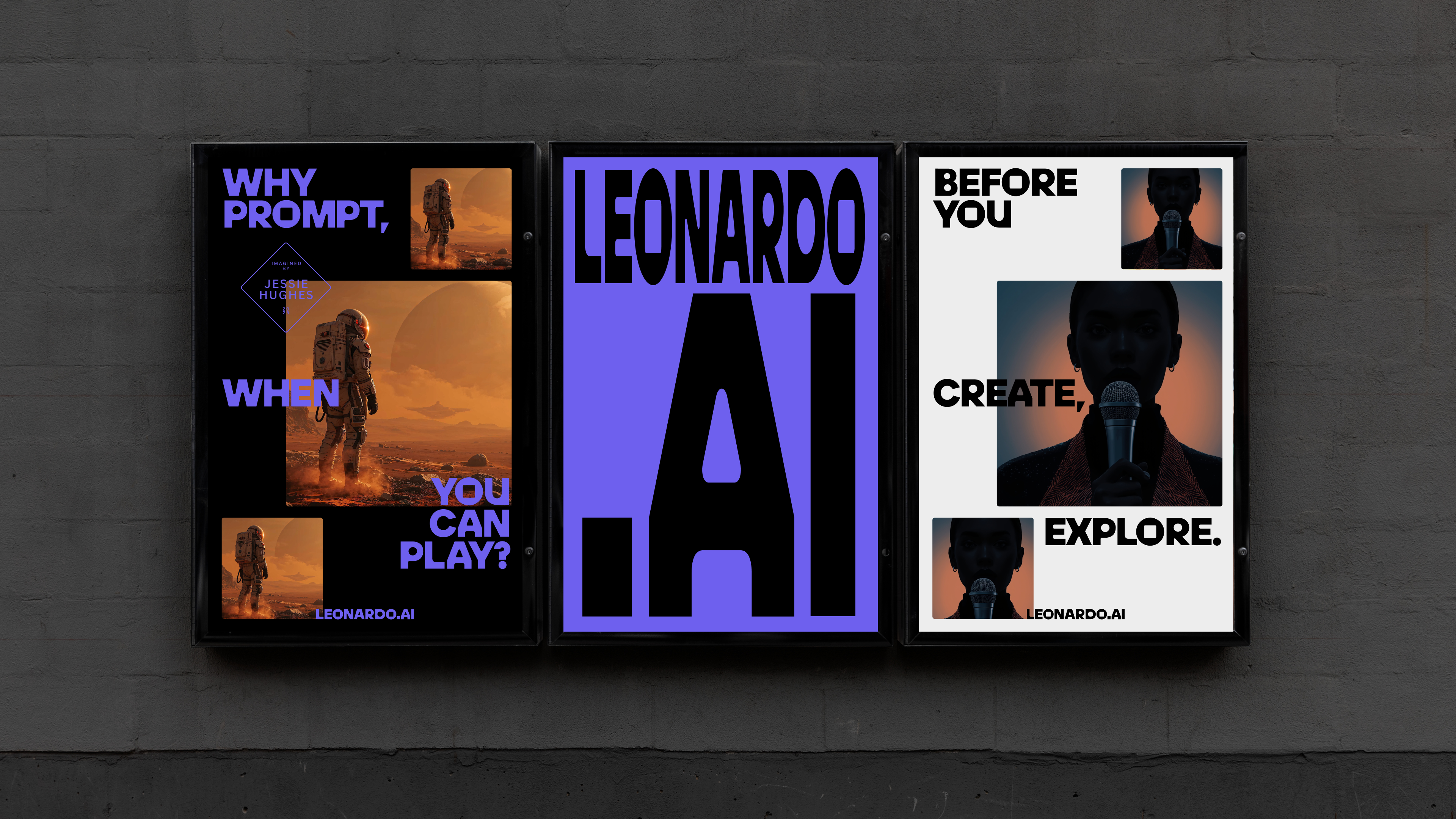
Build prototypes with Adobe XD
Design seamless transitions between screens using Auto-Animate and control it with your voice in Adobe XD.
Sign up to Creative Bloq's daily newsletter, which brings you the latest news and inspiration from the worlds of art, design and technology.
You are now subscribed
Your newsletter sign-up was successful
Want to add more newsletters?
Five times a week
CreativeBloq
Sign up to Creative Bloq's daily newsletter, which brings you the latest news and inspiration from the worlds of art, design and technology.

Once a week
By Design
Sign up to Creative Bloq's daily newsletter, which brings you the latest news and inspiration from the worlds of art, design and technology.
Once a week
State of the Art
Sign up to Creative Bloq's daily newsletter, which brings you the latest news and inspiration from the worlds of art, design and technology.

Seasonal (around events)
Brand Impact Awards
Sign up to Creative Bloq's daily newsletter, which brings you the latest news and inspiration from the worlds of art, design and technology.
In contemporary web and app design there are often times when the interaction doesn't open a whole new page or screen. The modern approach to creating interactive content requires transitions between design interface elements so that the user is surprised and wowed by the experience of changing content. This all happens on the same screen or page, without a refresh. Designing these kinds of interactions and refining them to work properly can take time, but it's worth doing before writing your code.
This is what Adobe XD has spent the last few months of development getting right. Create content in one state on one screen, move that content to the new state on the new screen and simply choose the 'Auto-Animate' option to transition. All the content that is the same on both screens automatically animates from one position to another. If you don't want all the content visible on both screens, make the content invisible on the first and it will transition into place.
Find out about other Adobe software such as Adobe Dimension.
Here we'll show you how to create an app prototype that does just this (for more how to create an app tutorials, check out our rundown of the best ones). And going beyond that, a new feature of XD enables the user to control interactions with their voice. We'll explore this as a design feature and how the app can speak back to the user as well, which can provide some interesting design opportunities.
Download the project files for this tutorial.
01. Starting the project

If you don't have Adobe XD, you can download and install it here. Once the install has completed, open the software and the welcome screen will enable you to choose a screen size to download for. In this case choose the iPhone 6/7/8, as that's the right size for this project, but you will see there are a variety of sizes available.
02. Import the first image

There are different ways to import images, but in this first instance go to File > Import. Choose the 'assets' folder from the project files and the first image to import will be 'sky.png'. Place it on the top of the screen and move it a just couple of pixels down.
Sign up to Creative Bloq's daily newsletter, which brings you the latest news and inspiration from the worlds of art, design and technology.
03. Place the cabin

The next image for the design will be the 'cabin.png'. Just import this in the same way you did in the previous step and then place it to fill the screen. Finally, import the image 'trees.png' and place it at the bottom of the screen with the trees over the lake.
04. Bring in the logo
The reason those images are separate layers is so that when a transition is created between screens they can move separately. Go to the File menu and choose Import. This time select 'logo.ai', which is a vector image. Place this image in the top centre of the screen.
05. Add a circle

Select the circle tool and draw a circle just slightly larger than the logo. In the Properties panel on the right, remove the stroke and make the background black. Select Background blur and reduce the brightness to -30 so that the circle is still black.
06. Reorder the graphics

Now the circle needs to move behind the logo. Select Object > Arrange and send backwards. Like in other Adobe products, it is also Cmd/Ctrl+[ to move any graphic backwards in the layer order. Using the right square bracket, meanwhile, will bring an object forwards in the order.
07. Drop the mic

Now import the 'mic.ai' image and resize the image to be relatively small. Place this at the bottom of the screen. Draw a circle around this and uncheck the fill so that it's removed. Then make the stroke white and two pixels wide. Position that around the 'mic' image.
08. Text message
Use the text tool to add the words 'speak to search' below the microphone. Make the text white and change it to Helvetica Neue Condensed Black. In the bottom left of the screen click the Assets panel icon to open it. With the text selected on the screen, click the '+' icon next to 'Character styles' to save this format for the text.
09. Join a group
Select the Layer panel icon in the bottom left of the screen. On the screen, select the 'search' text and Shift-click to add the circle and the mic icon. Go to Object and choose Group. In the Layer panel rename this group 'Search'. It's useful to name groups, especially when animating these.
10. Group the logo

Just as in the last step, select the logo and the blurred circle around it, then group them together. In the Layer panel, rename the whole group 'logo' so that it is easily identifiable if you need to edit this again later. For the moment the design for the first screen is complete.
11. Extra elements

Even though the first screen is complete there are still more design elements that need to be added. This is how animation is created by changing the elements' positioning between screens. Go to the rectangle tool and hold Shift to add a square on the screen, making the border white.
12. Different import

Now open the folder for the assets through your operating system. Select the 'cabin1.png' image and drag this directly onto the square that you created in the previous step. It will automatically be masked inside this. Double click to edit the position of the image and make sure that the cabin is visible in the square.
13. Add a label

Using the Text tool, add the label 'Forest Cabin' below the text and use the Assets panel to style the text in the saved style from step 8. Select the image and the label and group them together. Name the group 'left cabin' in the layers panel.
14. Duplicate the group

Normally repeating an interface element is the perfect job for the 'Repeat Grid' tool. However, this is going to need specific animation, which doesn't work with the Repeat Grid. Select the image and text group, then copy and paste it so that it sits next to the original, and add the image 'cabin2.png' instead.
15. Rename then copy again

Change the text to 'Snow Cabin', and in the layers panel name this 'right cabin'. Select both the left and right cabin and duplicate them, position the duplicates below and update their text and images with 'cabin3.png' and 'cabin4.png'. Group both of these together and name the group 'lower cabin'.
16. Text title

Add text to the page with the text 'Search results for cabins'. Give this the Rockwell typeface and save this to the Character Styles in the Assets panel. Now position the 'lower cabin' group right at the bottom of the screen and take the appearance down to zero so that it is invisible on this screen.
17. Changing opacity

Now select the left and right cabins, move them to the bottom of the screen and take the appearance slider to zero. Repeat again for the search text. When we move to another screen these will all animate to their new positions. In the Layer panel, move the 'left cabin' above all of the other cabin groups.
18. Duplicate the screen

Select the artboard by clicking on its name, then double click the artboard and change the name to 'home'. Copy and paste the artboard and rename it 'search'. Now select the logo and move it up to almost off the screen, then reduce its appearance to zero.
19. Move the backgrounds

Select the sky image and nudge it up slightly on the screen. Select the cabin image and move it up until the cabin is at the top of the screen. Then click on the trees image and move it over the cabin. Finally, select the 'search' group and reduce the appearance down to zero.
20. New elements appear

Select the search results in the Layer panel and bring its appearance up to 100. Move it up on the screen. Repeat this for the left cabin, right cabin and lower cabin. Use the pen tool to draw a simple back button and add a circle around it. Make the background blur and take the brightness of that down to -30.
21. Complete the back button
Select the back arrow and circle, group them together and name them 'back button' in the Layer panel. Switch over to the 'Prototype ' mode by pressing 'Prototype' in the top left of the XD interface. Select the homescreen, drag the blue arrow to the search screen and a pop-up panel will appear.
22. Voice command

Change the Trigger to Voice and type the word 'search' as the voice command to control this. Change the Action to Auto-Animate and Easing to Snap. Make the duration 1.5s. In the search screen click on the back button and drag the blue arrow back to the 'home' screen. Just change the Trigger to Tap.
23. Test the prototype

Over in the top right of the XD interface is a play button. Click on this and a working prototype will now pop up on the screen. On the homepage you will need to hold down the Space bar while you speak the voice command 'search'. When you let go of the Space bar it will take you to the next screen and animate the graphic interface into position.
24. Going back

Once the transition has run you can press the back button to get back to the homescreen. Close the prototype and click on the search screen, then click the blue arrow to the right (don't drag). Change the Trigger to Time, make the delay 0s and set the Action to Speech Playback. Make the speech 'search results for available cabins'.
25. Speech confirmation

Test this now with the play button to hear a voice confirmation of the search. Close the prototype when you have tried this out. Another screen is going to be created, so let's click back on the 'Design' view in the top left of the XD interface. Click on the search screen by clicking the name, and then copy and paste it.
26. Scaling the image

Rename the new screen 'cabin'. Double click the image for the 'left cabin' layer. Resize the corner handles so that it fills the screen, then reposition the image inside so that it covers that screen. Click on the search results text and take the appearance down to zero to remove it from view.
27. New screen elements

Double click the 'Forest Cabin' text as it is part of the group. Enlarge the text size to 26 pixels and move it up slightly on the screen. Add text to the screen in Helvetica Neue Medium at 14 pixels size and set it to white to stand out against the background. Add a white line with the line tool under the heading.
28. Create a button

Use the Rectangle tool to draw a rectangle on the screen at the bottom of the design. Drag in the corner handles to give this shape round corners. Add the word 'Reserve' to this, using the saved character style in the Assets panel for Helvetica Neue in Condensed Bold.
29. Move to Prototype mode

All the design elements are in place now for the entire design of the app. Move to the 'Prototype' mode by clicking the word 'Prototype' in the top left corner. In the search screen click on the 'forest cabin' group of the image and text. Drag the blue handle from this over to the 'cabin' screen.
30. Animation settings

In the pop-up panel for the transition between screens, choose Tap as the Trigger, then make Action Auto-Animate. Keep Easing as Snap but reduce the duration of this to 0.6s. This ensures that the animation doesn't drag – the movement of the first screen to the second screen had a lot of movement that required a longer transition.
31. Link up the back button

Now select the back button from the final screen and drag the blue arrow from this back over to the 'search' screen. All the settings from the previous transition should be remembered. You are now ready to go ahead and test this by clicking on the play button.
32. Auto-animate

What you will see with the auto-animate now is that the image expands to fill the screen, and the elements that are no longer needed will fade away while the new text will fade in. The opposite happens when going back. This provides a good way to see the auto-animate working across three screens.
33. Save the project

By default your project should automatically save to the Creative Cloud, but it is a good idea to save a copy to your own hard drive in case there are any issues. Click File > Save, change the location to your own computer and name the project with a suitable name.
34. Sharing the project

The whole point of prototyping is to test the project on other people. Fortunately there is a share button on the top right of the XD interface that makes this a breeze. Click the share button, and in the drop menu that appears select the option Share for Review.
35. Publish prototype

In the next screen you are told that auto-animate support is not yet available for the web, but it is coming soon. Click Create Public Link and then click the link in the top right to visit the public link in a web browser. You will need to hold the Space bar down to use the voice command with the prototype.
36. Video version

Another prototype can be shared by recording the interface in action. Click the share button and choose Record Video. This will open a window, and when you close this you will be prompted to save a recording of the screen as an MP4 file, which is also a useful way to share your prototype.
This article was originally published in issue 285 of creative web design magazine Web Designer. Buy issue 285 here or subscribe to Web Designer here.
Related articles:

Mark is a Professor of Interaction Design at Sheridan College of Advanced Learning near Toronto, Canada. Highlights from Mark's extensive industry practice include a top four (worldwide) downloaded game for the UK launch of the iPhone in December 2007. Mark created the title sequence for the BBC’s coverage of the African Cup of Nations. He has also exhibited an interactive art installation 'Tracier' at the Kube Gallery and has created numerous websites, apps, games and motion graphics work.
