Build an animated split-screen landing page
A step-by-step guide, using HTML, Sass and JavaScript.
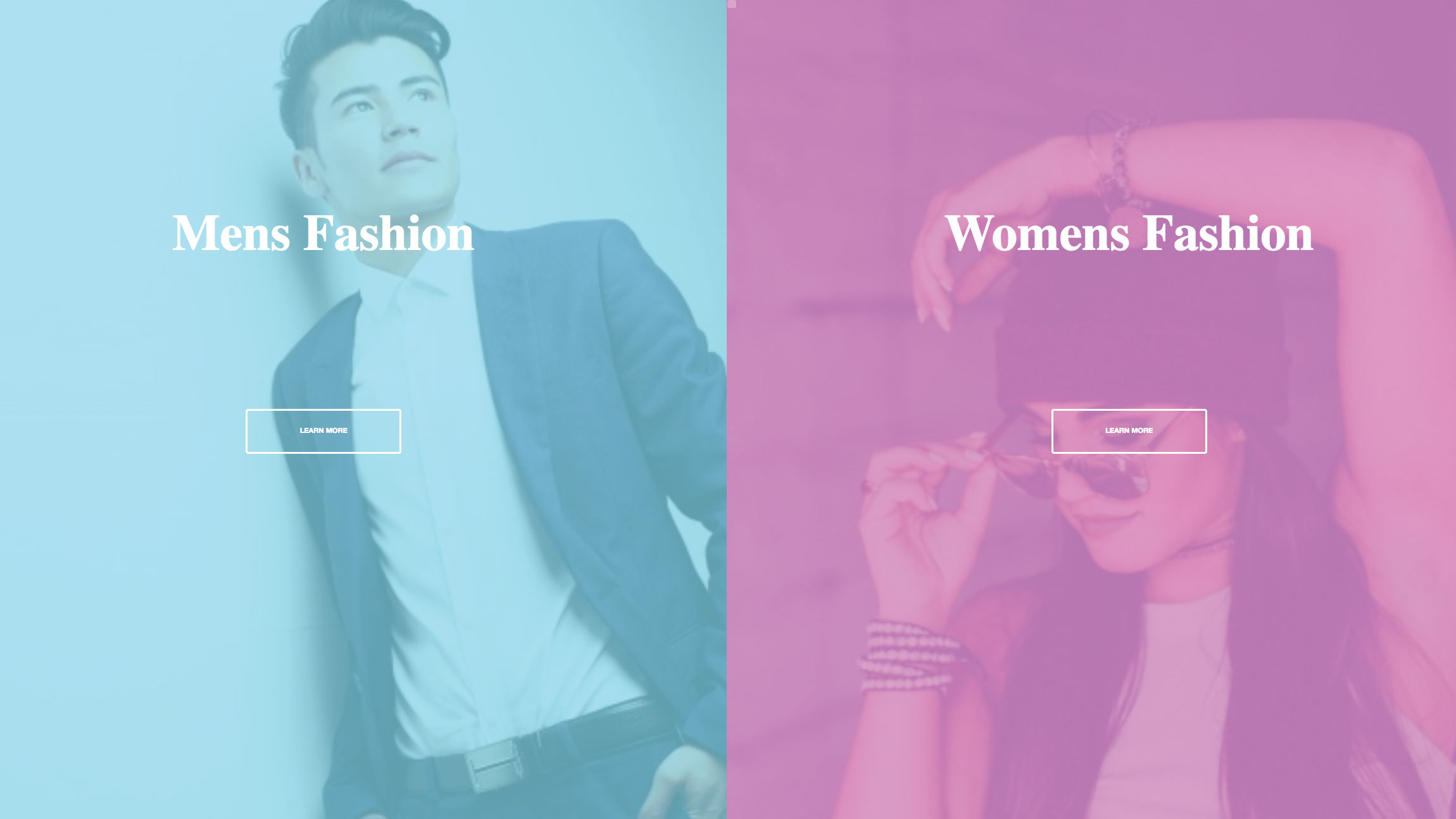
Your landing page is a crucial element in your website layout. It is the first real opportunity you have to introduce your business, or the product you sell, so its design is key. Landing pages are designed with a single focused objective known as a call to action (CTA). The use of colours and images to complement the calls to action and the user experience is a must.
In this tutorial, we'll walk through how to build an engaging landing page for a fictional fashion brand. It will be centred around a split-screen design with large images and animated transitions that happen on hover. This page will have two clear call to action buttons and we'll be using HTML, Sass for styling and a touch of vanilla JavaScript that uses the ES6 syntax (remember to make sure your web hosting is suited to your website needs). Too complex? Create a website without the need for code, try a simple website builder.
01. Get set up
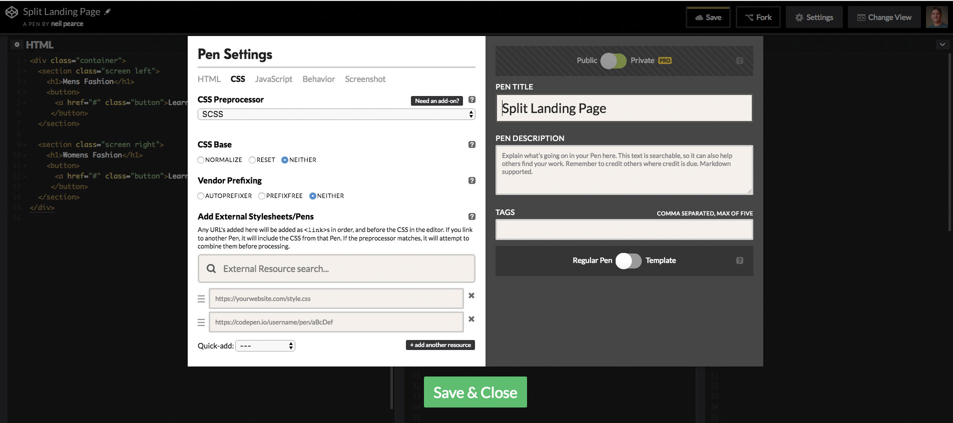
If you're using CodePen, make sure the CSS is set to 'SCSS' in the Pen settings. You can make this change by clicking on the settings tab, choose 'CSS' and change the CSS Preprocessor to SCSS in the drop-down options.
Then we can begin adding in our HTML. We're going to wrap a section called 'left' and a section called 'right' within a container class, with both sections given a class of 'screen'.
<div class="container">
  <section class="screen left">
  </section>
  <section class="screen right">
  </section>
</div>
02. Finish the HTML

To finalise our HTML, we will add in a title for each section using an h1 tag. Underneath that we will need to add in a button, which would link to another page if this was a real-world project. We will give this a class of button to keep things nice and simple.
<div class="container">
   <section class="screen left">
    <h1>Mens Fashion</h1>
      <button>
       <a href="#" class="button">Learn More</a>
      </button>
    </section>

    <section class="screen right">
       <h1>Womens Fashion</h1>
        <button>
          <a href="#" class="button">Learn More</a>
        </button>
     </section>
03. Explore Sass variables
The one thing we all love about Sass is the use of variables. Even though native CSS variables are getting more support, we will keep things safe by using Sass. We will put these at the top of our .scss, and you can choose whatever colours you want, but using rgba values will give us more flexibility.
/** Variables **/

$container-BgColor: #444;
$left-bgColor: rgba(136, 226, 247, 0.7);
$left-button-hover: rgba(94, 226, 247, 0.7);
$right-bgColor: rgba(227, 140, 219, 0.8);
$right-button-hover: rgba(255, 140, 219, 0.7);
$hover-width: 75%;
$small-width: 25%;
$animateSpeed: 1000ms;
04. Adjust body styling
Firstly, we will clear all default padding and margin to the body and then set the font family to Open Sans. This will only affect the button, so it doesn't matter too much what font we use. Then we will set the width and height to 100% and make sure that anything that overflows on the X axis gets hidden.
Get the Creative Bloq Newsletter
Daily design news, reviews, how-tos and more, as picked by the editors.
html, body {
  padding:0;
  margin:0;
  font-family: 'Open Sans', sans-serif;
  width: 100%;
  height: 100%;
  overflow-x: hidden;
}
05. Style the section titles
It’s time to pick a Google font for the section titles – we’ve chosen Playfair Display. Then using translateX we can make sure the section titles are always centred on the X axis.
h1 {
  font-size: 5rem;
  color: #fff;
  position: absolute;
  left: 50%;
  top: 20%;
  transform: translateX(-50%);
  white-space: nowrap;

  font-family: 'Playfair Display', serif;
}
06. Make the CTAs stand out
Our buttons will act as our calls to action, so these need to be big, bold and positioned where they are easy to click. Both buttons will have a white border and an interesting transition effect. The default styles for both buttons will be the same, however we will change their colours on hover.
.button {
  display: block;
  position: absolute;
  left: 50%;
  top: 50%;
  height: 2.6rem;
  padding-top: 1.2rem;
  width: 15rem;
  text-align: center;
  color: white;
  border: 3px solid #fff;
  border-radius: 4px;
  font-weight: 600;
  text-transform: uppercase;
  text-decoration: none;
  transform: translateX(-50%);
  transition: all .2s;
The main buttons will have a nice simple hover effect and we will use the Sass variables we specified for the colour, which will be a similar colour to the background of the page.
.screen.left .button:hover {
  background-color: $left-button-hover;
  border-color: $left-button-hover;
}

.screen.right .button:hover {
  background-color: $right-button-hover;
  border-color: $right-button-hover;
07. Set the container background and screens
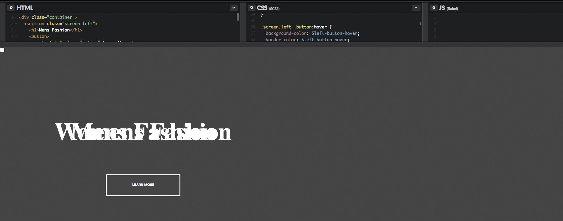
The container class will act as our page wrapper and we will set the position of this to relative, simply because we want to position the screens to absolute positioning. We will give the container a default background colour, but of course this won't be seen because we will be setting different colours to both screen backgrounds.
.container {
  position: relative;
  width: 100%;
  height: 100%;
  background: $container-BgColor;

    .screen {
      position: absolute;
      width: 50%;
      height: 100%;
      overflow: hidden;
    }
}
08. Add background images
Both the left and right sections will display an image, and you can find royalty-free stock images from websites such as Unsplash, Pixabay or Pexels (which I've used in this tutorial). To make things easier, I've used a free image hosting and sharing service called imgbb that we can link to in our CSS.
.screen.left {
  left:0;
  background: url('https://preview.ibb.co/cpabRm/pexels_photo_450212_1.jpg') center center no-repeat;
  background-size: cover;

    &:before {
       position:absolute;
      content: "";
      width: 100%;
      height: 100%;
      background: $left-bgColor;
    }
}
The right-hand side of the page will also display a background image using imgbb, and we will set the background colour to pink. Again, we set the background size to cover. This will allow us to cover the entire containing element, which in our case is the .screen class.
.screen.right {
  right:0;
  background: url('https://preview.ibb.co/mToPCR/seth_doyle_82563_1.jpg') center center no-repeat;
  background-size: cover;

   &:before {
      position:absolute;
      content: "";
      width: 100%;
      height: 100%;
      background: $right-bgColor;
    }
}
09. Add transitions and hover effects
The animation speed for our hover effect on both screens will be controlled by a transition that holds the value of our variable $animateSpeed, which is 1000ms (one second). Then we'll finish off by giving the animation some easing, which is an ease in and out that will help to give us a smoother animation.
.screen.left, .screen.right, .screen.right:before, .screen.left:before {
  transition: $animateSpeed all ease-in-out;
}
What we want to happen now is that when you hover over the left screen, there will be a class added to that section using JavaScript (which we will write in a later step). When this class is added, then that screen will stretch to whatever the width of the variable we specified – which will be 75%, and then the right side will be set to the smaller width variable (25%).
.hover-left .left {
  width: $hover-width;
}

.hover-left .right {
  width: $small-width;
}
.hover-left .right:before {
  z-index: 2;
}
This works exactly the same as the left side, where a new class will be added on mouse hover using JavaScript, and the right screen will stretch out accordingly. We also need to make sure the z-index is set to 2 so the CTA button becomes more prominent.
.hover-right .right {
  width: $hover-width;
}

.hover-right .left {
  width: $small-width;
}

.hover-right .left:before {
  z-index: 2;
}
10. Move into JavaScript
We will be using a touch of vanilla JavaScript to help us add and remove CSS classes and we will also be using some of the new ES6 features. The first thing we need to do is to declare some constant variables.
Because we will be using document more than once, we will set a constant variable called doc and store the document within that so we can keep the word 'document' nice and short.
const doc = document;Now we need to set three more constants that will store the .right, .left and .container selectors. The reason we are using constants is because we know we don't want to change the value of these, so using a constants makes sense. With these now set, we can go ahead and add some mouse events to them.
const right = doc.querySelector(".right");
const left = doc.querySelector(".left");
const container = doc.querySelector(".container");
Using the left constant variable we declared in the last step, we can now add an event listener to it. This event will be the mouseenter event and instead of using a callback function, we will use another ES6 feature called Arrow Functions' ( () => ).
// adds a class to the container element on hover
left.addEventListener("mouseenter", () => {
  container.classList.add("hover-left");
});
11. Add and remove a class
In the last step, our event listener added a mouseenter event that targets the main container class and adds a new class called hover-left to the left section element. With this called added, we now need to remove it when we hover off it. We'll do this by using the mouseleave event and the .remove() method.
// removes the class that was added on hover
left.addEventListener("mouseleave", () => {
  container.classList.remove("hover-left");
});
Up until now we have done everything on the left screen. Now we will finish off the JavaScript and add and remove classes on the right section elements. Again we have used the arrow function syntax here to keep everything looking nice and tidy.
right.addEventListener("mouseenter", () => {
  container.classList.add("hover-right");
});

right.addEventListener("mouseleave", () => {
  container.classList.remove("hover-right");
});
12. Make it responsive
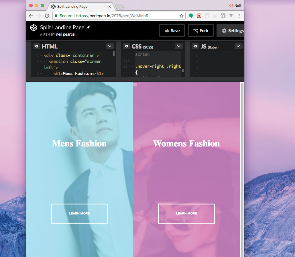
No project – no matter how big or small – should avoid being made responsive. So, in this step we will add some media queries to our CSS, and make this small project as adaptive to mobile devices as best we can. It's worth checking out the original CodePen to see how this works.
@media(max-width: 800px) {
  h1 {
    font-size: 2rem;  }

  .button {
    width: 12rem;
  }
We've made sure that when the width of our page gets down to 800px, the font and buttons will reduce in size. So, to finish things off we want to target the height too and make sure our buttons move down the page when the page height gets below 700px.
@media(max-height: 700px) {
  .button {
    top: 70%;
} }
Want to save your pages? Export them as PDFs and save them in secure cloud storage.

Web design event Generate London returns on 19-21 September 2018, offering a packed schedule of industry-leading speakers, a full day of workshops and valuable networking opportunities – don’t miss it. Get your Generate ticket now.
This article was originally published in net magazine issue 305. Subscribe now.
Read more:

Thank you for reading 5 articles this month* Join now for unlimited access
Enjoy your first month for just £1 / $1 / €1
*Read 5 free articles per month without a subscription

Join now for unlimited access
Try first month for just £1 / $1 / €1
