An introduction to CSS custom properties
By writing valid CSS and using custom properties you can future-proof your code; here's how to get started.

Sign up to Creative Bloq's daily newsletter, which brings you the latest news and inspiration from the worlds of art, design and technology.
You are now subscribed
Your newsletter sign-up was successful
Want to add more newsletters?
One of the single best features of CSS processors is variables. Having the ability to declare once and reuse the variable across your project should not be optional in any system.
Using a preprocessor like Sass (find out more in our article on what is Sass?) gives you at least one extra build step, which can be a pain if you just want to build a thing fast (to build really fast, try a website builder). CSS has come a long way since the dark days of table hacks, so let's look into one of the most useful aspects: custom properties.
For more tools that'll make your life easier, see these web hosting service and the best cloud storage options. Or read on and we'll start with a simple example.
    :root {
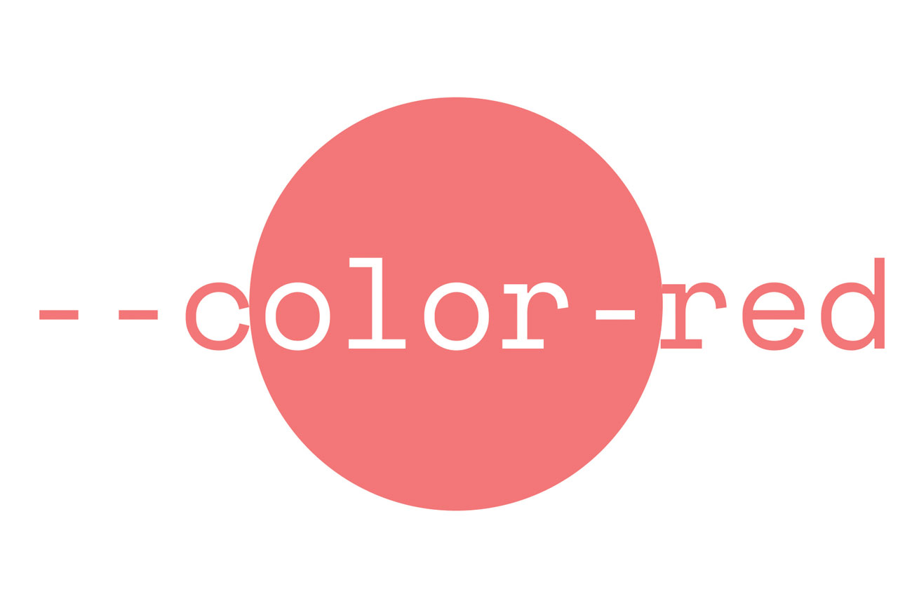
      --color-red: #fc4752;
    }

    .site-navigation {
      background-color: var(--color-red);
    }

    .site-footer {
      color: var(--color-red);
}
The :root pseudo selector targets the highest-level parent element in the DOM, giving all elements access to --color-red. Yes, CSS variables definition should start with --, and you can access them anywhere with var(). Well, anywhere that is cascaded under our :root selector.

With var() you can also define a fallback value, which will be used if the given variable is unreachable or non-existent for the class.
    .site-navigation {
      background-color: var(--color-red, red);
    }
Values are inherited from the DOM, which means you can make them more specific.
    :root {
      --color: red;
    }

    .site-navigation {
      --color: green;

      background-color: var(--color);
    }

    .site-footer {
      color: var(--color);
    }
Every var(--color) is red, except every var(--color) under site-navigation. Generally speaking it's not an ideal practice to overwrite a value that is already defined but there are cases in which a scoped value is still the most adequate solution.
Sign up to Creative Bloq's daily newsletter, which brings you the latest news and inspiration from the worlds of art, design and technology.
These are the basics but you can do so much more. A useful example for responsive web design is changing layout based on viewport size.
    :root {
      --color-red: #fc4752;
      --flex-layout: row;
    }

    @media (max-width: 640px) {
      :root {
        --flex-layout: column;
      }
    }

    .site-navigation {
      display: flex;
      flex-direction: var(--flex-layout, row);

      background-color: var(--color-red, red);
    }

    .site-footer {
      color: var(--color-red);
}
Under 640px the media query triggers, changing the flex direction to column on site-navigation class, making its content vertical (column) instead of the default horizontal (row). In this example, because of the default variable given to site-navigation, you don't even need the initial :root definition of --flex-layout; instead it will actually go straight to row.

This is cool but it's not all fun and games just yet. For instance, since the media query is not an element, the breakpoint value cannot come from a custom property. Although CSS Working Group has a draft of using env() for queries, vendor implementation and proper support is probably years away from where things are today.
That's okay. We will stick to what we have now. One more advanced use case for a custom property is switching themes. You can define a base theme, build your website around it and just switch it out, with the browser doing the heavy lifting. And it's not even that heavy.
Essentially, think of it being along the lines of Twitter's Night Mode, but without you actually switching the CSS (I see you).
    <main>
      <nav class="site-navigation">
        <div>I love interwebs</div>
      </nav>
      <div class="site-footer">
        <label for="color-picker">Change color</label>
        <input type="color" id="color-picker">
      </div>
      <style>
        :root {
          --color: #fc4752;
        }

        body { margin: 0; padding: 0; }

        main {
          display: flex;
          flex-direction: column;
          justify-content: space-between;
          height: 100vh;
        }

        .site-navigation,
        .site-footer {
          padding: 12px;
        }

        .site-navigation {
          background-color: var(--color, red);
        }

        .site-footer {
          color: var(--color);
        }
      </style>
      <script>
        var colorPicker = document.querySelector("#color-picker");
        colorPicker.addEventListener("change", function() {
          document.documentElement.style.setProperty("--color", this.value);
      })
      </script>
</main>
Input colour's picked value replaces the document's --color value, making the change without a hitch. You can play with blend modes, alpha channel colours or pngs – endless possibilities and fun.

Now with your future-proof CSS in place, which doesn't depend on any third-party developer and uses only custom properties, there is a good chance you are covered and ready to kick-start production.
But what if you want something other than variables in your code, let's say CSS modules? As of today, for existing CSS features like modules or nesting, you couldn't spare the extra build step any longer, but you can implement it with the sweet promise of not having to rewrite code when vendors catch up with the spec.
Instead of refactoring your CSS every time you want to improve your output, you should write your code in a specification aligned that way in the first place. This is the main difference between pre- and post-processors. A preprocessor actually writes the CSS for you (basically, from a text file), while a post-processor aligns your already valid CSS for more browser support, the latter giving you more flexibility in the process.
Using the native method always beats the workaround, and having the working knowledge of future technologies is the best position you can be in when learning CSS.
This article was originally published in issue 306 of net, the world's best-selling magazine for web designers and developers. Subscribe to net here.
Related articles:
