Affinity Designer is a suite of vector editing tools available for Mac and Windows, as well as on the iPad. It provides a great middle ground between the more basic free graphic design software and the pricey but feature-rich Creative Cloud suite, and it offers incredible quality for the cost.
In this tutorial we're going to look at how to use grids in Affinity Designer for Mac. Any designer will know that a solid understanding of grid theory can take some of the guesswork out of the design process. I use grids in around 90 per cent of my work – they're handy for everything from providing construction guidelines for logos, to ensuring consistency in detail-heavy illustrations. Turning grids on and enabling the 'snap to grid' option helps you plot lines and shapes quickly and easily.
Read on for a rundown of how to use grids in Affinity Designer, or watch the video above for a mini-tutorial to get you started.
Click the icon in the top right of each image to enlarge it
01. Enabling the grid
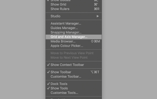
To enable the grid, go to 'View > Grid and Axis Manager'. With the sub-menu open, you can check ‘Show grid’. You can also toggle the grid on and off by pressing cmd + '. I find being able to toggle the grid off is quite useful when illustrating, so I can get more clarity.
02. Tweaking the grid
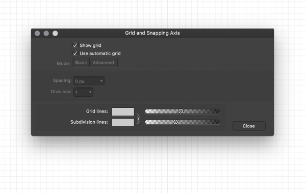
To tweak your grid, uncheck the 'Auto grid' option. I usually keep my spacing at 5mm, but you should experiment with different sizes to see what suits you and your design style. Just bear in mind that the bigger the spacing, the less detail you will be able to go into if you are snapping your design to the grid.
04. Snap to grid
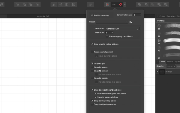
When designing I enable snapping to grid. This can be toggled on and off by clicking the drop-down menu next to the snapping item on the top bar menu. With this enabled, shapes and Pen tool nodes you plot will snap to your grid. This is a very quick way to ensure your designs are lined up as you wish, and improve accuracy in logo designs and illustrations.
Get the Creative Bloq Newsletter
Daily design news, reviews, how-tos and more, as picked by the editors.
03. Advanced features
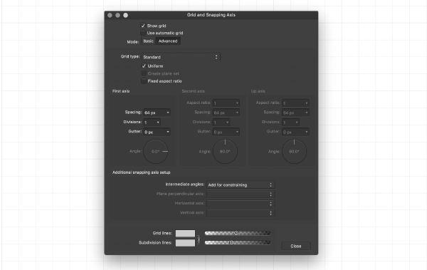
Clicking the 'Advanced' mode option with expand the menu to show you a plethora of other options for you to tweak. I usually don’t touch any of these, but it’s good to have the capability if you need it. There are several grid types you can select from; the isometric grid is particularly useful when making 3D art or type.
Read more:

Thank you for reading 5 articles this month* Join now for unlimited access
Enjoy your first month for just £1 / $1 / €1
*Read 5 free articles per month without a subscription

Join now for unlimited access
Try first month for just £1 / $1 / €1

Tom Ludd is a Product Designer at Softr, and the founder of creativity.wtf. He previously founded The Designers' League, a community of more than 80,000 creatives, and has written for Creative Bloq on digital design tools. Tom also runs the brand and product design studio Prelude, which is currently working on Showcase, "a place to discover what's next at the intersection of tech and creativity."
