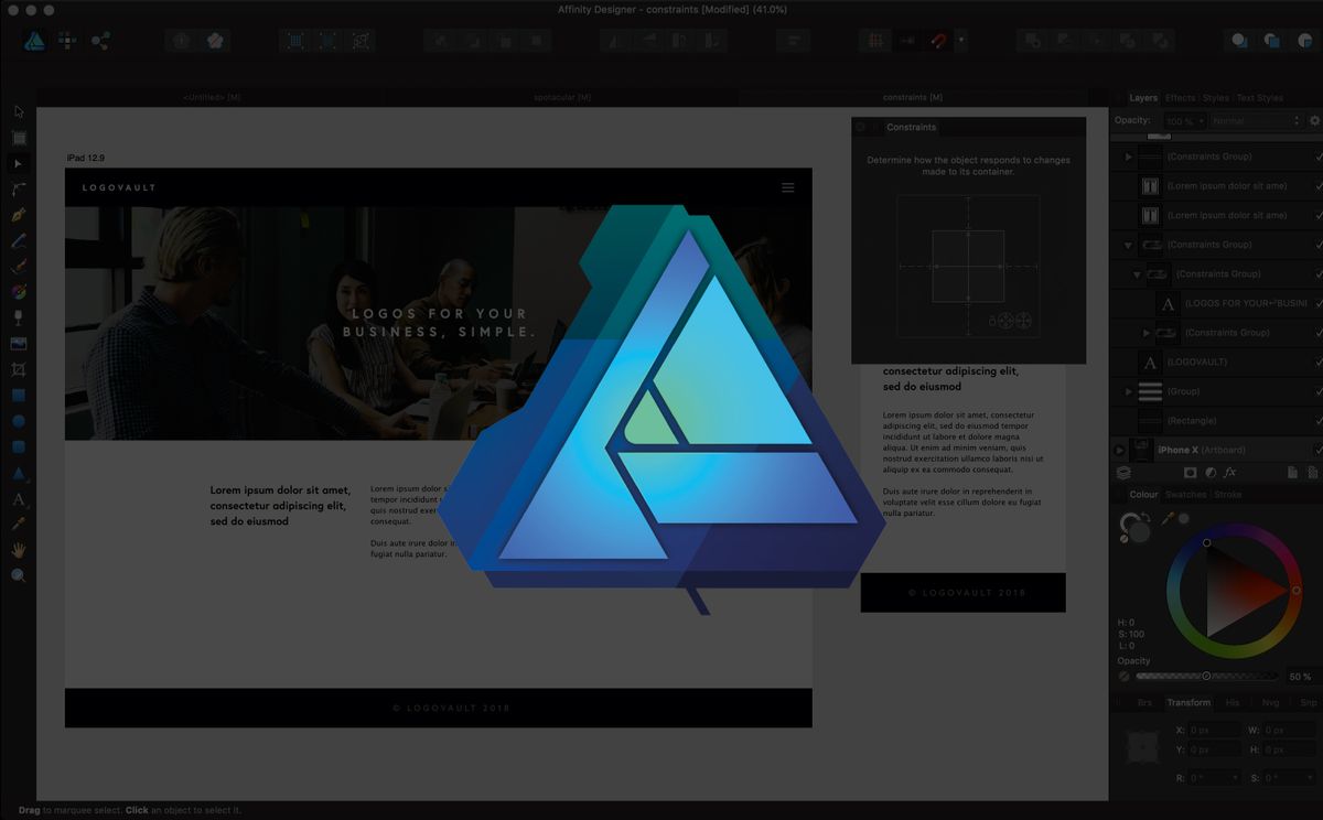
Affinity Designer is a popular vector art tool. As well as Mac and Windows versions, Serif recently released Affinity Designer for iPad.
Nowadays, if you are designing for the web and apps, you need to be working with multiple devices and resolutions in mind. This can lead to multiple artboards and serious headaches when it comes to keeping things uniform. Fortunately, Affinity Designer can help you streamline this process a little more, with something called constraints.
In this tutorial we will briefly go into the fundamentals of constraints and how they work. Watch the video below for an overview, or read on for five essential tips for using constraints in Affinity Designer.
Also don't forget to check out our articles on how to use grids and how to use the Export persona and how to use the Pen tool.
01. Parent and child objects

Constraints work by using parent and child objects. Your selected object is the ‘child’, and the container is known as the ‘parent’. Child objects will scale relative to the parent object.
For example, if you alter the size of your artboard and your child object is anchored to your artboard, it will respond with the change. You will need to toggle the various options to achieve your desired outcome.
02. Toggle constraint options
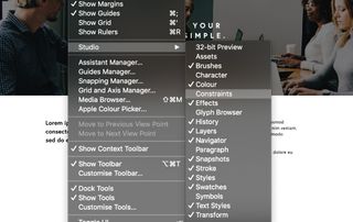
To enable constraints, go to View > Studio > Constraints. From there, you'll get a popup menu showing the constraint options. The inner square is where you toggle the constraints of your child object, and the outer square is your parent object.
Get the Creative Bloq Newsletter
Daily design news, reviews, how-tos and more, as picked by the editors.
03. Apply constraints

As we mentioned before, anchoring objects to the artboard will cause them to resize with the artboard. However, in order to maintain the spacing between objects and avoid distortion, we need to set certain rules.
In this example, I'm working with a website header, logo and menu navigation. For the header (pictured above), I enabled constraints on the left, right and top of the object. This means that the header will be anchored to the left, right and top of the artboard, no matter how the artboard is scaled.
For the site title I enabled constraints on the left and top of the object. If you were to enable the right container/parent constraint, the design would distort. The navigation is similar, but with the right side enabled, because it sits on the right. Once you have practised this a couple times it will make much more sense! It might also help to watch the video above and see this in action.
04. Paste constrained items

My original design was based on an iPad screen. Now, when I paste it into an iPhone X-sized artboard, my header, logo and navigation button will automatically adapt to the narrower container. This is great because it keeps my design and spacing uniform across different artboard sizes.
05. When to use constraints
Using constraints is a great tool to save you pockets of time in places. However, I would advise that you use them sparingly and carefully. They're great for simple things like headers and footers, but any content-heavy designs (and images in particular) will require some tweaking.
Read more:

Thank you for reading 5 articles this month* Join now for unlimited access
Enjoy your first month for just £1 / $1 / €1
*Read 5 free articles per month without a subscription

Join now for unlimited access
Try first month for just £1 / $1 / €1
Tom Ludd is a Product Designer at Softr, and the founder of creativity.wtf. He previously founded The Designers' League, a community of more than 80,000 creatives, and has written for Creative Bloq on digital design tools. Tom also runs the brand and product design studio Prelude, which is currently working on Showcase, "a place to discover what's next at the intersection of tech and creativity."
