Adobe XD: How to use the Auto-Animate feature
Create simple animations and transition effects with Adobe XD.
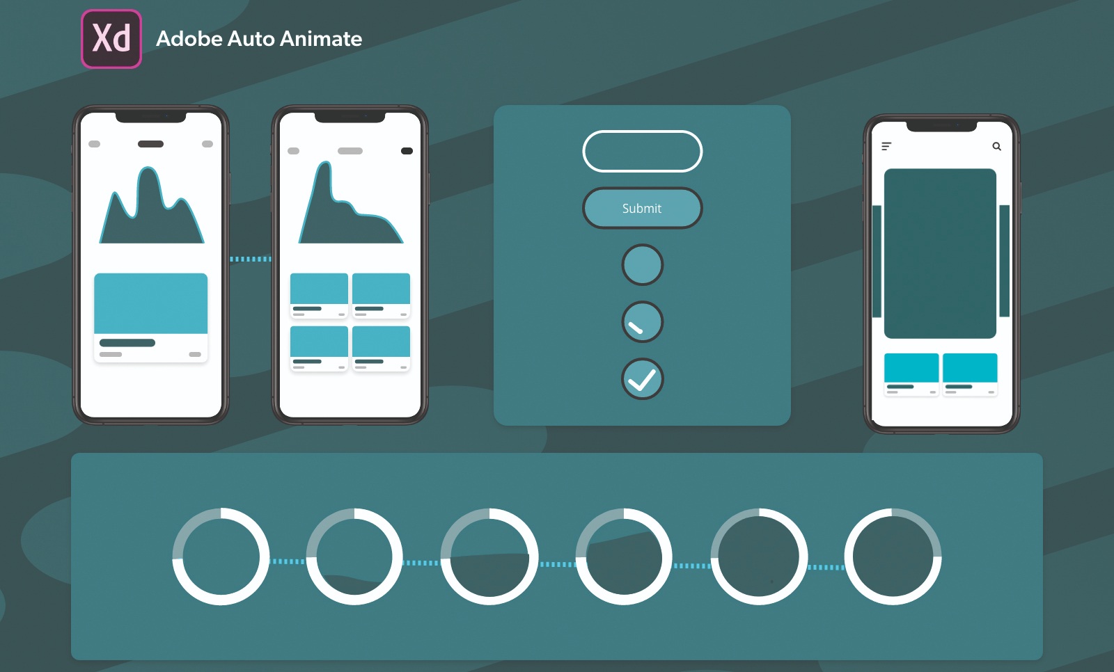
Despite its late entry into the prototyping game, Adobe XD is one of the best and quickest wireframing and prototyping tools available. Prototyping is a key process in the design lifecycle but also plays a vital role in development by helping designers and dev teams with workflow maintenance.
As designers, we often need a lot of tools to design the various stages of the user experience workflow. Adobe is actively innovating a cross-platform tool that can be used for testing designs, creating wireframes, handing off specs to the dev team and also collaborative designing (see our list of wireframe tools for more options).
The Auto-Animate feature means that Adobe XD can also be used to create seamless micro-interactions and animations like tools such as Principle. This helps designers to craft rich prototype experiences, from onboarding flows, animations for mobile carousels, progress indicators and more. The best part about this feature is that it’s simple to learn and execute.
In this article, I will be explaining how to create simple micro animations using the Auto-Animate feature. We will be looking at both gesture-based and tap-based interactions.
If you haven't got Adobe XD yet, see our how to download Adobe XD post, and then check out our favourite Adobe XD plugins.
01. Swipe gestures to add to fav or delete
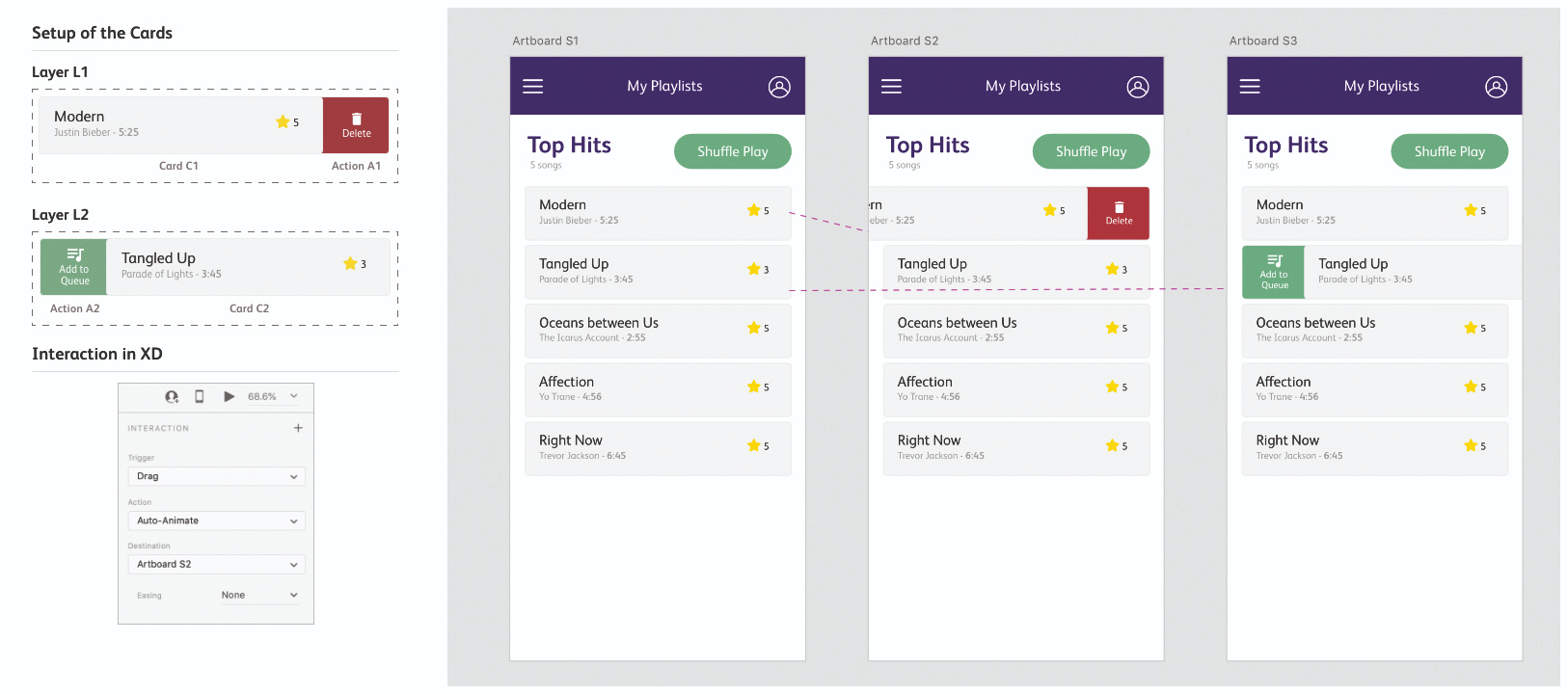
Swipe interactions are one of the most commonly used micro-interactions on mobile apps. For this example, let’s look at a music playlist. For the first artboard, we’re going to create a playlist screen with five songs in it. Each song is an individual card and essentially when each card is swiped left, it should remove the song from the playlist. When a card is swiped right, it should add the song to the queue.
Let’s get started and create the first card. You can add basic details such as the name of the song, name of the artist, length of the song and the rating. Now group all these elements into a single layer. Duplicate it until five of the similar cards are made. You can edit them based on your taste.
For the first card – C1 – we are going to add a left swipe for delete action. So, let’s create a small square with a red background, add some Delete text and an icon as shown in the screenshot below. Group all these items into a layer called A1. Now combine C1 and A1 into a layer L – so that A1 is on the right side of C1.
02. Create the second card
For the second card – C2 – we are going to add an add to queue right-swipe action in a similar fashion. Create a group A2 with icon, text and green background. Add it to the left of the group C2 and create a combined layer named L2. Now, the first artboard (S1) is complete. Let’s duplicate the entire artboard twice, into two states – S2 and S3. We will be using S2 for delete swipe and S3 for add to queue swipe. In order to do that we need to make some changes for each of these artboards. Here are the settings for both swipes:
● S1 – Change the Opacity of A1 and A2 to 0% and arrange L1, L2 so they are centre-aligned.
● S2 – Arrange the L1 card so the right edge of L1 is aligned with the other cards. Change the Opacity of A2 to 0%.
● S3 – Arrange the L2 card so the left edge of L2 is aligned with the other cards. Change the Opacity of A1 to 0%.
03. Animate the artboards
Now that the artboards are completely set up, the next step is to animate them. You can do this by going into the Prototype mode on the top-left side of the tool. Now on the S1 artboard, click on the layer L1 and add an interaction on the right side of the tool by setting Trigger to Drag, Action to Auto-Animate and Destination to Artboard S2. You can also add easing based on your preferences. Test this interaction by clicking on the play button on the top-right side of the tool. On the S1 artboard, click on the layer L2 and add a similar interaction using the same settings but, in this case, set the Destination to S3. This interaction will create the left swipe.
04. Expand your cards
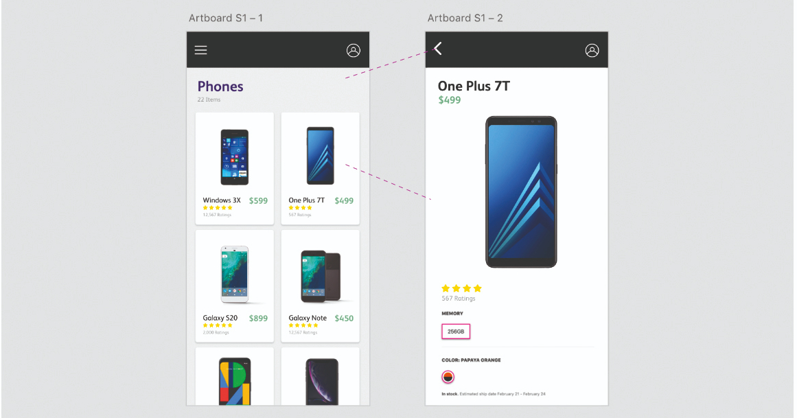
The second interaction we will be looking at is commonly seen on most apps and websites where you are going through a list or a catalogue of products and when you click on one of those, you are taken into a new page with more details about the product. Auto-Animate makes it super simple to animate this kind of interaction. For this example, let us start by creating a product catalogue page. You can choose any product like, for example a mobile phone (which is going to be our example), apparel, etc. For the first artboard (S1), create a header bar with a hamburger menu and a profile icon.
05. Work on images and details
Now, create a header text element with the number of catalogue items. For each of the product cards, we are going to have one image, the name of the phone, price and ratings. We can call these cards C1 to C6. The best way to do this is to create the first card (C1) and then use an amazing feature of XD called Repeat Grid, which is found on the top-right corner of the Tool panel. This enables you to duplicate items with ease, keeping the alignment and spacing intact. The set up of this artboard is complete. We are going to animate the second card, so it is important to ungroup the elements of that card so XD can perform Auto-Animate.
06. Design the second artboard
Now to get to work on the second artboard. Duplicate the first artboard and delete cards C1, C3-C6. We are going to use the existing card C2 to build this page, so the names of the layers are the same. First, expand the background of the card so that it covers the entire page below the header bar. We can now arrange the other items in any way that we want – the basic idea being that it should be different from how the card was in the artboard S1, because that’s when you can see the transition. For that reason, let’s bump up the name of the mobile to 25px and make it bold. Similarly, increase the size of the price and place it below the mobile name. Next is the important part – the image of the mobile phone. You have to increase its size significantly and also align it in the centre.
07. Apply the finishing touches
To tidy everything up and finalise the design, arrange the ratings and the stars below everything and to the left. Since this artboard represents the detailed version of the product, you can now include additional information about the phone such as memory, the available colours of the phone, accessories given with the phone and so on, based on your preferences. Everything else will follow as you scroll the artboard. You can also change the header icon of the hamburger, to enable the user to go back to the previous artboard S1. Remember to change the name of the icon to match the icon name in the first artboard.
08. Create the micro-interaction
Let’s go to the prototype mode now to create the micro-interaction. To do this, select the card C2 in the artboard S1 and drag the blue arrow to the artboard S2. In the Interaction panel on the right-hand side, set the Trigger as Tap, Action as Auto-Animate and Destination as S2. For smoother interactions, it is good to go with Ease Out for Easing and a Time of 0.4 or 0.6 seconds. Click on the back arrow icon on artboard S2 and drag the arrow to S1. You can use the same settings for this to make it consistent. Now click on S1 and play the prototype to see the magic. You will observe a smooth animation when the card C2 is tapped. Adjust the Easing settings to make the animation smoother.
09. Go beyond the basics
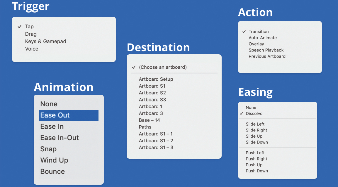
You now have a basic idea of how to create simple interactions. You can also try auto animating by changing the colours of the elements, sizes and shapes to see smooth transitions between multiple artboards. In addition to tap and drag triggers, there are other triggers that designers can experiment with, such as using keyboard keys and gamepad keys to trigger prototypes on a particular key tap. There is also a mode in which you can create and design voice prototypes for Alexa, Siri and so on, where you can assign sentences and speak them to get specific responses.
Read more:
- The best website builders
- The Adobe XD shortcuts you should know (but probably don't)
- Build prototypes with Adobe XD
Get the Creative Bloq Newsletter
Daily design news, reviews, how-tos and more, as picked by the editors.

Thank you for reading 5 articles this month* Join now for unlimited access
Enjoy your first month for just £1 / $1 / €1
*Read 5 free articles per month without a subscription

Join now for unlimited access
Try first month for just £1 / $1 / €1
Vamsi is a senior UX designer at SunTrust Banks and is an expert in UX, mobile animation and JavaScript.
