Use Adobe XD to create micro interactions
Create simple animations and interactions using Adobe XD’s Auto Animate feature.
Adobe XD can help with prototyping – one of the most important processes in the design life cycle, which plays a vital role in development by helping designers and dev teams with workflow maintenance. There have been some major changes in the prototyping landscape recently: designers are spoilt for choice.
Just like many other disciplines, there is no single design and prototyping tool that can achieve everything. Different stages require a unique set of tools. Gone are the days when designers used to rely solely on Photoshop and Sketch. Though they are great UI design tools, they do not have the capabilities for quick user flows and wireframes (see our top wireframe tools for more wireframing options).
Now with the growing amount of interactions in designs – such as animations, gestures and voice control – it’s tough to find a tool that can achieve all these prototyping capabilities and still keep things simple. Coding is one way of creating these interactions but it’s time-consuming. Fortunately, Adobe XD has come to the rescue by releasing an update to its prototyping tool that includes a handy feature called ‘Auto Animate’. It is by far the biggest addition to the powerful toolset.
The idea here is simple: Auto Animate enables designers to build interactive prototypes with immersive animations by simply duplicating an artboard or modifying the properties of an object. These properties could be anything, such as the dimensions, position of X and Y, opacity, rotation. Previously Adobe XD offered basic interactions such as sliding, push and dissolve.
With the addition of the new features, designers can easily create motion-based animations, which in turn will help the user to create mental models of information flow when they are navigating between multiple screens. This can also be used to create visual hierarchies, CTAs or messages that fade in or out of the screen temporarily.
In this article, I will be explaining how to create simple micro animations using this new Auto Animate feature of Adobe XD. Before we begin, there are a few things to consider about how objects must be handled for auto animation:
- When an object or element is not on the destination artboard, it usually fades out when previewed
- When an element is not present in the initial artboard, it tends to fade in
- Always wire the artboards when you are in prototype mode, which will create the interactions
- For creating animations, always make sure objects and elements have matching names in the layers and also the name of the group they may be in
Make a state change using Auto Animate
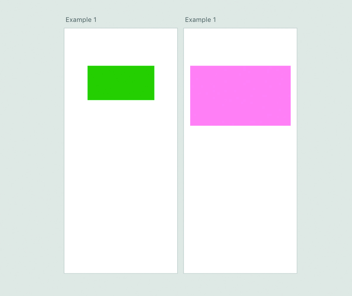
Let’s start by making a simple example of state change using Auto Animate. In this example, the properties that would change are width, height and colour. For any Auto Animate transitions, you need more than two artboards.
Get the Creative Bloq Newsletter
Daily design news, reviews, how-tos and more, as picked by the editors.
On the initial artboard, draw a shape – in our example, it’s a green rectangle of 500px X 200px. Duplicate this artboard and select the rectangle on the second artboard. We need to modify the properties of the rectangle by increasing the width to 1000 and the height to 500. You can also perform further modifications such as changing the opacity to 50% or making the colour pink.
Now click on the Prototype tab on the upper-left corner. Select the first artboard and link it using the arrow to the second artboard. When you do this, there is an Interaction tab on the right of the app that can be used to set parameters such as Trigger, Action, Destination and Easing. Each parameter can be customised according to your needs. There are five types of trigger – including Tap, Drag and Timed – that will initiate the animation.
Set the Action tab default to Auto Animate and because there are just two artboards in our example, set the Destination tab to Artboard 2. There are also multiple smooth transitions that can be chosen and timed. Click on the play icon on the top right to see Auto Animate do its magic and animate the rectangle. When there are more than two elements that need to be changed simultaneously, make sure the names of these elements are the same in both the artboards. This will inform the application that these two elements need to be animated.
Expand cards
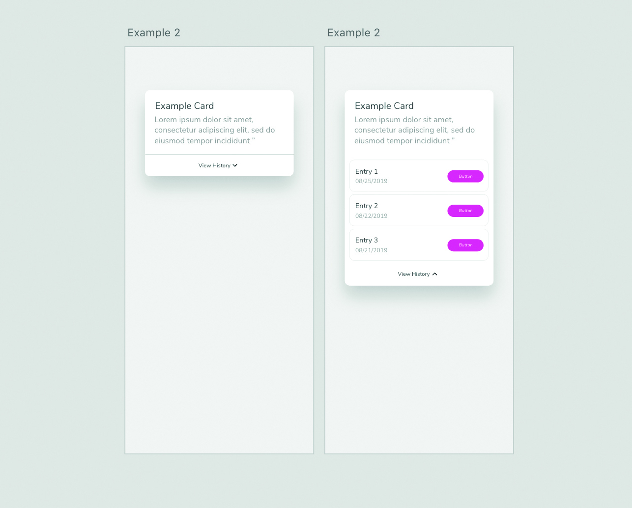
Now let’s progress to an example with more interactivity and one that includes multiple elements. Let’s start by creating the first artboard for this, consisting of a card. The card will have elements such as a header, description and a link at the bottom reading View History. Next to the link, there will be an arrow icon facing downwards. When the user clicks on the link, the card will open up like a drawer to show previous entries. Since this happens on the click/tap function, the previous entries should not be created in the first artboard.
Next, we duplicate this artboard and change a few properties of the card. The first thing to do is increase the height of the rectangular card to make it look like an expanded state. The header and the description below should be unchanged. Now it’s time to add those entries we mentioned before.
Imagine there are three entries for the card. Each entry has an entry name, entry date and a button as shown in the main image. You can create one entry and duplicate it twice to create a group of entries. Arrange them as shown in the main image and place the View History text link below these entries. Because it is in an expanded state, rotate the arrow icon so that it is facing upwards. That’s it. You have completed setting up the artboards.
To create the animation, go to the first artboard and click on the Prototype tab from the top-left corner. Now click the View History link on the first artboard and drag the prototype link to the second artboard. This makes the View History link the trigger. Change the properties in the Interaction tab on the right by setting the Trigger to Tap and Action to Auto Animate. Test it to see the smooth drawer animation. Make changes to the Easing option in the Interaction tab if you find the animation is not smooth enough.
Make drag animations
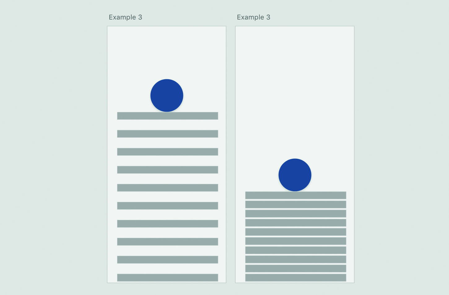
Drag is one of the most common animations when it comes to mobile interactions. Let’s try a simple example with two artboards. For the first artboard, start by creating a circle of any colour and dimensions. Now create a rectangle with a width of 250px and a height of 25px. Duplicate this rectangle eight times, maintaining a space of 20px between each duplicate, so that it creates a stack. Place the circle on top of the first rectangle before duplicating this artboard.
There is not much left to do for the second artboard. Simply reduce the gap between each of the duplicated rectangles so it feels like it is compressed. Similar to the first artboard, place the circle on top of the first rectangle. The final step is to prototype it by clicking on the Prototype tab from the top-left corner. Now click on the circle from the first artboard and make it a trigger. Just like the previous examples, change the properties in the Interaction tab on the right by setting the Trigger to Drag and Action to Auto Animate. When you click on the play button to preview the animation, you’ll be able to see a smooth action as if the block is being compressed by the sphere.
Create infinite loader animations
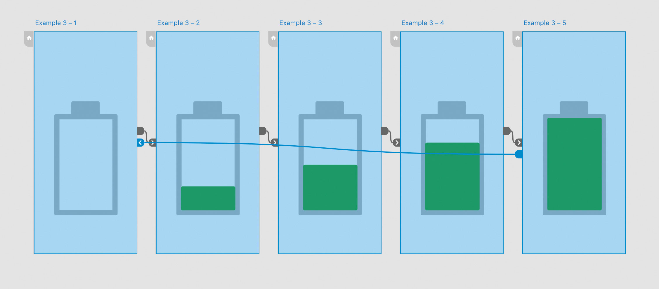
One of the best features of Adobe XD is that Auto Animate can be applied between multiple artboards. To do such an animation, you just need to make simple changes to one of the properties.
Let’s create a loading animation in which a battery gets filled up. The key to getting this perfect is to craft the first artboard properly. The first artboard has a battery placeholder as shown in the image. It can be created using rectangular shapes. For the actual battery inside the placeholder, the first artboard should be empty (which represents 0%). Duplicate this artboard and create a green rectangle with a 50px height that fits perfectly inside the placeholder. Create similar duplicates so the height of the battery in the third artboard is increased by 50px and so on. Continue until the artboard is completely filled.
Now we have to create an infinite loop between these artboards so that it creates a synchronous loading animation. For this, go to the Prototype mode, click on the first artboard and drag the prototype arrow to the second artboard. Change the properties in the Interaction panel, by setting the Trigger to Time and then set the Delay to 0 seconds, which will animate to the second artboard when previewed. Perform the same changes to all the artboards, by linking the second to the third and so on before finally linking the last artboard to the first one. We have successfully linked all the artboards to form an infinite loop. Change the Easing and Duration settings as per your requirement to make the loading smoother.
Though there are tons of variations that can be tried using Adobe XD, the current capabilities of the tool are limited and are still being regular updated by the development team. So, when compared to tools like Principle, you might feel as though XD has a restricted toolset. However, Adobe has done an excellent job of making the tool simple to learn and use. Creating complex interactions might take some time and effort but they are totally achievable using XD’s Auto Animate feature. The key is to understand the basics of moving objects, resizing them, adding layers and using triggers.
This article originally appeared issue 326 of net, the world's leading magazine for web designers and developers. Buy issue 326 or subscribe here.
Read more:

Thank you for reading 5 articles this month* Join now for unlimited access
Enjoy your first month for just £1 / $1 / €1
*Read 5 free articles per month without a subscription

Join now for unlimited access
Try first month for just £1 / $1 / €1
Vamsi is a senior UX designer at SunTrust Banks and is an expert in UX, mobile animation and JavaScript.
