Add visual cues to your site
Improve usability with web page background images, creating an interactive navigation display.

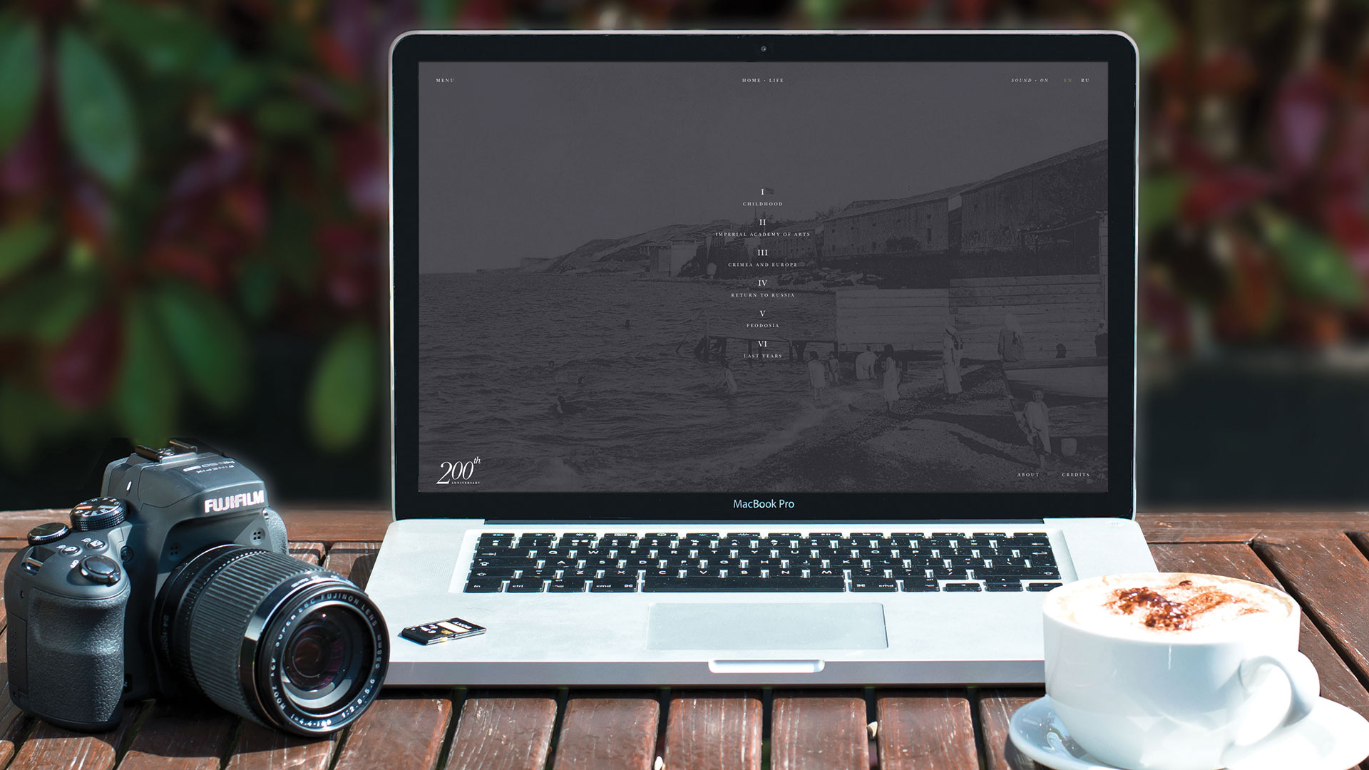
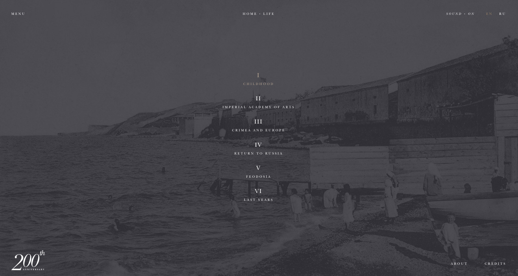
It's annoying for website users to click on a link only to find that the web page isn't of interest, wasting their time. Using a picture in the page background is a great way to give users an indication of what to expect from a link before committing to loading the page. You can see a great example of this technique in use on the Ivan Aivazvsky life site (save any inspiration you gather in cloud storage).
Using the page background can also help dyslexic readers or those who speak English as an additional language. In these cases you can communicate additional information to the user without overloading them with too much text.
As with any effect that combines text with background images, make sure that your text remains readable at all times. This can be achieved by placing a semi-transparent colour on your navigation links. Also consider UX readability for issues such as colour blindness that affect how users are able to interpret coloured text (decent web hosting can help you make your site accessible).
Here's we'll show you how to create an interactive navigation display with useful and accessible visual cues. For other web design resources, try our guide to the best website builder.
Download the files for this tutorial here.

01. Create the HTML document
Create the main HTML document template, which consists of the HTML container storing the head and body section.
The head section stores description information such as the document title, as well as links to external resources – ie CSS and JavaScript.
Get the Creative Bloq Newsletter
Daily design news, reviews, how-tos and more, as picked by the editors.
The body stores the document content. A significant feature of the body is the 'data-theme' attribute it has applied – to be modified by JavaScript to trigger CSS presentation changes.
<!DOCTYPE html>
<html>
<head>
<title>Navigation Background</title>
<link rel="stylesheet" type="text/css" href="styles.css" />
<script type="text/javascript" src=”code.js”></script>
</head>
<body data-theme>
*** STEP 2
</body>
</html>
02. Add navigation HTML
The page content consists of a navigation container containing links. The navigation's ID and the titles of the child links will be used by JavaScript to listen for interactions and alter the 'data-theme' attribute defined as part of the body container.
<nav id=”mainNav”>
<a href=”#” title="Page 1">Page 1</a>
<a href=”#” title="Page 2">Page 2</a>
<a href=”#” title="Page 3">Page 3</a>
</nav>
03. Initiate the CSS file
The HTML content is now complete, so create a new file called 'styles.css'. This file stores the CSS formatting rules that control the visual presentation. Start this file with rules to present the HTML document and its body to appear across the full screen using a white background and black text.
html,body{
  display: block;
  width: 100%;
  height: 100%;
  margin: 0;
  padding: 0;
  font-family: Helvetica, sans-serif;
  color: #000; }
04. Set rules for visuals
An important component for the effect is the use of the 'data-theme' attribute applied to the document body. A rule is set to define the data's default behaviour – which we'll use for background positioning and change transitioning.
This avoids the need to repeat these rule definitions for each individual theme, which makes your web pages easier to maintain.
[data-theme]{
  transition: background 1s;
  background: no-repeat center center;
  background-size: cover; }
05. Design the theme
The design of each theme is set using the value of the data-theme attribute.
To achieve the desired effect, we are setting a different background image for each version of the theme. The previous step takes care of all of the default settings that these themes will inherit.
[data-theme="Page 1"]{
  background-image: url(image1.jpg);
}
[data-theme="Page 2"]{
  background-image: url(image2.jpg);
}
[data-theme="Page 3"]{
  background-image: url(image3.jpg);
}
06. Add a navigation container
The navigation container is used to make sure that links are presented with a consistent width placed in the middle of the screen. A width of 50% and auto calculation used for horizontal margining is applied. This approach provides a guarantee of consistency regardless of the user's screen resolution/size.
#mainNav{
  display: block;
  width: 50%;
  margin: 0 auto 0 auto; }
07. Style navigation links
The links inside the navigation container are to be displayed as blocks set to adapt to the width of the container. This means that their 100% width is defined by the container's width. Padding, borders and background colouring are also applied to make sure that they stand out from the background images.
#mainNav a{
  display: block;
  width: 100%;
  background: rgba(255,255,255,.3);
  color: #000;
  padding: 1em;
  margin-top: .5em;
  border: 1px solid; }
#mainNav a:hover{
  background: rgba(0,0,0,.5);
  color: #fff; }
08. Link event listeners
The CSS is now complete, so create a new file called 'code.js' for the JavaScript.
The effect requires each link inside the navigation to listen and react to a mouseover event where the user hovers over a link. This listener applies the 'title' value of the link to the data-theme attribute of the document body – hence triggering styles in the CSS.
After the page window had loaded, the navigation link nodes are placed into an array, upon which a for loop is used to apply the event listener.
window.addEventListener("load", function(){
  var nodes = document.querySelectorAll("#mainNav a");
  for(var i=0; i<nodes.length; i++){
  nodes[i].addEventListener("mouseover", function(){
  document.body.setAttribute("data-theme", this.getAttribute("title"));
  });
  }
});
This article originally appeared in Web Designer issue 262. Buy it here!
Related articles:

Thank you for reading 5 articles this month* Join now for unlimited access
Enjoy your first month for just £1 / $1 / €1
*Read 5 free articles per month without a subscription

Join now for unlimited access
Try first month for just £1 / $1 / €1

Leon is a freelance web developer and trainer who assists web developers in creating efficient code for projects. He has worked on front-end and server-side web applications, having taught himself to code using an Amstrad computer in the 1990s. Leon has written an extensive selection of tutorials on web design for Web Designer Magazine and .Net, as well as introductions to programming concepts for beginners.
