Add UI animations to your site
Learn how to create an animated user interface using both GreenSock and CSS.

Most people see user interfaces daily, whether it's inside a mobile app or on a website, so it's important to get it right when creating them (a website builder will make this simple for you), and if you can enliven them with some CSS animation, all the better.
While building for the web, particularly when it comes to animation, you have to consider things like browser support and performance (decent web hosting will help here). In this tutorial, we're going to walk you through two of the best solutions for creating UI animations and transitions.
We will be using a combination of CSS and GreenSock (GSAP). We are all aware of CSS but some of you may not be aware of the GreenSock platform. GreenSock is a JavaScript framework that enables you to easily create stunning animations with HTML elements using just a few lines of code.
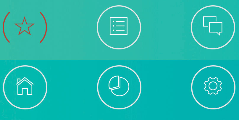
Images and logos have particularly stood out a lot more over the last few years. How often do we use emojis rather than text? Mobile navigations seem to use icons rather than text and over time users come to know where each will take us. We are going to start by creating an animated navigation bar just using logos. When you hover over each one, it will animate to the final state, which will look similar to this screenshot. Got a lot of media to add? Back it up in cloud storage.

Build the navigation
First of all, we will create a new index.html file and set up our navigation area along with six links. Each link will be made up of an icon taken from Ionicons. We will need to assign a class to each.
<div class = “navigationbar">
<a href="#" class="navlogo ion-ios-star-outline"></a>
<a href="#" class="navlogo ion-ios-list-outline"></a>
<a href="#" class="navlogo ion-ios-chatboxes-outline"></a>
<a href="#" class="navlogo ion-ios-home-outline"></a>
<a href="#" class="navlogo ion-ios-pie-outline"></a>
<a href="#" class="navlogo ion-ios-gear-outline"></a>
</div>
We won't be covering the full HTML or CSS document in detail but you can get the full code listing from GitHub.
Next, we will need to create a CSS file that's called style.css and then insert the following line of code to import Ionicons:
Get the Creative Bloq Newsletter
Daily design news, reviews, how-tos and more, as picked by the editors.
@import url(https://code.ionicframework.com/ionicons/2.0.1/css/ionicons.min.css);We will now set up the class navlogo for our navigation images inside the stylesheet. Here we will set up the position, height, font size etc.
.navlogo {
  position: relative;
  font-size: 40px;
  width: 75px;
  margin: 40px;
  height: 75px;
  line-height: 75px;
  display: inline-block;
  color: #fff;
}

.navlogo:after {
  position: absolute;
  top: 0;
  bottom: 0;
  left: 0;
  right: 0;
  border: 2px solid #e6e6e6;
  content: '';
  z-index: -1;
  border-radius: 50%;
}
Next, we need to set up the animation for our .navlogo element. Here we will create the rotation and transition effects, as well as changing the element colour on hover.
.navlogo:before,
.navlogo:after {
  -webkit-transition: all 0.45s ease-in-out;
  transition: all 0.45s ease-in-out;
}
.navlogo:hover,
.navlogo:active,
.navlogo.hover {
  color: #c0392b;
}
.navlogo:hover:after,
.navlogo:active:after,
.navlogo.hover:after {
  border-color: transparent #c0392b;
  -webkit-transform: rotate(360deg);
  transform: rotate(360deg);
}
Finally, we will need to add an event that removes the hover class when the mouse is no longer hovering over our logos. This is to make sure that our logo comes out of its animation. Create a new JavaScript file called main.js and then enter the following code:
$(“.hover").mouseleave(
  function () {
    $(this).removeClass(“hover");
  }
);
Our navigation is now ready to go, apart from adding some hyperlinks. We have managed to achieve this just by using CSS3.
Create and animate buttons on load

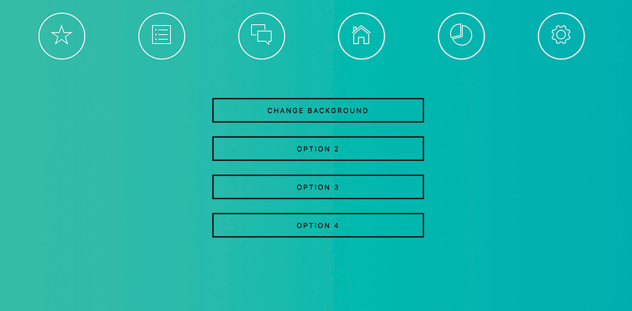
We will now add four buttons to our page and use the GreenSock library to slowly bring in each button, one after the other with a one-second delay. This will create a nice transition effect.
First, we will need to reopen the index.html file and create our button section using the code below:
<div id = “buttonarea">
<button class="anibutton">Change Background Colour</button>
<button class="anibutton">Option 1</button>
<button class="anibutton">Option 2</button>
<button class="anibutton">Option 3</button>
</div>
We then need to set up a reference to the GreenSock library inside the <head> section.
<script src="https://cdnjs.cloudflare.com/ajax/libs/gsap/1.19.1/TweenMax.min.js"></script>Finally, we need to set up our animation. This will only take one line of code. StaggerFrom is a function that will stagger the start time of our element. In our brackets, we specify the name of the element. In this case it would be .anibutton. We also need to set a duration and in this case it is set to one second between each anibutton element.
TweenMax.staggerFrom('.anibutton', 1, {opacity:0}, 1);Background and element colour transition

The next thing we are going to look at is transitioning the website background and buttons from one colour to another. We don't often come across this feature on websites, although it would definitely be interesting for things like accessibility or for web app preferences when the user might want to set their own colour scheme.
Make sure that you have a background colour and a border and text colour set up for your page in the style.css file.
.anibutton {
border: 2px solid #000;
color: #000;
}
Next, we will create a JavaScript function to set up our various GreenSock colour transitions.
function changeBackground()
{
   TweenMax.to(“body", 3, {backgroundImage:"linear-gradient(to left, #646580, #212121)"});
   TweenMax.to(“.anibutton", 3, {color:"#fff"});
   TweenMax.to(“.anibutton", 3, {border:"2px solid #fff"});
}
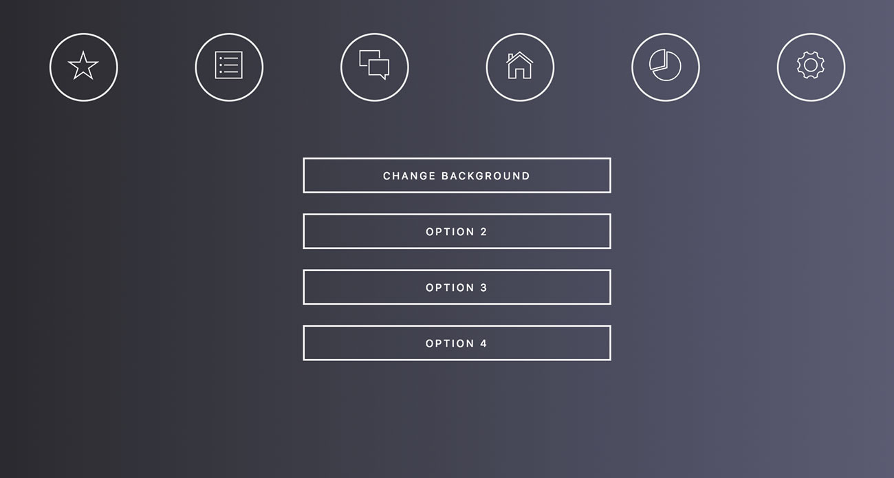
We are going for more of a dark mode look here, so the background will be dark but the buttons will appear light. The first line of code will change the background colour to a darker variation over a period of three seconds. The second and third line will change the colour and border of the text to white over a period of three seconds.
Finally, we will need to call the changeBackground() function from one of our buttons found in the index.html file.
<button class="anibutton" onclick="changeBackground()">Change Background</button>The project is now ready to run. Of course, you can go a lot further by adding new elements and changing the colour style for those, too.
This article was originally published in issue 309 of net, the world's best-selling magazine for web designers and developers. Buy issue 309 here or subscribe here.
Related articles:

Thank you for reading 5 articles this month* Join now for unlimited access
Enjoy your first month for just £1 / $1 / €1
*Read 5 free articles per month without a subscription

Join now for unlimited access
Try first month for just £1 / $1 / €1
