How to add pop to your character art
A step-by-step guide to creating vibrant portraits that provide personality for your characters.
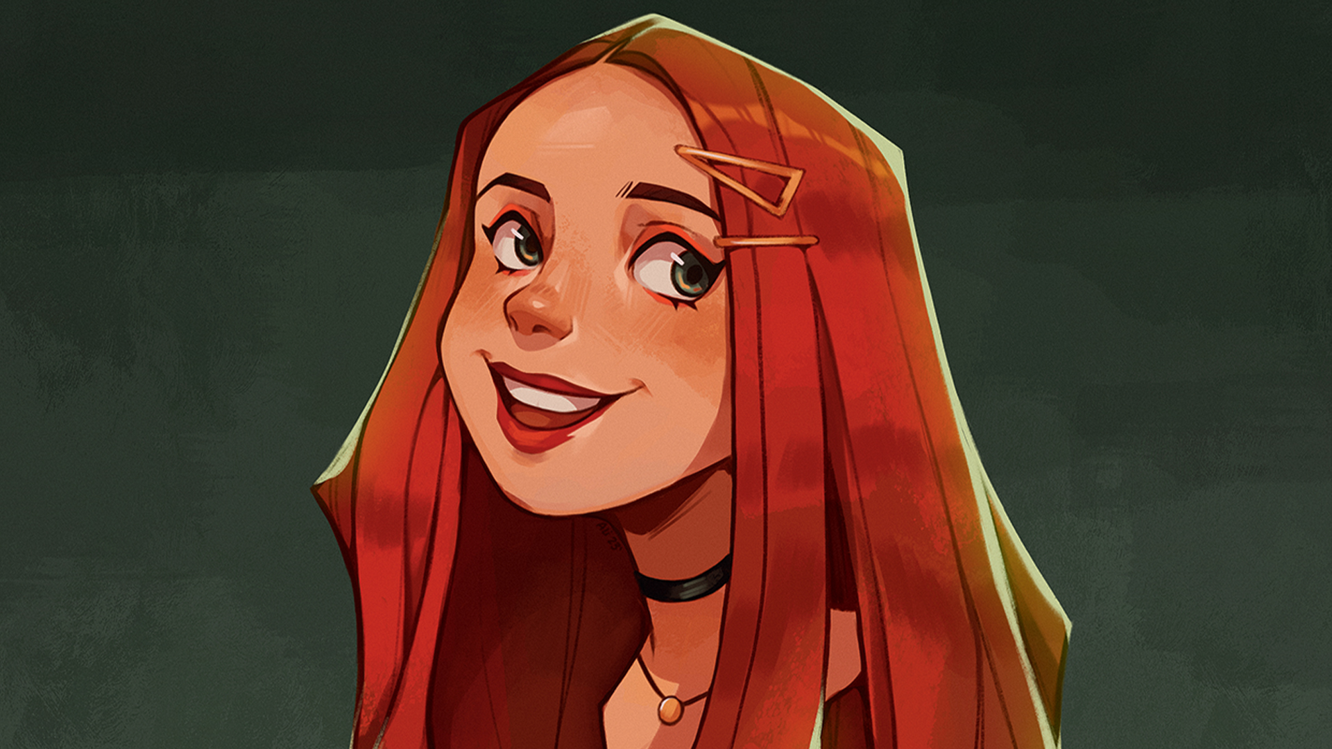
For this workshop, we’ll be creating a portrait that gives your character, well, their character! Whether you’re a beginner artist or more experienced, a portrait can be a great way to explore characters. While the design can focus on anything from their build to setting the character’s tone, the portrait can show who they are at an intimate level.
Try to focus on the overall shape of the portrait design. Be aware of negative space around your character and how that can help with clarity, like how the hair can frame the face or the full portrait. As for colour, we’ll focus on a simple colour palette that complements the design.
One thing to keep in mind is the expression. Try thinking of your character’s situation and how they would react. What would their expression be? Would it be over the top? Many people connect with an expression, which can make it pop.
We’ll be using Procreate for the iPad. This software is a great way to explore your character, from sketching to finalising a painting. We’ll use multiple brushes, layer modes and adjustments to achieve the look for you. Awareness of some basic digital art techniques will be helpful for this tutorial, but there are plenty of Procreate tutorials to hone your skills.
01. Start out with thumbnails
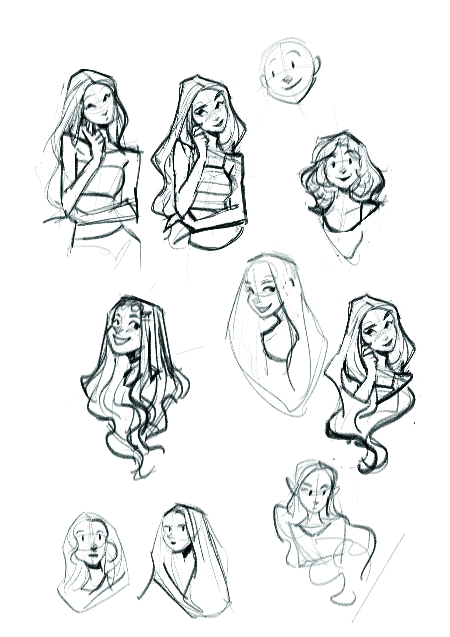
Using the Angular Sketch brush, create a few thumbnails of your character. Pay attention to the figure’s overall shape and use elements, like the shape of the hair and how it frames the character, to convey that shape. Play around with the head tilt, pose and expressions until you find one that works best.
02. Sculpt your rough sketch
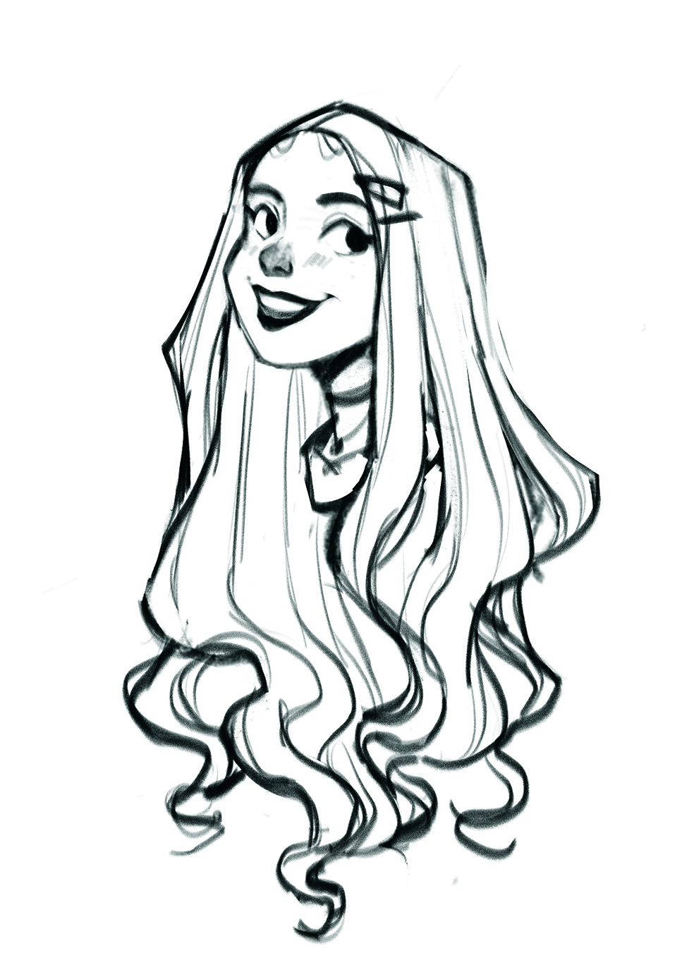
Copy and paste your thumbnail and enlarge it on a new canvas set to 300dpi. Select the Eraser and choose the Sharp Render brush. Use it to clean up some lines of your sketch. Think of it like clay; you’re sculpting the lines and shapes for clarity.
03. Start your second sketch
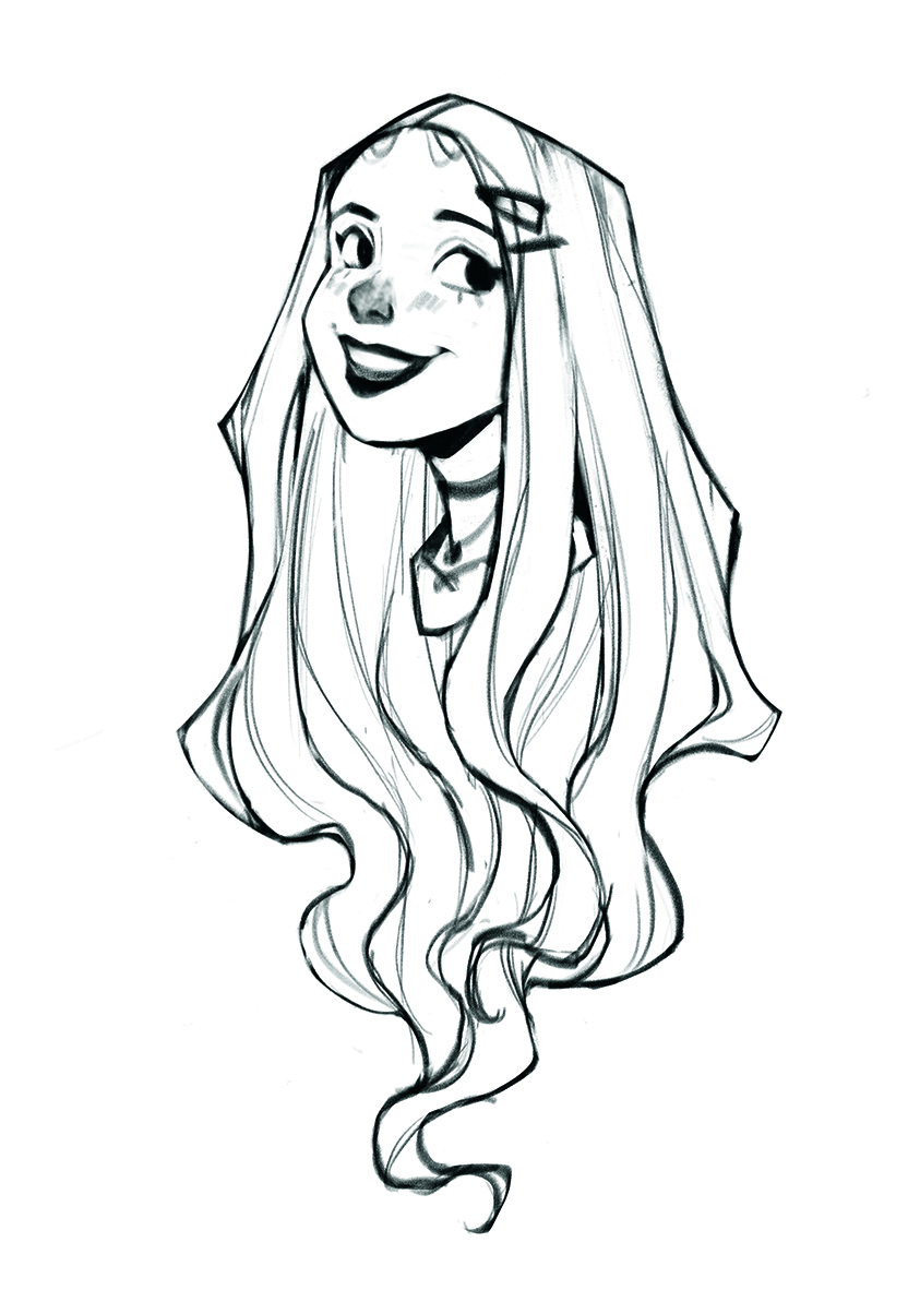
Lower the opacity of your rough sketch and create a new layer. At this stage, focus on what you can add or remove to make the piece pop. Can you push the expression further? Add more detail in one area? Less in another? Remember to keep the overall shape consistent.
04. Create the line art
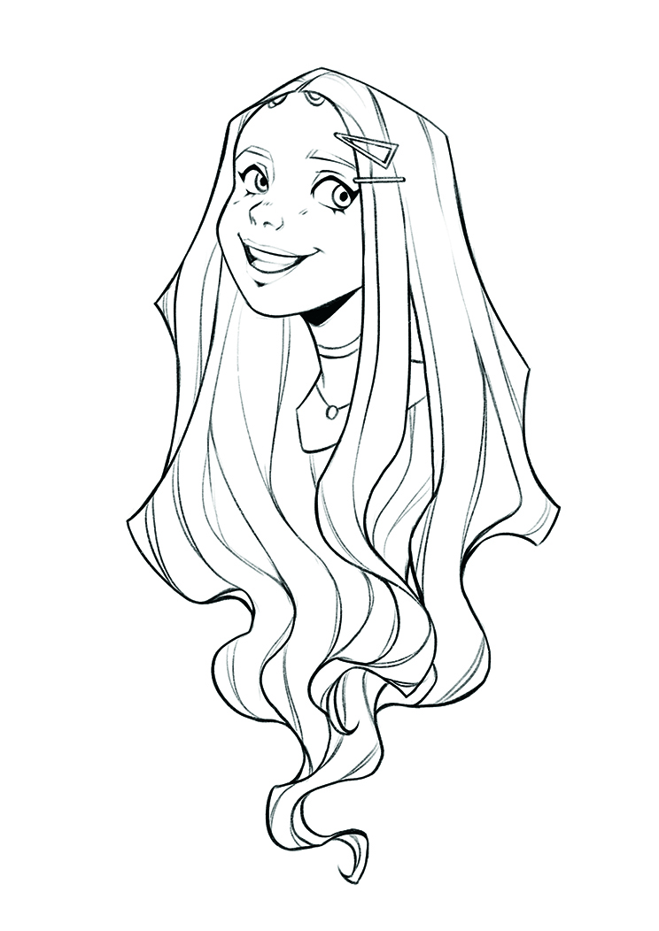
Use the Oval Sketch brush on a new layer to begin your line-art. Focus on creating smoother lines. You can adjust the stroke of your lines under the Stabilization settings of your brush to help keep them smooth. If you need to, create separate layers for lines behind other shapes. You can clean them up with the Eraser, then merge everything on one layer.
05. Test out your colours
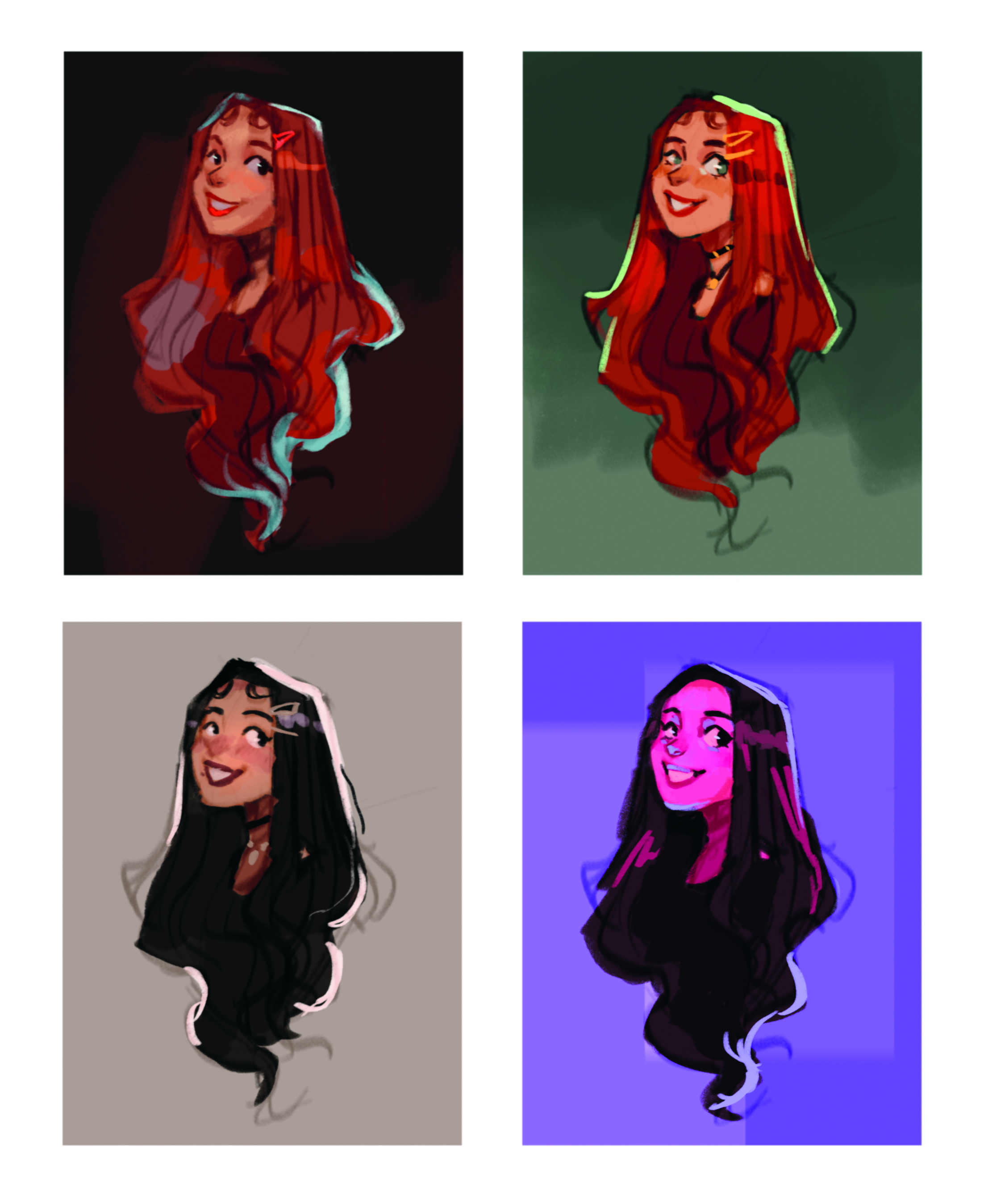
I like to create a separate canvas with my thumbnail sketch for colour comps. Create four separate groups of your sketch with a background layer. Using the Gouache Clean Glaze brush, paint four different colour palettes. Try to keep your palettes limited and stay zoomed out, so you can easily see the colours’ cohesion. Once you like a combination, merge that group and copy it to your main canvas.
06. Begin your background
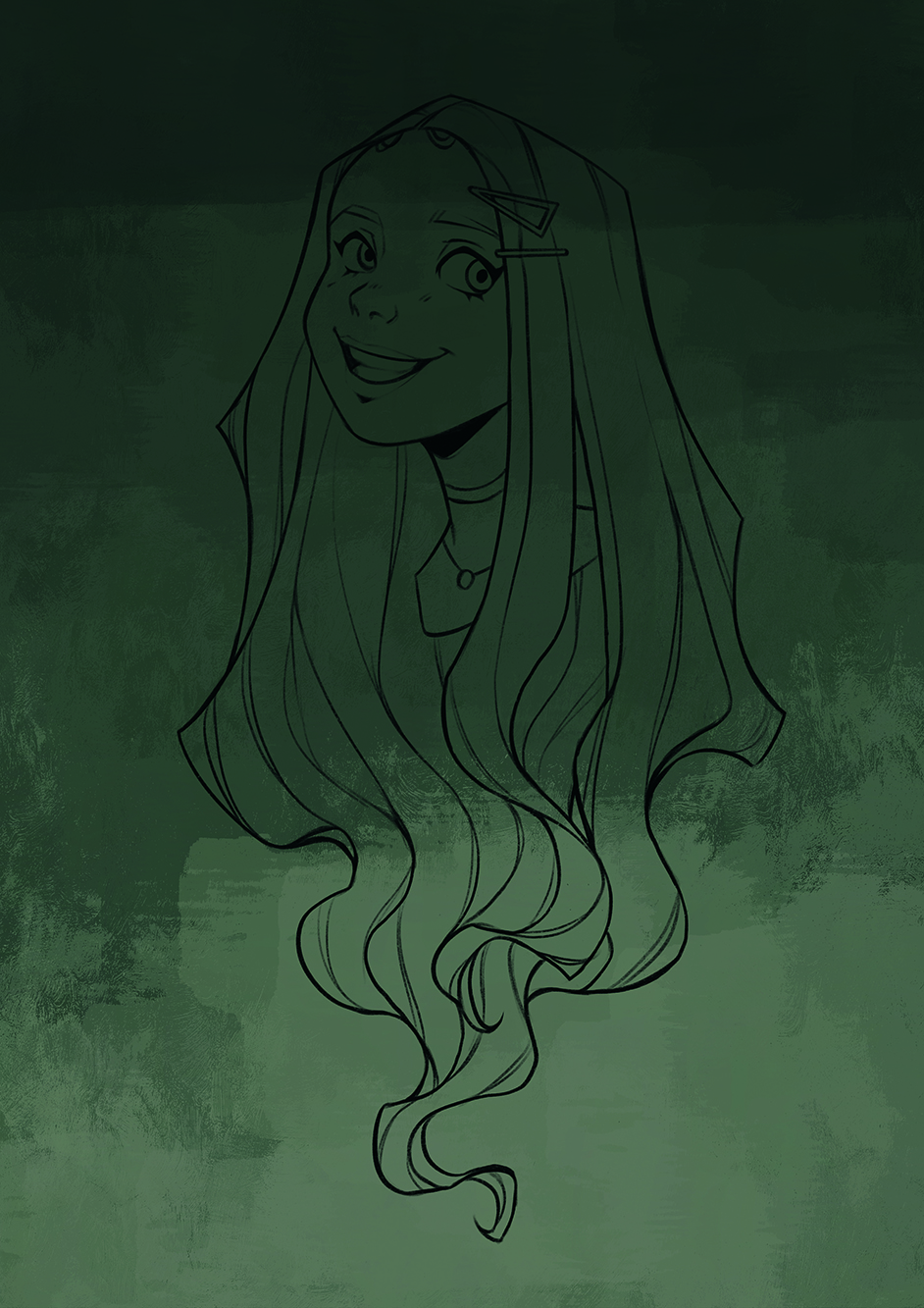
Create a new layer under your line art. You can select and fill the layer with the primary background colour from your colour comp or the Color panel. To add some variation, use the Wes Gardner Lovely Paint #2 brush, or any texture brush to paint in variation in tone, or add some extra values.
07. Add in base colours
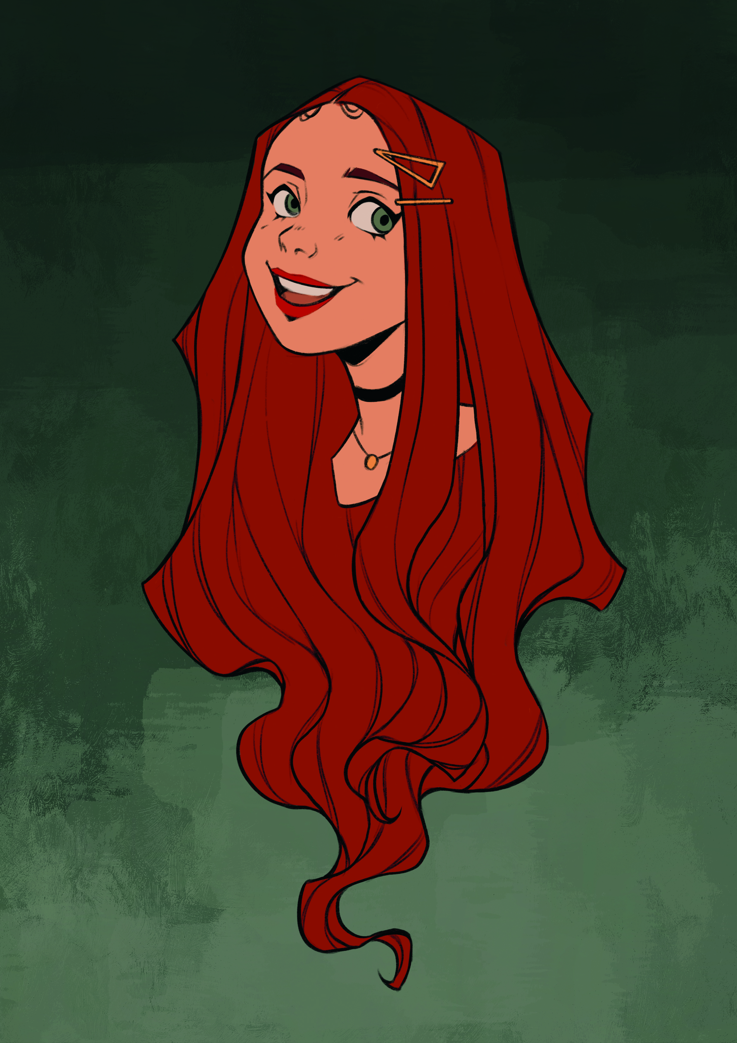
Use the Hard Round brush on a new layer to create an outline of your portrait. Fill in the shape using the base skin tone from your colour comp. Create a new layer above and set the layer to Clipping Mask. Repeat the outline, this time around the hair, then fill in with the base hair colour. Next, fill in the smaller details on a separate layer using the clipping mask.
08. Tone the line art
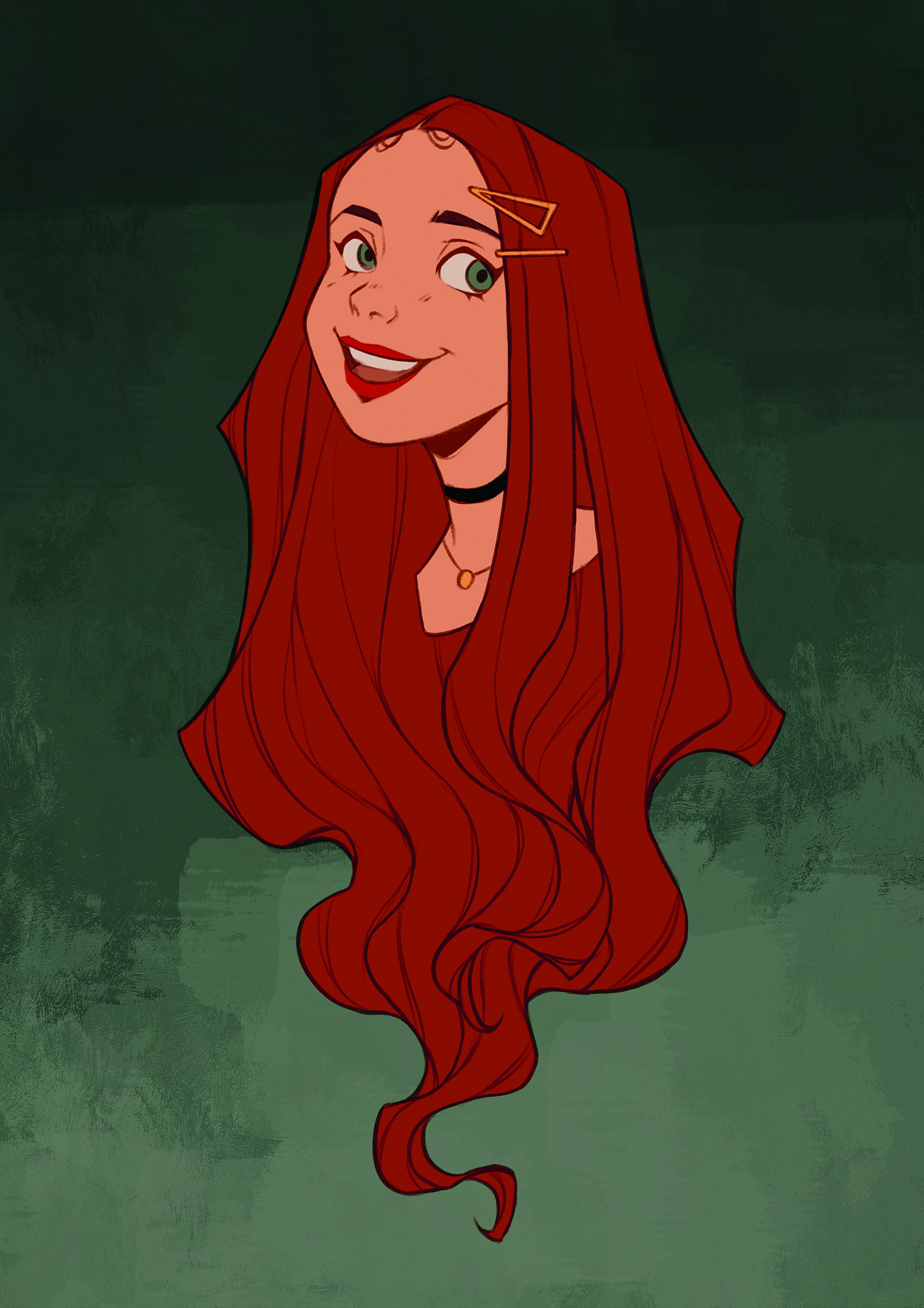
Alpha Lock the line-art layer and select a dark hue that fits your colour palette in the Color panel. Fill your line-art layer, then change the layer mode to Hard Light. You can use the Hue and Saturation options under Adjustments. Move Saturation under 40 per cent, push the brightness for the line-art transparency, and adjust the Hue to match the colour palette to what works best.
09. Paint tones and detail
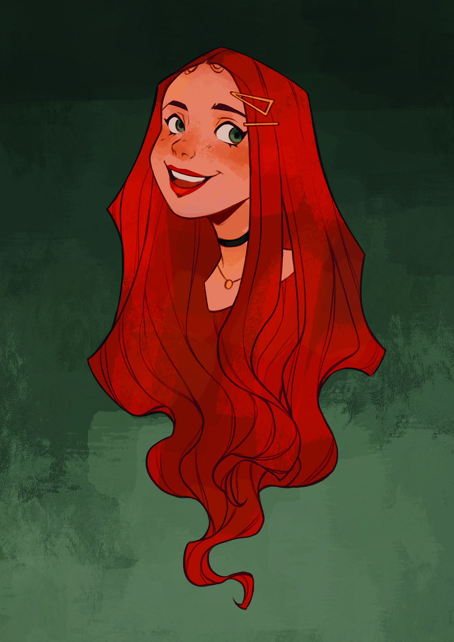
Continue to paint in more colours. Use a low-opacity brush to paint in some reddish and cooler tones, to create variations on new layers above your skin and hair base. You can paint background colours in at a low opacity to add more cohesion to the piece. Add more colour details under the line art, like a dark colour under the eyelashes and eyebrows.
10. Add shadows
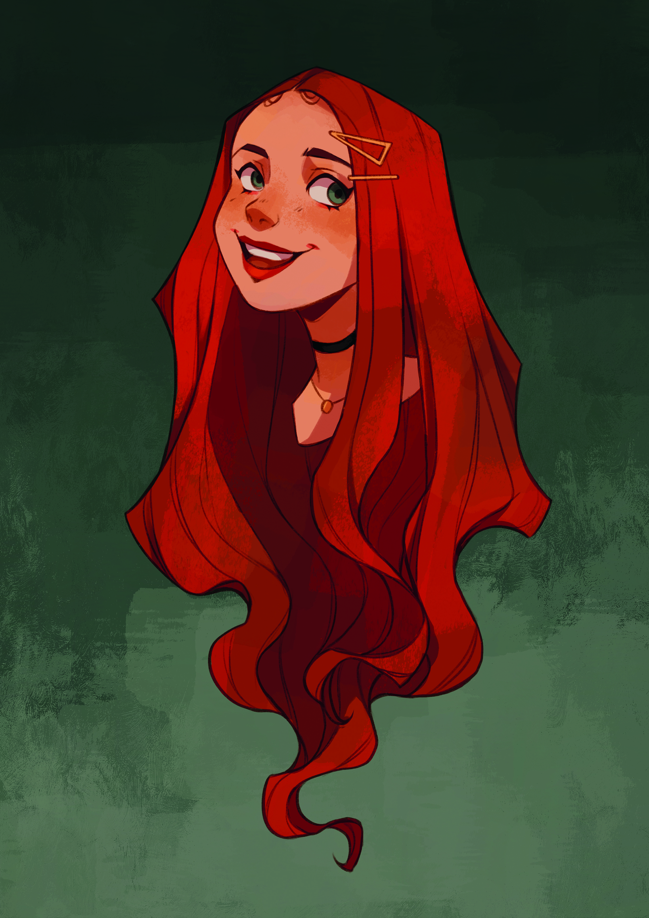
Create a new layer above your colour layers and set the mode to Multiply. Select a reddish-grey and paint in your basic shadows using the Clean Glaze brush. Remember where the lighting is and the general shape of the figure, and you can adjust the colour using the Hue and Saturation. Just in case, duplicate your canvas to save the piece, so you can make any changes before rendering after you finish the shadows.
11. Begin the first render pass

Under the line-art layer, create a layer above your colours to start rendering. Focus on clearing up larger shapes and adding details, like extra skin highlights, eye details, and smaller shadows in the hair. Use the Sharp Render brush for clean shapes and the Gouache Clean Glaze brush for loose paint strokes.
12. Complete the second render pass
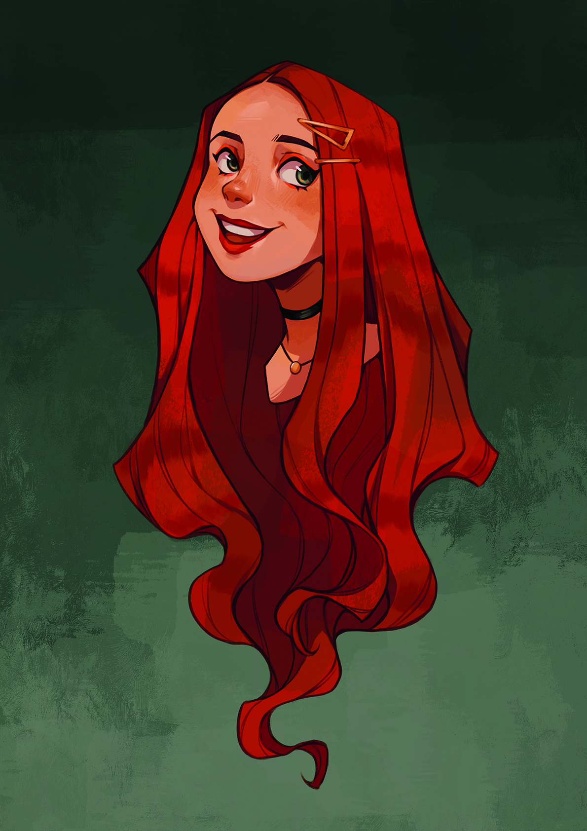
Group together all your layers, minus the background, and then flatten them. Create a new layer and continue to render over your portrait. Add even more detail and start cleaning lines for clarity. Focus less on blending everything out, and try to paint in texture to create more enticing shapes.
13. Refine extra effects and lighting
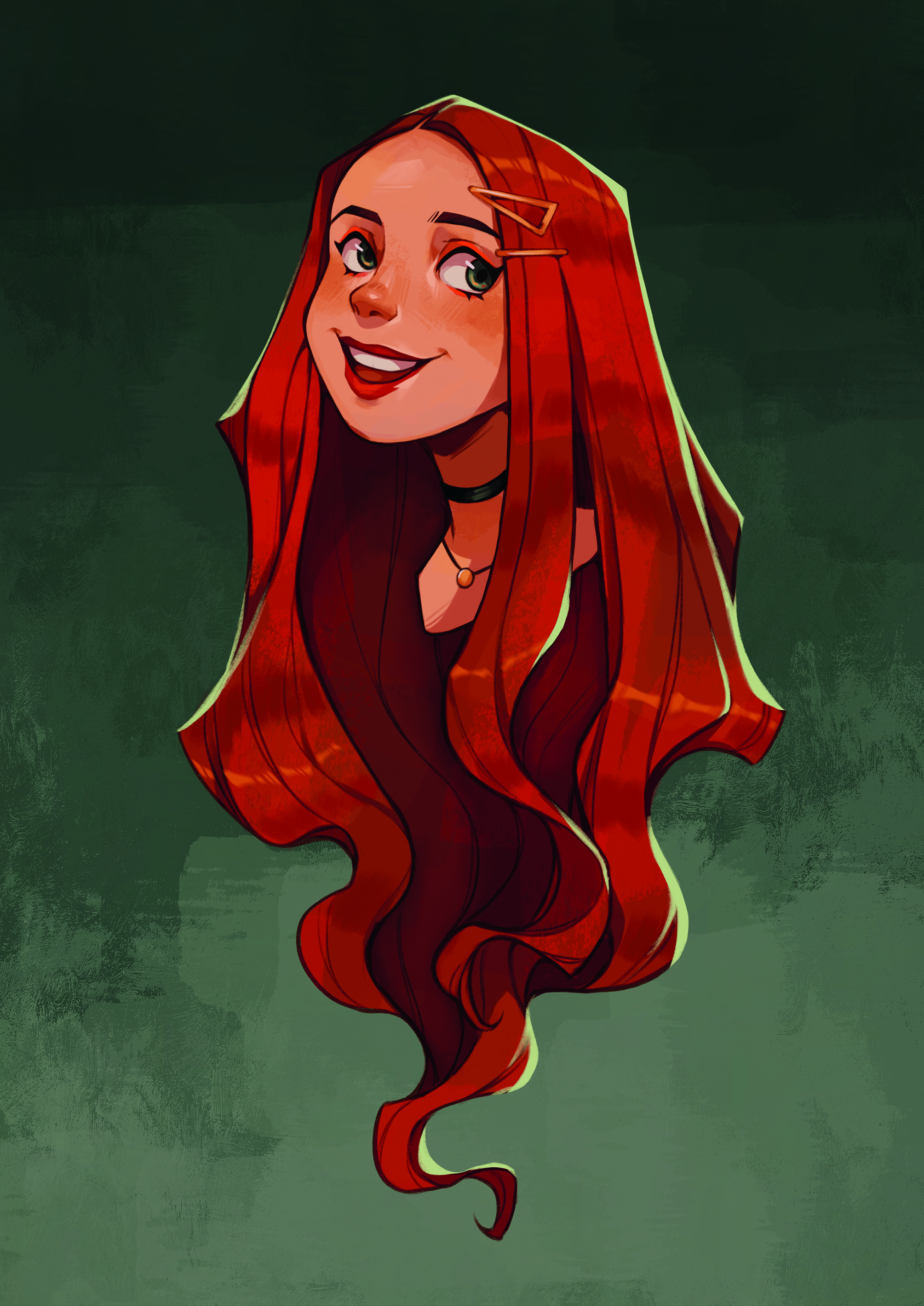
Create an extra layer set to Multiply to add a little more shadow. Bring in more dramatic lighting by painting in a rim light along the edge of your piece on a separate layer above. You can also paint in some highlights to the hair, and then erase them to clean up the shapes.
14. Add finishing touches
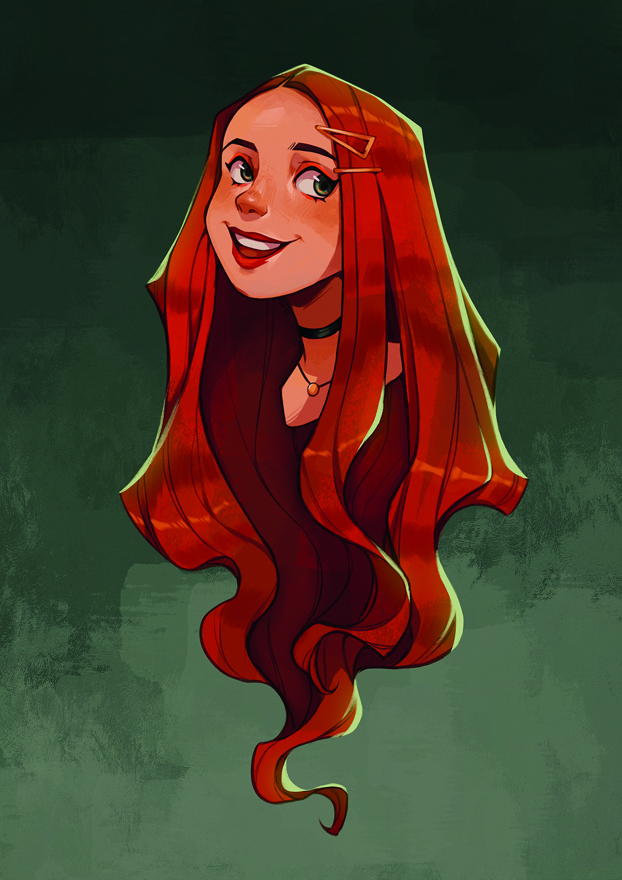
Using more of Procreate’s adjustments, you can add effects to help clean up the piece. To start, merge all your layers with the background. Try Bloom to add a little glow to the highlights, while Sharpen is excellent for clearing shapes, and finally use a little bit of Noise to add a slight grain texture. Congratulations, you now have a finished character portrait!
This article originally appeared in ImagineFX. Subscribe to the magazine at Magazines Direct.
Get the Creative Bloq Newsletter
Daily design news, reviews, how-tos and more, as picked by the editors.

Thank you for reading 5 articles this month* Join now for unlimited access
Enjoy your first month for just £1 / $1 / €1
*Read 5 free articles per month without a subscription

Join now for unlimited access
Try first month for just £1 / $1 / €1
Alix is an illustrator and character artist whose primary medium is digital, creating in Procreate on iPad, and occasionally working traditionally in gouache.
