How to achieve scale in your paintings
These principles will make your art feel epic.
In this tutorial we will go over some basic principles that will help communicate the idea of large scale in your own pieces. I'm using pencils and oils for this tutorial, but you can also apply these principles to your digital artwork.
Conveying a sense of scale isn’t just a matter of drawing huge objects within your scene. Those objects must appear correct relative to other elements, through the use of value, colour theory, repetition, viewpoint and so on.
Photographic lenses and their relationship to apparent scale is a little-understood aspect of illustration and will also be covered. As always, basic lighting design, colour choices and composition will strengthen your work.
A couple of the matte paintings I worked on for the film The Fifth Element are, to my eye now, failures of scale. Perhaps one day I’ll correct them, but for now my goal is to help you avoid some of the mistakes I made back then.
This is by no means a comprehensive study of scale, but hopefully a good beginning. So let’s get started...
01. Determine a point of view
This is one of the most difficult aspects of all illustration: where do I view my scene/subject from? What point of view (POV) best communicates the concept?
Would we paint a portrait of a person from directly above or from the floor? Of course not. However, a lower angle looking up at a large object quickly conveys height. This can also be communicated from above, by inducing our own fear of falling! Which one is right for the scene will depend upon the original idea for the work.
Get the Creative Bloq Newsletter
Daily design news, reviews, how-tos and more, as picked by the editors.
When creating any scene, I do my best to visualise myself within the environment and wonder where would I be if I were to ‘shoot’ the scene with my camera. Where would I be standing as the action unfolds?
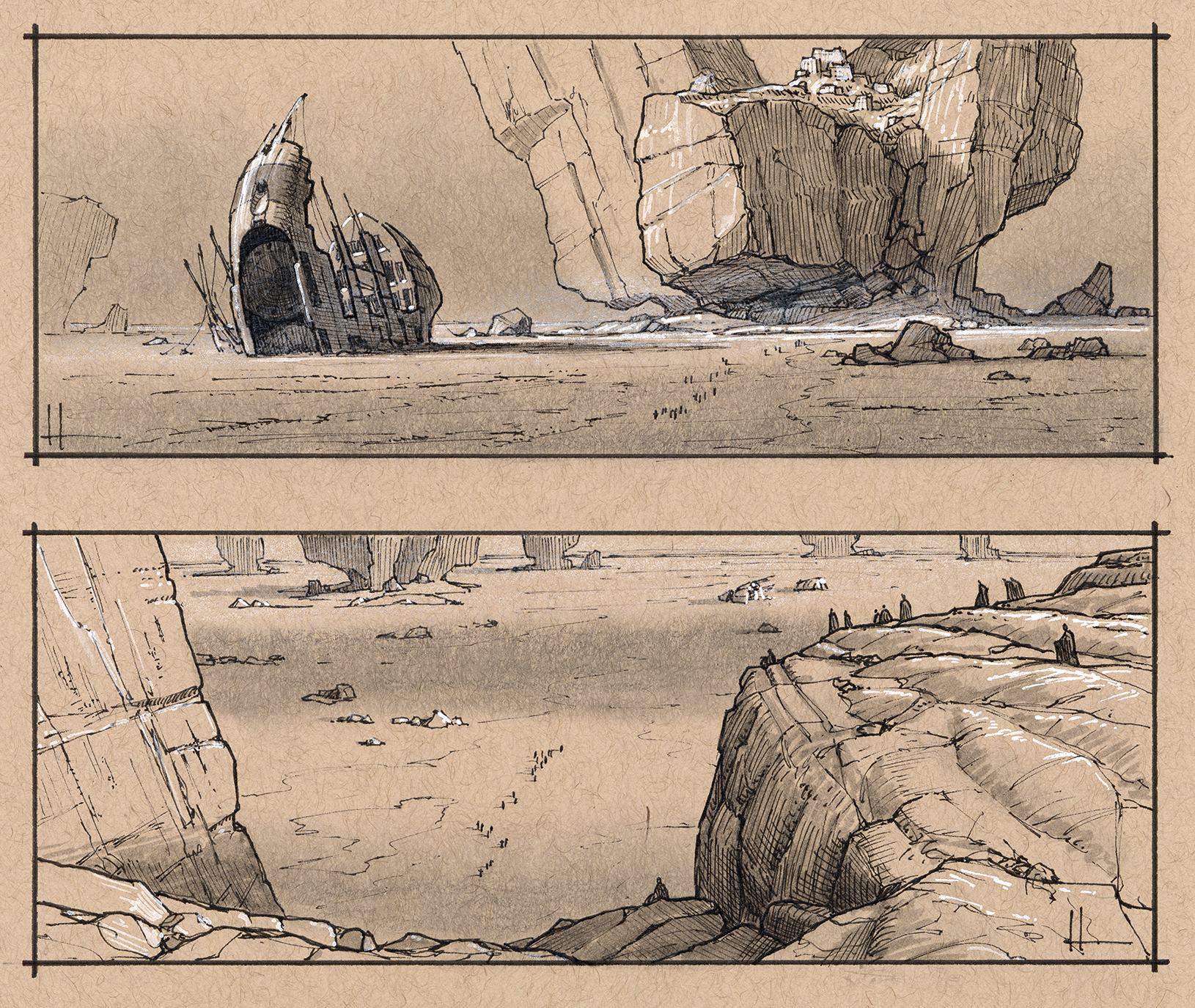
These two sketches show two takes on the same scenario. One is a lower view from the position of the figures travelling towards the rock formation, while the second is from atop the rock looking down. Both convey scale, so it’s now a matter of seeing which POV best fits the story.
For tips on sketching, see our 20 sketching tips to help you make your first marks.
02. Choose the right lens
This tip requires a whole article for itself, but suffice to say that longer focal length lenses, for example a 150mm zoom, provide a visual compression of perspective, a flattening of elements within the scene and starts to show a truer indication of relative scale. One side effect is the cropping of objects beyond the picture frame that would otherwise be visible with a wide-angle shot.
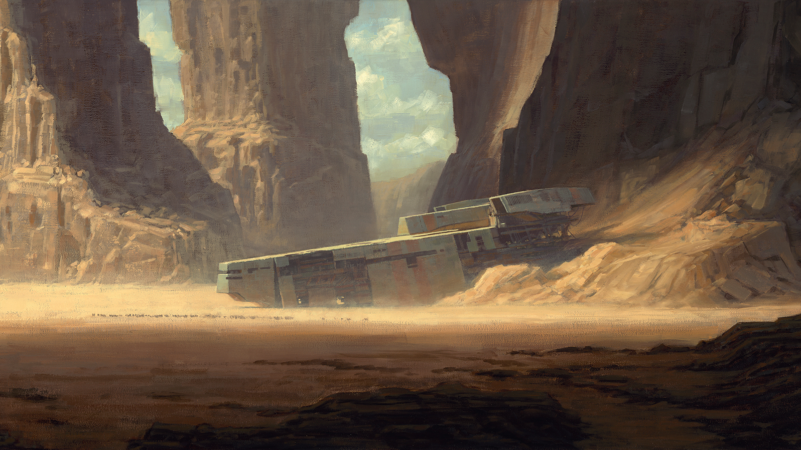
A longer lens enables you to visually edit out most of the information in front of you, yet still show an enormous portion of the landscape within the scene. Anything that breaks the frame can be left to the imagination and is usually perceived to be larger than it might actually be. I use this to effect in my painting, Desert Wreck.
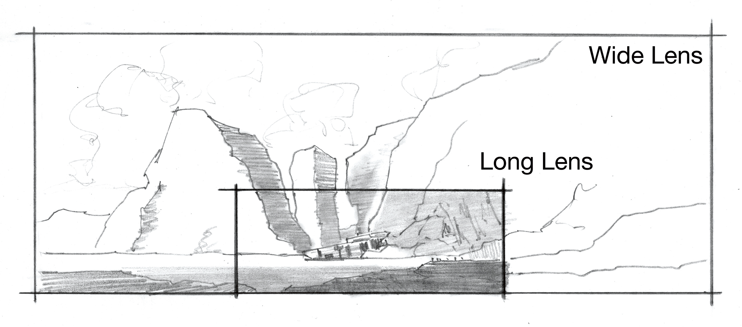
In the sketch above you can see the original painting frame and the view if I had composed with an imaginary wide-angle lens.
If you'd like to use real, rather than imaginary lenses to capture a scene and then work from a photo, then don't miss our guide to the best cameras available right now.
03. Repeat objects
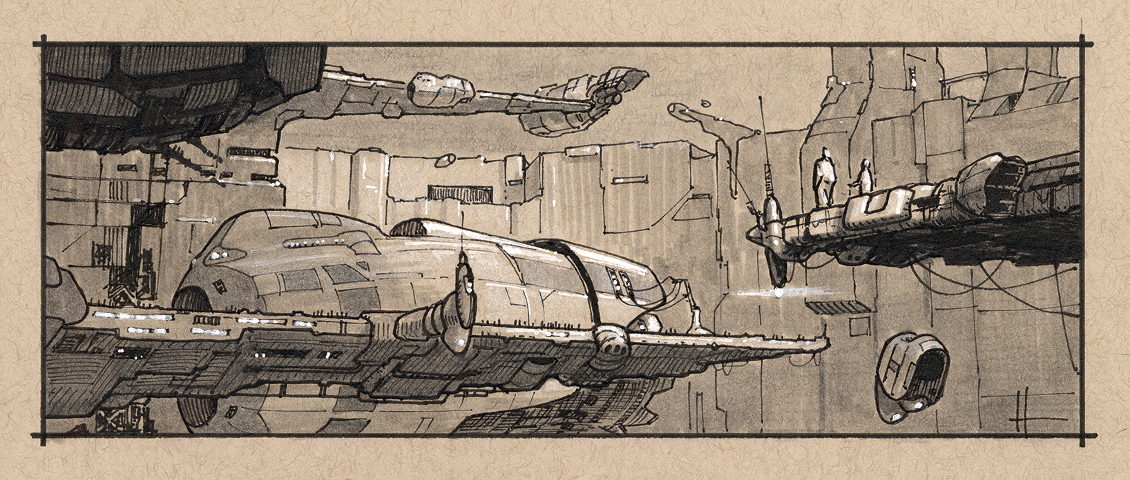
Here, you can see how the repetition of objects work in the scene. While we don’t see the foreground ship and landing platform as complete objects, there’s enough visual information to let the viewer know that the docked ship at the platform in the background is a repeat of the first. The tiny figures seen on the foreground platform convey the size of the docking environment.
You can also see this principle applied in my painting Rendezvous (tip #9).
04. Use values to create a varied atmosphere
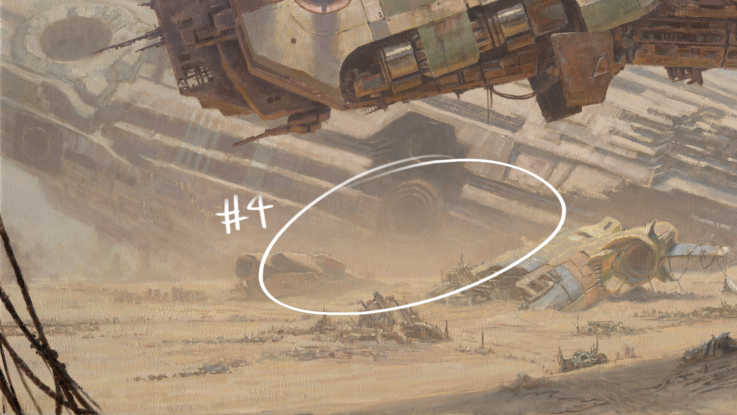
Value is one of the easiest ways to help convey scale of objects in the distance. Atmosphere through dust, pollution and smoke lifts the value of shadows as they recede into the distance. The amount varies depending on how thick the atmosphere is and where it’s concentrated.
Light rays reflecting off objects within a shadowed area don’t have the power to overcome the intensity of the light striking the atmosphere itself, which is between you and the distant shadowed areas. Light hitting countless atmospheric particles overrides any detail that might otherwise be seen within those shadows.
To see this principle in action, refer to the lighter shadowed areas of the background wreck (the circled #4 area in the painting).
05. Play with the same object at different sizes
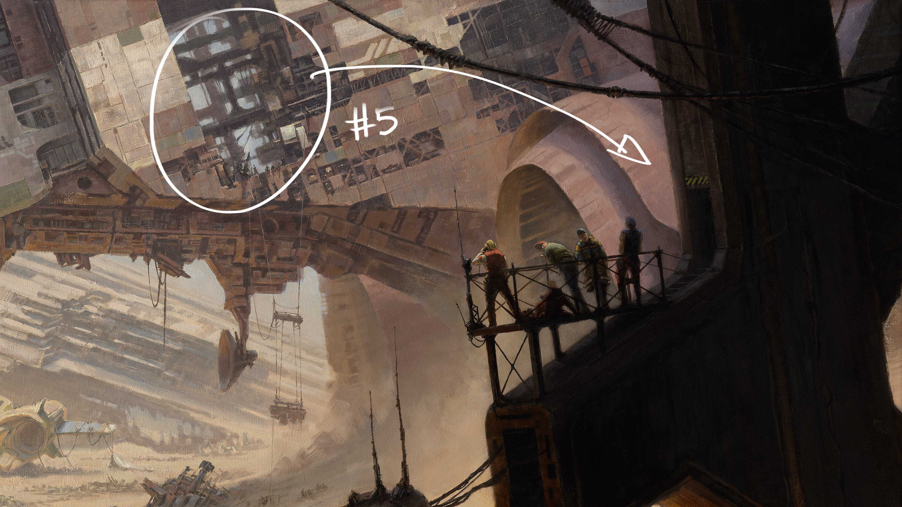
This relates to the repetition of objects within a scene. What looks like a small detail on a distant object can turn out to be a large feature when seen up close. The juxtaposition of a human figure against such ‘minor’ details will also strengthen the overall sense of scale.
Take the beams in the image above: the figures on the foreground platform attached to the heavy beam gives the viewer an idea of the scale of the beams seen within the belly of the mid-ground ship.
06. Vary your line weight
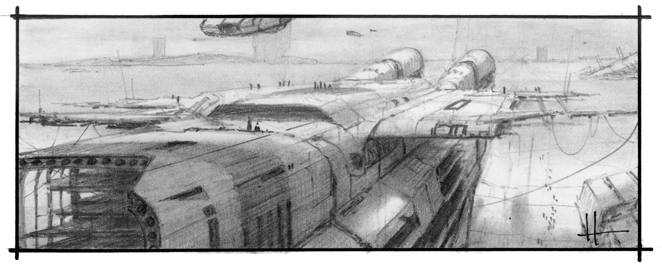
This is related to tip #4’s value and atmosphere advice, in that you want to convey distance and scale even at the smallest thumbnail stage. Varying your line thickness and weight of shading will help quickly communicate atmosphere and scale.
Use a harder 4H pencil and a light touch for background objects, and go for a softer 4B for the foreground details. To give you an idea of how much visual information even a thumbnail sketch with varied line weights can convey, this image is only 12cm across.
07. Contrast foreground and background details
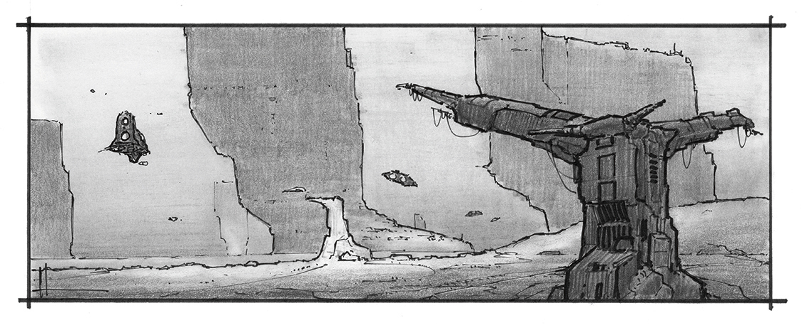
The level of detail apparent in the foreground tower provides all of the information needed to tell us what the details might be on the distant mid-ground tower. There’s no need to paint things in distant objects if you can describe them in close-up elements.
If you need to paint distant details, keep them confined to the lit areas of the object, and suggest them loosely and sparingly.
08. Minimise details within shadows
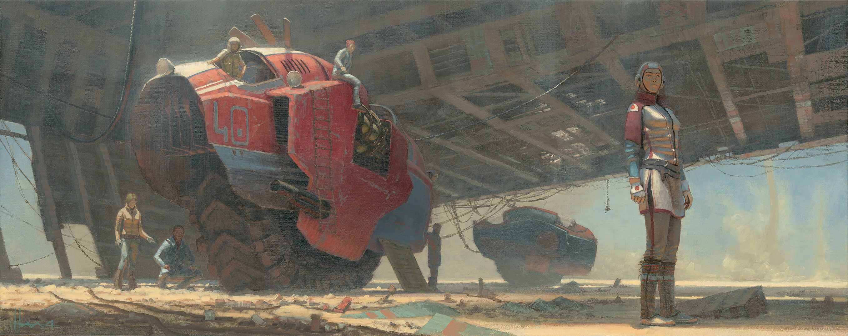
The amount of detail should also be kept to a minimum within shadows. In my painting Dust Devil, the details are merely suggested in the shadows and are progressively reduced by the time I get to the background vehicle.
Even though the distance from foreground figure to the background vehicle isn’t that great, I still want to keep the details to a minimum. This helps keep the focus on my main character.
09. Convey scale with a human figure
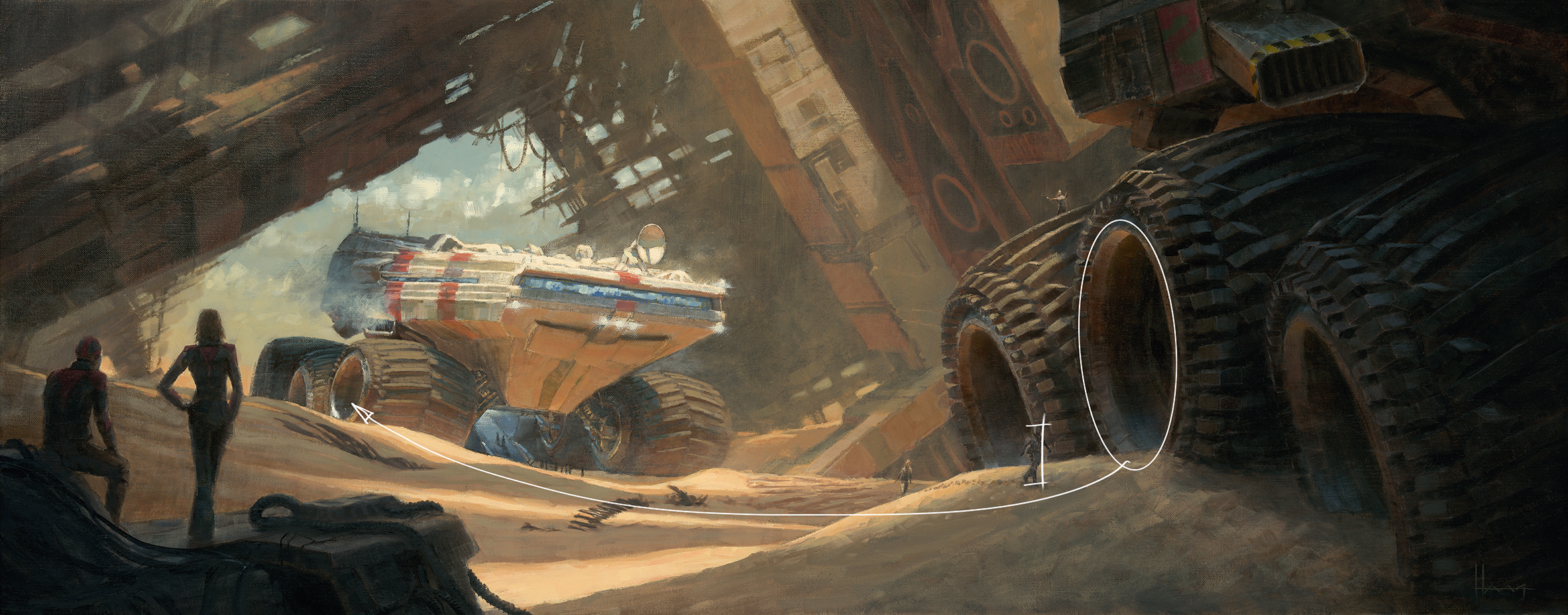
Placing a human figure into a scene is an easy way to help convey scale relative to other objects in the environment, even if those objects are fantastical in nature.
In my painting Rendezvous, the figure next to the wheels of the foreground rover enables the viewer to understand the true scale of the background rover – even though we don’t see the entirety of the foreground one.
10. Introduce a range of textures
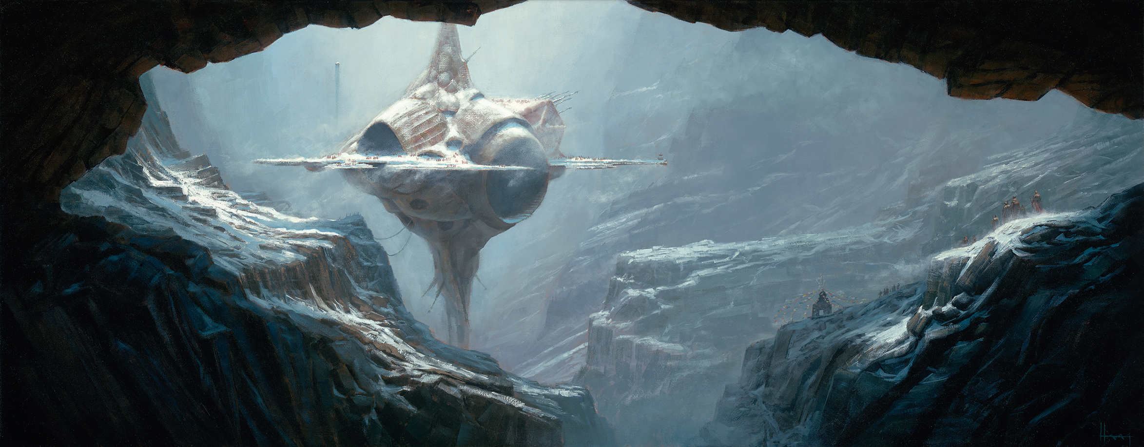
Texture can provide an artificial sense of detail and thus a closeness that you may not want in distant objects. The sky appears to us to be texture free and smooth compared to the rocks at our feet.
Here, I’ve kept the background atmosphere smooth so as not to draw attention to itself. It can be hard to eliminate this when painting with oils on canvas, but very easy to control digitally. As the rock cliffs recede into the background, the amount of detail and texture is reduced.
11. Make edges do the heavy lifting
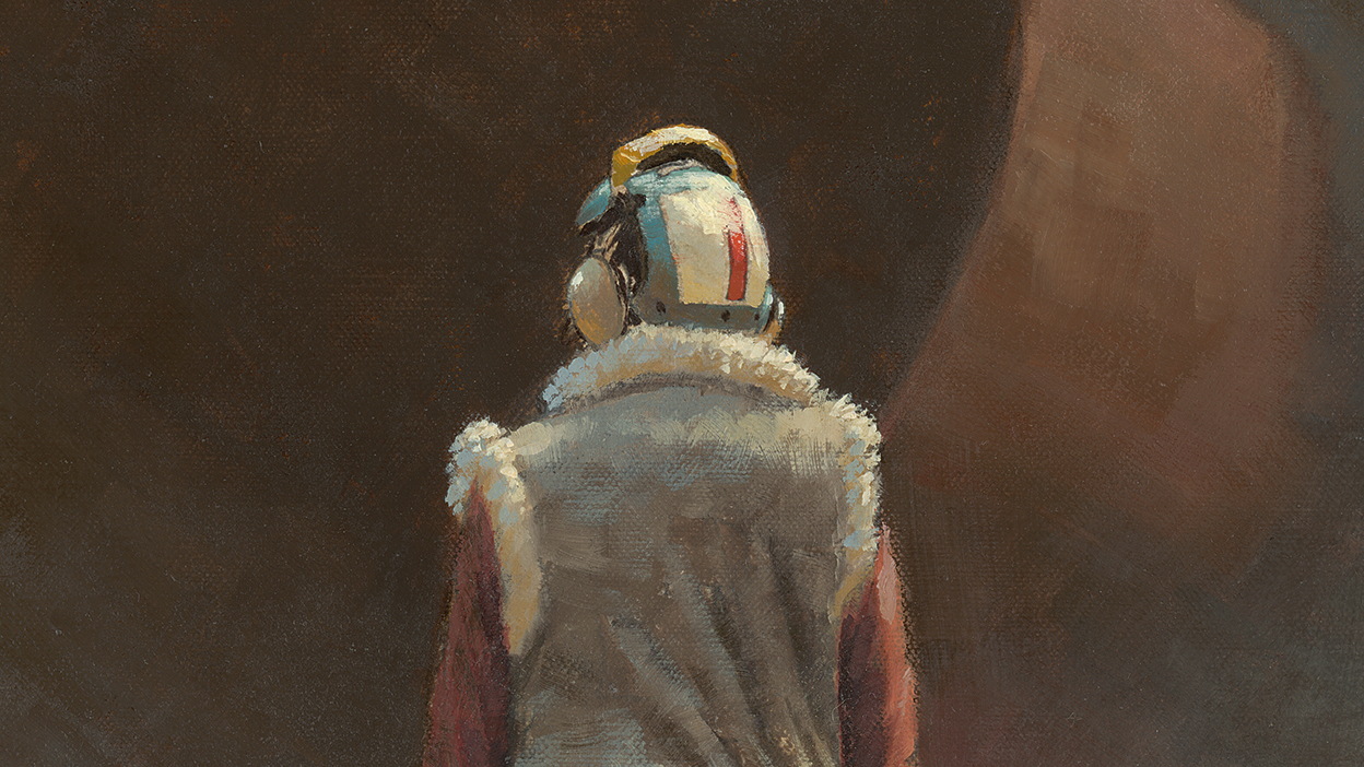
Decreasing sharpness where it’s not required can help to separate foreground objects from background objects, particularly where those elements overlap. John Singer Sargent was the master of edges – study his paintings!
12. Use a neutral colour palette
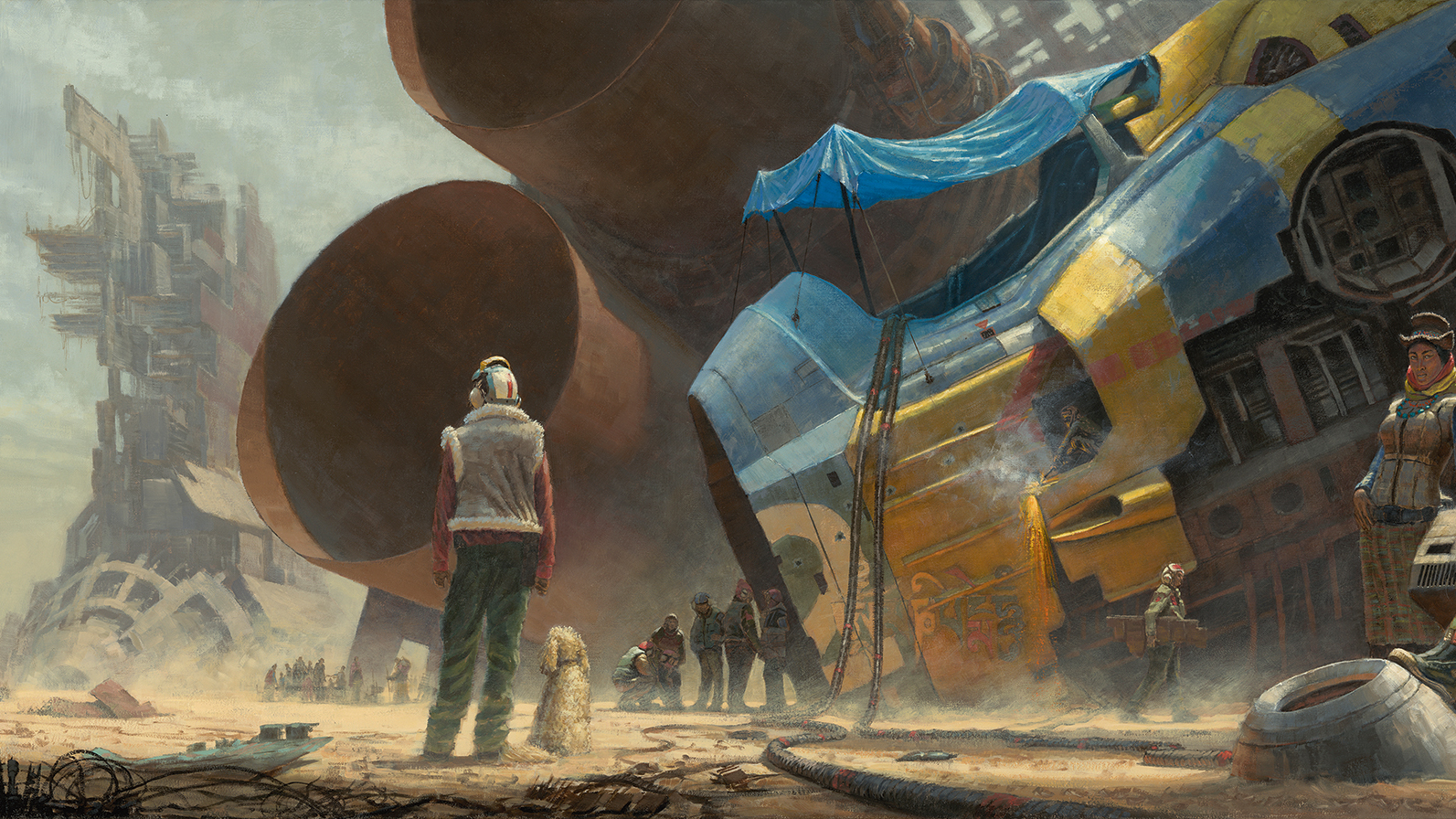
With the understanding that colours will decrease in intensity the further away they are, communicating scale and depth can be helped by limiting the choice of colours of distant objects to a more neutral palette.
Restrict the more intense colours for your focal point and allow the receding elements to progressively become less intense. In my painting, Sky Burial #3, I set out to showcase the bold colours of the foreground wreckage against predominately muted colours.
A lot of landscape painting is primarily the art of painting with a variety of greys that have been shifted towards a particular colour. Think of a grey of the required value mixed with a hint of colour, rather than a raw bright colour dulled down.
It’s faster to start with a neutral grey and tint it with pigment – traditionally at least – than drag a full-blown colour down to what’s needed.
13. Bear lighting design in mind
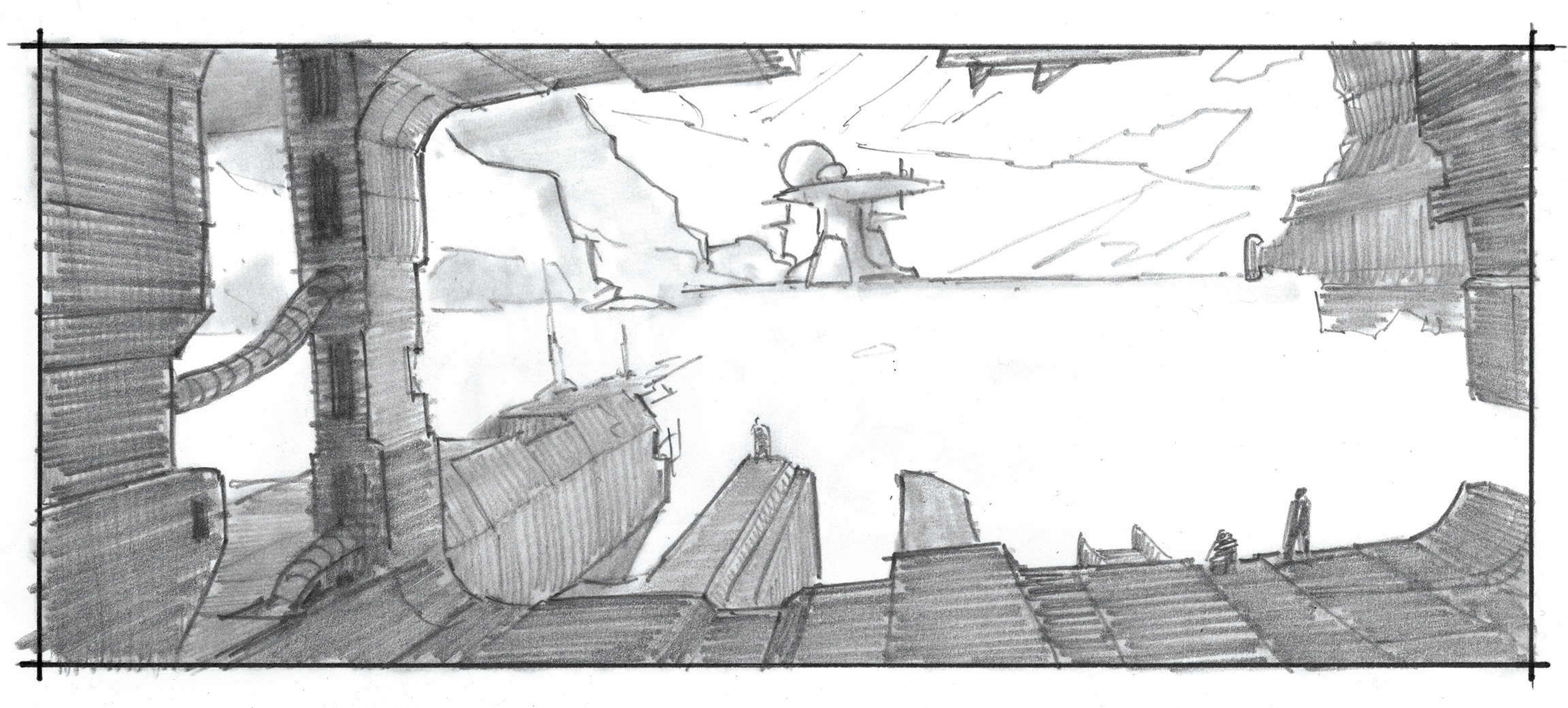
Good lighting design isn’t restricted to scale, but is needed in all good picture-making, so I’m briefly covering the topic here.
I start with a light/no light situation, rendering either digitally or traditionally, and establish what will be in light and what will be in shadow. This is done at the lowest resolution level of the picture. So in this sketch there are two values: white for light and a grey (pencil or marker) for shadow. The justification of that lighting scenario can come later.
Don’t get hung up on the ‘how’ at this point – concern yourself only with the design of the relationships between light and shadow. The focal point is not always in light and can very often be in shadow against light.
14. Keep it simple
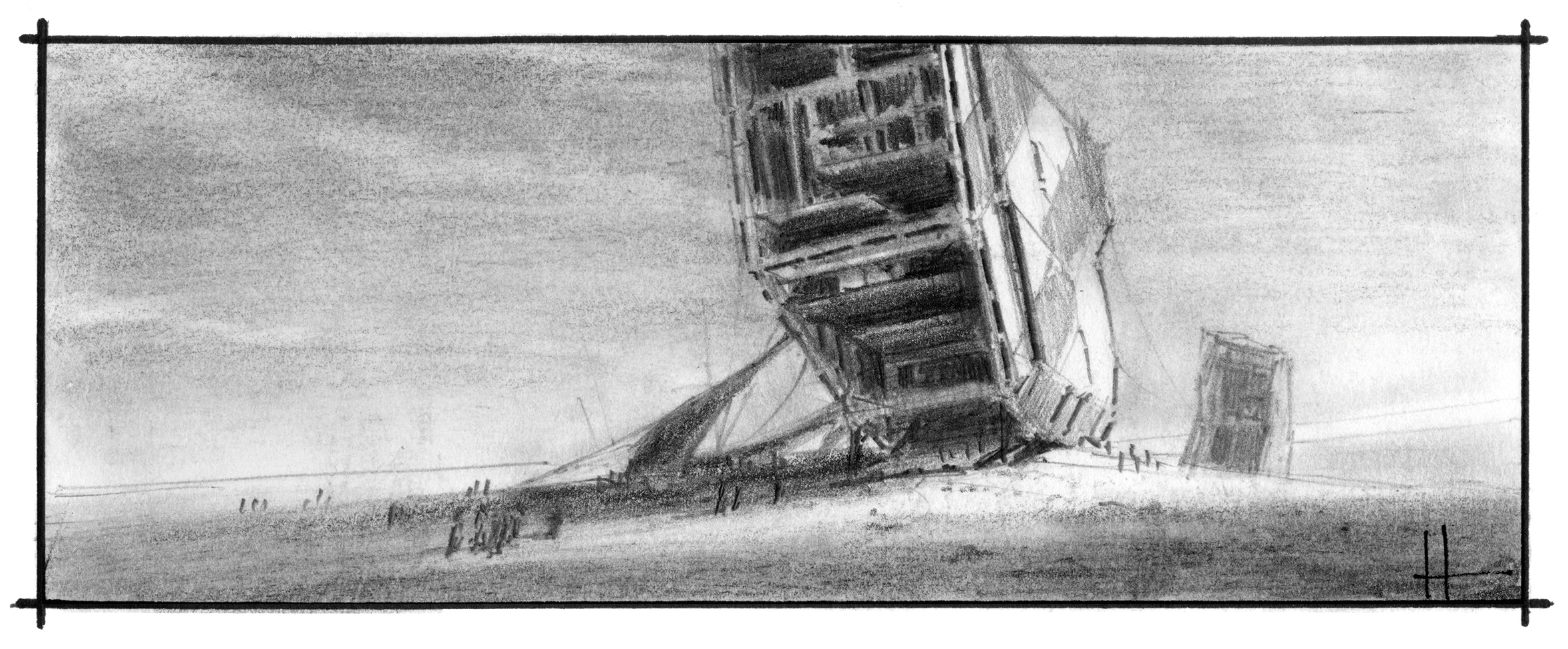
This tip is pretty self-explanatory but it’s always good to be reminded of it. Keep it simple. Simple composition, simple concept, simple execution, simple tools and materials and simple presentation.
Those points combined will, more often than not, produce powerful results. They are also achievable, which means you’ll finish the piece and that’s the point. Finish the work, learn from it and move on to the next one.
This article was originally published in issue 167 of ImagineFX, the world's best-selling magazine for digital artists. Buy issue 167 or subscribe.
Related articles:

Thank you for reading 5 articles this month* Join now for unlimited access
Enjoy your first month for just £1 / $1 / €1
*Read 5 free articles per month without a subscription

Join now for unlimited access
Try first month for just £1 / $1 / €1
