A guide to Google's web tools
Google’s Material Design was initially seen as another tiresome redesign of the GUI stack. But, as time went by, users started to embrace the typography-centric design approach. Technologies like Progressive Web Apps required the presence of a JavaScript version.
Given that JavaScript GUI stacks are pretty common, Google did not face a difficult task. The favourite way to include Material Design components involves npm. It’s not easy, though, which is why we’re starting out with a simple example.
01. Get started
<html>
<head>
<link rel="stylesheet" href="https://unpkg.com/material-components-web@latest/dist/material-components-web.min.css">
<script src="https://unpkg.com/material-components-web@latest/dist/material-components-web.min.js"></script>
</head>
</html>
Test framework functionality by adding a button to the body of the page:
Article continues below<body>
<button class="tams-button mdc-button">Button</button>
<script>
mdc.ripple.MDCRipple.attachTo(document.querySelector('.tams-button'));
</script>
</body>
</html>Material Design components behave like most other JavaScript GUI stacks. Developers add widgets to the page, CSS classes ensure the decoration gets deployed. Finally, a JavaScript invocation enforces the attachment of event handlers.
02. Go full frame
Experienced developers only need one look at mdc.ripple.MDCRipple to see the source of the problem. The JavaScript and CSS files we included come out of a complex project. The sanest way involves loading the entire framework to your machine.
First of all, obtain the toolchain and deploy it into a Node project:
tamhan@tamhan-thinkpad:~/materialspace$ npm
init
tamhan@tamhan-thinkpad:~/materialspace$ npm
install --save-dev webpack@3 webpack-dev-
server@2 css-loader sass-loader node-sass
extract-loader file-loader
tamhan@tamhan-thinkpad:~/materialspace$ npm
install --save-dev autoprefixer postcss-loader
tamhan@tamhan-thinkpad:~/materialspace$ npm l
--save-dev babel-core@6 babel-loader@7
babel-preset-es2015 babel-plugin-transform-
object-assign
The actual deployment of our modules takes place via WebPack. Open Package.json and add the following markup to set up the workflow:
Sign up to Creative Bloq's daily newsletter, which brings you the latest news and inspiration from the worlds of art, design and technology.
. . .
"main": "index.js",
"scripts": {
  "start": "webpack-dev-server"
},
. . .
WebPack controls itself via a file called webpack.config.js. Create it in the folder containing package.json – a full installation managing all features looks like this:
const autoprefixer = require('autoprefixer');
module.exports = {
entry: ['./app.scss', './app.js'],
output: {
  filename: 'bundle.js',
},
module: {
  rules: [
    {
      test: /\.scss$/,
      use: [
        {
          loader: 'file-loader',
          options: {
            name: 'bundle.css',
          },       },
        {loader: 'extract-loader'},
        {loader: 'css-loader'},
        {loader: 'postcss-loader',
          options: {
            plugins: () => [autoprefixer()],
          },   },
        { loader: 'sass-loader',
          options: {
            includePaths: ['./node_modules'],
          },    }    ],   },
    {
      test: /\.js$/,
      loader: 'babel-loader',
      query: {
        presets: ['es2015'],
        plugins: ['transform-object-assign']
}, } ], }, };
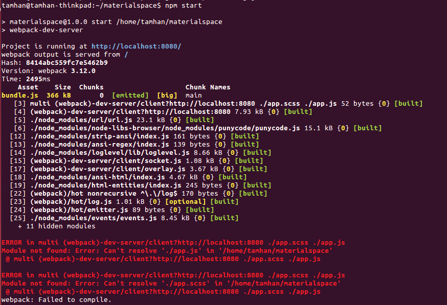
WebPack transforms code by chasing it through a sequence of processors, each of which can take one or more parameters. In our case, both CSS and JavaScript items are to be processed. In theory, the WebPack stack is ready to run at this point – sadly, the compile process will fail due to missing input resources, as shown in the image above.
03. Add components
Now the main workflow is set up, we can add the individual components needed to create our app. We want to build a small resistor calculator, which requires the loading of a group of widgets:
tamhan@tamhan-thinkpad:~/materialspace$ npm
install --save-dev @material/ripple
tamhan@tamhan-thinkpad:~/materialspace$ npm
install --save-dev @material/button
tamhan@tamhan-thinkpad:~/materialspace$ npm
install --save-dev @material/textfield
tamhan@tamhan-thinkpad:~/materialspace$ npm
install --save-dev @material/line-ripple
tamhan@tamhan-thinkpad:~/materialspace$ npm
install --save-dev @material/floating-label
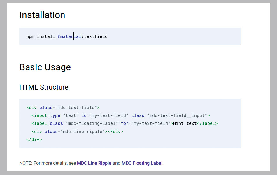
Google ‘beautifies’ the situation by breaking the framework into hundreds of packages. In the case of our text box, for example, multiple sub-elements need to be present. Sadly, the documentation does not tell you about this (see image below).
In the next step, create the two ‘containers’, which act as inputs to the WebPack stack outlined above:
tamhan@tamhan-thinkpad:~/materialspace$ touch
app.scss
tamhan@tamhan-thinkpad:~/materialspace$ touch
app.js
Finally, a dry run can take place. WebPack should now report that the compile process worked out:
tamhan@tamhan-thinkpad:~/materialspace$ npm
start
04. Add widgets
WebPack eliminates ‘unneeded’ parts from the compiled output. Adding widgets starts out in app.scss, which must now look like this:
@import "@material/button/mdc-button";
@import "@material/textfield/mdc-text-field";
@import "@material/line-ripple/mdc-line-
ripple";
@import "@material/floating-label/mdc-floating-
label";
In principle, we need one include for each component our program plans to load. As both textbox and button come with a few colleagues, we need a total of four lines worth of includes. The ripple effect used before is even more complex – we will omit it for now.
Next, touch a file named index.html. It acts as the main entry point and must load the various script files emitted by the WebPack process:
<html>
   <head>
       <link rel="stylesheet" href="bundle.css">
   </head>
   <body>
       Hello World
       <script src="bundle.js" async></
script>
   </body>
</html>
Finally, create a file called app.js. At this point, re-enter npm run to verify that the configuration still works. WebPack emits an URL similar to http://localhost:8080. The packaged results can be downloaded via a server living in npm. Don’t forget, though, to restart the server after changing files, since WebPack does not pick up changes.
05. Create widgets
Now the server is running, return to index.html and replace the Hello World message with a bit of markup:
<div class="mdc-text-field">
<input type="text" id="txtR" class="mdc-text-
field__input">
<label class="mdc-floating-label" for="my-text-
field">R</label>
<div class="mdc-line-ripple"></div>
</div><br>
<div class="mdc-text-field">
<input type="text" id="txtU" class="mdc-text-
field__input">
<label class="mdc-floating-label" for="my-text-
field">U</label>
<div class="mdc-line-ripple"></div>
</div><br>
<div class="mdc-text-field">
<input type="text" id="txtI" class="mdc-text-
field__input">
<label class="mdc-floating-label" for="my-text-
field">I</label>
<div class="mdc-line-ripple"></div>
</div><br>
<button class="mdc-button" id="cmdRun">Button</
button>
Just like in the case of our button, a text box also consists of a group of attributes. One of them displays a hint with information about what to enter, while the other one supports animation.
However, getting animations to work requires a change in app.js:
import {MDCTextField} from '@material/
textfield';
const textField = new MDCTextField(document.
querySelector('.mdc-text-field'));
This snippet of code is interesting since it targets all three text boxes in one swipe – Google designed the API to sweep over entire CSS selectors in one go.
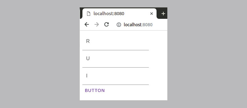
At this point, our program is ready to run – it will present itself like the figure. Finalising our little resistor calculator requires you to add JavaScript event listeners. After all, MDC components are but fancy HTML5 ones…

Integrating Material Design widgets into your application definitely takes a bit of work. But, the rewards are substantial and definitely worth the time. This is only the beginning. Be sure to check out the Material Design site for more tutorials, repos and information on what is available, as well as what can be done.
Material Design tools and resources
Material Theme Editor
Should you find yourself working on a Mac, take Theme Editor for a spin. This small but nifty program creates customised colour palettes, which you can use to change the look and feel of various Material Design-based systems.
Icons
Material Design differs from Metro in that it also allows for the use of small symbols. Google provides developers with ample choice – simply visit the URL to pick icons until your heart’s content.
Color Tool
This tool allows users to create, share, and apply colour palettes to a UI. Plus, it measures the accessibility level of any colour combination that you decide to put together.
Next page: Get to grips with Progressive Web Apps
Current page: Get started with Material Design
Prev Page Working with Device Mode Next Page Get to grips with Progressive Web Apps
Tam Hanna is a software consultant who specialises in the management of carrier and device manufacturer relationships, mobile application distribution and development, design and prototyping of process computers and sensors. He was a regular contributor to Web Designer magazine in previous years, and now occupies his time as the owner of Tamoggemon Software and Computer Software.


