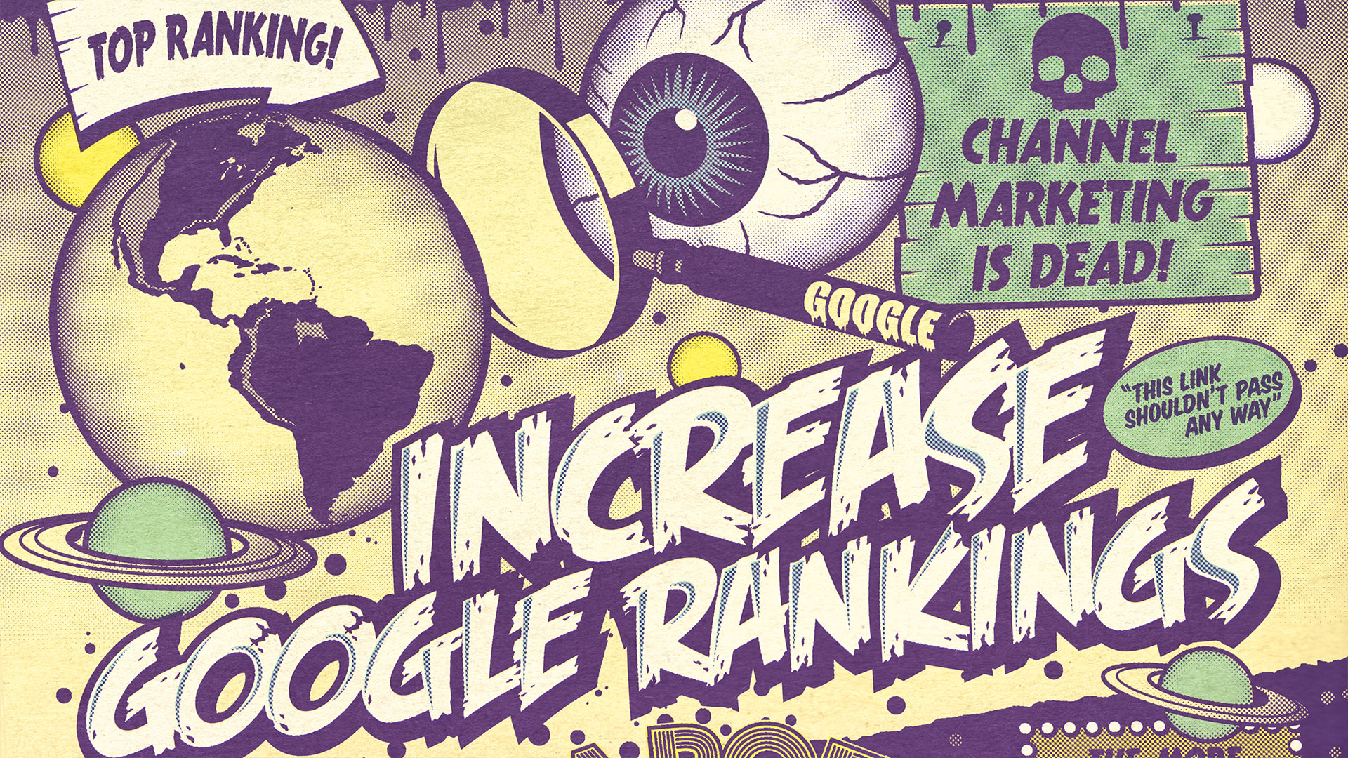
SEO: it's a dirty job but someone has to do it, and if you want anyone to see your design portfolio other than by word of mouth then you're going to have to bake a bit of SEO into your workflow.
Getting to grips with SEO from a standing start can feel utterly daunting, especially as the rules seem to change on a regular basis. However, if you follow these tips from SEO experts, you'll soon find yourself starting to climb the Google rankings. For more help, see our guide to the must-know SEO tools.
01. Learn by doing
"All designers need to understand how SEO works and second-guess how Google and other search engines, are moving the goalposts," says James Huckle, head of technology at digital agency Mirum UK. "In the short term, the best way to do this is to get your own website that you can control, add some content, social links and analytics, then do some tests and see what happens."
02. Keep experimenting
"Don't be afraid to get out of the sandbox!" says Evan Fraser of GraphicSprings.com. "Try on-site optimisation techniques on your live site, to see how search engines respond. There are tons of resources online, but you won't know what works for you until you try."
03. Use free resources
"Rand Fishkin and his Whiteboard Fridays are an absolute must for anybody learning SEO," says Fraser. "SearchEngineJournal and the GSQi Blog are also very informative. And in general, the MOZ community has been my go-to for many years."
04. Build backlinks
Backlinks from other sites to yours will boost a site's SEO considerably. "So my tip would be: Find out where relevant online conversations are happening, and join them," recommends John Atkin, head of PR at Affinity. "But make sure you stick to the spirit of the community: don't go wading in with blatant commercial plugging. Nudge conversations, don't ram them. In time, you'll build relationships which will result in links and mentions," he continues.
05. Focus on security
"Search engines will continue to prioritise security and mobile compliance and will reward websites that conform to these standards with improved rankings," says Anthony Miroballi, front-end developer at Chicago-based 50,000feet. "Google is already giving large bumps to sites that utilise its AMP platform, and a stripped-down mobile version of your site with enhanced mobile UX will pay dividends."
Get the Creative Bloq Newsletter
Daily design news, reviews, how-tos and more, as picked by the editors.
This article was originally published in issue 280 of Computer Arts, the world's best-selling design magazine. Buy issue 280 here or subscribe to Computer Arts here.
Related articles:

Thank you for reading 5 articles this month* Join now for unlimited access
Enjoy your first month for just £1 / $1 / €1
*Read 5 free articles per month without a subscription

Join now for unlimited access
Try first month for just £1 / $1 / €1

Tom May is an award-winning journalist and editor specialising in design, photography and technology. Author of the Amazon #1 bestseller Great TED Talks: Creativity, published by Pavilion Books, Tom was previously editor of Professional Photography magazine, associate editor at Creative Bloq, and deputy editor at net magazine. Today, he is a regular contributor to Creative Bloq and its sister sites Digital Camera World, T3.com and Tech Radar. He also writes for Creative Boom and works on content marketing projects.
