5 tips for super-fast CSS
Learn how to hasten page rendering by cutting the excess from your site's CSS.

Have you thought about the size of your site's CSS? If your style sheet is ballooning, it could be delaying page rendering.
Though CSS isn't the largest asset type you'll serve, it's one of the first that the browser discovers. Because the browser is blocked from rendering the page until CSS is downloaded and parsed, it must be as lean as possible. Here are five tips to help you get there.
Got a complex site? You need the perfect web hosting service. Or, if you want to make a site without the fuss, try a website builder.
01. Use shallow selectors
Your parents told you that shallowness isn't a virtue, but when it comes to CSS, they're wrong. Used consistently, shallow selectors can trim kilobytes off big style sheets. Take this selector:
nav ul li.nav-itemThis could be expressed more succinctly:
.nav-itemAs well as helping to keep your CSS svelte, the browser will also render the elements targeted by shallow selectors faster. Browsers read selectors from right to left. The deeper the selectors are, the longer it takes for the browser to render and re-render the elements those selectors are applied to. For complex DOMs that reflow often, short selectors can also cut down on jank.
Ideally, you want selectors to be as shallow as possible, but this doesn't mean you should cut everything down to the bone. Sometimes you need additional specificity to extend components. Strike the right balance, but be pragmatic, too.
Daily design news, reviews, how-tos and more, as picked by the editors.
02. Use shorthand properties

This seems like common sense, but you'll be surprised at how often longhand properties are used needlessly. Here's an example of some longhand properties in use:
font-size: 1.5rem;
line-height: 1.618;
font-family: "Arial", "Helvetica", sans-serif;
That's a lot of CSS! Let's tidy that up:
font: 1.5rem/1.618 "Arial", "Helvetica", sans-serif;The font shorthand property condenses several declarations into a handy one-liner that takes up much less space.
In the example shown above, the shorthand uses about 40 per cent less space than its longhand equivalent. It's not as readable at first glance, but the syntax becomes second nature after you've spent some time using it.
Of course, font isn't the only shorthand available to you. For example, margin can be used in place of longer properties such as margin-top, margin-right and so on.
The padding property works the same way. For more ways to clean up your CSS, Mozilla Developer Network offers a helpful list of shorthand property references.
What if you need to override a value further down in the cascade? For example, let's say you have a heading element that needs to change its font size for larger displays.
In this case, you should use the more specific font-size property instead:
h1{
    font: 1.5rem/1.618 "Arial", "Helvetica", sans-serif;
}
@media (min-width: 60rem){
    h1{
        font-size: 2rem;
    }
}
This isn't only convenient, it also increases component flexibility. If any other part of the underlying font property is modified, those changes will percolate up to larger displays. This works great for component overrides where a new context requires a different treatment.
03. Use the preload resource hint
The preload resource hint can give the browser a head start on loading your site's CSS. The preload resource hint tells the browser to initiate an early fetch for an asset.
You can set it as a <link> tag in HTML:
<link rel="preload" href="/css/styles.css" as="style">Or as an HTTP header in your server configuration:
Link: </css/styles.css>; rel=preload; as=styleIn both of these scenarios, preload gives the browser a head start on loading /css/styles.css. Using preload in an HTTP header is preferable, since this means the browser will discover the hint earlier in the response headers, instead of later on in the response body.
Another reason to use preload in an HTTP header is that it will initiate a server push event on most HTTP/2 implementations. Server push is a mechanism by which assets are preemptively pushed to the client when requests for content are made, and it offers performance benefits similar to inlining CSS.
Server push isn't available on HTTP/1. However, using preload in an HTTP/1 environment can still improve performance.
04. Cull redundancies with csscss

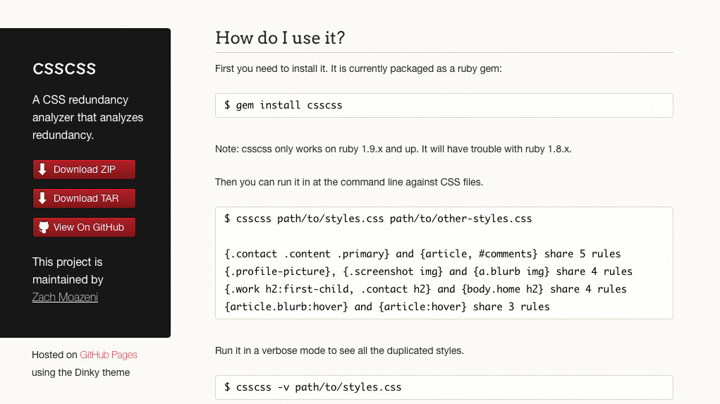
It can pay to check your CSS for duplicate rules with a redundancy checker. Take the Ruby-based tool csscss, for example.
Ruby users can install it with:
gem install csscssOnce installed, you can examine your CSS for redundancies like so:
csscss -v styles.cssThis command lists which selectors share rules that you can de-duplicate to save space:
{h1} AND {p} share 3 declarations
  - color: #000
  - line-height: 1.618
  - margin: 0 0 1.5rem
You can move duplicate rules under one selector:
h1, p{
    color: #000;
    line-height: 1.618;
    margin: 0 0 1.5rem;
}
You'd be surprised at how much space this process can save in large projects. Use the --help option to see more commands you can use to tweak things further.
05. Go the extra mile with cssnano

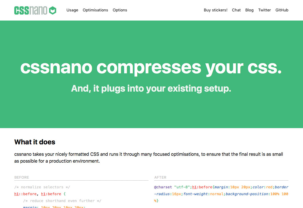
For the cherry on top, you can use cssnano – a node and PostCSS-dependent tool. cssnano not only minifies CSS, it makes many focused optimisations that can reduce your CSS even further. Install it on your system with npm like so:
npm i -g cssnano-cliThen use it to optimise your CSS:
cssnano styles.css optimized-styles.cssIf running commands ad hoc isn't your style, you can automate cssnano with a build system. Here's how to use cssnano in a gulpfile:
const gulp = require("gulp");
const postcss = require("gulp-postcss");
const cssnano = require("cssnano");

const buildCSS = ()=>{
    return gulp.src("css/styles.css")
        .pipe(postcss([cssnano()])
        .pipe(gulp.dest("css/optimized"));
};
const watch = ()=>{
    gulp.watch("css/styles.css", buildCSS);
};
exports.buildCSS = buildCSS;
exports.watch = watch;
The buildCSS task reads the CSS you write in css/styles.css, then pipes the optimised output to the css/optimized directory. The watch task kicks off buildCSS whenever changes occur in css/styles.css.
The watch task can then be invoked in the terminal like so:
gulp watchWith some tweaking, you can build a workflow that performs this specific optimisation in addition to other CSS-related tasks, such as building Sass/Less files, autoprefixing and more.
Want to save your website pages? Export as PDFs and save in reliable cloud storage.
This article originally appeared in net, the world's leading magazine for web designers. Subscribe here.
Related articles:

Thank you for reading 5 articles this month* Join now for unlimited access
Enjoy your first month for just £1 / $1 / €1
*Read 5 free articles per month without a subscription

Join now for unlimited access
Try first month for just £1 / $1 / €1
