3D text tutorial for graphic designers
How to use Cinema 4D to add 3D elements to your designs.
11. Change the colour of the lights
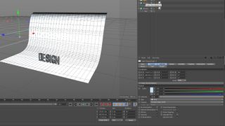
Select one of the lights on the sides, go into its General tab, click the white swatch in the Color property. It will open a small window; choose a light blue colour.
Repeat this step for the other side light but this time push the light’s temperature closer to the orange warm side of the spectrum.
12. Add some shadows
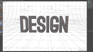
In the original light’s Attributes panel, navigate to the Shadow tab. Change the Shadow from None to Shadow Maps Soft. Repeat this step for the other two lights.
Navigate around the Perspective View to centre and zoom in on the text until you can’t see the edges around the backdrop. Your image should be look like the one above.
13. Render your image

Now for our Render, which you’ll see in the menu at the very top, above the Perspective view. In the Output tab, change the Width and Height to 1920 x 1080. Skip down to Anti-Aliasing and change the setting from Geometry to Best.
Let’s see how everything looks. At the top of your window you’ll see three movie slate icons. Choose the one on the left, Render View. It should look something like the image above.
14. Add a little more shadow


To ground the type a little more in its shadow, use Ambient Occlusion. On the bottom-left of the Render Settings Window you’ll see a button that says Effect. Click it and add Ambient Occlusion.
Get the Creative Bloq Newsletter
Daily design news, reviews, how-tos and more, as picked by the editors.
Do another quick Render View – you’ll noticed a marked difference in the darkness of the shadows in the tightest spots.
15. Position your camera
We now need to create a camera so our image will work in After Effects, where we’ll do the final render.
Go up to the top and click the camera icon. Next to the camera in the Objects panel is a little icon that looks like arrows pointing in different directions in a box – this is the look-through camera icon. Click it to activate (it will turn white), then position your camera as you want it for the final render.
16. Switch to After Effects
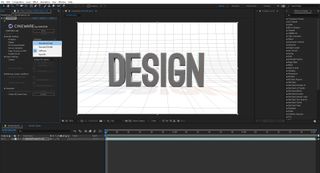
To save our design we have to jump back to After Effects. You’ll see the little Cinema 4D icon and the name of your project in the the Project panel in the top right. Drag that onto the Create a New Composition button.
You’ll notice the preview looks like a wireframe. To get it ready for render, look in the Effects and Controls panel and you’ll see an automatically applied effect called CINEWARE. In this effect under Render Settings where it says 'Renderer' change the setting to Standard (Final). This will change the quality so the image looks just like it did in Cinema 4D.
17. Render the final image

Go to Composition > Save Frame As > File, choose the output location desired in the Render Queue and hit Render.
If you don’t want to go back into After Effects and you don’t mind a lower quality render, you can also always just screenshot the render in the Cinema 4D window, to use in your other design software.
About Pluralsight
Pluralsight is an enterprise technology learning platform that delivers a unified, end to end learning experience for businesses across the globe. Through a subscription service, companies are empowered to move at the speed of technology, increasing proficiency, innovation and efficiency. For a free trial and more information, visit www.pluralsight.com.
Read more:

Thank you for reading 5 articles this month* Join now for unlimited access
Enjoy your first month for just £1 / $1 / €1
*Read 5 free articles per month without a subscription

Join now for unlimited access
Try first month for just £1 / $1 / €1
- 1
- 2
Current page: Finishing 3D text and rendering in Cinema 4D
Prev Page Getting started with Cinema 4D