15 tips for cross-device optimisation
Discover the key rules to remember when optimising and testing your sites to ensure compatibility on a range of devices.

Design for all the devices! Anna Dahlström will be speaking about the importance of building device-agnostic UX systems at Generate London, 21-23 September. She'll walk through why device-agnostic design matters, what it means and how we go about it; book now!
I started messing around with HTTP log files and user agent strings over 15 years ago, analysing and attempting to understand all the different devices rocking up at the early John Lewis ecommerce websites. What advice would I give myself, if I could go back in time?
It would be this: Every website or product you work on from now on will be broken – you just don't know where, on what device or browser, or how severely. If you hunt these defects down, you'll make easier money for your clients than almost all your other work put together.
It's taken me 15 years to realise that despite the tendency of customers to complain quickly, the vast majority won't report bugs in your device experiences. If you get a small number of complaints, you probably have a major disaster on your hands. If you don't get any complaints, it's likely still broken.
We can't rely on website visitors to be our 'canary in the coal mine' for device and browser problems – we have to take responsibility, and become smarter and more proactive in how we test. Device compatibility is a right not a privilege, and getting it wrong is a form of neglectful discrimination.
This article outlines the key rules to remember for cross-device optimisation and A/B testing. Tackle the optimisation tips first. If you're making basic mistakes with device compatibility, performance and usability, there's no point bothering with A/B testing. Find and fix the broken things first. Then, when you've got enough traffic to run A/B tests (at least 500 conversions or checkouts a month) – you can make some new mistakes.
01. Don't assume responsive solves everything
I once built a tiny mobile site that's not responsive, yet now takes the best part of a billion Euros in revenue every year. For the tasks required, it's perfect. It's not responsive in fluid layout terms, but it is responsive to the needs of almost everyone who uses it. Know the difference.
Get the Creative Bloq Newsletter
Daily design news, reviews, how-tos and more, as picked by the editors.
Sometimes people think that responsive web design is a sign of digital mastery. It's just an attribute that conveys nothing of quality – like saying 'we have a website' or 'our website lets you click things'. It's no guarantee of a great cross-device experience.
I see many responsive sites that have a superficial slickness but fail on usability because the team has ignored customer knowledge. One good example is an ecommerce website that went responsive and lost 40 per cent of its revenue. It had built a great mobile experience but the desktop version sucked, and that's where 80 per cent of the money came from. Knowing where the golden goose is helps if you want to avoid killing it!
02. Do your research first
Optimising a site does not start with hacking at the page content. It starts with doing your research so when your lips say 'customer journey' , what comes out isn't a fairytale. It's vital to know the visitors, their tasks and goals, entry points, device mix, paths, flows and abandonment areas first. It is very difficult to solve a problem you don't understand.
Using analytics data with user experience research, surveys or feedback is a rapid and lightweight way to remove bullshit, ego and assumptions about 'the journey'. One hour of informed data is worth a thousand hours of unchallenged opinion.
Further reading: 'Conversion research in one hour'; 'Session replay tools for research'.
03. Track people, not devices
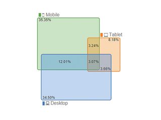
Unless you're using an analytics set-up that tracks users, you'll just end up tracking devices instead. Companies complain that their 'mobile' traffic isn't converting – and we find that the traffic is actually converting, just on a completely different device.
People may use their phone to browse and add a product to their basket, but find it's tricky to get through the checkout, so finish the sale on their laptop. The site thinks of these as two people: a mobile customer and a desktop customer.
So your conversion problem is actually an attribution issue. How can you credit the sale to a device experience if the customer uses more than one device? Google Analytics has a user view you can switch on (for logged-in users) that lets you track people, not devices, and there are many analytics tools to help you make sense of this.
04. Don't ignore the wider context
In this hyper-mobile device world, context is everything. What you need from an airline app might be very different 48 hours before your flight compared to when you're running for the gate. For that person with the phone, you need to consider the factors that impact the experience. These might include the tasks, goals, device, location, data rate, viewport, urgency, motivation, data costs, call costs, or even the weather at the time of their visit!
05. Get out of the office
Making better products shouldn't involve long days spent in the office. Why not break up the work day with visits to coffee shops and pubs? This is one of the cheapest ways to find customers for UX research. Offering a beer or coffee in exchange for feedback on your prototype or design is a priceless return on investment. And don't forget the website – if you have traffic, you can recruit people and run tests with them online too.
Further reading: 'UX tools to rule them all'.
06. Don't assume everyone uses iPhones
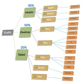
In most analytics set-ups, iPhone models are lumped together, suggesting these are the main customer devices. If you just look at models in your data, this will skew your thinking; you need to split devices by OS or platform to see the real picture. Google Analytics might say my top model is the 'iPhone' but even a handful of top Samsung models may add up to a much larger audience.
Every time someone is tempted to focus on their own personal device preference instead of the customer mix, direct them to the diagram above right (it's worth sticking it up on your office wall) to remind them what the data says.
Further reading: 'The ultimate guide to using Google Analytics for cross-device optimisation'.

07. Don't forget call tracking
A mention for a free and rarely used technique. If you have touch devices that can make phone calls, you can track calls. Simply add an event (or pageview) to your analytics data each time someone taps a phone number to call you. Then you'll know how many calls you get, exactly what web page people called from and which marketing campaigns or sources drove the most calls.
I used this data to analyse a PPC account for a large company. When we factored in the sales coming from phone calls, it completely changed our bidding. The saving was 40-70 per cent lower bills for PPC but the same amount of revenue.
08. Use real data to track website speed
Not many people know that Google Analytics collects real visitors' measurements of how slow your pages are, every day. Rather than imagining the performance (as you browse your site on a Wi-Ficonnection), you can let the data tell you where it sucks. Look at the DOM timings report: this records how long the webpage structure and content takes to load. Making sites quicker is a game changer.
There is a huge correlation between performance and conversion rate so if it's slow, you're spending marketing money just to send people to your competitors!
Further reading: 'Interpret site speed'.
09. Copy the testing method, rather than the creative
When you look at the tests other companies have run, you have no idea if they completely borked the test or not. Their data, method, QA or sample size might show they made elementary mistakes. They might have run the test for too short a period of time or not checked if it was collecting data accurately. You just don't know.
And even if you did have all the background info, you still couldn't predict if their method would work for you. Your customers, marketing, website and everything else are completely different. In short, the best practice rules for testing are mainly about copying the method and not the creative.
Further reading: 'The endless suck of best practice and optimisation experts'; 'When conversion optimisation best practices fail'.
10. Don't test without planning
There are millions of things you could test in places all over your site. If you just 'get started' you might eventually get an optimal website – but the heat death of the universe will get you first. If there is stuff broken in your experiences, you need to fix that first (before testing) as otherwise it will drag everything else down. Once you have the basics of performance and device compatibility, use analytics to identify opportunities.
'Just changing stuff' isn't a good enough reason to test; you need evidence or insight to drive a good test. The best learning comes from having great questions to channel into your testing.
11. Establish your hypothesis

The Hypothesis Kit is one of the most useful things I teach:
Because we saw [data/feedback] we expect that [change] will cause [impact]. We'll measure this using [data metric].
Asking people to frame their question or A/B test in this way forces them to think about why they are running the test and how success will be measured.
Further reading: Hypothesis kit 3.
12. Run a test calculator first
It's really good practice to run a test calculator before you A/B test. If it says it will take around nine million years to finish, you can do something more useful with your life.
13. Don't stop at 95% confidence
It's a very common noob mistake to make with A/B testing. You should decide your test time in advance, then run it for that time, stop it and analyse it. Most of the tests being run in the real world are completely fictional – and that's why people get disappointed when the promised 'lift' in conversion does not arrive. Calling tests wrongly or waiting too long for results are common problems that should be avoided.
Further reading: 'Statistical significance does not equal validity'; 'Why every internet marketer should be a statistician'.
14. Segment by device class
If you have different devices or breakpoints in your design, the A/B test will look completely different. If you're not sure how your design looks on all devices, how can you be sure it works at all? If you don't analyse and segment the data by the different device classes or 'breakpoints' , how will you know the behavioural shift? One of my clients stores the exact design the customer saw in their data layer, which is very useful.
Always understand how you're targeting or segmenting people across mobile, tablet and desktop device classes. There is no 'average' visitor – not when the device experience varies so hugely.
15. Don't forget QA testing
If you haven't worked out your device mix, you are probably not QA testing your A/B tests either. That means quite a few of them are probably broken – and if your A/B tests are broken, your data and decision-making is likely flawed. About 30-40 per cent of all my test designs fail basic QA, even with high-quality developers – that's JavaScript for you! Assume it's broken until proven otherwise.
Summary
Here I've covered a number of tips for improving your cross-device experiences. When you're starting out, knowing your device mix and understanding the customers behind those devices is vital. The next stage is to work with data to help you prioritise your efforts. Making a good testing list (with the aid of Google Analytics) cuts the effort for developers, but will increase the number of defects you remove on popular devices.
Designing great cross-device experiences is a careful balance of data, intuition, empathy and experimentation. If you allow these to occupy the space usually filled by ego and opinion, good work will flourish. As Stephen Hawking said: "The greatest enemy of knowledge is not ignorance, it is the illusion of knowledge."
Learn about the importance of device-agnostic design with Anna Dahlström at Generate London! In Building device-agnostic UX systems, she'll explain why you should let content guide layouts, and move away from designing pages to focusing on the modules that those views are made up of. Book your ticket now!
This article originally appeared in net magazine issue 279; subscribe now!

Thank you for reading 5 articles this month* Join now for unlimited access
Enjoy your first month for just £1 / $1 / €1
*Read 5 free articles per month without a subscription

Join now for unlimited access
Try first month for just £1 / $1 / €1
